Zurb Goes Mobile First With the All-New Foundation 4
Planning web projects for a host of devices got a little easier this week with the release of Zurb Foundation 4, a responsive framework with a mobile-first outline.
The follow-up release to Zurb’s Foundation 3 flexible grid is structured to make designer’s think mobile first. With more than 1.08 billion smartphones being used worldwide, it’s a trend that will likely continue to gain popularity. Join us as we take a look at what’s new in Foundation 4, and discover why you should consider using it for your next design project!
What’s New?

Foundation 4 is a new from-the-code-up build from Zurb. The mobile-first concept is the driving factor behind it.
“Mobile-first is definitely the new wave, even if the concept has been floating around for a while,” said Jonathan Smiley, partner and design lead at ZURB. “We held off on going mobile first until now precisely because we didn’t think most designers, or even most of our clients, were ready for it. Now the story is a bit different.”
Aside from the new way of thinking when you go into a website build, the guts of Foundation 4 have changed as well in hopes of offering a faster, more streamlined platform.
Designers and developers will likely notice smarter, more semantic coding. The code is streamlined to allow designers to focus more time working on the HTML.
“We wanted to enable Foundation users to overcome the most egregious flaw in frameworks: presentational markup” — Jonathan Smiley
Smiley noted that “the promise of HTML/CSS was that HTML told the device what your content was, and CSS told it how it should look. With other frameworks (including Foundation 3) you were stuck putting all kinds of markup in your HTML to say how it should look — with Foundation 4 you can pull all of that out into the CSS through the magic of SCSS mixins.”
The framework also uses the lighter Zepto instead of jQuery. Pages must load fast in mobile environments to hold the attention of users. Zurb says these improvements to the code and Javascript will do just that.
What’s the Same?
The framework is responsive. The idea is to design with a mobile-first thought process — but that’s not where it stops. Foundation 4 is made to build responsive websites that work on mobile devices, tablets and web browsers of most any shape and size.
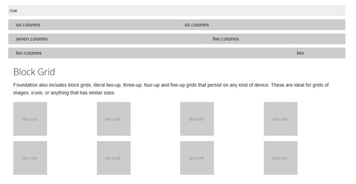
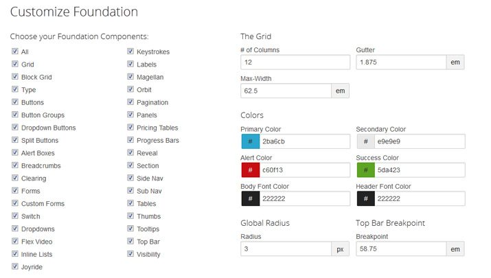
The grid Zurb is known for – that great 12-column fluid structure – hasn’t gone anywhere. You can still use it; the design process just starts with mobile. Foundation 4 is fully customizable, from components to grid specifications to colors and breakpoints. And the software is full of little extras and add-ons as well, to help you get a prototype made in no time.
A Designer’s Tool
Foundation 4 is made especially for designers. The straightforward code starting point is great for designers who maybe aren’t as code-savvy. And as a designer, this means that I get to use that time designing, rather than fighting the code. (A real bonus.)
The Foundation 4 outline also serves as a great place to get started. With so many mobile options out there, just the idea can be a little overwhelming and this tool eliminates some of that fuss. Foundation is an excellent starting place and a great way to dive head-first into the world of designing for all types of mobile devices.
Time to Upgrade?
Foundation 4 is not going to replace the popular Foundation 3, which “competes” with Twitter’s Bootstrap software. (You can read more about that in a previous Design Shack article.)
Foundation 3 users will be happy to know that Zurb is going to continue to support the product (and even has an update planned). Version 3.2.5 will serve as the solid, desktop-first responsive framework that people are accustomed to.
That being said, those who want to make the leap, can. Foundation 4 has a thorough migration guide, for those who need it. But this is a very different tool – remember mobile first rather than web first – and not all designers or developers will want to “upgrade.”
Foundation 4 is likely a better tool for new projects – maybe even those that have already been started if internal research has shown a strong connection to mobile users. For new projects, it is a worthwhile option for designers: “It’ll help focus their efforts, focus the interaction and experience, and deliver a better site to their users.”
Wave of the Future
Zurb is the first major tool with a mobile-first platform. And it will take some time to see how quick developers and designers are to embrace it.
A mobile-first version of Bootstrap is on the horizon as well. When Version 3 is release, according to the Bootstrap blog, it too will be mobile-first.
Zurb is estimating a cautious adoption rate to start.
“We’d expect adoption of mobile-first for development to still be a slow burn, at least for a few months, but whatever we can do with Foundation to accelerate that, we’ll do,” Smiley said. “We firmly believe mobile-first as an approach makes the most sense right now, and we’ll aggressively pursue that.”
With mobile use growing at 14 times the rate of desktop use, this strategy is becoming more important each day. And more and more designers and developers are talking about it – a lot. According to Luke Wroblewski’s “Mobile First,” thinking with mobile as a priority allows websites to reach more people, forces designers to focus on content and functionality and lets designers innovate and think about new technologies.
Conclusion
It is refreshing to see someone take the leap to a mobile-first development strategy. We are in an ever-increasingly mobile web-based world and more users are expecting an exceptional experience online, regardless of device.
“We think by helping people build for the devices people are really using, and build in a responsible, machine-readable, semantic way we’re helping set up a generation of sites and apps that will work the way they ought, even on devices and with technology that doesn’t exist yet,” Smiley said. “We’re pretty excited about that.
From a designer’s standpoint, so am I. Designing mobile first just makes sense. I was taught to design the smallest pieces first and make them work and be readable and then build from there. That’s the basis of Foundation 4. Build small first and then expand the design. Seems like a solid strategy.