Swap Your Page’s Background Image on Navigation Hover
I love the challenge of building something with CSS that uses one item to trigger another. It can get pretty tricky to wrap your mind around all of the pieces involved and come up with a way to flow your HTML in a way that is easily controlled in your CSS.
Today we’re going to embark on just such a challenge. We’ll build a basic home page that swaps out background images based on the link that you’re hovering over in the navigation. Along the way, you’ll learn all about the idea of remote hovers and how to wield them in your projects.
Sleight of Hand
Did you know that it’s possible, using only CSS, to manipulate one element when a user hovers over a completely different item? It’s a little tricky, but once you the hang of it, you can pull off some really cool effects.
To see how this works, let’s use a really basic example. Imagine that you have the following code:
<section>
  <a href="#">Some Link Text</a>
  <img src="pic1.jpg" alt="">
</section>
Pretty simple right? Just an image and an anchor tag inside of the same parent. Imagine though you wanted to make it so that when the user hovered over the link, a border appeared around the image. How would you do this?
Let’s start with the basics. We know how to create a hover effect for the anchor, and adding a border is easy enough:
a:hover {
  border: 3px solid #000;
}
This isn’t at all what we were looking to achieve though. All this does is add a border around the anchor, but we want it around our image. Obviously, our fault lies in the selector. We’ve set a hover event on our anchor, now we need to target our image for the action. My first instinct here is usually to do something like this:
a:hover img {
  border: 3px solid #000;
}
Unfortunately, this doesn’t work either! We’re close, but when we hover over the link, the border still doesn’t appear around the image. What we need is our old friend the adjacent sibling combinator.
a:hover + img {
  border: 3px solid #000;
}
With the addition of that little “+”, we’re now targeting any image element that falls immediately after an anchor tag. So if we added a few more images to our HTML, hovering over our link would add a border to the first image.
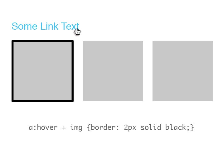
The first image is an adjacent sibling of the link, so it gets a border on hover. So what if we want to add a border to all of the images when the anchor sees a hover? For this, we’ll need the general sibling combinator.
a:hover ~ img {
  border: 3px solid #000;
}
Whereas before we were targeting only adjacent siblings, now we’re targeting any old sibling. So now, all of the images that are on the same level of the DOM tree as our anchor will receive a border as a result of the hover.
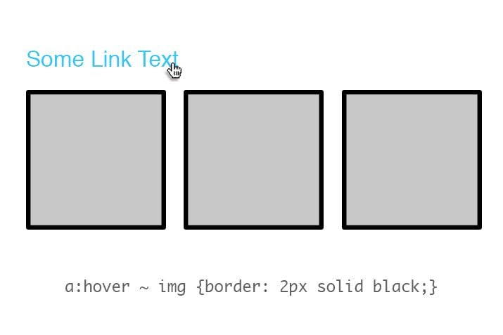
Changing the Way You Think
Notice that, for this technique to work, the items that we’re messing with have to be closely related from the perspective of the DOM tree. More specifically, the item that you’re going to manipulate must be a sibling or child of the element that you want to hover over. You can’t have a remote hover that requires climbing back up the DOM tree.
As you begin to build projects that use this technique, you’ll find that these simple rules can cause some real headaches! They bend and break the format that you might typically use for structuring your HTML and cause you to think creatively to figure out how to restructure your elements just right so that the remote hovers will function.
For today’s example, it took me quite a few tries to structure my HTML and CSS properly so that everything works. From your perspective, it’ll look super simple because I’ll lay it out in the proper order. Just remember though that when you do this in your own projects, it’s going to take a lot of fiddling and tweaking. Don’t give up! Experimentation is where education happens.
What We’re Building
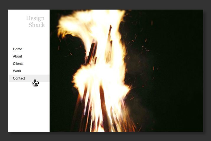
The item that we’re building today is a simple website homepage. The navigation is a vertical menu down the left side and the rest of the content box is taken up by a large image.
Demo: Click here to launch.

Now, if this is all we were doing, the HTML would be fairly simple. One big div with a background image that contains a narrower div with a white background and an unordered list inside. We want to make things a little more complicated though. When the user hovers over a navigation link, the background image needs to change.
This means that we need a whole stack of background images. The challenge though is figuring out where to place those images in the markup so that we can access them via a remote hover. Let’s see how it works.
Step 1: HTML
For our HTML, we’re going to need a container an unordered list inside of a nav element, which is wrapped in a container div. Here’s the basic structure:
<div class="container">
  <nav>
    <ul>
      <li></li>
      <li></li>
      <li></li>
      <li></li>
      <li></li>
      <li></li>
    </ul>
  </nav>
</div>
We’re obviously going to want some text in our navigation, so we can throw this in as well. Also notice that I tossed in a heading to serve as the site identifier.
<div class="container">
  <nav>
    <h1>Design Shack</h1>
    <ul>
      <li><a href="#">Home</a></li>
      <li><a href="#">About</a></li>
      <li><a href="#">Clients</a></li>
      <li><a href="#">Work</a></li>
      <li><a href="#">Contact</a></li>
    </ul>
  </nav>
</div>
To finish off, let’s add in our images. We’ll want each link to correspond to an image. The best way to do this is to place an image after each link, this way we can control those images when a link is hovered by leveraging a sibling selector like we did above. Here’s how this looks in action:
<div class="container">
  <nav>
    <h1>Design Shack</h1>
    <ul>
      <li>
        <a href="#">Home</a>
        <img src="pic2.jpg" alt="">
      </li>
      <li>
        <a href="#">About</a>
        <img src="pic3.jpg" alt="">
      </li>
      <li>
        <a href="#">Clients</a>
        <img src="pic4.jpg" alt="">
      </li>
      <li>
        <a href="#">Work</a>
        <img src="pic5.jpg" alt="">
      </li>
      <li>
        <a href="#">Contact</a>
        <img src="pic6.jpg" alt="">
      </li>
    </ul>
  </nav>

  <img src="pic1.jpg" alt="">
</div>
This is our completed HTML structure. Notice the image floating all by itself at the end, this will serve as the background for the page when no anchor is being hovered over.
Step 2: Starter CSS
We’re all finished with the HTML, the rest of the project is all CSS. Let’s start with these basic styles, which really require no explanation. Feel free to use a more robust reset if you have a preferred method:
* {
  margin: 0;
  padding: 0;
}

body {
  background: #333;
}
Step 3: Container Styles
The first section here that we need to code is the container div. I start with some basic positioning context. We’re going to be using absolute positioning later, and we want that confined to our container, so I used relative positioning here. I also set the overflow to hidden because we’re going to have a few images that are hidden outside the bounds of the container.
Finally, I set the bounds of the container, centered it and tossed in a shadow. Here’s the chunk of code that does all this:
.container {
  position: relative;
  overflow: hidden;
  margin: 100px auto;
  width: 800px;
  height: 500px;
  -webkit-box-shadow: 10px 10px 10px rgba(0,0,0,0.3);
  box-shadow: 10px 10px 10px rgba(0,0,0,0.3);
}
Now for the tricky part. We need to get those images to do what we want. First, I set all of them to line up perfectly with the container (the images are also 800px by 500px) by using absolute positioning and zeroing out the values. Then, I slid only the images that were inside a list item outside of the container by pushing them to the right. These will now be hidden until we bring them back in.
Two more final tweaks: z-index makes sure that the offscreen images will slide in on top of the static image and transitions will animate the switch.
.container img {
  position: absolute;
  top: 0;
  left: 0;
  z-index: -60;
}

.container li img {
  position: absolute;
  top: 0;
  left: 800px;
  z-index: -50;
  -webkit-transition: all 1s ease;
  -moz-transition: all 1s ease;
  -o-transition: all 1s ease;
  -ms-transition: all 1s ease;
  transition: all 1s ease;
}
Step 4: Nav Styles
That last step has our container and its images all styled up and ready to go. Here’s a peek at what the page currently looks like:
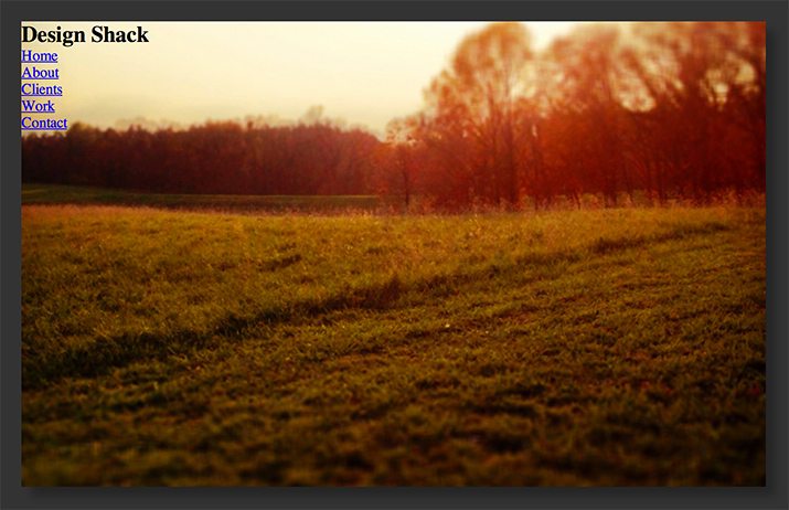
As you can see, the navigation is still pretty ugly, so we’ll need to get that in order. To do this, we set the width to only occupy 170px and the background to white.
nav {
  width: 170px;
  height: 500px;
  background: #fff;
}
This will make sure we have that left side white bar that we want. Now let’s proceed to styling the text and list. We need to target the h1 and the ul, then apply some basic styling:
nav h1 {
  padding: 20px;
  color: #ccc;
  text-align: right;
  font: 25px Georgia, Times, serif;
}

ul {
  width: 800px;
  height: 500px;
  list-style: none;
}
Now that we have the ul element styled, we need to dig in and specifically style the pieces of text, which are really all anchor elements inside of list-items. Target these, set them to block so you can specifically set their dimensions, then style them up like so:
li a {
  z-index: 1;
  display: block;
  padding-left: 20px;
  width: 150px;
  height: 30px;
  background: white;
  color: #444;
  text-decoration: none;
  font: 14px/30px Helvetica, Verdana, sans-serif;
}

li:nth-child(1) {
  padding-top: 50px;
}
Given the way that our document is structured, we can’t move around that nav element or unordered list too much. As a result, we need to specifically target the first list item so that we can nudge the text into place. This is accomplished with nth-child (IE9 and above only, use selectivizr for older browsers).
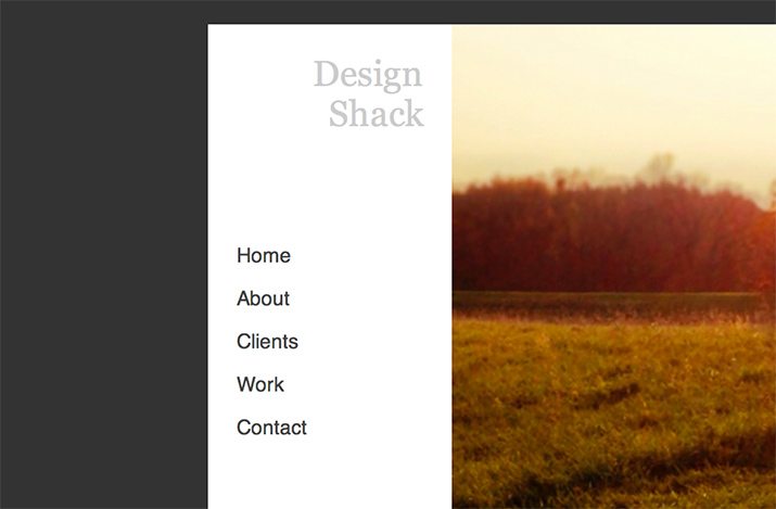
Step 5: Hover Styles
As you can see in the image above, the navigation menu looks perfect now. Unfortunately, it still doesn’t do anything! Don’t worry though, we’ve set everything up just the way we need it, so a few lines of CSS is all it takes to bring it all to life.
li a:hover {
  background: #eee;
}

li a:hover + img {
  left: 0px;
}
First, I added a hover effect to the text so that you have some visual feedback that something is happening there. This is important to illustrate the concept that what the user is doing on the left is affecting the photos on the right.
Finally, to finish everything off, all we need to do is wait for the user to hover, then grab one of the images outside the container and pull it in over the default background image. Notice that we do this with the adjacent sibling combinator that we learned about before. This makes sure that we’re grabbing the specific image that’s paired with the anchor that’s being hovered over.
See It in Action
With that, we’re all finished! Now it’s time to take a look at the fruit of our labor. Be sure to hover over each of the links in the sidebar and watch how it affects the background image.
Demo: Click here to launch.
Go Build Something
By now you should have a good idea of how to wield remote hovers to pull off some fancy CSS events. Think of something cool to do with this idea and go build it. It seems simple, but I can almost guarantee that you’ll run into some mind-boggling snags along the way. Just refer back here to see how it works and make sure you keep at it until you’ve mastered it!