How to Get Your Site Featured in Our Web Design Gallery
Here at Design Shack we love good inspiration and seek to provide you with daily bits of visual sustenance that will help you become a better designer by expanding your horizons and opening your mind up to different styles of design.
We’d love to feature your work in our gallery and want to make sure you fully understand the process so you can effectively decide whether or not you should make a submission. The following will serve as a basic guide for anyone interested in submitting a site. It will delve into our goals for the gallery, who should submit designs, some tricks to getting in and even how to handle a rejection notice.
The Ultimate Designer Toolkit: 2 Million+ Assets
Envato Elements gives you unlimited access to 2 million+ pro design resources, themes, templates, photos, graphics and more. Everything you'll ever need in your design resource toolkit.
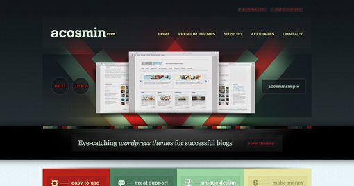
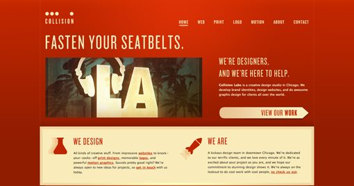
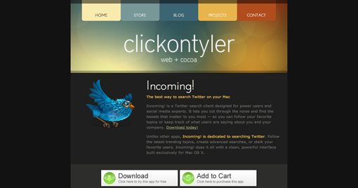
Along the way we’ll scatter in some rockstar designs from our gallery that we feel typify the quality of work that we like to feature.
What Is the Gallery For?
The gallery here at Design Shack is meant to provide design inspiration. Our goal is to create a place where designers can go and flip through tons of concepts in such a way that a spark of inspired but ultimately original thought is kindled.
As a bonus, inclusion in the gallery will in fact provide your site with increased exposure to the web design community. However, we do not see this as an advertising slot. We will therefore not accept your submission just because you could “really use the exposure.”
Should I Submit My Design?
As a website owner or web designer, every project you create has a specific purpose. Many times, your specific needs require something boring. This is perfectly acceptable from a business standpoint.
Your client asks for something simple and usable with no flashy bits or fluffy design nonsense and that’s exactly what you provide. Sometimes originality can be less effective than an overused but familiar format that simply “gets the job done.” This type of site has a large appeal to many users and is the foundation of many wildly successful websites.
However, even if you’ve created a successful site that meets all the client goals and attracts a million users in two days, you should think twice before submitting to our gallery.
This site is all about design. Superfluous, purposeful, gaudy, or minimal, we evaluate and showcase aesthetic appeal. What this means is that sites like the type described above are rejected every single day. Somewhere on the web there should exist a showcase for boring, unoriginal corporate design, but that simply isn’t here.
When you create something that you feel is original, or even unoriginally trendy but particularly attractive, then you should consider submitting it to our gallery. The key question to ask yourself is whether or not your design can stand up to the scrutiny of professionally trained designers. Will these types of individuals laud you for your creativity or be disappointed in the unfinished quality of your work?
How Do You Decide Who Gets In?
To be brutally honest, there is no checklist of points to make sure you’ve covered or magic formula for getting accepted.
We take a look at the site and usually decide within the first two seconds whether or not it will be accepted. Completely off the cuff and non-formal, the exact same way your visitors will view your site for the first time.
What this means on a practical level is that if you want in, you have at best, two seconds to impress us. As I said above, there are no guarantees or formulaic approaches, but there are in fact a few things you can try that will increase your chances.
A Beautiful Header
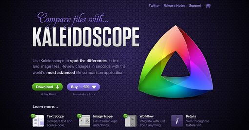
Perhaps one of the single best ways to get into our gallery is to create a stunning header. The top portion of your site is prime real estate and no small amount of effort should be put forth in making it a bold statement that sets the impression for the entire site.
You’ll notice that our screenshots are most often cropped in such a way that the top portion of the website is highlighted. This is simply the first area everyone visiting your site will see and we like it when gallery entrants show off their skills here.
I often see entries that use minimalism as their theme and therefore really miss the mark in this area. Minimalism is great and we love to display it, but we have to have something to display. If the top third of your site is empty space, there’s simply nothing to inspire other designers. It may look great in the overall scheme of your site, but it simply won’t work in our gallery.
Be Bold
Again, there’s a lot to be said for “safe” web design and how it fuels the corporate world. However, we’d much rather fill our gallery with the exceptions instead of the rule.
We want to see something that impresses us, shocks us, makes us laugh, and/or genuinely inspires us to be better designers.
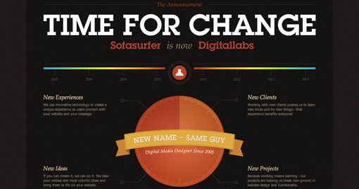
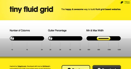
Boldness comes in color, size and complexity. Perhaps your site is shockingly yellow, has unnaturally huge typography, impressively complex illustrations or all of the above. Great, we want to see it!
Caution: We Said Bold: Not Ugly
Keep in mind that it’s very easy to go overboard with your big bold idea. What starts as a stylish retro circus concept all too often becomes something that looks like a carnival threw up on your website.
Stay away from colors that clash instead of compliment, anything that looks like it was designed in the 90s (it’ll be cool in ten years but not now), and any fonts that Windows users think are cool.
Know the Basics
The freelance design industry is overflowing with self-taught designers. On one hand, this is laudable. You deserve a pat on the back for blazing your own trail and learning a valuable skill without selling your soul to pay for a college degree.
However, the downside of this phenomenon is that half the designers out there making a full-time living at this don’t know jack about proper design theory. An intuitive sense of design is great, but unless you convert some of that into explicit knowledge, your designs will be hit and miss.
The most frequent fundamental problem I come across with gallery submissions is poor alignment. I think this is because many untrained designers have a “feel” for alignment but not a real understanding of how it should work. This goes hand in hand with the use of negative space, another frequently misused tool in web design. Check out this guide on using negative space for more information on how to effectively structure basic layouts.
Get the Details Right
Even though we generally abide by the two second rule for whether or not to further examine a site, make no mistake, we will look at the site in-depth and attempt to spot problems.
If your site is absolutely beautiful, but has an ugly logo in the top left, it will get rejected. If your site has an image with poor resolution that affects the aesthetic appeal, it will get rejected. If there is a bug in your CSS that causes some tiny bit of unintentional overflow in a major browser, your site will get rejected. And yes, if your site is built entirely in Flash and takes thirty seconds to load, it will get rejected before I even see it (Flash is fine, just watch your loading times).
How To Handle Rejection
To reject a website, we send one of two emails. The first highlights specific areas of the site that need to be addressed before we will display it. This implies that there is hope for the site to be included if you are willing to put forth the effort to improve it.
The other email we send simply addresses the fact that the overall design needs work. This usually means that we just didn’t like your site and honestly have no idea how you could fix it without starting from scratch.
Obviously, if you get the first email, we’ll be more than wiling to work with you on meeting our standards. Too many entrants get angry and defensive at this point when in reality they are a five minute fix from getting in. In this situation, you can either move on and spend your time on other projects or address the details we pointed out. The choice is completely up to you.
If you receive the second email, don’t be discouraged. Not making it into our gallery doesn’t mean that you’re not a good designer or that you don’t have an effective site. It simply means you found a couple of people who don’t like it enough to share it with others. Ultimately, it’s not really a big deal and you shouldn’t let it ruin your day.
Conclusion
I hope the information above will help you to make your decision for whether or not to submit your site to our gallery. We don’t pretend that we are the best design critics in existence, nor do we imagine ourselves to be the best designers on the web, we merely have very specific standards that help ensure we are providing the design community with a quality product.
As a general rule, when in doubt, submit your site. Ultimately, good or bad, we love seeing your submissions and helping you improve the quality of your work.
Now that you’ve read the manifesto, head over to our submission page and show us your work!
