10 Presentation Design Mistakes to Avoid (With Examples)
One of the most important aspects of a successful presentation is designing an effective slideshow. Unfortunately, it’s also a part most professionals often neglect or don’t pay attention to.
This is why most of the bad presentation designs share a pattern. They are usually made using the default PowerPoint templates. They use the same default fonts as every other presentation. They also include terrible stock photos. And try to stuff as much information as possible into a single slide.
We noticed all these mistakes and more while exploring some of the most popular presentations on SlideShare. They were slideshows with thousands and even millions of views. But, they were riddled with mistakes and flaws.
In this guide, we show you how these mistakes can be harmful as well as give you tips on how to avoid them. Of course, we made sure to include some examples as well.
1. Adding Too Many Slides

One of the biggest mistakes you can do when designing a presentation is adding way too many slides. This not only makes your presentation unnecessarily long but it can also affect the audience’s engagement. After a few slides, your audience will surely lose interest in your presentation.
Rand Fishkin is a well-known entrepreneur in the marketing industry. This is one of his presentations that received over 100,000 views. And it features 95 slides. We believe it could’ve generated more views if he had made the presentation shorter.
A presentation with 95 slides is a bit of an overkill, even when it’s made for an online platform like SlideShare.
Solution: Follow the 10/20/30 Rule
The 10/20/30 rule is a concept introduced by expert marketer Guy Kawasaki. The rule recommends that you limit your presentation to 10 slides, lasting only 20 minutes, and using a font size of 30 points.
Even though the rule states to limit the presentation to 10 slides, it’s perfectly fine to design a 20-slide presentation or even one with 30 slides. Just don’t drag it too far.
2. Information Overload
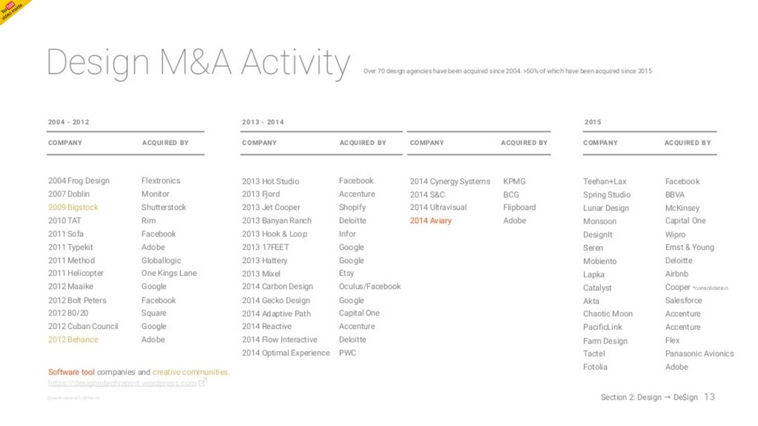
Statistics and research data are important for backing your claims. Even in your presentations, you can include stats and data to add more validity and authority. However, you should also remember not to over-do it.
A good example is this popular SlideShare presentation with more than 1 million views. Since this is a tech report slideshow, it includes lots of stats and data. But the designer has made the mistake of trying to include too much data into every slide in the presentation.
If this slideshow were to present to a large audience at a big hall, most of the audience won’t even be able to read it without binoculars.
Solution: Visualize Stats and Data
A great way to present data is to visualize them. Instead of adding numbers and long paragraphs of text, use charts and graphs to visualize them. Or use infographics and illustrations.
3. Choosing the Wrong Colors

How long did it take for you to read the title of this slide? Believe it or not, it looks just the same throughout the entire slideshow.
The biggest mistake of this presentation design is using images as the background. Then using colors that doesn’t highlight the text made it even worse and rendered the text completely unreadable.
Solution: Create a Color Palette
Make sure that you start your presentation design by preparing a color palette. It should include primary and secondary colors that you use throughout each slide. This will make your presentation design look more consistent.
4. Using Terrible Fonts

Fonts play a key role in improving the readability in not just presentations but in all kinds of designs. Your choice of font is enough for the audience to decide whether you’re a professional or an amateur.
In this case, the slide speaks for itself. Not only the font choice is terrible but without any spacing between the paragraphs, the entire slide and the presentation is hardly readable. How did this presentation generate over 290,000 views? We’ll never know.
Solution: Avoid the Default Fonts
As a rule of thumb, try to avoid using the default fonts installed on your computer. These fonts aren’t designed for professional work. Instead, consider using a custom font. There are thousands of free and premium fonts with great designs. Use them!
5. Adding Images from Google
You could tell by just looking at this slide that this person is using images from Google search. It looks like the designer lazily downloaded images from Google search and copy-pasted a screenshot onto the image. Without even taking the time to align the screenshot to fit the device or removing the white background of the image.
Or he probably added a white background to the images after realizing the black iPhone blends into the black background. Most of the images used throughout this slideshow are pretty terrible as well.
Solution: Use High-Quality Mockups and Images
The solution is simple. Don’t use images from Google! Instead, use high-quality images from a free stock image site or use a premium source. Also, if you want to use devices in slides, make sure to use device mockup templates.
6. Poor Content Formatting
There are many things wrong with this slideshow. It uses terrible colors with ugly fonts, the font sizes are also too big, uneven shapes, and the list goes on.
One thing to remember here is that even though apps like PowerPoint and Keynote gives you lots of options for drawing shapes and a color palette with unlimited choices, you don’t have to use them all.
Solution: Use a Minimal and Consistent Layout
Plan a content layout to be used with each and every slide of your presentation. Use a minimalist content layout and don’t be afraid to use lots of white space in your slides. Or, you can use a pre-made PowerPoint or Keynote template with a better design.
7. Writing Long Paragraphs
Adding long paragraphs of text in slides is never a good way to present your ideas to an audience. After all, that’s what the speech is for. The slides, however, need to be just a summary of what you’re trying to convince your audience.
Don’t make the mistake of writing long paragraphs that turns your slideshow into a document. And, more importantly, don’t read from the slides.
Solution: Keep It Short
As the author Stephen Keague said, “no audience ever complained about a presentation or speech being too short”. It takes skill to summarize an idea with just a few words. You should always try to use shorter sentences and lots of titles, headings, and bullet points in your slideshows.
8. Not Using Images

This entire presentation doesn’t have a single image in any of its slides, except for the company logo. Images are a great way to keep your audience fully engaged with your presentations. Some expert speakers even use images to add humor as well.
The saying “a picture is worth a thousand words” is popular for a reason. Instead of writing 200-words long paragraphs, use images to summarize messages and also to add context.
Solution: Use Icons, Illustrations, and Graphics
You don’t always have to add photos or images to make your presentations look more attractive. Instead, you can use other types of graphics and colorful icons. Or even illustrations and infographics to make each slide more entertaining.
9. Designing Repetitive Slides

This presentation about Internet Trends is one of the most popular slideshows on SlideShare with more than 4 million views. If you go through the slides you’ll notice the entire presentation is filled with nothing but charts and graphs.
Your audience will easily get bored and lose attention when your presentation has too many slides containing the same type of content.
Solution: Use a Mix of Content
Make sure to use different types of content throughout the slides. Add text, images, shapes, icons, and other elements to create each slide more engaging than the other.
10. Using Complex Infographics
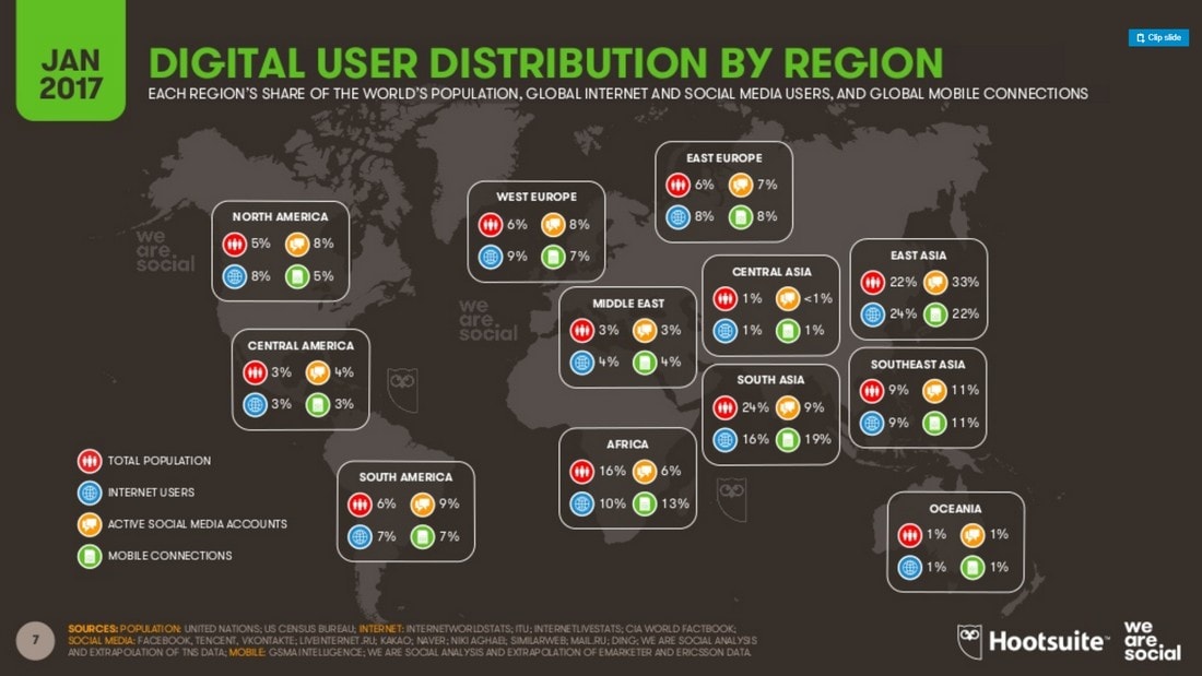
Even though images and graphics are great for visualizing data, it’s important to use the right designs to showcase the data without confusing the audience.
For example, this slideshow made by HootSuite is filled with stats and data. Most of which look fine. Except for a few slides that include complicated designs filled with information all over the place.
Solution: Design Simpler Graphics
There are many great online tools you can use to design your own infographics and visuals. Use them. But, also remember to use simpler designs that are easier to understand for all audiences.
In Conclusion
There’s no such thing as the perfect presentation design. Every slideshow has its flaws. But, if you learn to avoid the common mistakes, you’ll have a much higher chance of winning over your audience and delivering a more engaging presentation.
If you don’t have any slideshow design experience, consider picking one of the bee PowerPoint templates or best Keynote templates. They feature designs made by professionals and you won’t have to worry about making any mistakes again.