Why Adobe Doesn’t Understand Web Designers
Earlier this week Adobe launched a preview of a WYSISYG web design project currently codenamed “Muse.” Though it looked promising, disappointed and even angry reactions from the web community are already all over the web.
With all the time, effort and money that Adobe spends on creating a “code free” solution for designing websites, you’d think that they would be able to create something decently usable by now. So what’s holding them back? Today we’ll take a brief walk down memory lane, starting all the way back at PageMill, to see if we can discover any reoccurring themes in Adobe’s history with web designers.
In The Beginning
Once upon a time, Adobe owned the creative industry. This was that magical point in history when print design was enjoying a long-held high, web design hadn’t quite taken off as a ubiquitous profession and everyone had finally decided that Quark pretty much sucked.
To be sure, I still don’t know of a single creative professional who doesn’t have an Adobe app or two open on their machines at almost all times, but the company still seems to be struggling with a new generation of designers.
Adobe has a long and sordid history with web designers, particularly in the area of WYSIWYG web editors. Again and again they’ve tried to revolutionize and own this industry, each time with less than desirable results. The fact that Adobe is still releasing yearly experiments in this arena is proof enough that internally, they think there is still plenty of room for improvement.
So why can’t the king of creative crack this nut? What is it about web design and/or web designers that Adobe just doesn’t understand? In our quest for the answer, let’s look at some of their notable attempts to infiltrate the web design world.
PageMill & GoLive
As far back as late 1994, Adobe realized that this Internet thing might be something that they needed to pursue. To do so, they did what any mega-company does in favor of wasting precious R&D time and money: bought up a competitor.
From 1994 to 1999, Adobe’s WYSIWYG of choice was PageMill, acquired from Seneca. By the second or third iteration, it had a lot of bells and whistles and was receiving fairly positive feedback, but Adobe was already working on its next big entrant into this area.
In 1999, Adobe decided to buy yet another company to help defend themselves against the growing threat of Macromedia Dreamweaver. This time around, the target company was GoLive Systems and the product a WYSIWYG editor called CyberStudio, which was rebranded as Adobe GoLive.
Many GoLive users complained that the product suffered from a fundamental conceptual flaw: it was too geared towards static design. It might have been decent for making a very simple, static page, but as soon as you wanted to add any sort of dynamic features, the interface became inefficient, clunky and an all around nightmare to wield properly. Pay attention because this is a theme that we see from Adobe even today.
Other complaints about GoLive related to its fairly messy output. Again, this is a huge lesson, the existence of which Adobe has still somehow managed to remain ignorant.
Surprisingly enough, GoLive was around all the way up through 2007, though it was pulled from the Creative Suite after CS2 and converted to a standalone product. Obviously, as many predicted, Dreamweaver won out in the end.
The Macromedia Chronicles
Macromedia was a hot name in the late 90s, mostly because of two key acquisitions. In 1996, they purchased both FutureSplash, which became Flash, and Backstage, which evolved into Dreamweaver.
You could write a book on the history of these two apps. None of us need to be reminded of how Flash changed the web forever, initially seeming like a savior and lately being marked as a Judas. Flash did in fact give us a taste of what the web could be though: a rich, interactive and dynamic experience that sometimes felt straight out of Hollywood. It also brought us lots and lots of easily viewable video content, a now critical feature of the web that most of us couldn’t imagine being absent.
Dreamweaver, in short, kicked GoLive’s tail. Nearly everyone who had used both apps extensively favored Dreamweaver’s friendlier workflow. Heavy lifting like scripting and database integration was supposedly much easier in Dreamweaver, causing many large corporations with behemoth sites to favor it. Even more basic features like CSS authoring was touted as superior in Dreamweaver.
Adobe Buys Macromedia
In true “can’t beat ’em, buy ’em” fashion, Adobe acquired Macromedia at the close of 2005, marking the beginning of the end for their interest in GoLive.
Six years later, the results of this acquisition are a bit mixed. Adobe has certainly invested a lot into furthering Macromedia’s various technologies, but as I mentioned above, Flash is the web’s favorite whipping boy at the moment (with Apple holding the whip).
However, Dreamweaver is still the WYSIWYG to beat. I was unable to find any solid sales numbers or suggestions of how many Dreamweaver users there are in the world, but once again looking to BuiltWith, we know there are upwards of 4.2 million websites using it (they obviously can’t monitor the whole web).
Obviously, no one can say that Dreamweaver isn’t still having a large impact on the web. However, deep and scornful criticism of Dreamweaver can be easily found wherever one might search for it. Some of this hatred is spewed towards WYSIWYGs in general, but much is directed at the still less than stellar code and perhaps even more at the huge barrier to entry that is associated with the application.
If your goal is to forgo learning some simple HTML and CSS in favor of tackling Dreamweaver, you might be taking on a massive task to avoid a small one! To be fair, coders can use Dreamweaver too, but I’m not alone in thinking that it’s much easier, faster and cleaner to simply code by hand.
Far From Ideal
Ultimately, few professional web developers today claim that Dreamweaver is the pinnacle of visually-driven web development. Instead, the industry seems to have an attitude that accepts that it’s likely the best solution we have at the moment while we eagerly await a true “Dreamweaver killer.”
The Tip of The Iceberg
As we transition into a discussion on two very recent efforts in this arena, know that I’ve merely hit the major players here. Adobe has launched a ton of other efforts such as Flash Catalyst that are targeted at code-free development.
Fireworks
To prevent large scale comment riots, I should also mention that Fireworks is a rockstar app that does successfully combine many elements of Photoshop and web design. It’s definitely not a way to build complete websites code-free, it’s merely what Photoshop would look like if it were truly built with web designers in mind. If you haven’t tried it yet, check out a basic tutorial here.
Project Rome
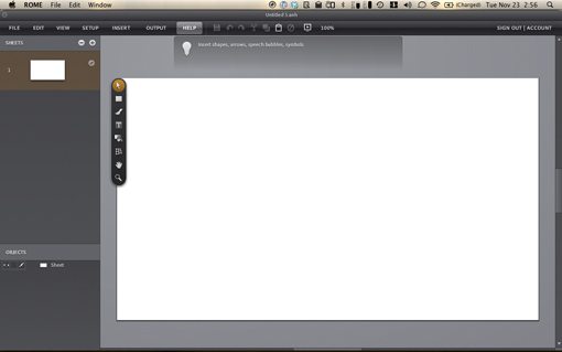
Fast forward to the last year or two and Adobe is still trying to figure out what the future of web design will be. A recent notable yet abandoned experiment was Project Rome, which I personally explored on this very site.
My conclusions on Rome were the same as countless other who tried it. There were some solid ideas at work. The learning curve was infinitely lower than Dreamweaver (I was building functional sites within an hour) and you could successfully achieve quite a bit without writing a single line of code.
However, the unforgivable downfall was, wait for it, the output! The brilliant idea here was that instead of using HTML and CSS, Rome could only export a Flash site, even when your structure had absolutely nothing to merit getting Flash involved. Obviously, in a web development climate that currently puts Flash development on par with the evils of table-based layout and terrorism, this didn’t go over well. The Rome website now contains the familiar message from Adobe about moving on to other projects.
Muse
Only this week Adobe launched Muse, the latest in a long line of promises to give graphic designers a way to build websites without learning code. The videos on the Muse homepage make some pretty big promises about revolutionizing the way websites are built, but we’ve heard all this before and you need only read the previous section to see how it usually pans out.
The web design community spoke out loudly and in unison almost as soon as the announcement email hit our inboxes. The general opinion is best summed up in Elliot Jay Stocks’ recent article, Adobe Muse: a step in the wrong direction. In this harsh but completely justified critique Elliot points out a few of Muse’s fatal flaws: strictly fixed layouts, non-semantic code output (seriously Adobe, have you learned nothing?) and horrible typography. With those areas deemed a failure, what’s left?
I gave Muse a shot and found it to be a logical mixture of the good parts of Project Rome and Photoshop. It’s an obvious attempt to take the same goals and ideas behind Rome and separate them from Flash. It’s super easy to pick up and run with and yet it feels quite limited in what I’m allowed to control. Ultimately, I can’t help but join Stocks in saying that Adobe has once again missed the mark.
What Adobe Doesn’t Understand
It’s immensely frustrating to see Adobe going through so many attempts to bring web design to all designers. It’s definitely a huge problem, one that I’m not sure anyone has solved, but I’m not sure Adobe has really taken the time to explore current practices in web design enough to try to revolutionize them.
The conversation in Adobe’s meetings has likely been the same for years, they want to leverage the unbelievably immense base of Photoshop users and give them a tool for easy web design. Lots of print designers are simply too intimated by code, so let’s give them a way to transition their careers into web design with as little pain as possible.
It’s a novel idea, and frankly one that I searched high and low for before learning to code, but the concept may be entirely flawed. Print design is by nature static. Short of lenticular illusions, ink on a page simply doesn’t offer many opportunities for real interactions.
The web on the other hand, is built on interaction. The basic idea of the worldwide web as we now know it is that it’s an interactive portal to a global network. No matter how much current and former print designers, myself included, want it to be print design on a screen, that’s simply not the case. The web is a living breathing thing and print design metaphors taken too far are simply serving up dead, static content.
When I build a website, behavior is every bit or even more important than the surface aesthetics. I think of how the site will function and let that define how it looks, not the other way around. Most WYSIWYG apps have it backwards and instead focus on building static, unusable designs that are then sloppily infused with a modicum of interaction. This model will forever fail to produce the kind of rich web content that the world is used to receiving.
The Solution: Stop Running from Code
Another thing that Adobe completely misunderstands is that there is a current web design industry! Print designers want into that existing industry, not some third niche that is looked down upon. If every “real” web designer hates your product, then odds are it’s not going to be adopted by incoming newbies who want to join the club.
To this end, Adobe should be attempting to build an app that makes coders happy. This is a tricky goal to be sure.
In my opinion, WYSIWYG’s shouldn’t be a way to avoid learning code, they should be a way to teach it! Consider options like Flux and CSSEdit (now part of Espresso). Both of these offer a visual way to create and style web content without relying too heavily on print design metaphors that simply don’t apply. Instead, the visual controls in these apps entirely revolve around technology that the web actually uses: CSS. If you’re new to coding, using these apps extensively will only help you gain a more thorough understanding of how web development works.
Further, when you look at the code that results from Flux, CSSEdit and even Rapidweaver, it’s clean and web developer friendly despite the fact that the generation was handled through a visual interface. This is immensely important. Adobe simply can’t keep ignoring the output of their web products under the argument that non-coders won’t know the difference. Non-coders will hear from coders that the product isn’t up to par and they won’t use it.
Instead of giving graphic designers a back door into the web industry, Adobe needs to start considering how they can create a product that truly and easily empowers them to be real web developers.
Conclusion
WYSIWYG web design is hard to discuss. So many people hate it and look down upon it in a fashion that completely alienates the users who are bound to it without any other viable alternative. After all, if hardcore coders are pretentious snobs, what incentive is there to become one? As someone who codes by hand 100% of the time, I’m completely guilty of this negative attitude and apologize to any would-be developers out there that are intimidated by a web design community that should be finding ways to welcome them into the fold and helping them out instead of casting them out.
That being said, it’s the state of WYSIWYG applications that get us so fired up. Most of them are simply so far off the mark that they can only cause disgust in the minds of people who spend 40+ hours a week dedicating themselves to following agreed upon practices that genuinely make the web a better place.
Adobe, more than perhaps any other company, lies at the heart of this debate and many believe that they are helping to create more problems than solutions. What would happen if Adobe got together with Eric Meyer, Jeffrey Zeldman, Paul Irish and other leading industry experts and asked how they could build a user-friendly visual editor that meets the lofty standards of these individuals?
What if Adobe slowed down in its mad grab for web design market share long enough to ask what being a web developer really means and how they can help bring print design converts to that place rather than making them the red-headed step children of the web design world?
Something truly revolutionary, that’s what.
Update: Further Reading
After writing and publishing this article, I became aware of some similar discussions and projects. I’m definitely not alone in thinking that a revolutionary step in this area is needed. Check out the links below for more information.
Project Meteor
“Project Meteor is a campaign to demonstrate the demand for a modern web design app and give app developers direction as to what it should be.”
The Perfect Web Design App… and Why It Doesn’t Exist
“Designers and developers share with Craig Grannell their tools for designing websites and demand something more in keeping with modern practices. The perfect tool, it seems, simply doesn’t exist yet, as highlighted by the Project Meteor campaign”