20+ New & Modern Color Trends 2025
Color is the main component of every design. Even though it may seem like colors always remain the same, it’s actually something that is ever-changing. And as a result, it makes way for new color trends every year.
If you’re preparing to start a new design project, staying up-to-date on the latest trends is important. It’s the key to making your designs relevant and appealing to the current audiences.
Today we take a look at some breakout color trends that will keep your graphic elements looking fresh. Rather than just talking about different trends, we wanted to go deeper. So we found real-life examples to show how each trend is being used by different industries.
What kind of color trends will be popular this year? Will there be new trends in color schemes? Or would any old trends make a comeback? Here are our predictions.
1. Dystopian Red
This is one of the most popular color schemes for creating a dark, moody aesthetic in various types of designs. It’s been widely used in everything from movie posters to branding designs, website designs, and even in fashion.
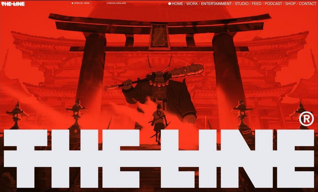
It often uses dark tones of red and black paired with high-contrast images to create an edgy and rebellious aesthetic. Achieving a strikingly different and unconventional look is the goal of using this color theme.
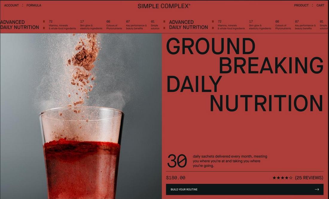
Whether it’s to highlight tech brands, fashion designs, or music bands, this dramatic color scheme will make your designs stand out from the crowd.
2. Subtle Luxurious Vibes
Olive green paired with a subtle gold color scheme is the go-to choice for creating a “quiet rich” look for website designs. This color scheme has been trending over the past few years for a reason. It not only helps you create a rich, luxurious, and classy look but it allows you to do it in a more natural and grounded way.
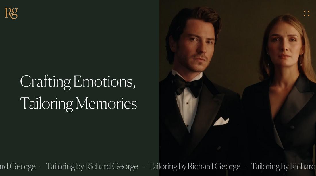
Most luxury branding designs often go for the classic black and gold color scheme. However, this color scheme is used by businesses and designers who aim to achieve more of a luxury vibe without overwhelming opulence.
This trendy color scheme goes beyond just digital designs as it can be used in various other design projects from packaging designs to business card designs, wedding invitations, and more.
3. Electric Greens
The bright and vibrant electric greens have a way of instantly grabbing your attention no matter where you see them. Often combined with a dark background, designers have been utilizing this color for various purposes over the years, especially for attractive accents and highlights.
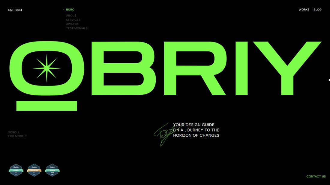
This neon-colored electric green color scheme is a popular choice in technology and sports-themed designs. The goal of this color trend is to help you create a futuristic and cutting-edge vibe for your designs.

When you want to bring extra attention to your call to action, important features, and messages, this vibrant color will do an exceptional job, especially when paired with neutral shades.
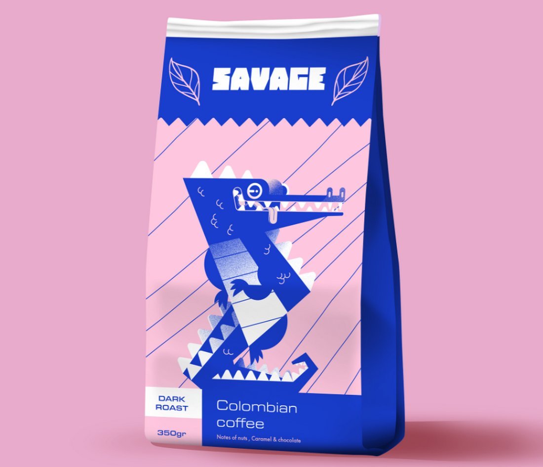
4. Cyberpunk Colors
Filled with bright and neon gradients, Cyberpunk color schemes are the perfect choice for representing the technologically advanced future with a dystopian aesthetic. As a result, this is one of the most popular color schemes used in web design, especially in AI, crypto, NFT, sports, and gaming-related projects.
The cyberpunk color schemes take inspiration from popular films and video games of the sci-fi genre, aiming to create a similar blend of futuristic and nostalgic looks.
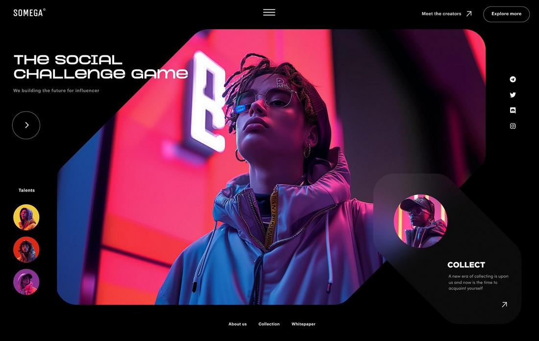
This color trend mainly involves using colorful gradients mixed with neon pink, purple, or yellow accents and of course with tech-forward images and photography.
5. 70s Aesthetic
The classic 1970s-inspired retro look is one of the new and trending designs in both web and graphic designs. There are multiple styles to this trend that use different types of color schemes.
Color palettes featuring a burnt orange color are the most popular choice for this trend. This color blends well with darker color tones. And when mixed with a rough, weathered textured effect, it creates a beautifully nostalgic aesthetic for the entire design. Other soft and lite colors also works well for this look.
In addition to web design, this color trend is also popular in branding, especially related to marketing, interior design, and masculine product packaging designs.
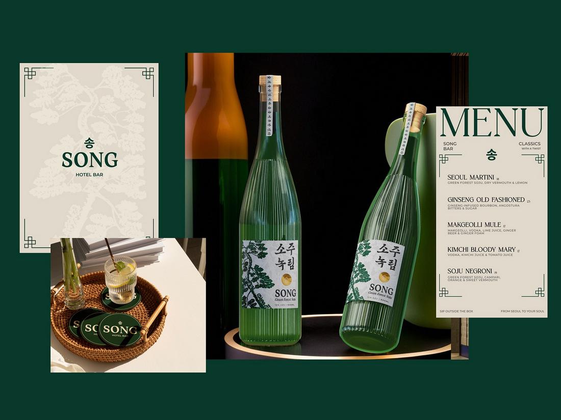
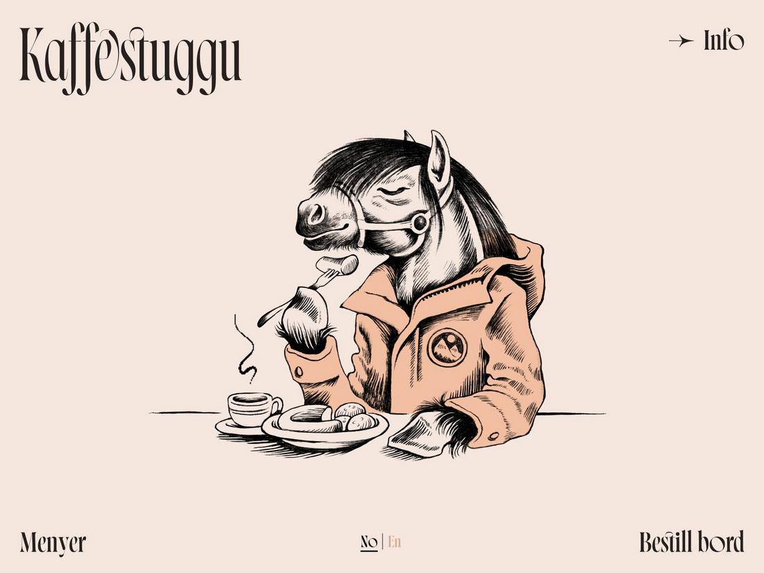
6. Earthy Tones
Down-to-earth and organic colors are among the most popular color trends in packaging design. Many brands, ranging from small boutiques to high-end luxury brands, use this trend to give their products a natural aesthetic look and feel.
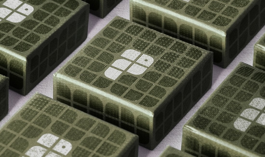
Color palettes that feature earthy tones usually include more grounded and muted colors, like olive greens, light brown, and terracotta. They go perfectly well together with most light colors to add a subtle organic and tranquil vibe to the overall design.
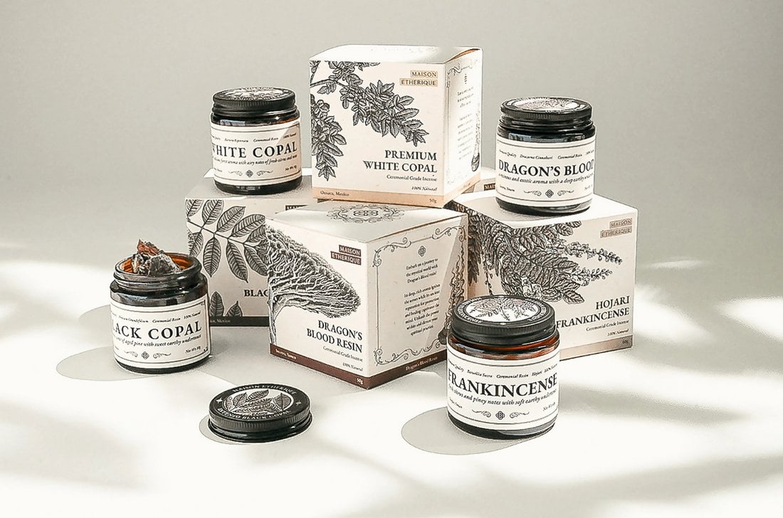
The earthy tones color trend is not just limited to packaging designs. It’s also used in many other designs, including digital designs like websites and app layouts as well as print designs such as posters, flyers, and greeting cards.
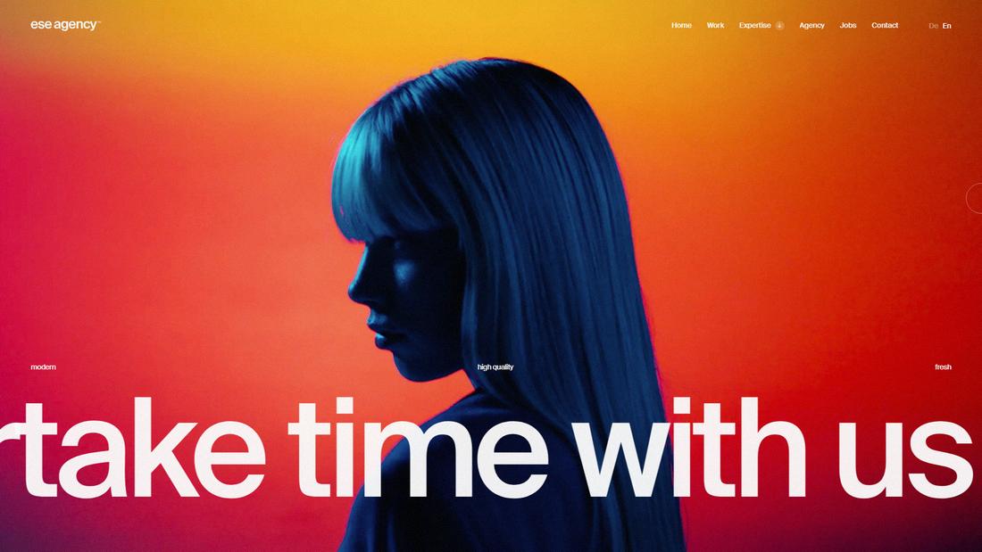
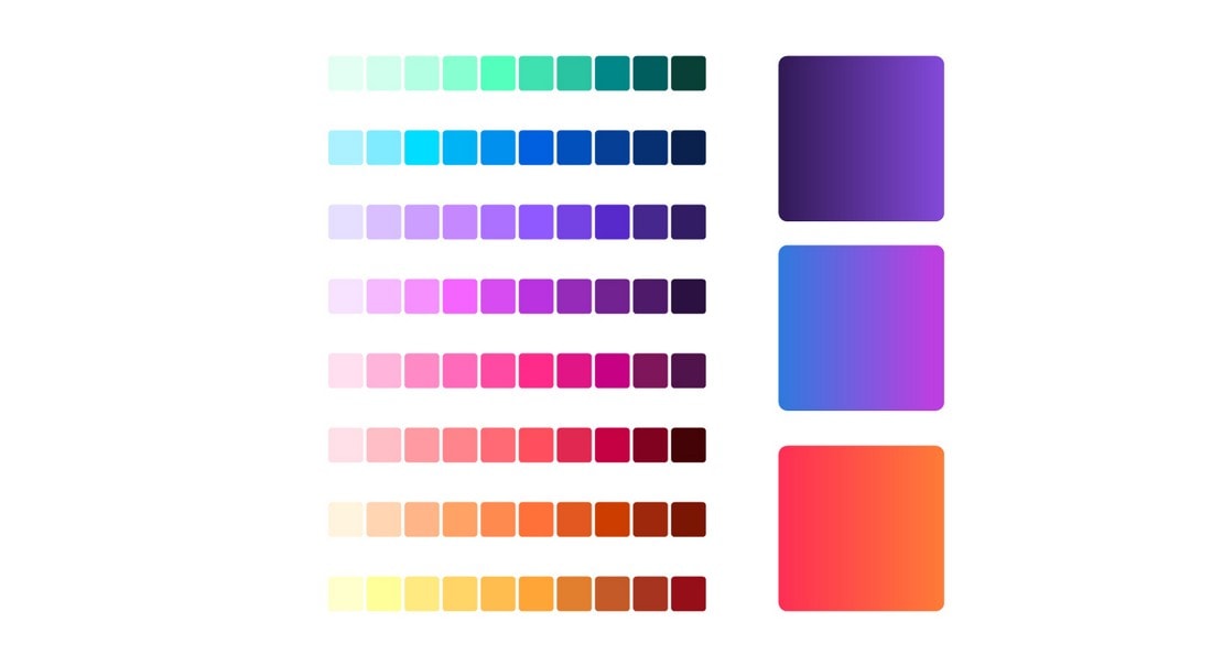
7. Gradients Everywhere
This trend is turning out to be one of those timeless design styles that never go out of style. The gradient color trend is nothing new but designers are finding new ways to use gradients, everywhere!
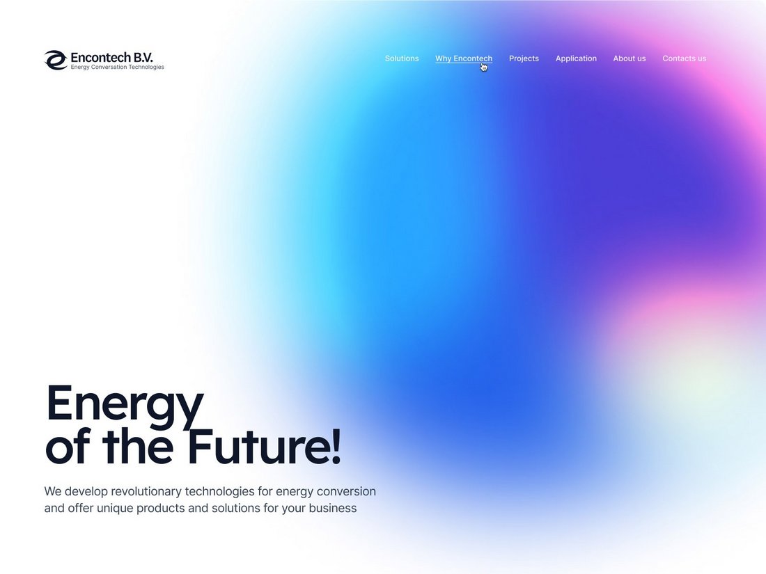
Even when used as backgrounds, the gradients are now more alive with subtle blur effects and cool animations. It adds a beautiful, soft, and modern feel to any design.
It goes beyond just digital designs as well. Now, gradient colors are slowly making their way over to print designs, including packaging designs. Admittedly, it does look quite dynamic and fluid when you add a gradient as a text masking effect.
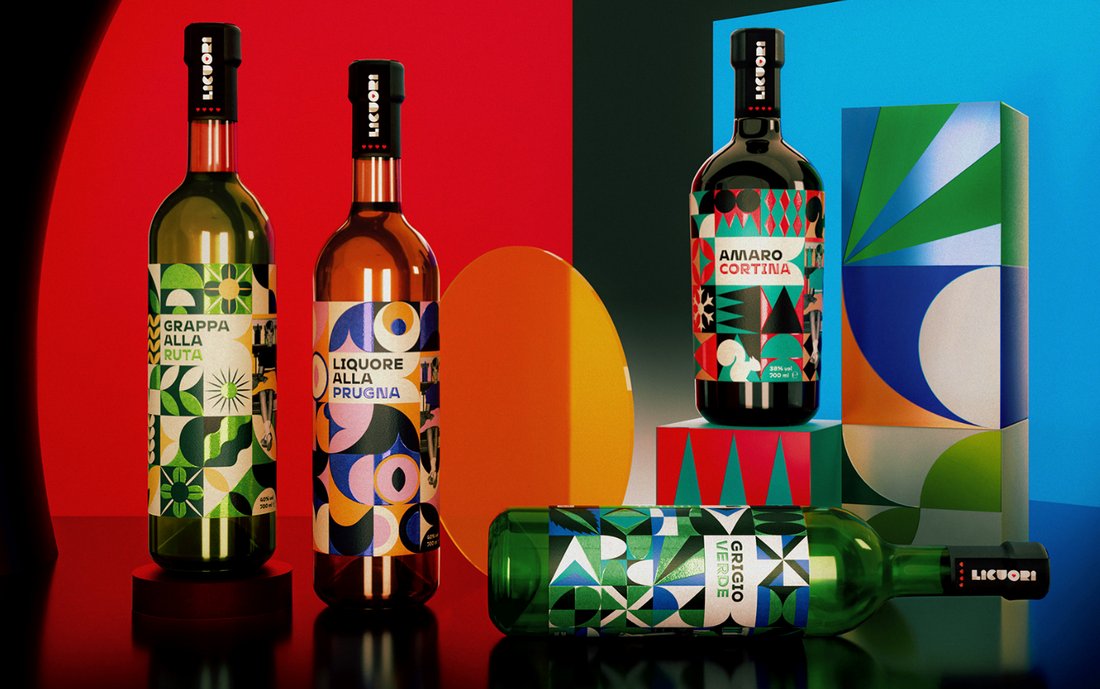
8. Saturated Hues
Saturated colors are the go-to method for making bold statements and making a design stand out from the crowd. The use of bold and intense colors is now much more than just about making statements, it’s now a trend!
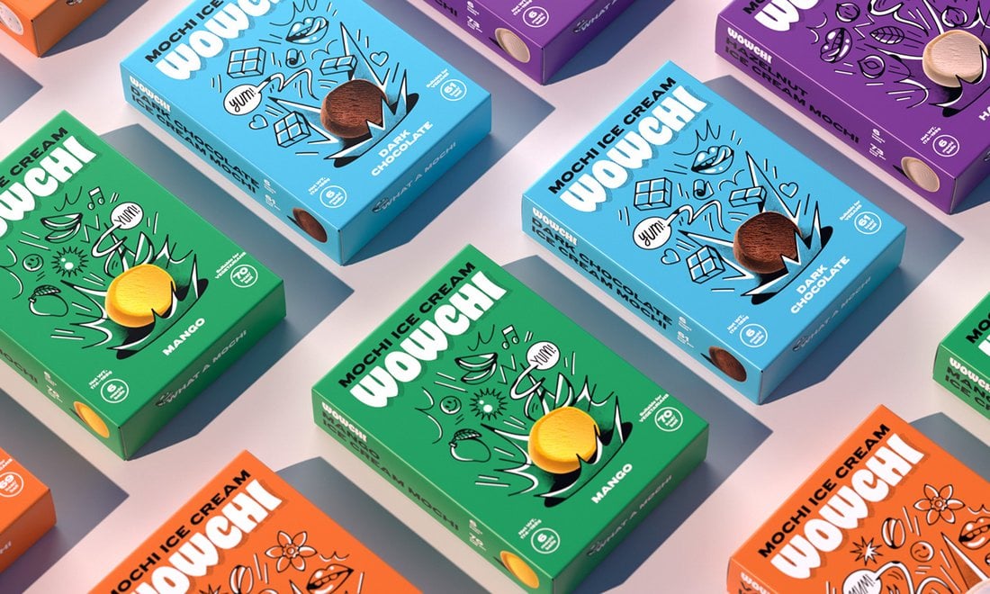
The main goal of using saturated hues is to grab the attention and make them more impactful. When you look at a design that has strong, saturated hues, you look at it more intensely and more focused. This is why many brands are now adopting this trend for packaging designs.
Of course, you need to be careful when using intense colors in a design. Coming up with the right secondary colors is key to creating a more balanced color look for the overall design.
9. Duotone Effect
One of the classic color trends from the early to mid-2010s appears to be making a comeback and we’re not complaining. The duotone color trend was quite popular in both digital and print designs for a long time. The way it created a distinctive contrast in designs made them much more impactful and memorable.
The duotone color effect is ideal for more elaborate designs, especially as it makes the job much easier to highlight and gives center stage to the content elements.
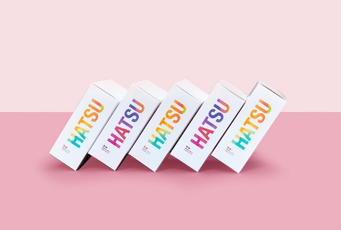
10. Playful Colors
Fun and playful colors used to be the go-to approach for designs that target younger audiences. But now, it’s turning into quite a popular color trend that creates more energetic and fresh looks for brands and businesses.
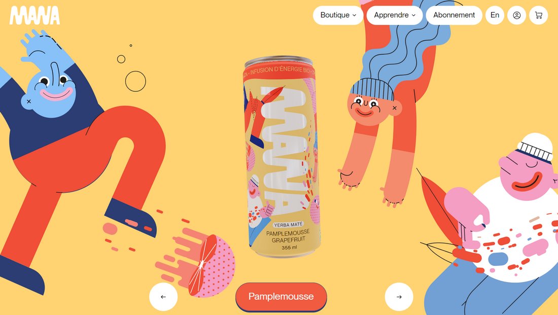
Ranging from soft pastel colors to bright yellows and coral colors are commonly used to create a playful color look. It’s used across websites, posters, packaging, and even branding designs as well.
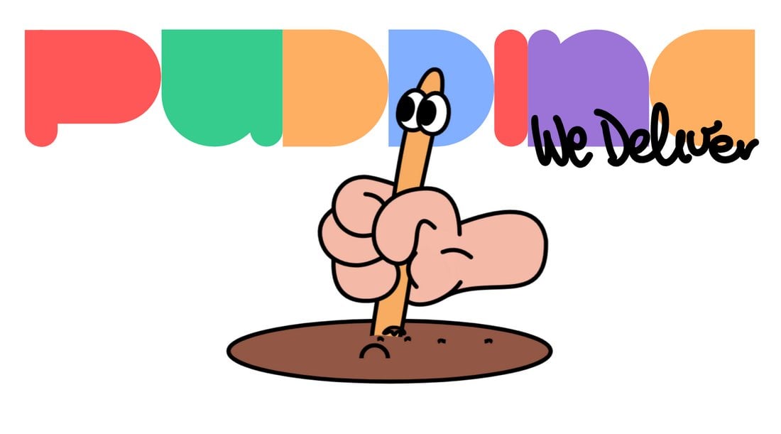
Whether you want to give a playful look to modern designs or evoke emotions and optimistic vibes, the playful color trend is a fantastic choice for various projects.
11. Bright and Vibrant
This is a color trend that looks easy to use but difficult to master. A trick to getting this trend right is to combine it with another design trend, like material design and Bauhaus design, but with more intense colors.
Of course, seeing bright and vibrant designs is nothing new. We see it all the time on social media posts, websites, and even TikTok video effects. But it’s now also expanding into print designs as well.

It’s a trend that has a wide variety of uses. It’s especially ideal for showcasing inclusivity and creativity. But mainly it’s about giving a more dynamic look to designs.
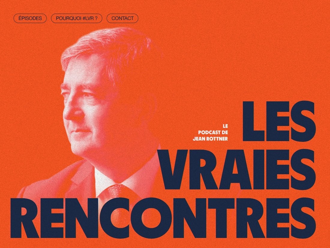
12. Bold Accents
Bold accents of color – sometimes in unexpected hues or places – is a modern trend that has made a major comeback. This style was popular, especially in print design, about a decade ago and is not pushing its way into websites and other projects.
Bold accent colors work when they contribute to the comprehension of a project. Does color help you see or understand the message more clearly? Is there a better focus on certain words or phrases? That’s where this trend can make a major impact.
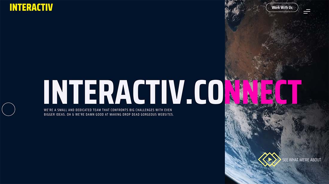
Interactiv uses two elements with bold colors – the yellow logotype in the top left corner and the pink “nnect” in the main headline. The colors draw the eye across the screen quickly and put emphasis on the brand name. Note that the pink actually drives you to read the brand (in white) separately from the whole headline.
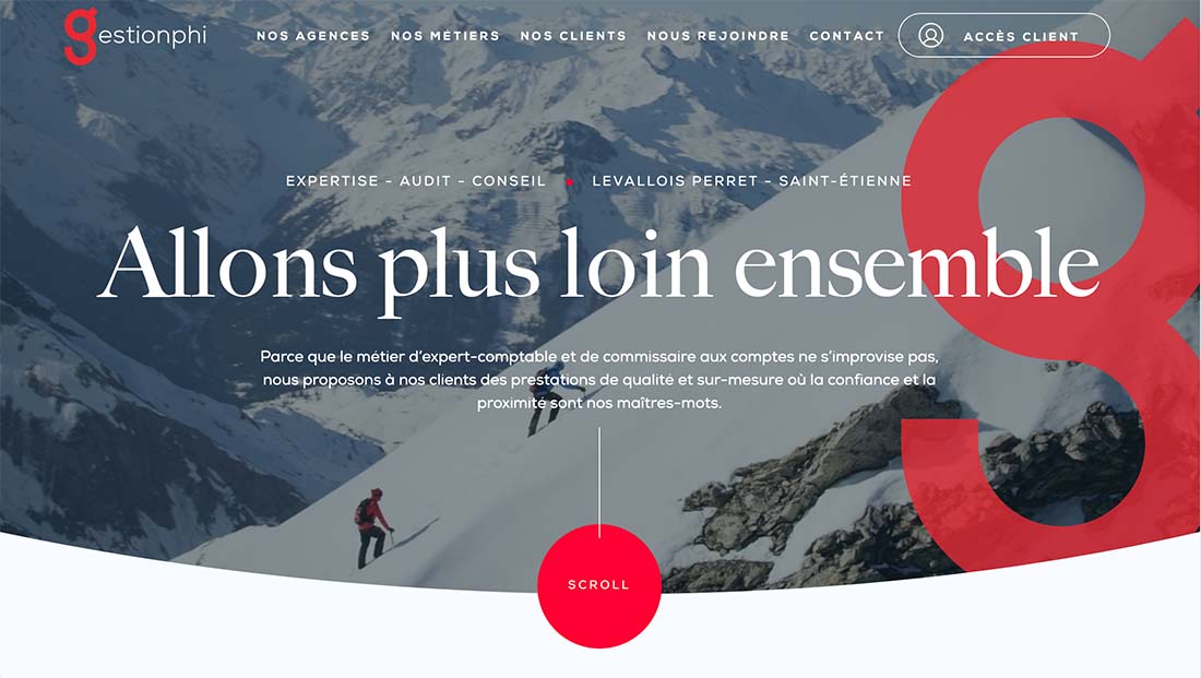
Gestionphi is a classic example of a red accent for design comprehension. It’s also nice that the color is part of the logo and is used in a few places and with multiple tints. The red scroll button is a can’t-miss element on the screen thanks to color choice.

Xpert Workwear uses nice orange color blocks to add a little more visual interest to the design. The neat thing about the orange here for a workwear brand is that the color is often connected to safety vests for workers. It also ties the design to details on the clothing items themselves to keep your eyes moving on the screen.
13. Nature-Inspired Hues
Color palettes inspired by nature are trending in a big way. With greens, beiges, and browns these palettes are neutral, simple, and appealing.
A big reason we might be seeing more of these color palettes is a return to simplicity and nature. In a world where we slowed due to the pandemic and then seemed to pop into overdrive again, this more serene, nature inspiration helps balance the yin and yang of the environment around us.
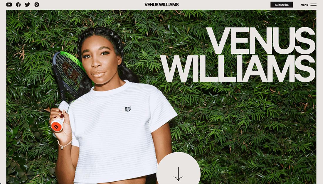
Venus Williams embraces nature with a full-screen photo with plenty of greenery as well as a beige backdrop for the whole design. Everything is simple and visually pleasing and the natural colors give plenty of room to all the photos in the design.

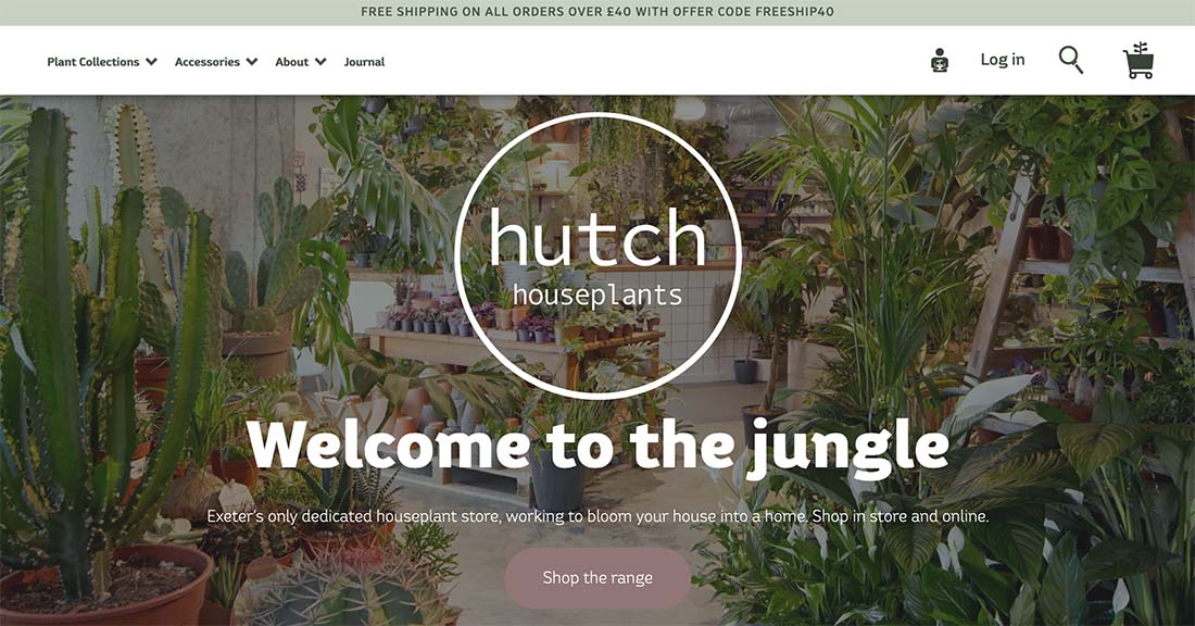
Hutch Houseplants embraces the colors that match their online shop with plenty of green tones. But note that it’s not just photos, text and other UI elements also carry this natural color theme.
Kerrygold’s Magical Pantry takes you on a journey through storytelling and recipes with a nature-inspired color palette. With plenty of greens and browns, color does not get in the way of the user journey.
14. Black and White Web Design
It seems like almost everyone is going back to the basics of black and white in website design. The difference in this color trend now in contrast with past iterations is that the overall visuals aren’t necessarily minimal in concert with black-and-white color palettes.
What the designs lack in color, they make up in other interesting effects such as animations, hover effects, and overall interactivity.
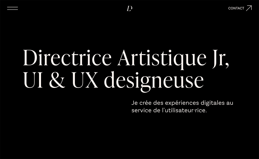
The website for Lou Dos Santos, above, uses hover interaction to create interest within the design. From a white bubble to show the cursor to a shifting of the text, black and white is anything but boring here.
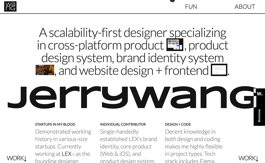
Jerry Wang uses similar interactive effects with a reversed black-and-white color palette. The style is a lot more akin to brutalism and has a bit of harshness about it that really works with the black-and-white scheme.
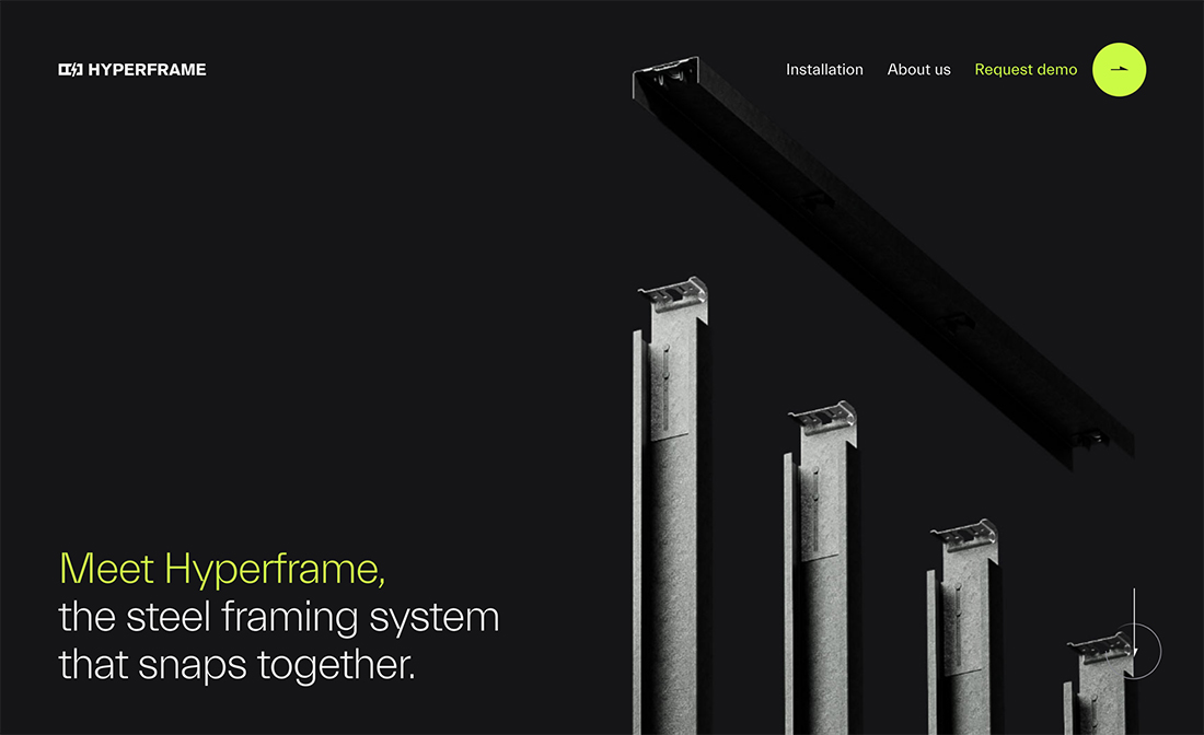
Finally, with black and white color palettes, some designers are adding a bright or bold accent color to help drive interaction and show users what to do with the design.
Lime green is a popular choice as seen above on the website from Hyperframe. Other popular color options include orange or bright blue.
The goal is to use an accent that works with the starkness of black and white without detracting from it.
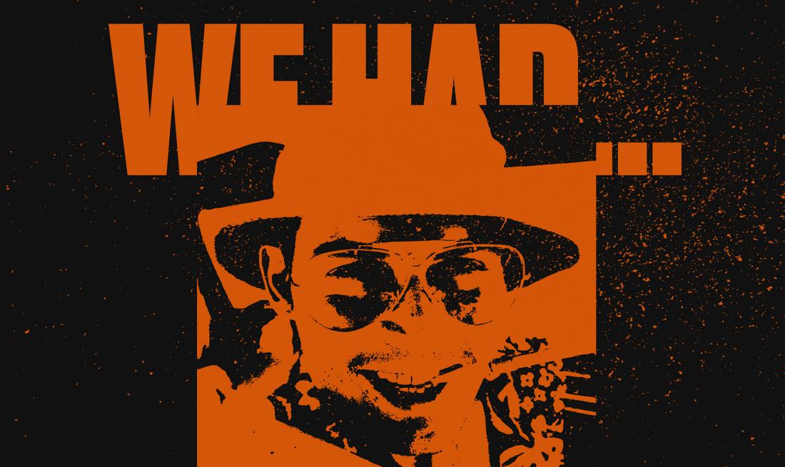
15. One-Color Poster Design
Along the same lines, a more simple color scheme for website designs is also happening with printed (or digital) poster designs, with creations that only use one color.
As with web design, the stark, almost colorless nature of these projects can disrupt you visually helping to generate more interest in the visual elements on display.
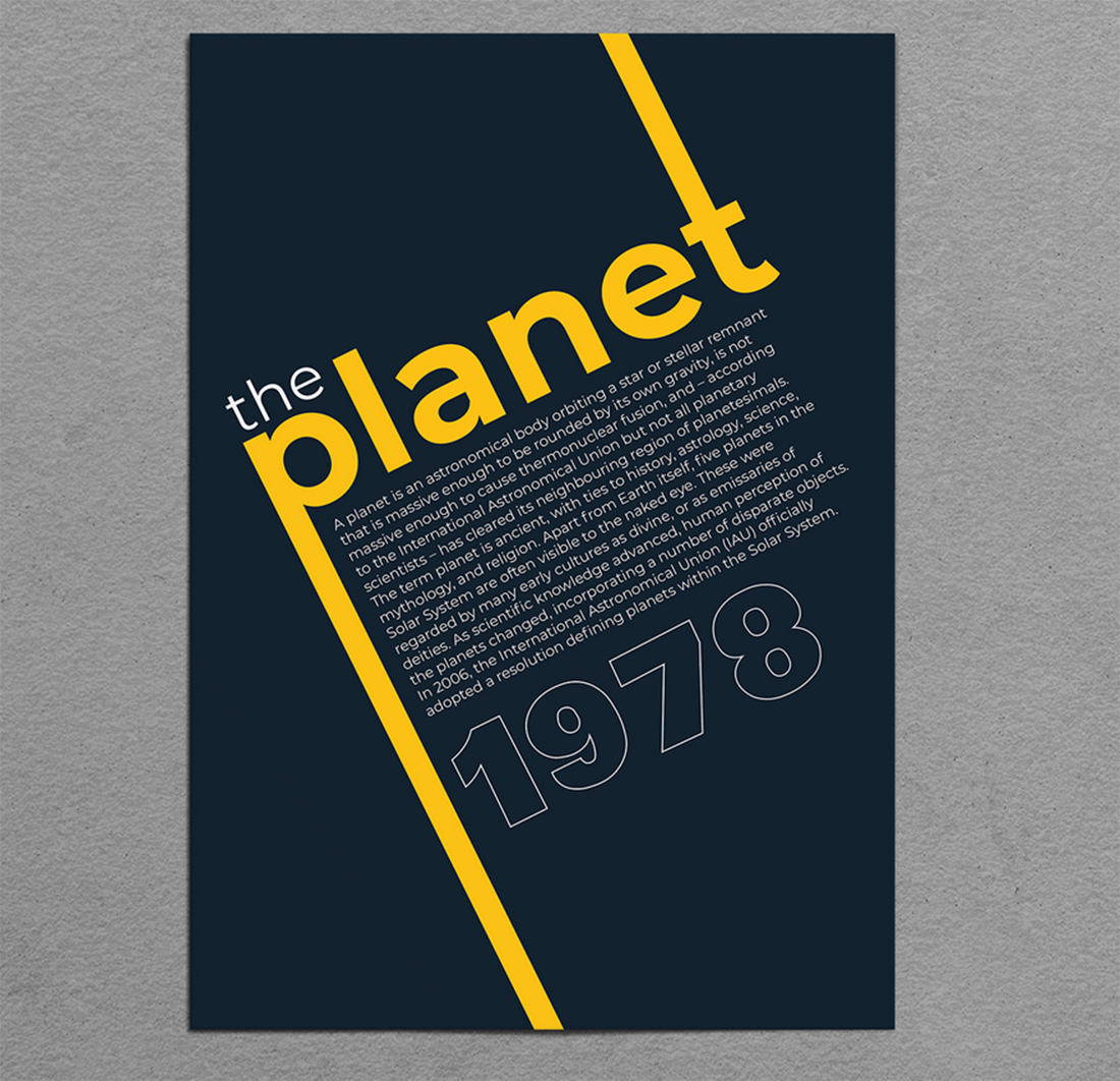
The poster design above uses a dark background and a golden yellow to tell the story of this design. The bright, contrasting choices are engaging and attention-getting.
This technique works well for poster design because it encourages someone looking from a distance to walk closer to investigate the overall design. That would be important here with so many small words in the center of the poster design.
Color is the element that grabs interest in this design scheme.
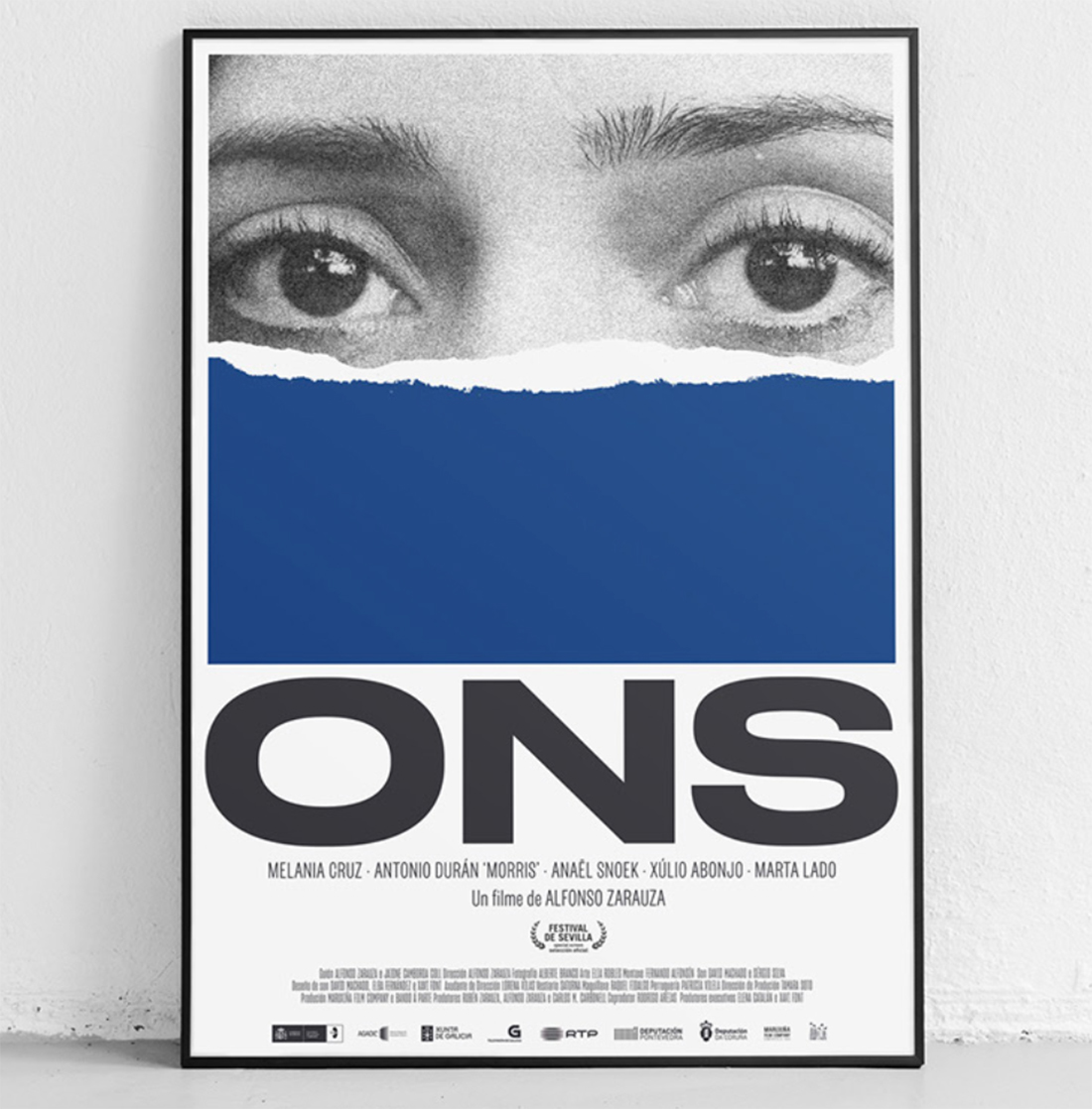
The contrast between the blue block and the black-and-white image and text is so intriguing in the example above that you just want to learn more. The single-color design sets the mood for the poster. (Imagine how different you might feel about the design if the image was in color.)
This effect can make a poster stand out when among many others. In this example with a movie poster, it is likely on display with lots of other similar-shaped poster designs.
Color helps ensure that you see this one before all of the similar full-color options in the surrounding environment.
Finally, a white poster with black text could be amazingly boring, but this example with red lines to create an image is interesting and engaging.
The use of one color pulls the eye into the design without taking away from the words in the design, which judging by the size and weight are the most important element that the designer wants you to see.
Color helps direct eye movement from top to bottom with a flow that provides a little lightness against the slab typefaces.
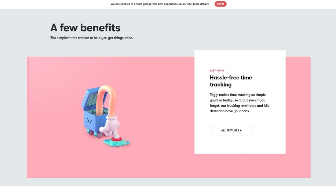
16. Pastel Colors in Website Designs
Most of the new color shades invented by Pantone were shades of pastel colors. Well, it’s not really a surprise at all. Especially with many brands and designers already adopting the new pastel color trend.
A great example of pastel colors in action is the Dropbox website design.
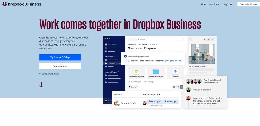
Fun fact, this is not the main Dropbox website. At the time we were publishing the trends in startup unicorn websites, the Dropbox website was different. So we likely stumbled upon an alternate version of the website, presumably a part of an A/B testing campaign.
Nonetheless, both the main site design and this new landing page variants of Dropbox websites use gorgeous pastel colors.
And Dropbox is not the only fan of pastel colors, many other brand websites like Toggl also use beautiful pastel colors in their design.
Another example is this Bootstrap website template. It also uses pastel colors in multiple styles of website layouts.
Why are pastel colors so popular? It probably has something to do with the pleasing and calming effect it has on people. It’s a feeling that’s difficult to describe but when you look at a design made with pastel colors it just makes you feel relaxed.
17. Gradient Colors in Icon Design
There used to be a time when designers were shamed for using multi-color color schemes in designs. Today, things are different. Using color palettes with vivid and multiple colors is encouraged. Because now it stands for something more meaningful than just random colors.
It’s probably why we’re seeing many designers adopting gradient color schemes. Especially when it comes to icon designs, we saw many brands such as Instagram take advantage of this trend. The latest brand to join is Mozilla.
Mozilla introduced its new Firefox rebranded icons design in June 2019. Firefox always had a colorful icon design. But this new approach took things to the next level.
Their new color palette featured a variety of colors and shades. The company says the new icons will help the brand stay relevant “long into the future”.
Are gradient icons only suitable for product icons? Not at all. You can use them on website designs and app interfaces as well. This business icon pack is a good example of that.
18. Retro Neon Colors in Logo Designs
The retro color schemes from the ’80s are making a comeback. Especially the use of neon colors in logo design is something that’s been picking up momentum recently.
A great example is this brand logo we’ve found on Dribbble. It’s designed for a Russian software company called ZenClass which specializes in online learning systems.
Notice how it uses glowing neon colors with a mix of gradients. It’s actually quite mesmerizing to look at.
While this trend is not applicable to most branding and logo designs, it has its own audience. Especially with the popularity of futuristic cyberpunk designs, this neon color trend is most relevant for technology and gaming-related brands.
19. Faded Vintage Colors in Label Designs
The use of vintage-themed designs in labels is quite popular these days. Especially the label designs that use washed-up and faded vintage colors are the ones that attract the most attention. We’ve seen the color trend in everything from clothing labels to coffee packaging and much more.
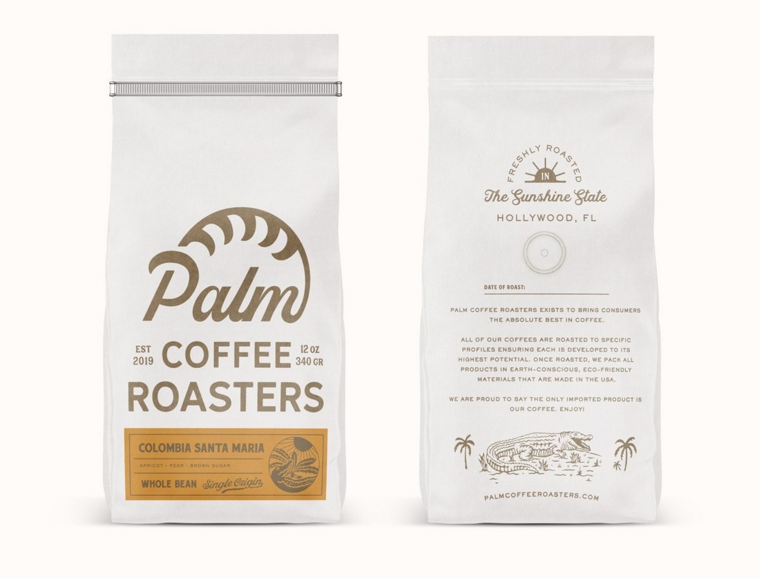
Why is it popular in label design? It’s mainly because the vintage colors look amazing when printed on cardboard and paper bags.
But lately, we spotted this new trend taking a step further. And appearing in even beer can labels.
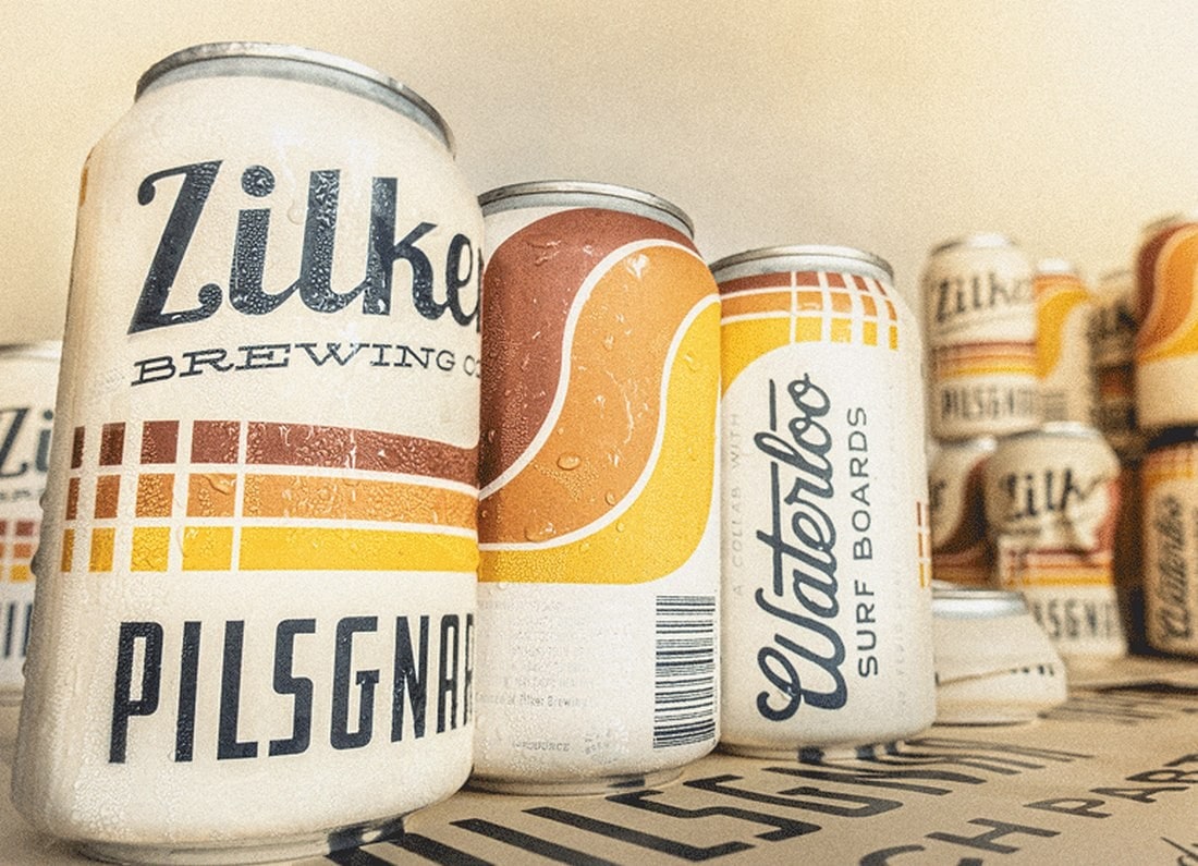
This really makes you wonder, are we going backward in following design trends?
20. Black and Gold Colors in Product Designs
The classic black and gold color mix is a trend that never goes out of style. This color trend has always been something that represents elegance, class, and luxury. Surely, we can expect it to hold up its place this year as well.
The question is, what type of brands and designs will adopt this timeless trend next? Well, how about a beer brand?
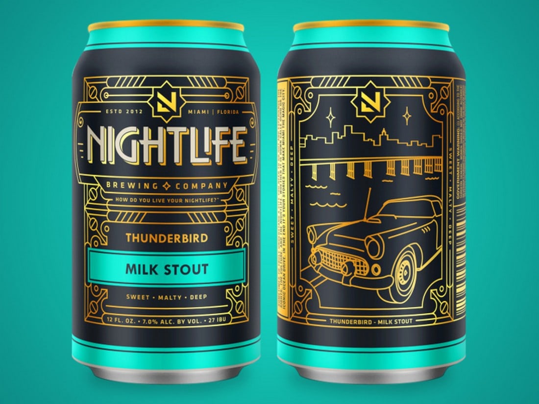
Nightlife Brewing is the latest alcohol brand to adopt the classic black and gold color trend for its product designs. As you can see, it looks amazing, especially when used with an art-deco style of design.
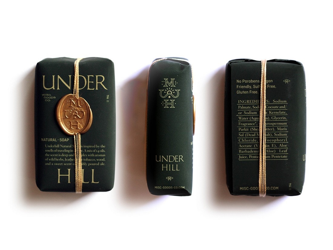
MGCO Soap company managed to put a spin on this new trend by using a dark green and gold color design for its soap packaging design.
21. Dark Colors in App UI Designs
It’s like every app on both mobile and desktop platforms are getting dark mode these days. With Android, iOS, and even Windows introducing dark user interfaces, it’s now standard practice to include a dark color mode in every app.
Google first introduced a dark mode for its Gmail mobile app. Followed by Whatsapp. Even Facebook now has a dark mode for its web app.
Needless to say, we’ll be seeing more apps using dark color UIs in the coming months. Of course, we hope designers will get creative with this trend.
It doesn’t always have to be black and white to create a dark mode for a user interface. There are many dark shades of colors that will help create an amazing dark color mode for apps.
What’s Next?
Among the seas of color and design trends, we’re certain that these specific trends will float through to the next year. And hopefully for many years ahead. Especially since they’re validated by some of the biggest brands in the world, you can safely use these trends in your design projects.
What kind of new color trends will come out next year? Tune in next year to find out.