25+ Presentation Design Trends for 2025: Create PowerPoint PPTs With Impact
Looking to knock your next presentation out of the park? Start with one of these design trends that will help you create a PowerPoint presentation with a lot of impact.
Here are some trending examples of current trends and techniques for delivering a modern presentation. From big, bold colors, to photo stories and big backgrounds. There’s no excuse for picking a standard design and delivering a stale, tired presentation anymore. Your audience expects more!
The best thing? If you like any of the examples here, you can download each one from Envato Elements!
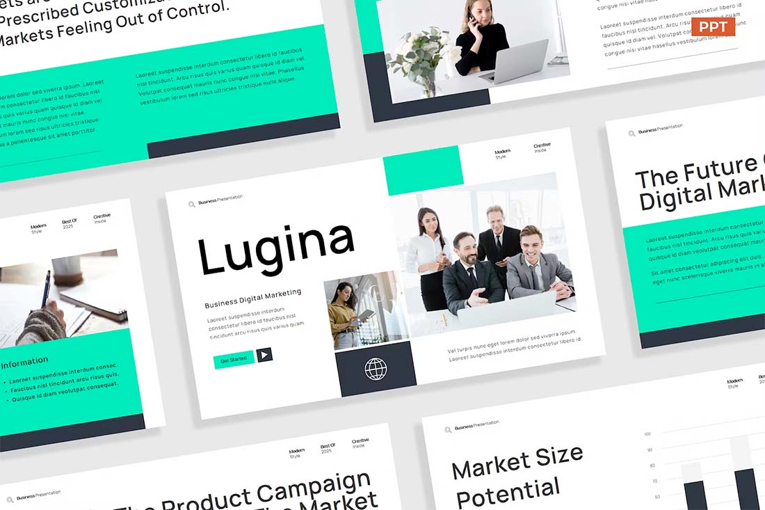
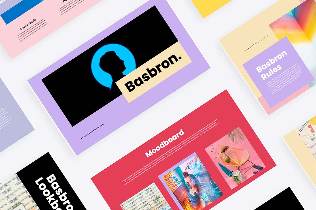
1. Big, Bold Typography
Nothing grabs attention like a big title with bold letters. That’s exactly what this presentation design trend is all about. To try this design trend, all you have to do is make your titles and headings look bigger on each slide and arrange the content around those big text elements.
The main goal of this approach is to quickly capture your audience’s attention with a big, splashy title. Once you have their attention, persuading them to read the rest of the content on the slide is much easier.
Remember to use a sans-serif font with a clean letter design. A slightly condensed font with all-caps letters would be the perfect choice for this.
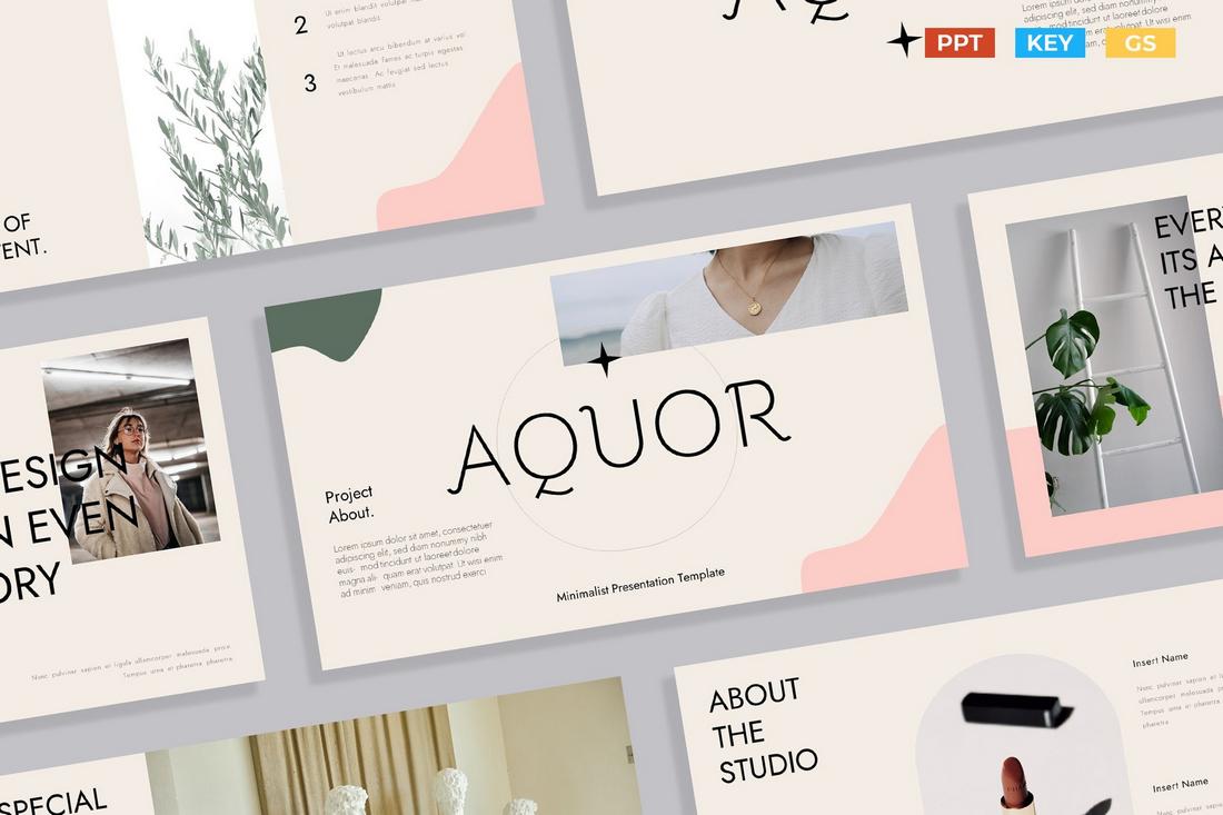
2. Aesthetic Vibes
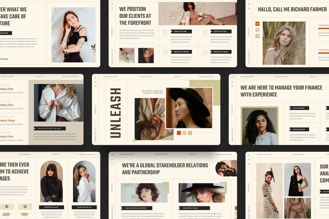
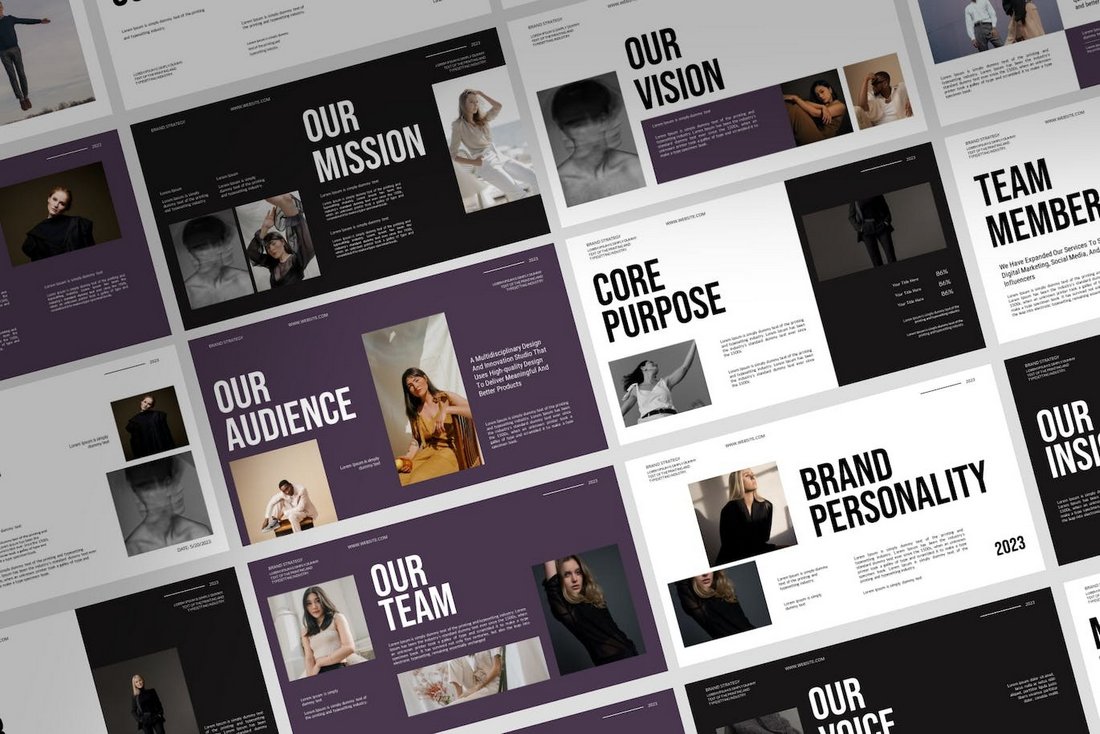
Beautiful aesthetic slide designs have been a common choice among specific presentations. Especially when it comes to creating slideshows related to fashion, lifestyle, beauty, and luxury brands, a classy and elegant look does a perfect job of creating a charming vibe across the presentation.
Soft browns, light creamy colors, elegant botanical greens, and pastel colors are common in these aesthetic-style presentation designs. Of course, the slide layouts play an important role too. Make sure to keep a consistent and clean look across the slideshow.
3. Gradient Color Schemes
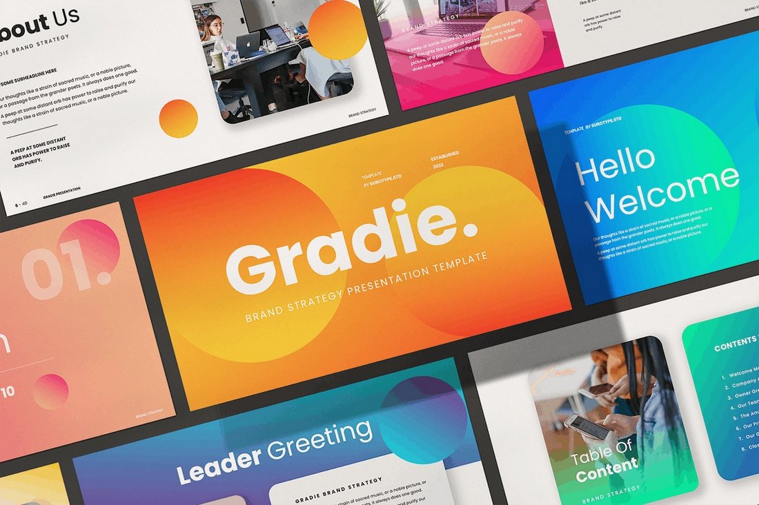
Marketers and designers are slowly moving away from the usual, traditional, and boring corporate-style slide designs and adopting more colorful and vibrant color schemes when designing presentations.
It’s quite a welcome change that makes slideshows look much more attractive and stand out from the crowd. One of the most popular looks in this new trend is using gradient colors for backgrounds and shapes. They do wonders for highlighting the text elements as well as for conveying creativity, inclusivity, and overall an energetic and fun vibe.
4. Retro and Groovy
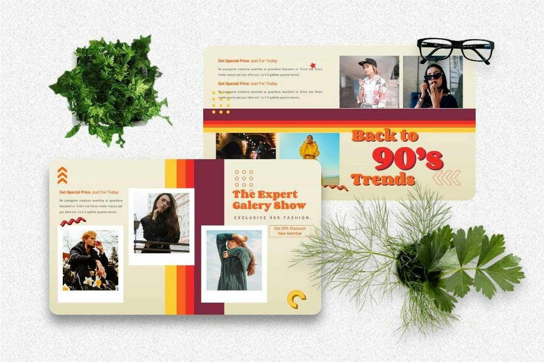
Being able to create informative presentations combined with a sense of nostalgia and fun is the main reason why this trend has been popular over the past few months. Designers who use this trend often go for various styles of retro-themed looks. Cool 90s vibes, 80s neon color palettes, and 70s groovy psychedelic-style designs are among just a few.
A retro and groovy presentation design is not just about making slideshows look fun but they can also be a tool for storytelling and evoking emotions. This makes this an effective trend to be used in presentations related to marketing and promoting brands.
5. Neon Colors
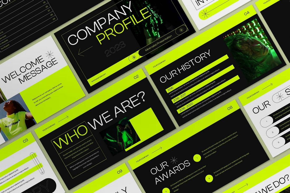
Bright, neon colors are proving to be one of the most effective design trends for presentations. The way these neon color schemes are able to create a vibrant and energetic vibe across each slide layout is unmatched by any other color scheme.
What makes this color trend more effective is how it’s able to attract the viewer’s attention and point them toward the most important parts of each and every slide in a presentation. Neon colors are often effective for technology-related slideshows as well as for presentations targeting younger audiences.
The key to creating a great neon color scheme is picking a good balance of colors for accents and backgrounds that don’t overwhelm the viewers with color overload.
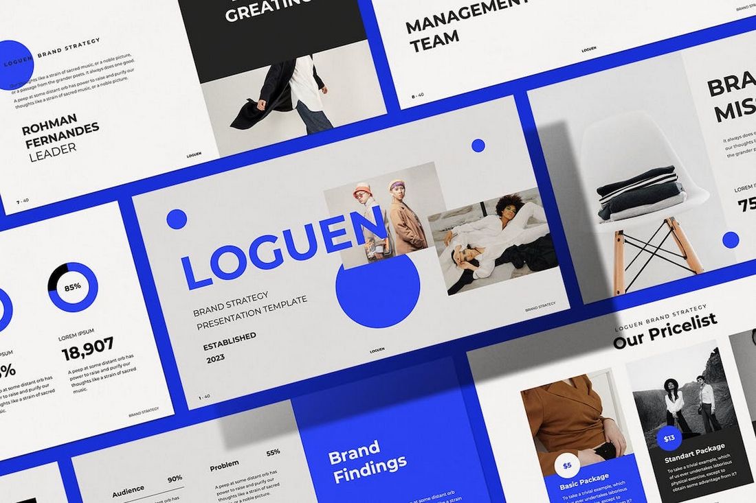
6. High Contrast Colors
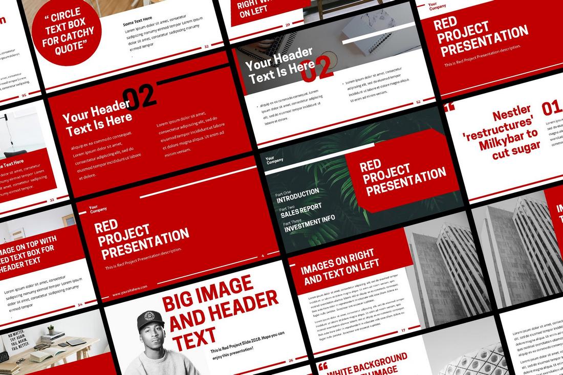
Another popular color trend in presentation design is the high contrast color schemes. This trend is quite similar to the neon colors trend but instead of using those bright electric hues, this trend uses a combination of colors that create a strong contrast between the background and foreground elements.
Whether it’s black and gold or white and orange, these highly contrasting color schemes are commonly used in marketing and creative agency presentations to make certain elements clearly visible and text easier to read.
The slideshows that use this style of color scheme make the slides easier to see from every corner of a large conference hall, making it especially effective for reaching a large audience.
7. Modern Geometric
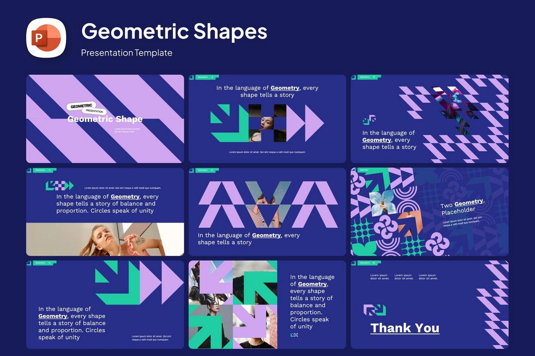
Geometric shapes in presentation designs are nothing new. However, designers have been finding unique ways to utilize geometric shapes and elements to create uncommon slides with decorative elements.
This trend inspired designers to find creative ways to arrange various shapes to design modern art-like dynamic objects to add a bold and aesthetic vibe to slideshows. Modern brands and agencies have embraced this new style of presentation to set themselves apart from the competition.
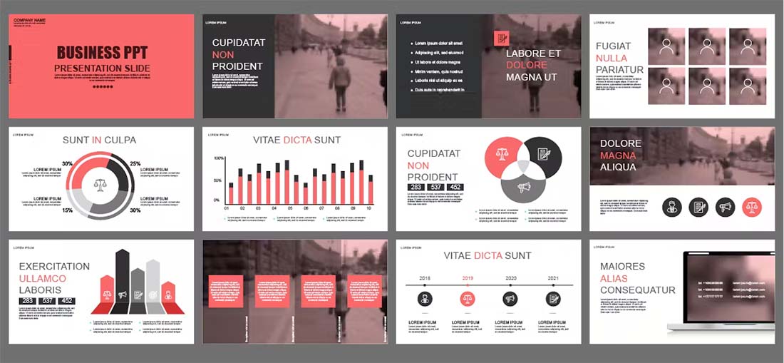
8. Doodle Infographics
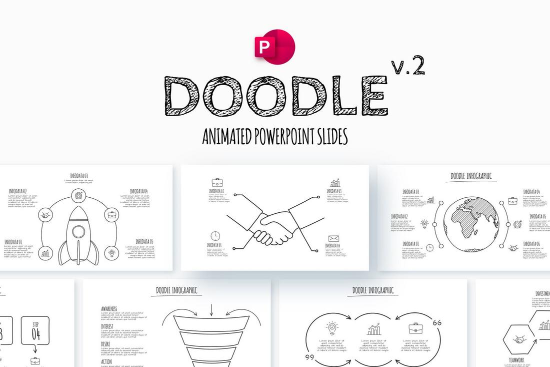
Infographics play a big role in almost every presentation. They not only help present data in a more user-friendly way but also help add authenticity by backing your claims. However, most viewers are tired of seeing the same old basic pie charts and bar graphs in every slideshow. That’s why these new doodle infographic designs have been highly sought after in the past few months.
Doodle-style infographics and illustrations help add a touch of personality and a joyful look that makes looking at data much more fun and engaging. It gives you the perfect chance to deliver hard statistics and information in an optimistic way.
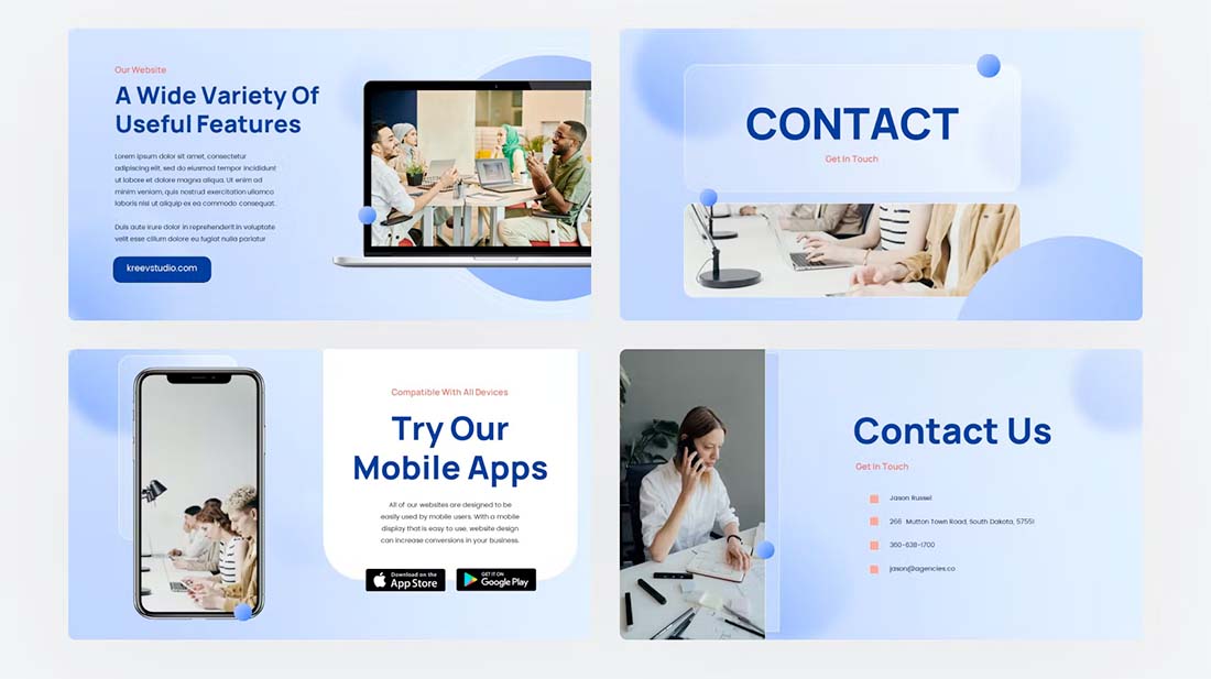
9. Soft Pastel Colors
This beautiful presentation trend shines the brightest when it comes to lifestyle, fashion, and travel-focused slideshows. Adding light, soft, and simple pastel colors gives presentations a gentle and soothing aesthetic that invites audiences with an appealing look.
One of the best things about using soft pastel colors is its flexibility. You can pair these colors with many other objects like hand-drawn illustrations, handwriting fonts, and photography to add a much friendlier and soothing vibe to the overall look of the slideshow.
10. Double Exposure

The double exposure trend is still alive and has finally made its way over to presentation designs. We’ve been seeing many creative and unique use cases of the double exposure trend in many business and agency presentations as it helps add an extra layer of sophistication to slide designs.
Double-exposure graphics are not just about aesthetic visuals, they also help with storytelling. It allows you to merge images to create unique concepts to symbolize ideas and convey your messages in an emotionally engaging way.
11. Asymmetrical Layouts
This design trend encourages designers to break away from the usual grid and column-based presentation slide designs and experiment with new layout styles.
Creating asymmetrical slide layouts allows you to use your creativity and imagination to create experimental content designs by placing text, images, and shapes on the slides in an unconventional way. This approach often creates more stimulating presentations and a unique experience for the audience with each slide.
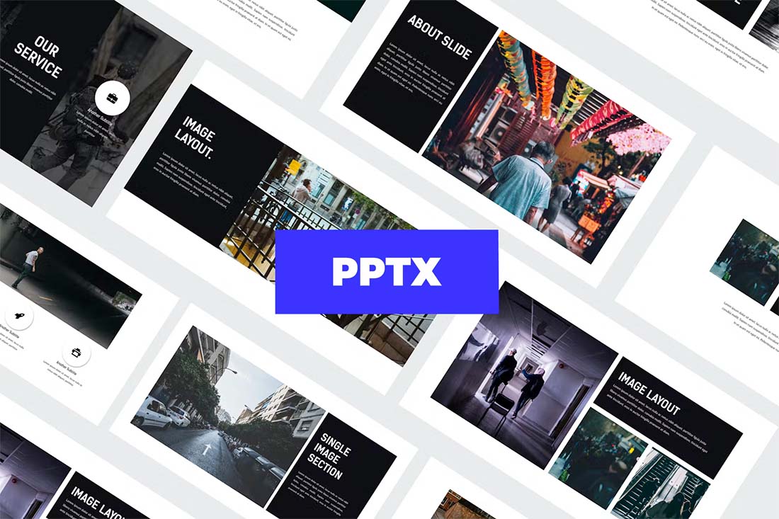
12. Full-bleed Images
Using full-bleed images that expand across the entire slide is a design strategy that allows you to create more impactful and emotional presentations that convey a strong message.
This design trend involves using large images as backgrounds to create more visual-centric slides. While it’s quite effective in photography, studio, and portfolio presentations, the key to creating a balanced slideshow is to only include a few full-bleed image slides among other normal slides.
13. Overlapping Elements
Creating slides with overlapping elements, also known as slide layering, is an innovative trend that offers a more dynamic look for modern presentations.
It involves creating slides with objects that overlap with one another. Like text and shapes that overlap with images. Or content blocks that seem out of place. These slides look much more unique and stimulating than most other styles of presentation designs.
14. Flowing Shapes

One way to make your PowerPoint presentation design stand out is to use flowing shapes. Too often, templates focus on all blocks and rectangles. With a set of flowing shapes, your presentation design will have an immediate impact.
When thinking about this style use a couple of different shapes and build on them. Ovals and circles are rather nice and partial shapes that extend off the screen and provide another option for these shapes with flow and movement.
Use shapes with a bright color or consider tints with a more subtle impact.
The trick to flowing shapes is to use them in such a way that they create visual flow toward text and other important messaging elements in the design. Plan accordingly!
15. Colorful Text Blocks
If you are working on a presentation design and don’t have a lot of great images, colorful text blocks can be a fun way to show information without feeling too bland.
There are a couple of ways to make this presentation design trend your own:
- Use color for text blocks that’s part of your brand palette.
- Use colors that are unique to a specific theme or project.
- Include limited imagery with color blocks for additional interest.
- Make sure the color block and text element has high contrast and is easy to read.
- Use your brand font palette for an even more custom look and feel.
16. Dark Mode
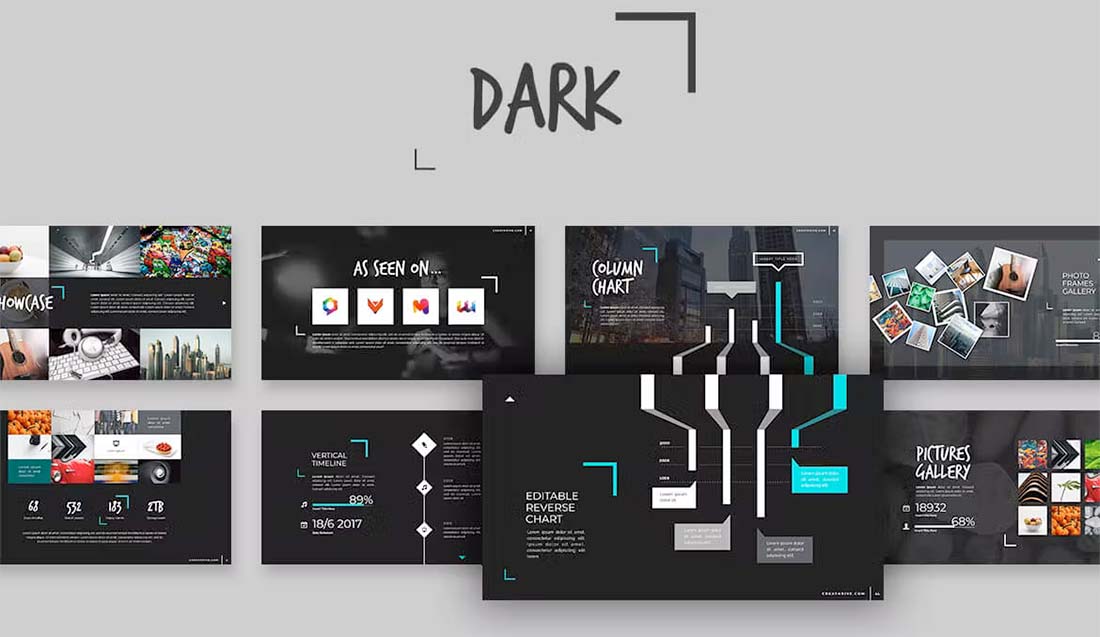
Dark mode isn’t just for website design. It’s one of those design trends that has crept into almost every facet of design, including presentations.
While this style looks very trendy and modern, it can present some challenges.
Reverse type can be difficult to read in some situations or lighting. Consider bumping up font sizes larger than you normally would. Don’t feel like dark has to mean black. Experiment with other dark color palettes for the base, such as purple or navy.
As long as the overall design has plenty of contrast and is readable, dark mode can be a fun and striking presentation design option.
17. Gray
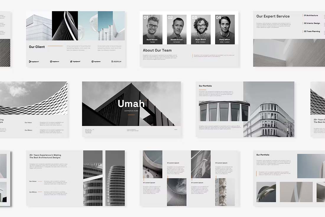
If dark mode is a little too dramatic for your PowerPoint presentations, consider an all-gray aesthetic. Gray has a calming feel, is visually pleasing, and is generally easy to read.
You can pair gray with colorful images or accents or go for a full-mode look, such as the example above, with black and white images and just a small hint of color.
This design scheme is trendy and quite elegant for presentations.
18. Image Overlays
There are generally mixed feelings about how to use images in presentation design. Some people love full-screen large image slides, while others argue that images can get in the way of messaging.
In the middle is this trend – use images with a color overlay. This allows plenty of room for images and text elements with a softer, more subtle feel.
Image overlays can also create a nice element of design and color consistency to help carry a presentation visually from start to finish.
19. High Color
High-color designs have been popular for a while in other design arenas, and are bleeding over into presentation design now. This style has a very distinct feel with bold, bright, or even more pastel palettes with a lot of color.
It’s not for everyone or every type of presentation message.
But if you are looking for a lighter, more fun style, this presentation design trend can be a good place to start. Use your brand colors for maximum impact here.
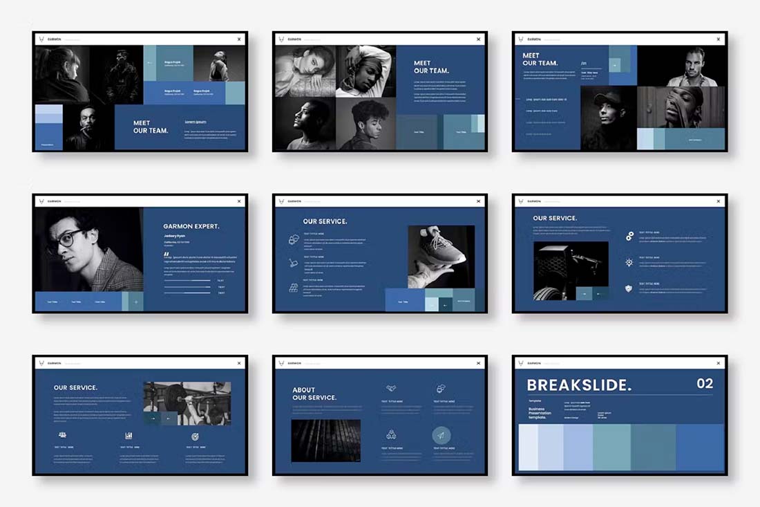
20. Minimal Monotone
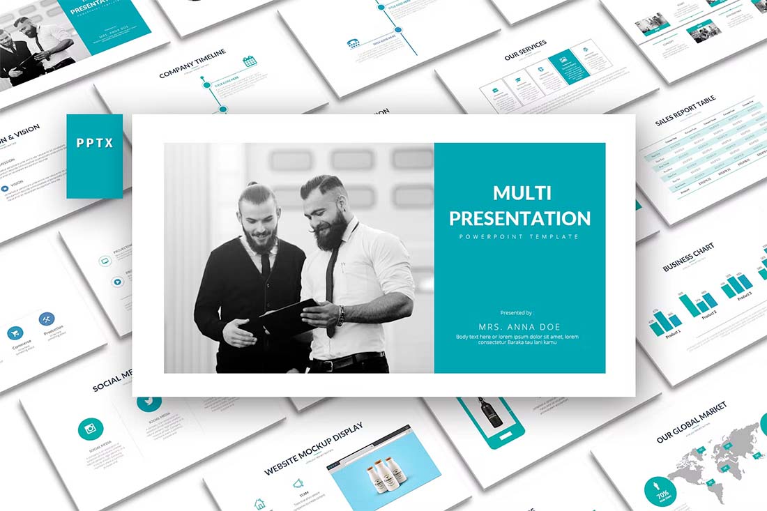
On the other end of the high-color spectrum is choosing a monotone color palette for your presentation design. Monotone does not have to mean low color, but you are working with one predominant hue.
The teal choice in the example above is elegant and modern. It has a fresh feel that works nicely with the minimal outline of the rest of the design. Minimal aesthetics with monotone color palettes are the perfect compliments.
21. Muted Images
If you are looking to make an impact with the presentation design and want to try something totally different, consider muting the images so that they almost fade into the background.
This design style can be a great way to use imagery so that the words on each presentation slide are the true focus. Go a step further and use interesting shapes to direct the eye through slides using this trending style.
22. Blocky Design
If you want to go for a modern and trendy look and love the feel of geometric shapes, consider a blocky design. Using colored blocks, squares, or rectangles, you can create interesting shapes and configurations that make your PowerPoint presentation dazzle.
This is a true high-design style that can take a lot of effort and is best for smaller slide decks. It might also be easier to design if you start with a template, such as in the example above.
The blocky design style also works well with another trend already featured here – monotone color palettes. A single-color design helps hold all the pieces together for a unified presentation design.
23. Photo Stories
A presentation design that uses photos to tell stories is a highly engaging and trendy way to share information. To make the most of this presentation design style, create a template with big image areas that pair with simple text elements.
Keep it interesting with photos of different shapes, sizes, and placements in the design. By pairing text elements with image shapes and sizes, you can create a lot of visual interest with a unified style that does not look repetitious.
A photo story presentation design often doesn’t need a lot of other design elements to work beautifully. All ow images to tell your story and keep other design techniques – color, typography, graphics, and icons – to a minimum.
24. Big Backgrounds
It’s not something we are used to seeing regularly in PowerPoint presentation design – big, bold backgrounds that carry throughout. When done well, an interesting background can make up for a lack of other visual content to help propel a presentation design.
In the example above, the background is made from a simple color palette with blurred shapes. It’s bold and interesting but doesn’t overpower the overall design. That’s the trick to using a style such as this – create interest without overwhelming it.
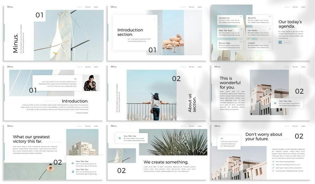
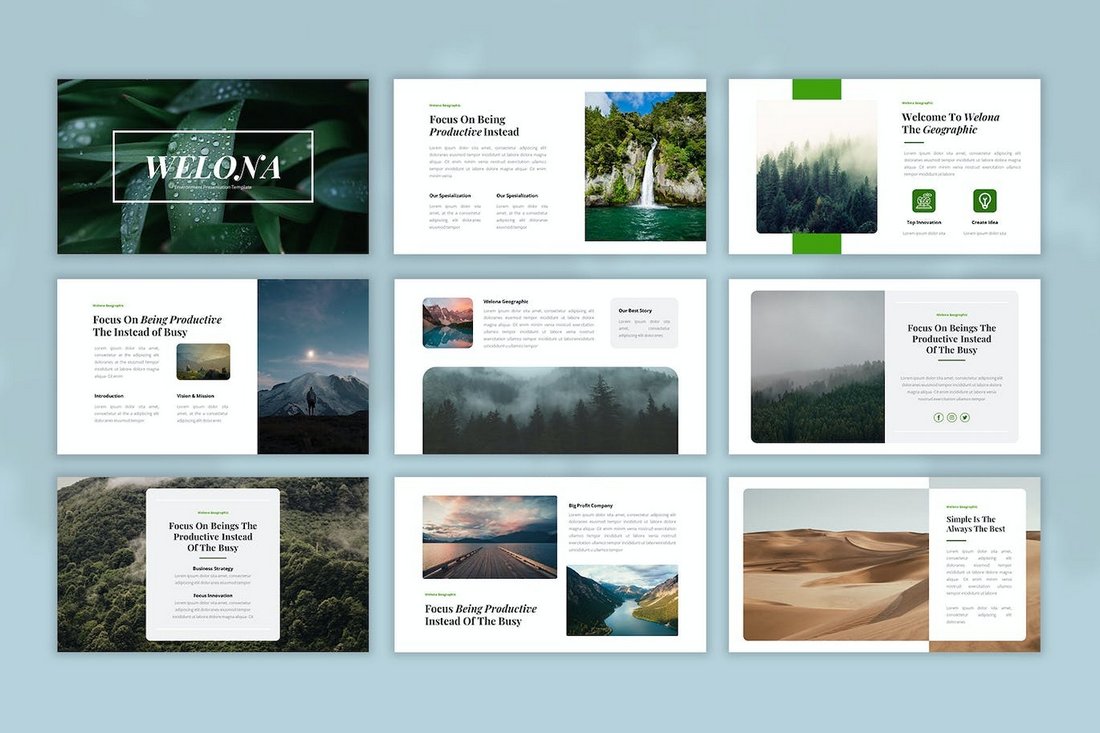
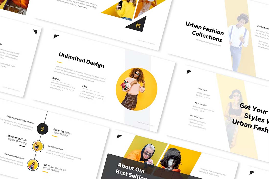
25. Clean and Simple
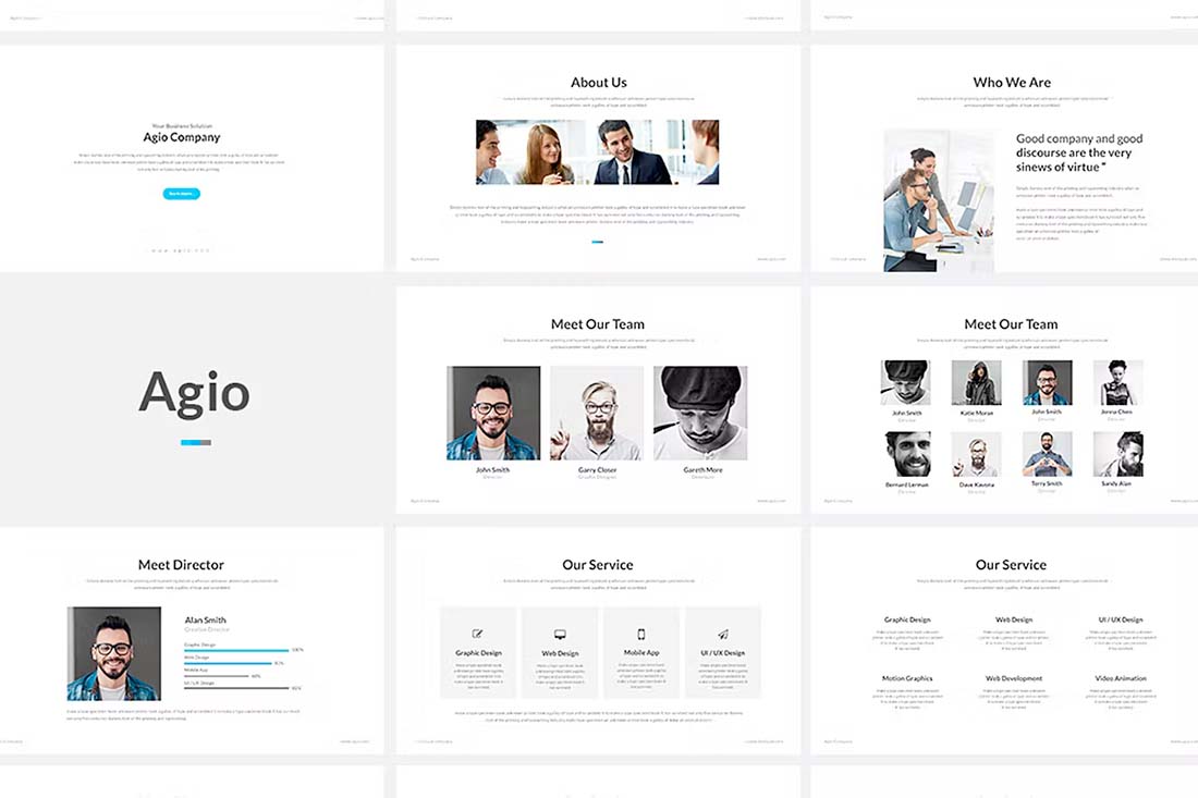
It seems a little weird to call this a trend because clean and simple are the most classic of design styles. But it’s trending because it always works. When in doubt, a simple design for a presentation can be just the ticket.
When creating a clean and simple design, think about developing reusable pieces that you can carry throughout the presentation, such as the shape of a photo or the color of a box. Stick to typefaces that further push this theme with a simple sans serif.