Vintage Graphic Design: Inspiration, Ideas + Modern Takes
Vintage graphic design is a nifty way to create an old-school feel for projects. Today we’re exploring the vintage graphic design trend, and how to use it in your design projects.
Vintage elements can include typography, illustrations, photo styles, and even entire aesthetic palettes. Further, there are different eras to choose from when you want to go for a vintage feel.
Vintage themes from different time periods can provide completely different visual properties and techniques to play with.
Let’s explore some of them!
What Is Vintage Graphic Design?
Vintage graphic design is any type of visual element that relates to another time period. While modern designs use vintage styles and elements, the common characteristic is a feeling of being transported to another time with the design.
Vintage graphic design creates a distinct user experience, evoking feelings of nostalgia, age, and even distinct (named) style from a certain design era.
Most vintage graphic design styles can be identified pretty easily. (It’s truly a know-it-when-you-see-it kind of thing.) These projects use typography styles that are associated with another time or illustrations or elements that have an aged style.
The major commonality is that these projects take users back to another time and place to establish the right foundation for messaging.
10 Vintage Styles
While there are plenty of vintage graphic design styles to work with, a few seem to rise above the rest. These more common vintage styles seem to maintain a mainstream presence in many design projects.
Mid-Century Modern
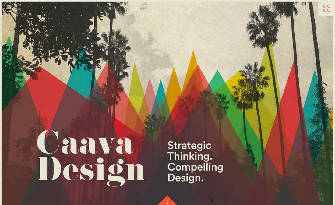
Mid-century modern graphic design boils down complex elements into a simple visual form. The style often includes geometric shapes, right color, and simple typography.
Pop Art
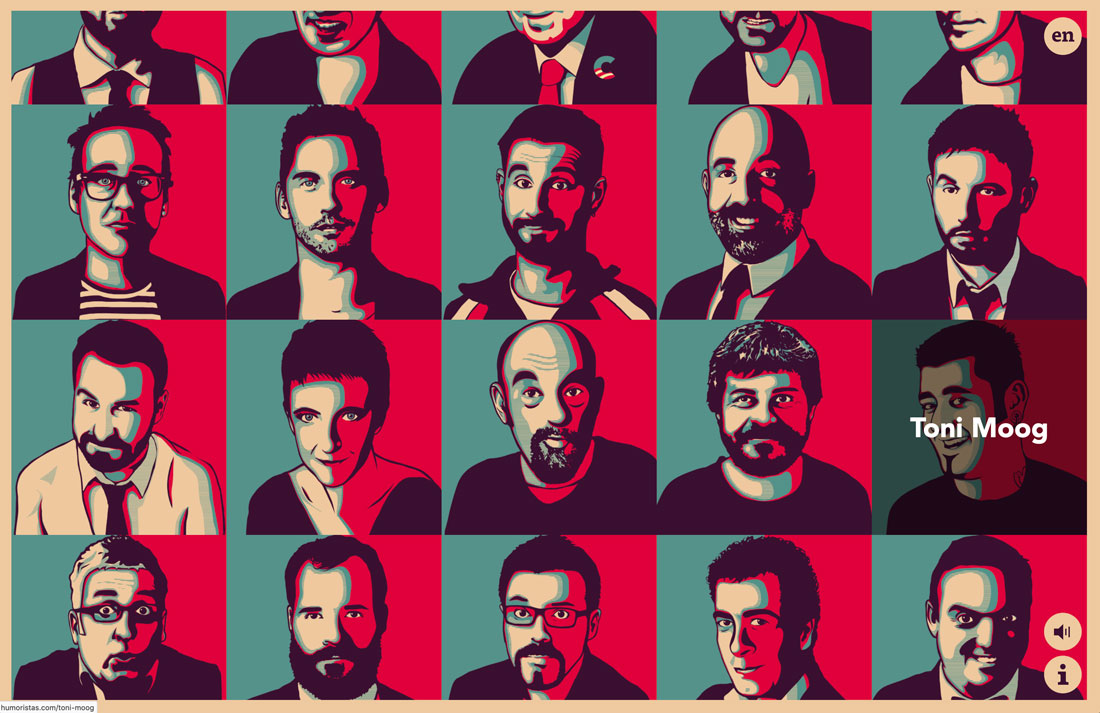
Pop art has close ties to mid-century modern styles with bright colors and a bold feel. It’s worth mentioning on its own because this is a vintage graphic design element that almost everyone goes to at some point, thanks to Andy Warhol. In addition to this classic color panel style, pop art also often features dot-grain images, comic book styles, and exaggerated color palettes.
Art Deco
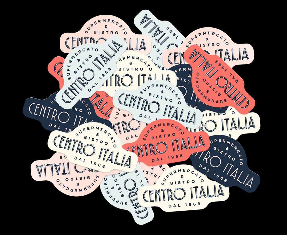
Art deco styles date to the 1920s and are one of the most identifiable vintage and retro styles. Modern art deco uses plenty of geo shapes, line icons and elements, chevron patterns, and mosaics.
Baroque
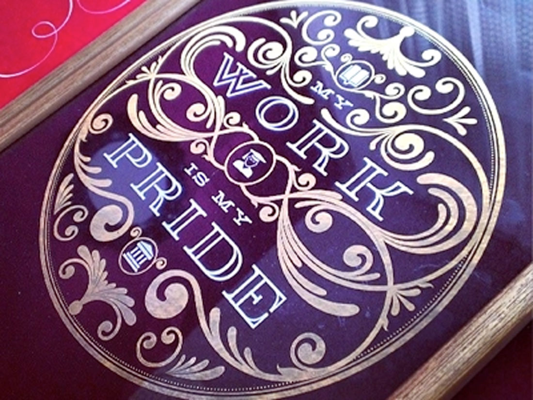
Baroque styles are more ornate and feature plenty of curves and decorative elements. The most common usage of baroque style in modern design is through ornate typefaces, such as those used for monograms, wedding invitations, or specialty display text.
Punk and Grunge
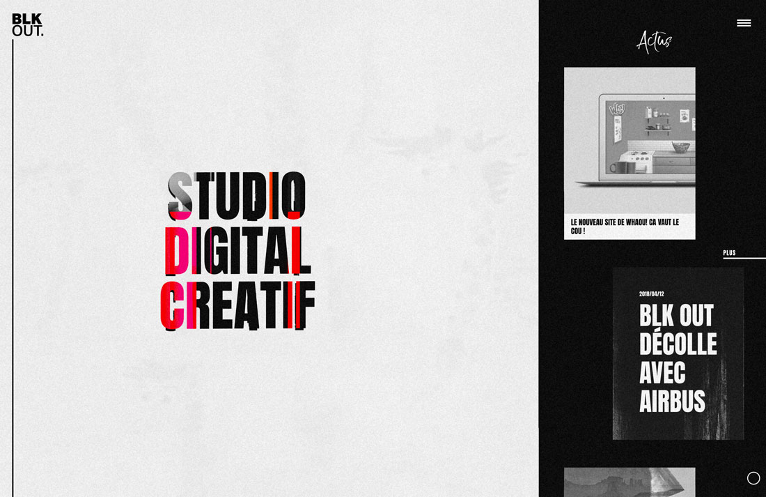
The 1970s and 80s led to an era of punk and grunge styles that still influence the “dark mode” designs of this era. These styles are attention-grabbing with unusual grids and text placements and bold imagery. The modern equivalent of the punk and grunge era is glitchy design styles and are related to TikTok.
Letterpress
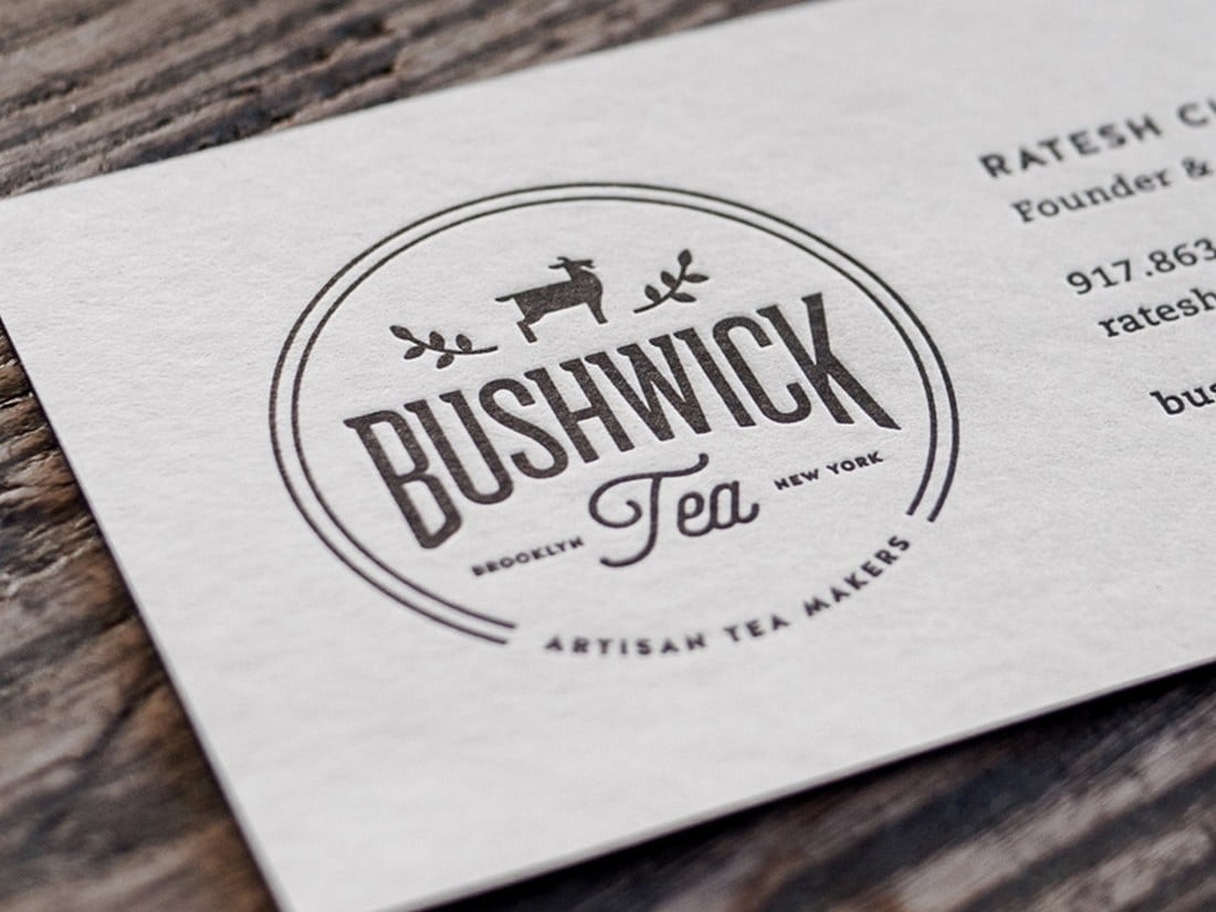
Letterpress styles mimic the look of traditional printing. They often include embossing, shadows for depth, and other techniques to create a tactile feel. Letterpress can have a strong presence or a softer feel depending on the style used for lettering and typography.
Gothic
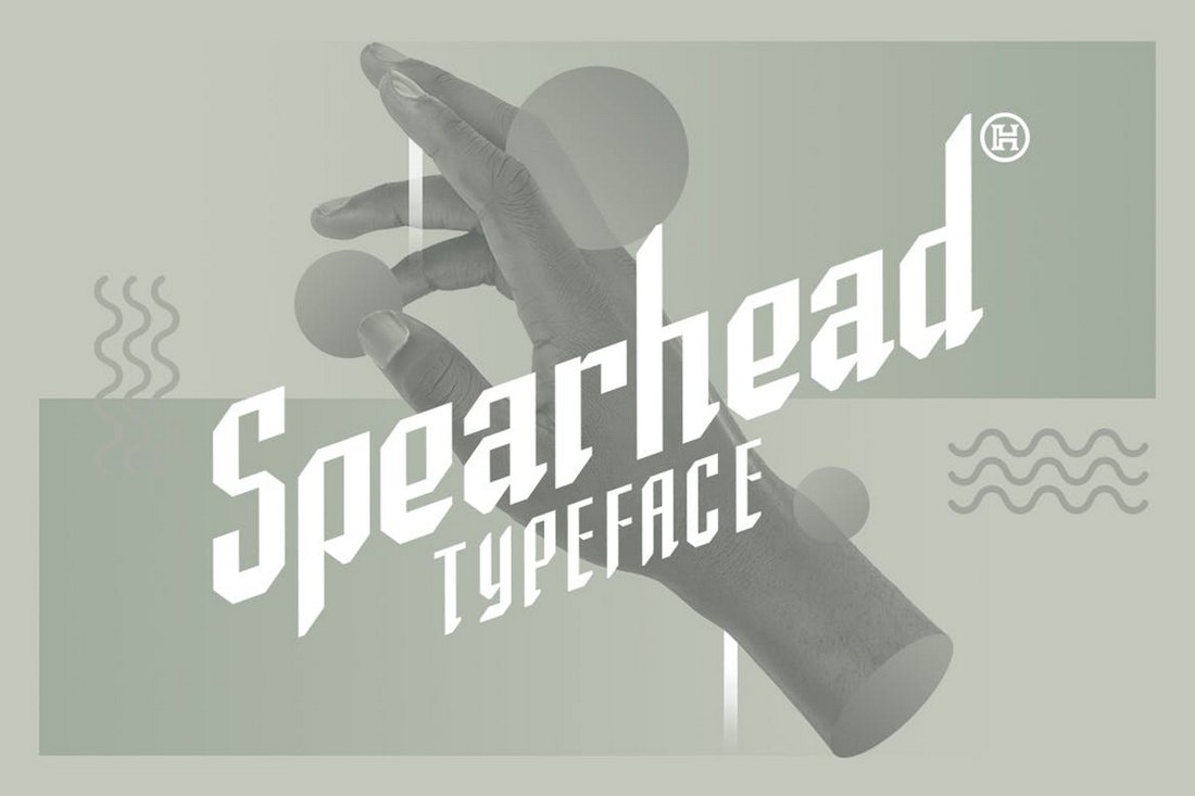
Gothic graphic design styles are rooted in architecture. Gothicism was popular in late medieval times and when it comes to graphic design is most commonly associated with typography – Gothic type styles – and elaborate textures and basic color palettes.
Steampunk

Steampunk is a cool vintage design that was popular in the 1970s and 80s thanks to roots in science fiction and futuristic thinking. The design style has Victorian-era influences with coils and detailing with curved lines, it uses subdued color palettes, and has a “romantic” look with high-fashion characters.
Bauhaus
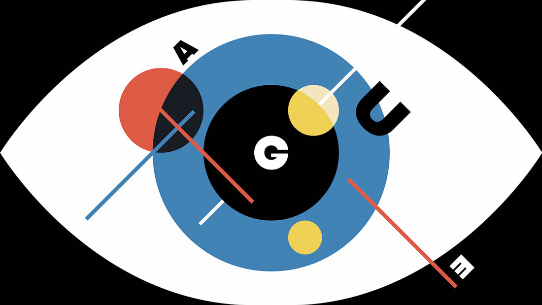
Bauhaus is a German vintage design theory that’s been around since the early 1900s. The core principle of this style is “form follows function,” making typography a core element of this style.
Hipster
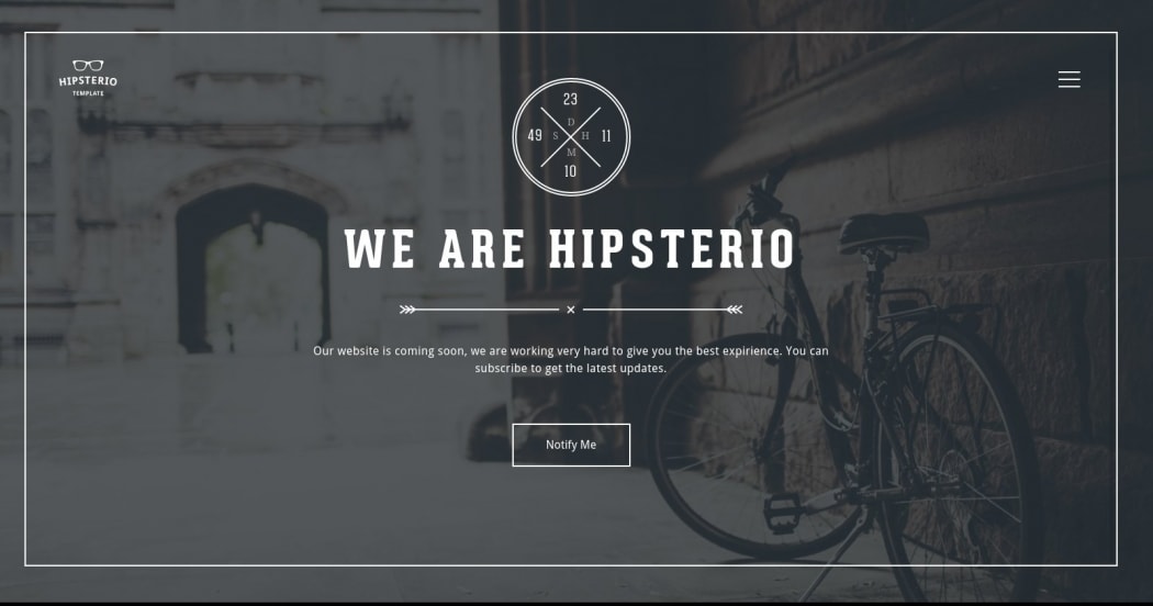
Hipster graphic designs are often in a minimal style with lines and even hand-drawn elements and typography styles. These projects use natural patterns and backgrounds – such as wood or chalkboard – or logos that overlay still images.
Ways to Use Vintage Design
When it comes to using vintage graphic design, the best advice is to implement techniques that match the tone of your project.
Vintage styles will create an emotional tie between the user and the project that connects to the content, making it so much more than just a visual concept.
Keep the following in mind when using a vintage design style:
- Start with the color palette. If the colors you want to use with a vintage style don’t work with your design elements, the project might encounter some roadblocks.
- Match typography to the feel of content, without sacrificing readability. Vintage fonts can be cool, but make sure you use type that’s easy to read and understand.
- Use vintage elements but don’t feel like you have to go fully vintage. Most modern design feature a mix of elements with modern functionality and design pieces.
- Consider vintage for branding when you want to create something that looks timeless.
- Avoid vintage styles if you want an in-the-now feel to your design project.
Conclusion
Vintage graphic design can be a fun way to try something different. It can test your design muscles when you try to work in older styles and elements with modern interfaces and design styles.
But these trends can connect the project to a certain era, feeling, and theme that’s easy for users to relate to. One thing is for sure, vintage graphic design really never goes out of style.