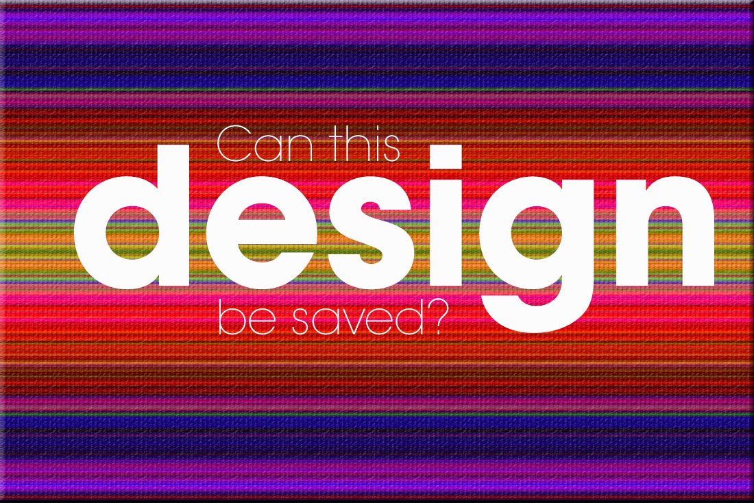
Can You Fix a Bad Design? Here’s Where to Start
It’s an hour before deadline and your boss just handed you a design project to finish up. And it’s bad. Very bad. It has problems ranging from poor images to crazy color, typography choices to general sloppiness. What should you do? Can it be fixed?
There are a few things you can do to help salvage a bad design with the understanding that it won’t be perfect. But making it passable as a design project for your company might well still be an option. Here’s how!
Step 1. Clean Up the Typography
Start with the text. Sometimes the issue is the palette — too many typefaces — and sometimes it is the use — lack of hierarchy. The fix is to find something that has a similar look and feel for the design, even if you use different fonts.
Stick to a typography palette that is readily available, fonts your business already owns, or that the client currently uses. Work with different options within the font family to ensure that text has a more intentional design. Clean up any messy alignment, loose or tight leading, and details such as hyphenation or justification.
Finally, look at the words themselves and make sure everything reads well. Is lettering on a part of the canvas that makes sense and is clearly visible? Are calls to action identifiable? Does the typography create a natural flow? While these questions are all pretty easy to answer in a design you start from scratch, they can feel a little more complicated when you are working from another designer’s pieces.
Step 2. Add White Space
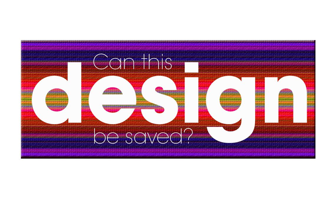
One of the biggest design problems that I am asked to fix is overcrowding. Too much information crammed into too much space; it’s a common designer-client challenge. Adding white space can help eliminate that cluttered feeling. But you might have to eliminate some elements of the design to do it.
Where do you get the space?
- Start with any extraneous divots, such as cutesy icons or text that does not relate to the main message.
- Resize or crop images if possible.
- Think about the size and scale of text and scale it down if possible.
What do you do with the extra space?
- Add plenty of room around the edges of the design.
- Increase spacing between elements.
- Increase text leading or space between blocks of text.
Step 3. Ditch Poor Images
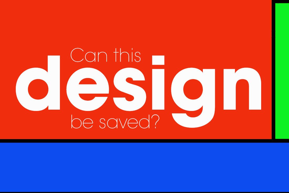
It the images are bad, just get rid of them. This includes everything from poorly shot photos to images with poor resolution to overused stock images. Trying to fix a bad image will result in a bad image. There’s just not a whole lot you can do it, when the quality is not there to start with.
Once you get rid of a sub-par image, it is amazing how the canvas for a project changes. Consider a minimal style framework if you are lacking in the image department and use fun color for emphasis. You might also be able to use a different image — ask what’s available — or find a better stock option if having a photo is integral to the final design.
But please, don’t spend any time trying to fix something that isn’t usable. It won’t save the design.
Step 4. Put It on a Grid
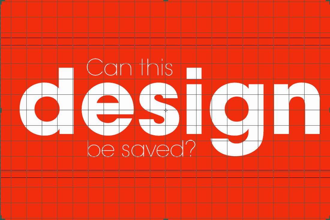
Sometimes the only thing standing in the way of the design is organization… or lack thereof. A grid can solve many of those issues, creating logical flow and harmony between elements on the canvas.
For small canvas items, such as business cards or stickers, start with a rule of thirds grid. With small spaces and few elements, this might be enough to create harmonious placements.
For larger projects a columnar grid can be the solution. Using equally spaced columns and gutters creates a logical placement and flow for text and can help you size (or resize) visual elements in the same pattern. Size everything within the columns and use the gutter-width as a vertical spacing guide.
Other projects require horizontal and vertical spacing, making a square grid necessary. Using a square grid can help create harmony between scrolling pages in a website or down the page on larger canvases. Use it like the column grid to assist in placement of items and spacing between elements.
Step 5. Streamline the Color Palette
Color can make or break a design. Too much color is often the culprit. Streamline an out of control color palette by sticking to two to three hues and using schemes based on color wheel geometry.
Then plan use for color. Boil it down to a primary color for dominant use in the project with a secondary color for emphasis. Consider a third color for text highlights. Black and white color palettes or color schemes with a lot of neutrals are always “in.” Bright, fully-saturated color is also trendy and can add a strong focal point by drawing the eye. (This works especially well in projects where there may not be other visuals to work with.)
Step 6. Eliminate the Tricks

When in doubt, go flat. It sounds simple but this “trick” works wonders because it actually eliminates all the tricks and overdesigned elements. (After you strip everything out, weigh whether you need to put something back or not.)
The more elements you can remove in a crowed design, or with a project that just does not feel right, the better off you will be. Keep it simple. That’s really the best design advice you will ever get. It’s true when you are creating something from scratch or revising something that needs a little help.
Step 7. Be Honest
Now that you’ve thought about all the ways you can help this project, determine if it is indeed fixable. (Some designs are doomed.) Can you make enough tweaks and changes to make it usable? Can you do it in a short order of time? (Or would it take less time to start over?)
Then communicate that honestly. Sometimes the time or cost is not worth it. Sometimes you can start from the beginning and do it quicker than trying to fix something else. Explain the logic and reasoning in a clear way so that you and your boss or client can be on the same page about how to proceed.
Step 8. Conclusion
Cleaning up a design project is not a task that most designers will jump at. It can be awkward to work on someone else’s work and often comes with difficulty. But it can be done.
The best cleanups should take considerably less time than starting a project over — half or less, otherwise it might be best to start over. Project cleanups should focus less on personal design style and more on basics and functionality. When fixing a bad design, keep the revision simple, streamline over designed effects, and work to ensure the final product is neat, organized and easy to read.