Color Accessibility Beyond Contrast: Designing for Color Perception
When discussing color accessibility, contrast tends to be the focus, and for good reason.
High contrast between text and background improves readability for users with low vision. But accessibility goes beyond just contrast ratios.
You also need to think about how people perceive color, especially users with color vision deficiencies or cognitive differences that affect how color is processed.
Designing with inclusive color in mind means understanding how people see and interpret color differently. It’s about using color in a way that communicates clearly, even when hue alone isn’t enough.
In this post, we explore how color perception works, why it matters in design, and what you can do to make your designs more inclusive and effective for everyone.
What Is Color Perception?

Color perception is how our eyes and brain interpret the wavelengths of light that we see as color. But not everyone sees color the same way.
Factors like lighting conditions, display settings, and most importantly, color vision deficiencies (like red-green color blindness) can change how a person perceives your design.
Color blindness affects approximately 1 in 12 men (8%) and 1 in 200 women. In the UK there are approximately 3 million colour blind people (about 4.5% of the entire population) – Color Blind Awareness
People with color vision deficiency are not able to distinguish between certain colors, especially when those colors are close in value or brightness.
For designers, this presents a challenge: how do you use color in a way that’s both beautiful and accessible to everyone?
Why Color Accessibility Goes Beyond Contrast
Contrast is just one piece of the puzzle. It ensures text is legible, but it doesn’t solve the full problem of color misinterpretation.
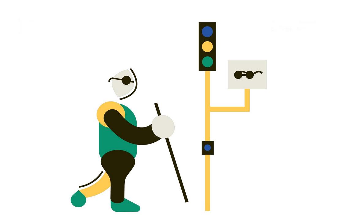
When designers rely on color alone to indicate meaning, such as using red for “error” and green for “success”, they can unintentionally exclude users who can’t distinguish between those shades.
Color accessibility also involves:
- Using patterns, icons, or labels to support color-coded information
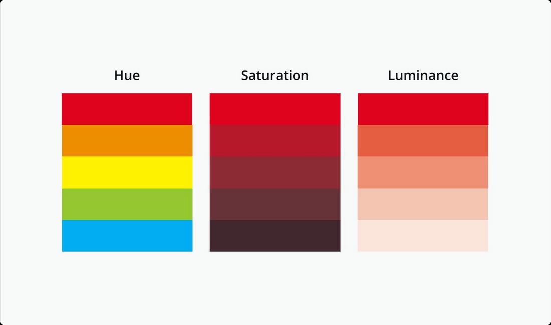
- Making sure adjacent colors differ in hue, saturation, and brightness
- Avoiding problematic color pairings like red/green or blue/purple
By thinking beyond contrast, you can create designs that communicate more clearly to a broader audience.
Inclusive Design and Color Theory
Color theory is the study of how colors interact, how they can be combined effectively, and the emotional responses they create.
It’s the foundation of creating visually appealing and balanced color palettes. Designers often use concepts like complementary, analogous, and triadic color schemes to create harmony and contrast in their work.
In the context of inclusive design, color theory becomes more than just aesthetic, it becomes functional. It helps designers choose combinations that are not only beautiful but also accessible.
For example, a complementary scheme with blue and orange might have enough contrast to work for most users, but you still need to test whether those colors are distinguishable to users with different types of color blindness.
Inclusive design encourages thinking beyond what looks good to most people and instead asks: Does this work for everyone?
Applying color theory with accessibility in mind helps ensure that color choices are usable, consistent, and easy to understand.
It’s about making thoughtful decisions that serve all users, no matter how they perceive color.
Designing for Color Perception in UI

In user interfaces, color often plays a role in guiding actions, like buttons, alerts, and status indicators.
But relying solely on color to convey these messages can leave some users confused. Instead, add visual cues that go beyond hue.
For example:
- Use icons or shapes alongside color (like an exclamation mark for a warning)
- Add text labels to color-coded tags or badges
- Use underline, bold, or spacing to highlight links, not just color changes
Also, don’t forget that devices and environments affect perception. Colors might appear differently on low-brightness screens or in different lighting conditions.
Make sure your palette remains effective and visible across devices.
Best Practices for Accessible Color Design

Designing for accessibility doesn’t mean limiting your creativity, it just means being more intentional with your choices.
When it comes to color, following these best practices can help ensure your designs are readable, usable, and welcoming to as many people as possible.
1. Use More Than Just Color to Communicate
Never rely on color alone to convey meaning. Always include a secondary indicator such as icons, patterns, labels, or placement.
For example, if you’re using color to distinguish between categories in a chart, consider adding texture or symbols so people with color blindness can tell them apart.
2. Stick to Safe Color Pairings
Some color combinations are harder to differentiate, especially for users with color vision deficiencies. Avoid problematic pairs like red/green, green/brown, and blue/purple when used together in key areas.
Tools like Adobe Color’s Accessibility checker or an online Color Blindness Simulator let you preview your palette through various types of color vision deficiencies, helping you make smarter choices early on.
3. Follow the 4.5:1 Contrast Ratio Rule
For body text, WCAG guidelines recommend a minimum contrast ratio of 4.5:1 between text and background.
For larger text (over 18px), a contrast ratio of 3:1 is acceptable. This helps ensure that text remains legible even in low-light or bright environments.
4. Test in Light and Dark Modes
More users are switching between light and dark modes, depending on their preferences or device settings. Make sure your color palette adapts well to both themes.
Avoid pure white or pure black when possible, and check how your UI elements invert or adapt in dark mode.
5. Use Consistent Color Roles Across the UI
Assign meaning to specific colors and use them consistently. If green means “success” in one part of your app, don’t use it elsewhere to indicate something unrelated.
This reduces confusion and helps users build trust in your interface.
6. Label All Color-Coded Elements
If you’re using colored dots, badges, or indicators, always add a text label next to them.
This ensures users who can’t distinguish the color can still understand the information being presented.
7. Keep the Palette Simple
A limited, well-organized palette helps create clarity. Too many similar shades can be hard to tell apart.
Stick to a handful of primary and secondary colors, and make sure each one serves a distinct purpose.
8. Test with Real Users When Possible
Accessibility tools are helpful, but there’s no substitute for real-world feedback.
If you’re working on a high-impact product, consider usability testing with people who have different types of vision or accessibility needs.
Conclusion
Color accessibility is about more than just ticking boxes, it’s about creating a design experience that feels thoughtful and inclusive to everyone.
When you take color perception into account, your designs become more intuitive, more functional, and more human.
As designers, we should aim to communicate ideas clearly and beautifully. And that starts with understanding how people see.
By going beyond contrast and thinking more holistically about color accessibility, we can make the digital world easier to navigate for all users, regardless of how they see it.