Typography in Shared Spaces: A Trend You Need to Know
It seems like such a simple concept, but this trend is just starting to take off. Designers are allowing typography to cross planes between elements.
The trend is exemplified by type starting in one part of the canvas and then it extends into the space of something else, such as overlapping part of a photo or encroaching on another colored box or image. The layering technique is interesting and can help add a bit of creativity to a design in a number of ways. Here’s a closer look at ways to use typography in shared spaces.
Identify the Trend
Typography in shared spaces is a web design trend that’s quite easy to identify. (You can also try this one out in non-web projects, such as posters or postcards.) The key characteristic is that type, or related elements, appear to cross multiple layers or planes in the design.
While the idea is that you are looking for typography in shared spaces, the trend can apply to almost any design element that crosses into a space that looks like it is reserved for something else. It’s often showcased as an extension of split screen design.
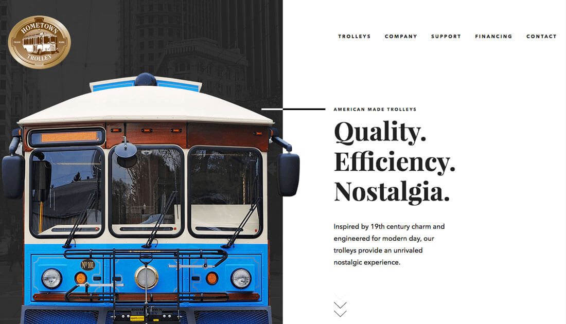
The element that crosses planes can be quite obvious, like many of the typography examples below, or more subtle. Look at the image for Hometown Trolley, above. The stroke extends from the type to pull the eye from the trolley image to the main headline. A closer look reveals that part of the trolley comes out of its background onto the part of the screen designed for type elements.
What this trend does – when designed well – is help guide the user’s eye across elements. With a divided design there are two distinct things to look at, sharing space helps guide the user to important parts of the design. The other bonus from a design perspective is that creating multiple spaces can make it easier to contain text elements – think of the design as two giant cards, with a layer on top that connects them.
Mix Photos and Typography
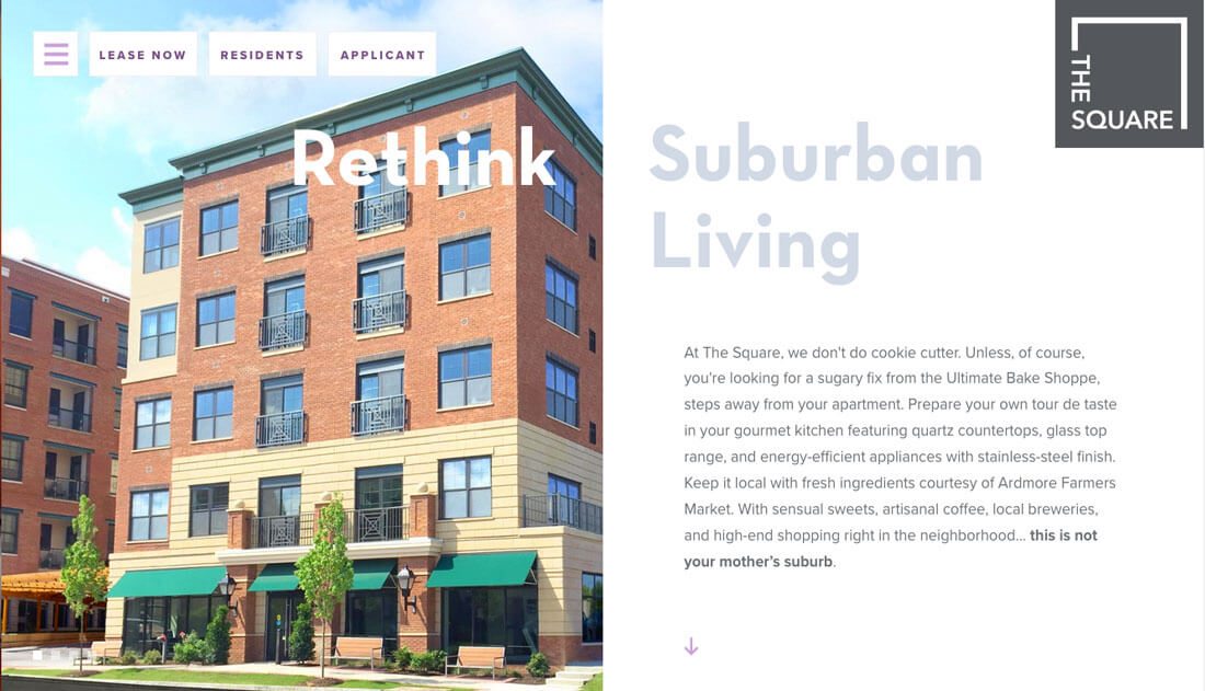
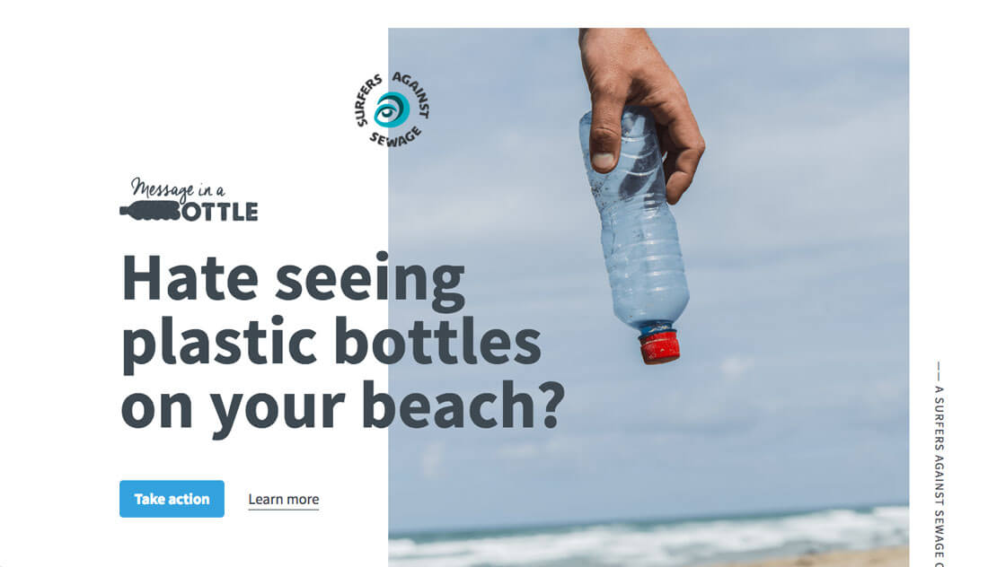
Typography in shared spaces works beautifully with strong photos. Many designers are using this trend with vertically-oriented images (something that isn’t used often because of the nature of screen aspect ratios).
Sharing space is a great way to use these shapes differently while still creating an impactful visual. Lettering can cross between the image and whitespace or can just read between the spaces, such as in the example above.
What’s clever about the typography and messaging for The Square Apartments is that the words can be read on their own in and almost split-screen format or across the panels for a more complete but of messaging.
The other thing that’s nice about this option is that it can be a little less tricky to pick a text color because letting is not going across multiple backgrounds. This might be the easiest variation of typography in shared spaces to try.
Try Bold Lettering
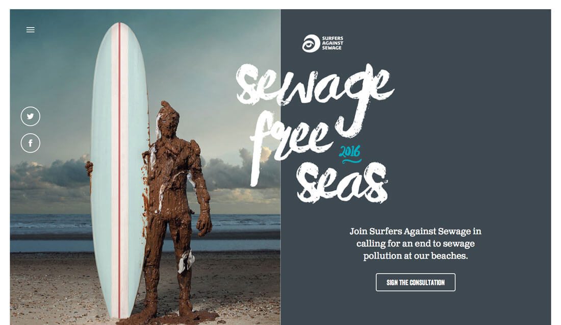
This trend is dramatically beautiful with lettering that crosses panels in the design and uses an interesting typeface in a big way. The added emphasis on the typeface because it layers on multiple spaces highlights the words and creates a focal point in the design.
For this to work effectively, you’ll need a short bit of messaging – long headlines will feel overwhelming, interesting typeface selection and an image and background pair with similar coloring so that type is easily read across the entire canvas.
In most instances, opt for black or white lettering on the background. This is a pretty complex design for users to digest – even if it might look rather simple – and readability should be a primary concern.
Layer Type with Color
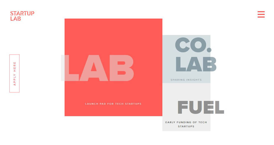
There’s nothing to say that typography has to share a space with images to use this trend. It can work equally well when you don’t have any images at all.
Mix and match colored boxes, geometric shapes and different typography options to create layers with flair.
Startup Lab, above, does a fascinating job of pairing colored blocks with type that ignored borders to create plenty of interesting layers. The neat shading on the big words provides a nice visual point of reference and contrasts nicely with the more simple, straightforward secondary type styles.
Add a Hint of Animation
Just because you are using the shared space trend, doesn’t mean you have to forego other fads. Add in a hint of animation for user interface elements or navigation items to help encourage users to click around the design.
Subtle movement can also help create focus if the design feels a little busy.
In the design above, the small circular logo spins slowly. It almost works to center the design, which has an almost asymmetrical layout. It fills in the trapped spaces between lettering and the image so that the overall design feels complete and balanced. Plus the animation takes you directly to the page branding.
Keep It Simple
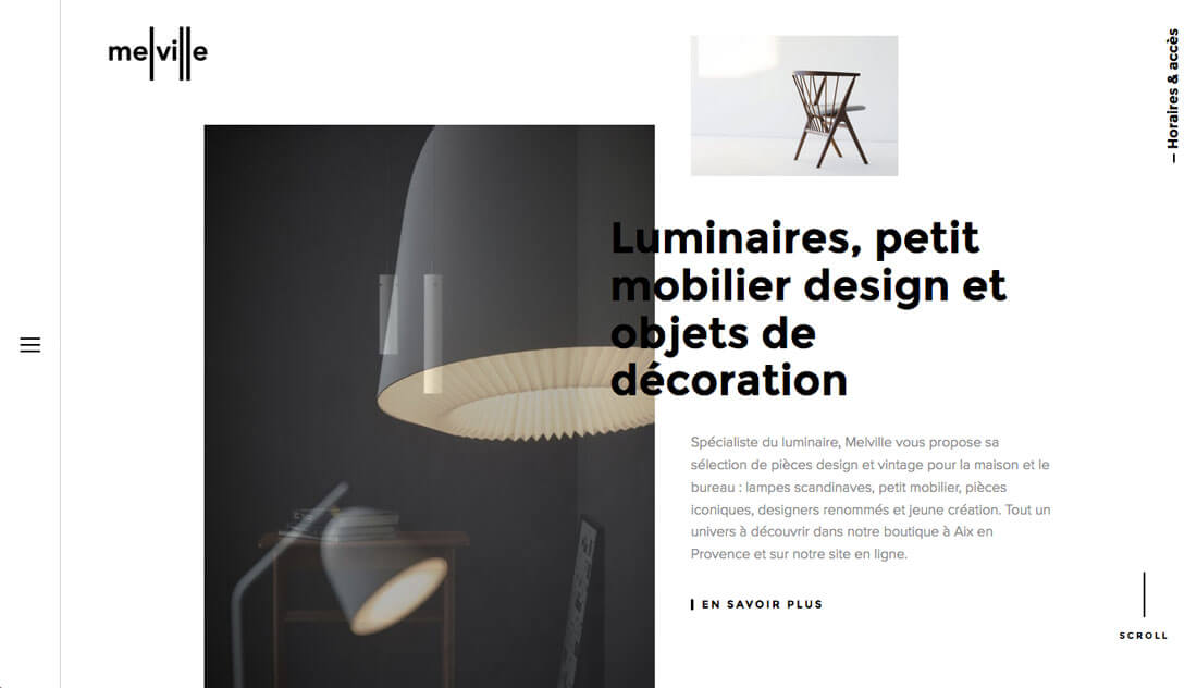
It’s a recurring theme here at Design Shack, but this trend works best when you keep it simple. While it can take a lot of planning and might feel complicated to create an effective design with typography or other elements in shared spaces, the end result should look simple and seamless.
If you’re not sure where to start, try a minimal framework. A white background with black type, such as Melville, above, can push focus to colored images. (Clean lines are always in style.)
Focus on visual flow with this type of design pattern. Think about what parts of the design are most important for users to see, and then click on. Layer the background, images and lettering to pull users through this flow so that the final thing they see in a natural progression is the next action. (In the case of the design above, users have two choices – click the link or scroll.)
Conclusion
Creating a design with typography in shared spaces is a modern twist on pretty traditional design techniques. It provides an option to help designers highlight imagery with crops of shapes that are often forgotten or design a bold option without images at all.
Focus on solid, readable lettering that cross planes well to make the most of this trend. Consider user flow and calls to action … and have fun!