7 Common UX Mistakes That Can Ruin Your Content
A successful project is a combination of good design, killer content and a little bit of luck. Too often a design is derailed by simple UX mistakes that ruin the content and muddle the intended actions of the interface.
Users can easily lose track of why they are there, and what they are supposed to do. Thankfully, many of these design mistakes are easy to identify and correct. (As a bonus, the examples in this post are doing things right; use them as a guide!)
1. Unreadable Typography
There was a short phase where designs were packed with novelty typefaces. While that is not an issue in itself, it does present a problem when the words are difficult to read. (What point are words in a design if they user can’t figure out what they say?)
When looking at novelty options, be aware of how letters look with the words you are using. Some combinations might work better in a typeface than others. Pay attention to the kerning and number of characters used, particularly with a novelty typeface. (Fewer characters is often better with specialty display typography.)
How do you know it’s hard to read? Be wary of typefaces with extreme slants, tight and condensed letterforms, overly elaborate swashes, tails or ligatures, or letterforms that seem to run together or have uncommon shapes.
Fix it now: Switch out that unreadable typeface for something with a wider stance and more common letterforms. You don’t have to change all the way to Helvetica, but go for something readable and interesting. Try something from this Google Fonts collection.
Doing It Right: LeadGen

2. Poor Alignment
Left, right, venter, justified?
We won’t argue the merits of the types of alignment here. The big takeaway is this: Consistent alignment is what really matters. Type and elements should rest comfortably within a grid. Jagged edges should be avoided.
The problem with poor alignment is that it disrupts visual flow, making it hard for users to move from one element to the next in the design. They can get lost in the mess and might miss what is most important when it comes to content.
Fix it now: Set alignment styles for elements. Are photos centered or do they sit in line with text on the left margin? Create a set of guidelines, adjust the design and stick to the rules moving forward.
Doing It Right: Lorem Ipsum

3. Inappropriate Imagery
Inappropriate imagery is a content killer. It can create a disjointed visual connection with text or leave user scratching their heads.
While imagery that falls short often comes in a “know it when you see it” fashion, there are a few red flags to look for in your projects.
- Silly or overused stock images: If the photo doesn’t seem real (people in business suits smiling aimlessly) or if you’ve seen it on other similar websites, avoid it.
- Poor quality images: If the photo is out of focus, dark or composed poorly, don’t use it. No photo is better than a bad photo.
- Low-resolution images: A pixelated image is always bad. Many of the photo rules that were part of design workflows a couple years ago need to be revised thanks to the dominance and popularity of high-resolution screens.
- Fluff images do not enhance content: Don’t get stuck including a photo just because you can, even when it has no relationship to the content. Images should enhance content, not muddy it.
Fix it now: Do a photo audit. Go through your design and remove any images that contain the red flags above. You do not have to replace an image if you don’t have something appropriate.
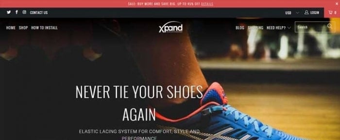
Doing It Right: Xpand Laces
4. Neglecting Mobile Details
It’s common knowledge that websites should be designed on responsive frameworks. It would be difficult to find a designer or developer that would argue otherwise. But a responsive template is not a one-stop solution. The design must be adjusted for different screen sizes.
Too often that detail is neglected. The website functions on mobile, but type sizes are a little too small or images are sized responsively, and proportionately for the different aspect ratio of a mobile device. These little details can seriously annoy users.
Fix it now: Spend some time with your mobile design. Take note of all the details that seem out of place and cause frustration. Check text sizes, images, load times, button placements and make necessary adjustments to provide a more seamless experience.
Doing It Right: And Co

5. Crazy Color
A bored designer will create a disjointed design. One of the ways this often manifests is with crazy color and lack of a defined palette.
Too much color can be distracting and often has an amateurish feel. For every one project that pulls off a rainbow-inspired palette, another 1,000 projects fail. Unless your brand guidelines call for using that kind of color scheme, avoid it. (And if your brand has such guidelines, encourage a refresh.)
Fix it now: Create a strong color palette. Start with a dominant color and one or two secondary options. If you need more variance, use tints and tones from that palette (and create rules for those as well). Don’t start adding more color.
Doing It Right: Rush Flyer Printing

6. Not Giving Users Something to Do
Imagine landing on a beautiful webpage, but then not knowing what to do next. Do you scroll? Do you click? Is there a next step to find more content?
There should be.
A good website design is a web of actions, interactions and movements that flow from page to page. The goal is to have visitors connect with as much content as possible on the path to a desired action.
Fix it now: Every page in the design should contain a call to action. Users should know exactly what the goal of each page is and want to click the button, fill out a form, play a game or buy a product. The design structure should include bold user interface elements to encourage clicks or taps from button styles to actionable instructions.
Doing It Right: Vinebox

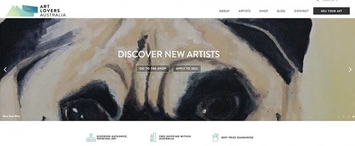
7. Too Much of a Good Thing
Don’t go overboard with your super-cool element.
Have a great illustration? Use it. Use it big, even. But don’t clutter it with lots of other illustrations that dilute the image.
The same is true of icons or any other technique that’s your hook to entice users. You want to leave them wanted more, not overwhelmed by volume. This sounds pretty easy, but it can be hard in reality. (Just think of that icon pack you bought and feeling a need to get your money’s worth by using every item.)
Fix it now: Employ a less is more strategy. Use only the elements you need to enhance the content. Don’t overwhelm it. Go through the current design and imagine taking one element away from every page. What would it be? Is the design better for it?
Doing It Right: Art Lovers Australia
Conclusion
Every designer makes a design mistake here and there. (Some of us make more than we would like to admit.) But can you identify the problems and recover?
You should have a good start in that direction now with this list of mistakes and ways to correct them. Don’t be ashamed when you commit a design sin, adjust and move on.