7 Ways to Adapt Content for Better Mobile UX
The beginning of a great design starts with content. To make the most of a stellar mobile UX, the content might need to undergo a few tweaks and changes.
But where do you start? How should content be adapted to work seamlessly on mobile devices? It starts with thinking about the way users interact with smaller screens, and how that impacts what (and how much!) they’ll want to read.
1. One Thought Per Screen

When collapsing content for mobile devices, try to plan elements so that there’s one through per screen. Even as phones seem to be trending toward larger sizes again, don’t be tempted to cram a lot of information on the screen!
One thought per screen is enough. Any more and you risk overwhelming the user.
Mobile device users tend to be multi-taskers. They are looking at your website while talking to a friend while attending a baseball game. By keeping the message and content simple and direct, you have a better chance of a single thought getting communicated.
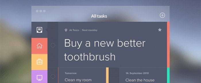
But what does one thought look like? It is a block of text, imagery and actionable element that are all tied together. The group of content should ask users to make one choice: do you want to do this?
2. Prioritize Navigation
There should be a handful of things that users tend to do, or that you want them to do, when they visit the mobile (responsive) version of your website. Make sure there’s easy-to-follow navigation that gets users to those elements quickly.
While a menu of ten navigation options with multiple levels might work on your desktop site, mobile users are often more time-pressed. They have no intention to poke around the site until they find something.
Navigation needs to be simple and streamlined. If you are not sure where to start, take a look at your mobile user analytics. What are the top three or four pages visited? Do these pages fall in line with what you expect? You’ve found the key navigation elements so you can adjust mobile content accordingly.
3. Think Like a Search Engine

Whether you get ten pageviews a day, or millions, you want to think like a search engine when it comes to content on mobile devices. Every word, image and bit of content needs to be fast and searchable. But don’t play the algorithm. Create quality content that users want to read.
When it comes to mobile, this might mean paring down some content elements. Rather than three images on the home page, for example, pick the one most important photo. Don’t weigh down your mobile site; web speeds and Wi-Fi are getting better all the time, but some users will struggle with connections and your website still needs to be accessible.
You can check mobile page speeds with this nifty tool from Google, which helps you to keep everything well-optimised.
4. Make the Text Bigger

Smaller screens should not mean smaller text. You should actually increase point sizes to make content easier to read and digest. Take a look at your body copy and opt for a size that allows for 30 to 40 characters per line. (This is about half of what is recommended for desktop screens.)
There are other tricks to making text more readable on small screens, too. You can find those in a previous Design Shack article on tips for designing better mobile typography.
5. Write Meaningful Microcopy

Great microcopy – the text inside elements such as buttons – can make or break the design. Microcopy can add personality and spark to the design. It also conveys a great deal of information and helps users find their way around the design.
On mobile devices, in particular, consider making microcopy a little larger than normal and always use it in forms to help users know exactly what to do.
Think about common problems you run into when paying for something on your phone, for example. The form can span across multiple screens or scrolls; guiding microcopy can make it a lot easier to fill everything in correctly the first time. (A key component in converting actions from mobile users.)
6. Strip Out Unnecessary Effects for Mobile

Spinning animations and parallax scrolling features look amazing on desktop websites, but can bog down mobile versions. Strip out everything you don’t need for mobile designs. You want everything to load quickly and seamlessly; animations that may or may not work get in the way of connecting with a user immediately.
Another effect you can strip out? Hover effects. There’s no such thing as a hover state for touch actions.
Streamline the mobile user experience with an easy to understand tap functionality (to replace click) that has an obvious bit of feedback. You don’t want users to question if an action took place; it should always be obvious.
7. Adapt to Scale
Nothing is more frustrating than landing on a mobile responsive site where everything is tiny. The point of having a mobile design is to make the website more accessible to users on smaller devices. You must adapt content to that scale.
Sometimes adapting the content is just a rearrangement of parts.
- Boxes that were lined up across the screen on a desktop might be stacked vertically on a mobile device.
- Photos are cropped more square or vertically based on the dominant orientation of mobile usage (vertical).
- Text is edited and trimmed for brevity.
- Navigation is repurposed and placed in a different location.
- Calls to action are made into bigger almost screen-sized elements.
- All buttons and tap elements are placed in easy to reach locations, based on the way users hold their phones.
Conclusion
Are you ready to rethink some of the content on your website? If you built a responsive website and just assumed everything would convert mobile users, then it is time to evaluate the mobile part of the design. Chances are that there’s room for small content changes that can really change the way users interact with the design.
This is a vital part of the design process. Take a look at your analytics. What percentage of your user base is accessing the design on a mobile device? If you aren’t making adjustments to cater to their needs, you could be alienating a large segment of your user base without meaning to offend them.