8 Ways to Design Clever Error Messages
Question: What happens when someone gets lost on your website or when someone stumbles upon a bad link or missing content?
Answer: They get to see your 404 page.
Now here’s the real question: Is that 404 page a well-designed Easter egg that will help users on their journey or did you forget to add design or informational elements?
Clever error messages and 404 pages are a website design art form. Some designers sneak these little nuggets in, to surprise and delight users. One thing is common, good error microcopy and design can actually help users connect with the content when they might otherwise bounce, making it important to use this element to your advantage.
Error Messages Should be Short and Direct
Error messages need to be easy to understand at a glance and look like “an issue.” A red alert is an obvious signal that something is amiss.
Pair that visual element with direct and simple language about the problem. Be direct, but try not to over-communicate. (There’s a fine line between the all-too-frustrating blue screen when something goes wrong to a page of documentation to help you get going again. Both options are highly frustrating for most people.)
The better option is to provide a simple explanation of the problem with an easy answer.
If users have to work too hard when a problem pops up, they will abandon the design. Think of these tiny bits of error microcopy and the last line of defense that can save a user before they leave your site.
A friendly, helpfully tone can work wonders here. Be clever and use natural language, but stay away from silly puns or words that could result in greater frustration.
Provide a Next Step
If a user has done something that results in an error, help them get where they need to be.
That’s a two-step process:
- Display a message with a short block of copy that lets them know the desired action did not happen. Be careful with this language to not blame the user for messing up. Keep the language neutral and helpful.
- Offer a solution. Remember to use your brand voice; it can be as light as “Need help with something?” to “Maybe this is what you are looking for” with a button or list of options.
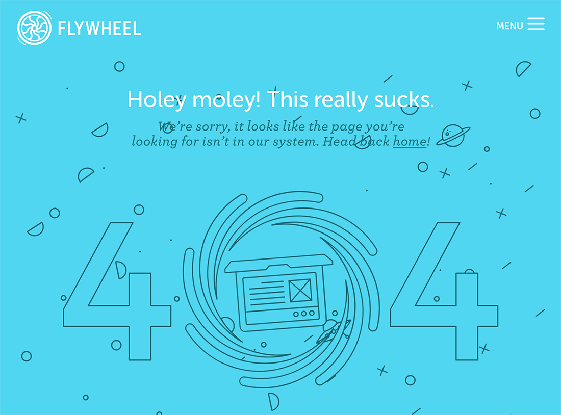
Flywheel has a simple design with a nifty animation with a simple call to action: “Head back home.”
Don’t Scream at Users
It shouldn’t need to be said, but this happens way too often. Don’t scream at lost users by typing everything in all caps, or bold, or with red letters, or with underlines. Unless that’s part of your overall design scheme.
Remember, a user who has encountered an error message or 404 page is likely frustrated already. The design and words should have a soothing, calming, helpful tone to help them finish what they were trying to do with the design.
Correct Errors as They Happen (When You Can)
Think of how happy you feel each time you start to enter an address and it already knows the city and state from the ZIP code? Or your location when you are looking for directions? Or that you already purchased an item? Or fields that know what type of credit card you have from the number alone? Or if you misspell a word during a search, but still get to the same results?
All of these little things prevent errors from happening due to wrong selections, typos, or general human error.
All of these little things correct potential errors before they happen.
And when you come in contact with these clever solutions, it makes your browsing life that much easier. Users love these little divots that make everything simpler, faster, and more accurate.
When planning a website design, think of ways you could use some of these same concepts to delight users and help them navigate and successfully complete actions on your website faster and more error-free.
Use Buttons
Buttons are easy. Users know what to do with them. Use them to help direct action when an error occurs.
While text links are helpful, buttons provide a little more implied action to find success. They are also especially helpful for mobile users since text links can be a little more awkward or fall victim to fat fingers.
404 Pages Should Look Like Your Website
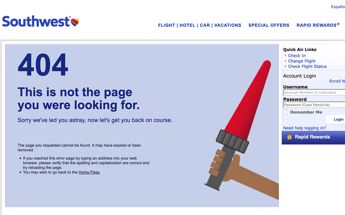
Why do so many 404 pages look like they were just stuck in the sitemap after the fact? (Probably because they were.)
A good 404 page looks like the rest of your website – using the same head and footer, but also using image elements and copy that matches other content. Don’t forget your brand voice and style here. It’s just as important on the 404 page as the home page.
Southwest tells users they are lost and then provides quick links to help flyers log in, or find flight information. They are taking advantage of the opportunity to keep people clicking.
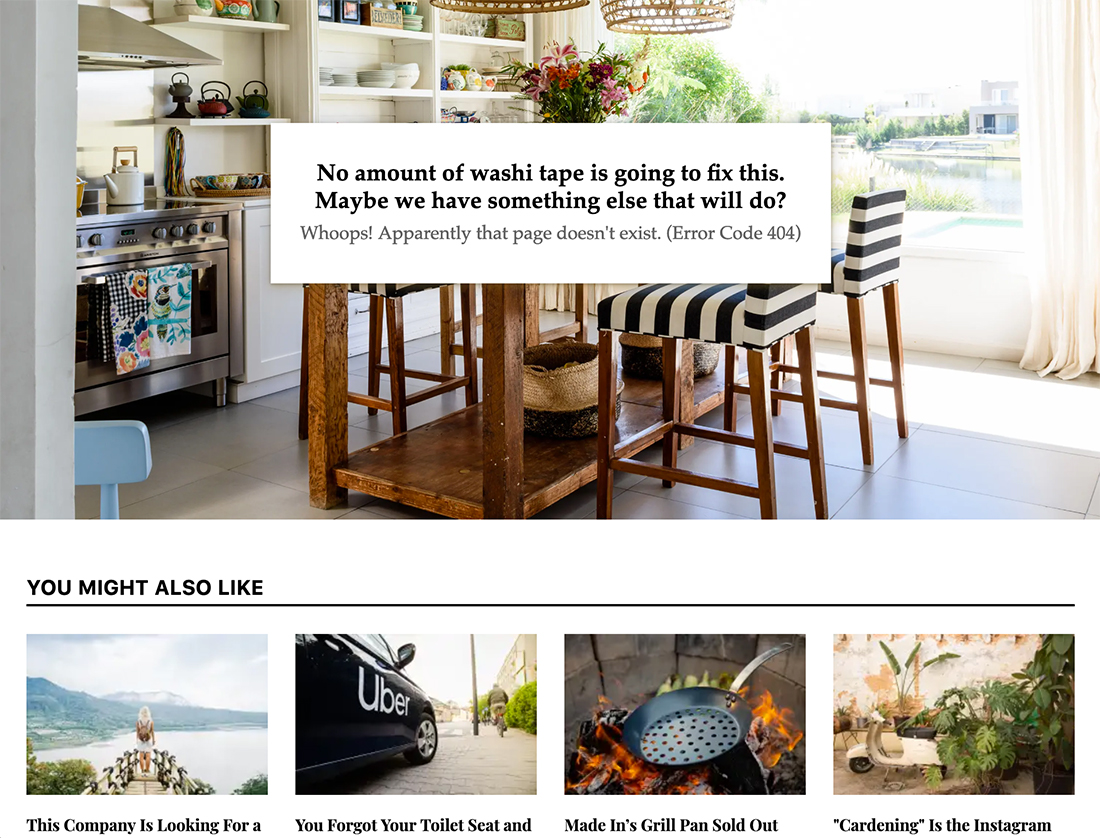
Forget “Oops” and “Whoops” on 404 Pages
The lighthearted “oops” or “whoops” 404-page headline has been done so many times that it feels lazy at this point.
If you can’t think of something clever – you won’t always have something snappy to say – use a great bit of brand imagery, apologize for the inconvenience, and give users something to do instead.
If you want to be clever, tie the message to your brand and what you do. Apartment Therapy keeps the 404 page super simple, but the messaging fits perfectly with what users on the website have come to expect.
It’s the perfect combination of informational, helpful, and clever. (That’s what makes a 404 page design work.) And yes, they do say “whoops,” but the primary headline is so clever that we’ll forgive them this time.
Create an Error Design Strategy
As with almost every other design problem and solution, a solid strategy is a foundation for success. During the planning phases, map out an error design strategy.
Here’s your checklist to get started:
- What are the common issues you expect users to face on your website?
- How can you solve those problems?
- What will the 404 page look like?
- What voice and tone is appropriate for your audience?
- What type of solutions will you provide? Buttons, search, something else?
- What’s the architecture for taking users through the correction process?
- Who on your team can anticipate problems and is best suited to write amazing microcopy solutions?
Conclusion
A clever resolution to a user problem is a combination of helpfulness, mindfulness, and quick resolution. If someone is having difficulty with the design, a direct answer is most likely to help keep them on your website and moving toward the path of conversion success.
Plan microcopy and design elements for these mishaps and work to ensure they work with your brand and the rest of the design so that users realize what they need to do next.