Designing for the Web: Are There Colors You Should Avoid?
The web is a rainbow of color options. Color is a great tool for grabbing the attention of users, providing visual interest and impact and creating contrast for readability. Color is also at the center of many design trends, including flat and material styles.
But can you go wrong with color? Are there hues or combinations that you should shy away from? In a word … yes! Today we’re looking at colors or color combinations that you should avoid when designing websites and apps. (And on the chance that you’ve already made one of these mistakes, we offer alternative suggestions as well.)
Neons

Neon colors can be fun, spunky and add a lot of pop to a design. Unfortunately they are incredibly hard on the eyes, giving users that “teared up” feeling where everything hurts to look at.
The problem with neons is that they are too bright to read with ease and cause problems paired with dark or light backgrounds. When used with text, neons present readability concerns as lettering tends to bleed into the background. Neon backgrounds are often overpowering and distract from the main message in the design.
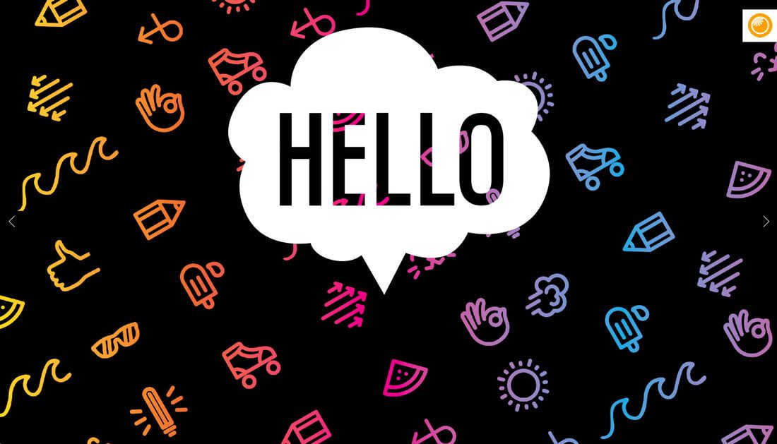
Try this instead: Remove some of the brightness from neon colors so they have a darker, more subtle look on screens.
Orange You Glad does a great job incorporating “almost” neon colors into the design of their homepage in a number of ways. The common theme is that the neons are used for smaller elements and with subtle color changes that make the pinks, yellows and greens easier on the eyes.
“Vibrating” Colors

When highly saturated colors are paired, they create a “vibrating effect” where colors seem to almost move in a blurring or glowing motion. You don’t want to do this.
This vibration can be unsettling for users as outlined by color theorist Josef Albers in his classic guide “Interaction of Color:” “This initially exciting effect also feels aggressive and often even uncomfortable to our eyes. One finds it rarely used except for a screaming effect in advertising, and as a result it is unpleasant, disliked, and avoided.”
You can almost predict what will make colors vibrate before putting them side by side.
- High saturation of each color
- Complementary on the color wheel
- Spaced 180 degrees apart on the color wheel
- Converting the colors to grayscale, results in very little contrast
A classic example is pairing bright red and green. The popular “Christmas” combination is one of the biggest (and most widely used) color offenses. These combinations present an accessibility problem as well because they are undecipherable by people with color blindness.
Try this instead: If you must use “vibrating” color combinations, separate them with something else (preferably a neutral) in between.
Light on Light

This is one of those mistakes that happens all of the time. Maybe it’s because you can pull it off with print projects, maybe it is because of certain screen settings that make it workable, but light on light color combinations just don’t cut it.
They are difficult to read. Every single time.
This is where the biggest offenses seem to happen: Hero headers that pair an image and white text, but the text falls across a light part of the image. At this point the words are unreadable. It happens way more often than it should. If every letter is not clearly readable, you need to rethink it.
Try this instead: Thankfully, there are pretty easy fixes for this problem:

- Choose a new image with a consistently-colored background.
- Use a colored box for text on top of images with a lot of color variation.
- Consider a full-color image overlay to increase contrast between the background and text elements.


Anything Rainbow-Colored
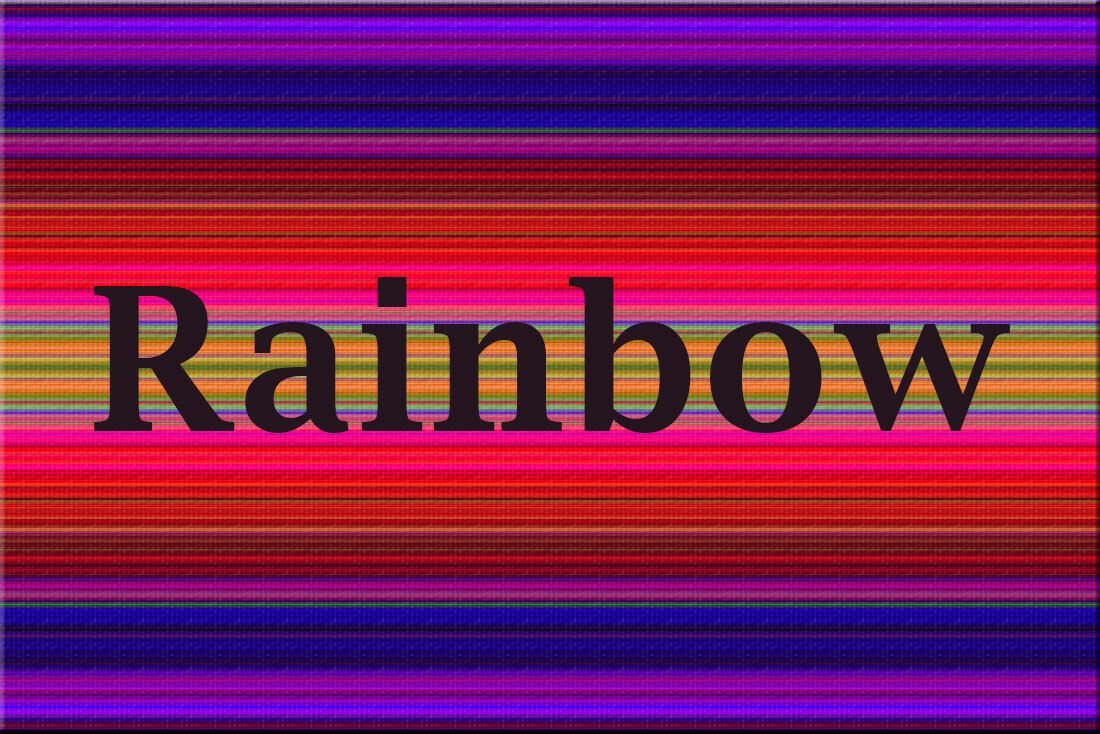
While it almost goes without saying, rainbow-colored websites just don’t work. (Think of how many color theory rules you are breaking just by picturing a rainbow-themed website in your head right now.)
Rainbow color combinations are overwhelming and overpowering. They might grab the attention of a user at first, but that user will certainly bounce once he or she realizes that the content is undecipherable.
Try this instead: If you want to use a wide-ranging color palette – as is the trend – opt for color-blocking or card styles, where colors can associate with elements. This container-style design will allow more flexibility with color while creating a sense of organization and flow.
Bright on Bright/Dark on Dark
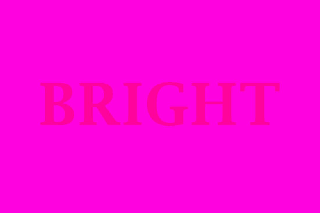
Just like light on light, and combination of similar color saturations will cause issues. It should go without saying, but avoid them.
If you think this won’t happen to you, be careful when you use monotone color schemes. That’s when designers tend to slip up here. (When in doubt use more contrast.)

Try this instead: Think in contrast. If you want to use multiple bright or dark colors, consider them as options for screens in a scrolling site. You’ll get to use all the dark or bright colors you like and maintain readability and usability. (It’s a win-win!)
“K” Black

Particularly if you cross between print and web projects frequently – as many designers do – pure black can slip into web projects by mistake. Known as “K” black in print projects, because it only use one plate or “Pure” black (#000000) in digital projects, this color is just flat.
Think about reality, all combinations of black are actually filtered with other hues to give it that richness. (Even the feathers of a raven often look blueish or more purple in the right light.) Use a combination of black that includes other colors to create that rich, dark color, and save pure black for print.

Try this instead: Try a black with hints of coloring that match your brand or add just the right color connotations. The more you lighten black into gray, the easier the makeup colors are to see. Consider black in concert with surrounding colors and think about the makeup of each and how they relate to one another. (For example, use a black with a little more of a bluish tone to offset orange or yellow hues for text or other elements.) For example, the color for Wonderland, above, is #0a0a0b.
Conclusion
The biggest reason to avoid these colors and combinations is lack of readability and contrast. The reality is with the right color choices and plenty of contrast, almost any hue can work in moderation.
But there is a catch. You might have to make it a little darker or lighter than you expect to make it work. Remember, colors take on attributes from their surroundings (including the backlight from a screen) and have to be adjusted accordingly.
Here’s your “trick of the day:” If you have to squint, question or move the screen at all to see something, the color does not work and you need to move on to something else.