Don’t Make These 10 Mistakes in Your App Design
No matter what type of app you are creating, have created, or plan to create, design mistakes can be lethal when it comes to adoption and usage. Users want to download apps that are fun, functional and offer value during multiple uses. Users also want apps that are aesthetically pleasing and don’t require a lot of effort to interact with.
The problem for designers is that sometimes we are so close to a project that we miss glaring mistakes in design and usability because we know how it works. Today, we’re going to help you make a mental checklist of mistakes to look for and avoid in app design.
(Note: All the included designs are from apps that are doing it right, so you get a good dose of visual inspiration.)
1. Bad First Impression

A good app starts with a good first impression. It should go without saying, but if users are turned off by your download page or initial impression when they open the app, chances are they won’t interact with it again. It is vital to make a great first impression.
The home screen should load quickly and provide an easy to understand and distinct action for users. Tell them what they are here to do. Remind them of the reason they downloaded the app in the first place.
The necessary actions should be easy to find and perform and should all live in a neat and organized container that reflects the visual style of your brand and the rest of the app content.
2. No Actionable Cues

What is your app made to do? How do you communicate that to users?
The design should include plenty of visual cues that help users understand exactly what actions to take, where to touch the screen and what will happen. When it comes to visualizing this information, go back to design theory for the basics:
- Color: Bright colors draw the eye and are a good options for tappable elements.
- Space: Leave plenty of room around key elements so that they are easy to find and touch.
- Typography: Use simple, clean fonts – often with uniform stroke widths – in a size that’s is appropriate for the screen. Every instruction should be clearly readable.
- Tell users where they are or show their current state. (Example: Hover state color changes.)
- Respond when an action is executed (this includes success and failure). (Example: Success notification when a form is submitted.)
- Tell users what is happening or what should happen next. (Example: Navigation arrows or a loading progress swheel.)
3. Cluttered Design

The biggest flaw in many apps is clutter. It’s as if the designer is trying to get every single part of the app design, whether it is a game or tool or news feed, on a single screen.
Forget it!
Apps are designed to work on small screens. Trying to do too many things at once is overwhelming for users.
Think of each “screen” as a single container for a single element. When you move to the next screen, a new bit of information can be displayed. Users will swipe and scroll if the content is engaging. And they are even more likely to do so if the design is clean and easily accessible.
4. Touch Elements are Too Small (Or Too Close)

Beware of fat fingers. Elements that are too close together or too small to tap without zooming are a problem for users.
Ensure that there is plenty of space around each element to help eliminate inadvertent clicks. There’s no magic formula for this space, but when it is wrong you will know it. (Just peek at your analytics.)
Here’s how I created my scale. I borrowed a friend with large hands. Drew a circle around his forefinger and that’s my guideline. The button doesn’t have to be that size, but the tappable area should be. And nothing should be any closer.
Because of this, cards and container elements to click for actions are nice. This means that anywhere you tap in an area related to the content all take the user to the same location. (It’s design friendly and user friendly.)
5. Nonstandard Icons or Actions

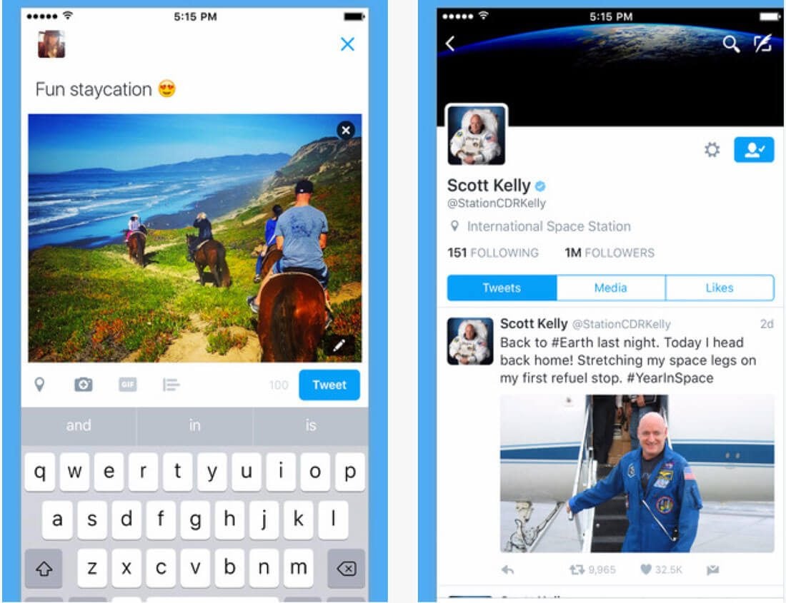
There’s no reason to recreate iconography for your projects. The Facebook link is supposed to be an “f” inside a button; Twitter should be represented by a bird. Why? Because every user know exactly what these elements are and what they do. So why would you change it?
Incorporate standard iconography and actionable cues in the design. It will save you time and will help prevent user frustration.
6. Design Inconsistencies

Everything within a single app should look and work in the same manner. As a user navigates deeper into the interface, he or she should start to have an expectation of what is to come and how it works.
As they learn the app, it needs to meet those expectations aesthetically and operationally. This includes everything from color and type choices to user tools and how they work.
7. Incomplete Feedback Loops

Every interaction should be met with an equal and opposite reaction. (It’s one of the laws of digital physics, right?)
Feedback gives the user a sense of control with engaging with an app and it provides you with valuable information about how users engage. Feedback also helps users make decisions and makes the interface easy.
The feedback loop should:
8. Not in Sync with the Platform

Are you an iPhone or Android user? Ask this question in a crowded room and you will get plenty of impassioned responses. Remember this when you design and release an app.
It should be in sync with the aesthetics of the platform where it is downloaded. That might even include two slightly different versions of the app.
Android and iOS guidelines will help you do this pretty easily. But you have to take the full interface into consideration. Just think about that lonely skeuomorphic app icon on your iPhone home screen that begs to be deleted. Say what you want about the new Instagram logo, for example, but it actually matches the interface now.
9. Interface is Too Complicated

It’s a common problem with gaming apps – they are way too complicated. By the time you figure it out, you don’t want to play anymore.
The interface should be simple. It should be scannable. It should be easy to understand and operate without an owner’s manual.
Anything else is just too complicated.
For most users, and app is downloaded to solve a problem. Each app is one solution. (You don’t use the same app as an alarm and to play a game, do you?) Remember that when you are in the design phase. What is the problem you are trying to solve? Solve it and move on.
10. Forgetting to Set Defaults

Default values in forms and interactive elements can be a big help for users. Consider them to be a small-scale visual walkthrough. Default values can include anything from a pre-marked preference (most-common choice or a null option) in lists and check boxes, instructional text in entry fields or any other example illustrating what is supposed to happen.
Defaults are helpful because they can make things easier for the user by showing them how to use the app, providing an option for users who are uncertain (as in the case with a null default) and by speeding up the entire interaction.
Defaults are also a good bit of feedback for you as well, particularly for forms, because they help cut down on the number of errors and with a “null” option, you immediately know the user did not make a selection.
Conclusion
Now it’s time to put your great app idea in action. You can use this post as a checklist or reminder to help you through the quality control process to ensure that your app is as good as it can be visually and in terms of usability. Good luck!
What killer mistakes do you notice in apps or websites? I’d love to hear from you about things that just drive you crazy. Let’s talk on Twitter.