7 Elements of a Highly Usable Landing Page
A highly usable landing page design is one that compels visitors to act in some way.
Sounds pretty simple, right?
Many websites include multiple landing pages for different audiences with different conversion goals. Here are seven elements that almost every successful landing page includes.
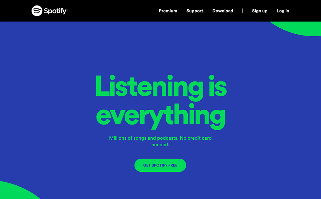
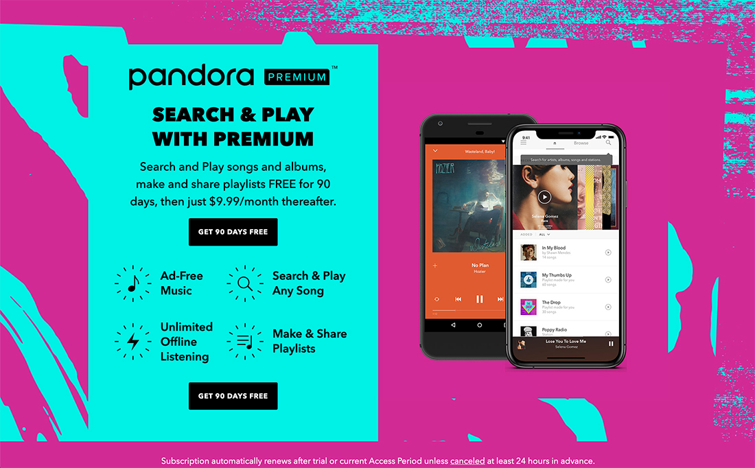
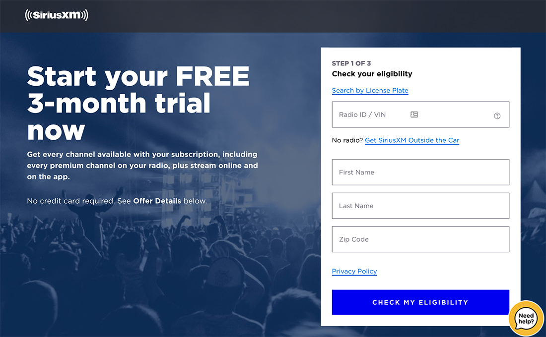
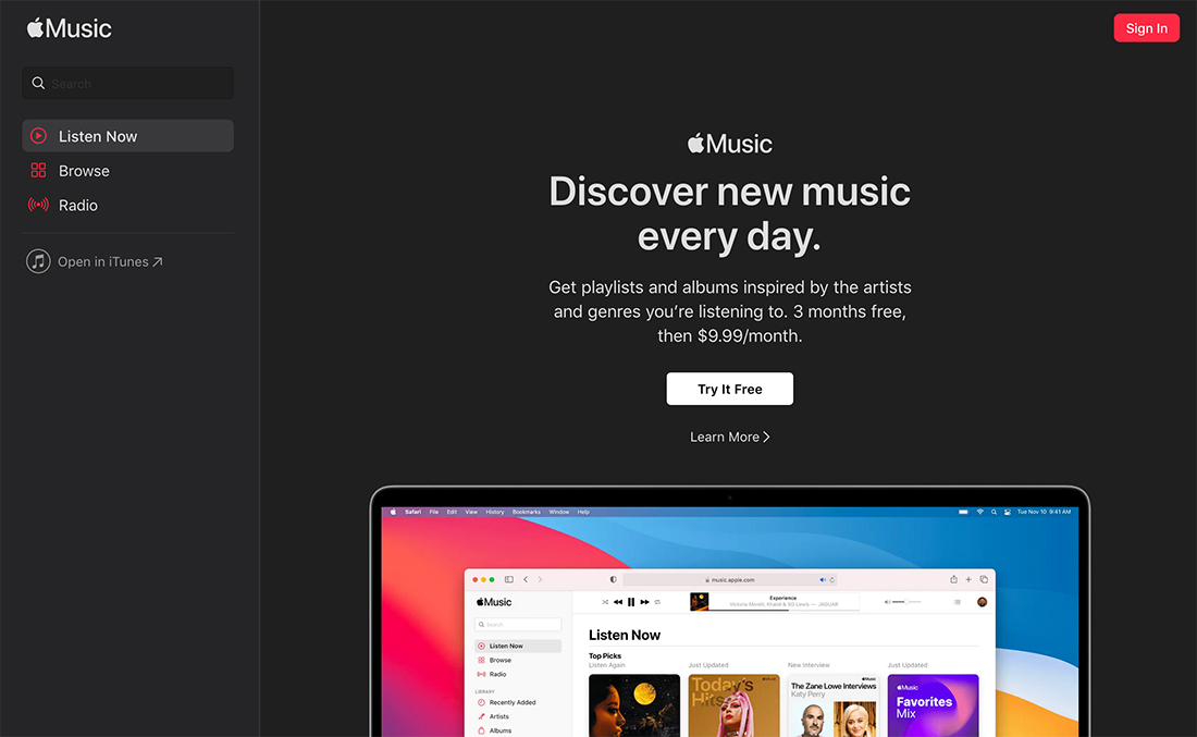
Just for fun, we are using examples of landing pages from different music streaming services for you to compare.
1. Distinct Unique Selling Proposition
A strong landing page starts with a little marketing 101. You have one chance to show why your information/product/page is important.
That’s where a unique selling proposition comes in. This concept sets clear expectations as to what the page is about and why it is important. When done well, it also sells the benefit of what you expect from website visitors (buy a product, watch a video, sign up for an event or email list, etc.).
When it comes to USP on a landing page, the most important thing to know is that you have to arrive at this information fast. That includes:
- The main headline
- In a hero image or video
- In supporting copy
- With a call to action
- With a last chance opportunity at the bottom of the page
2. Clear Structure
A landing page needs to have a clear structure that leads visitors through content with ease. You only have a few seconds – if that! – to capture their attention and keep them moving through the information.
Start with an interesting visual and a clear call to action right away. Explain to users what they should expect to do on your website.
Extend this structure to images and text throughout the page. Make sure to include technical elements such as h1, h2, and h3 elements with body copy to create visual flow. Repeat the call to action multiple times for longer scrolling pages.
Remember to connect your landing page design to the rest of the website. This is important to establish brand and connection for those that might already know you when they land on the page from an external source.
Don’t forget the footer with contact information or navigation elements. If users scroll to the end of the page, you want them to have all of the information they need to feel like the website is credible and they can find what they are looking for.
3. Targeted Headline and Supporting Copy
Words are an important part of the design. So are the typography choices you make to display that text.
Once you have a clear and targeted headline and supporting copy, make sure to pick typefaces that elevate messaging.
If your goal is conversions – as is true for most landing pages – stick to a simple, easy-to-read typeface. You don’t want readability issues to slow down visitors or cause them to leave altogether.
Messaging should be direct, emphasize the USP, and provide something for users to do right away.
Text elements need to be scannable. Use fonts that are large enough to read at a glance with short paragraphs and lists, where applicable.
4. Appropriate Color Combinations
Color can imply a lot at a glance. Use a color scheme on your landing page that speaks to your target audience and helps direct them to key content on the page.
Ideally, buttons will be a bright color – red or orange – to help draw the eye and generate conversions.
Use brand color elements to connect the landing page to other associations that users may already have with you.
Finally, think about how you want landing page visitors to feel. Use colors that work with those emotions and connect emotional color choices to the overall feeling of the design.
Some basic color emotional connections to consider include:
- Red: Exciting, passionate
- Yellow: Cheerful, bright
- Orange: Clarity, warmth
- Green: Natural, growth
- Blue: Strong, dependable
- Purple: Creative, regal
- White: Clean, neutral
- Black: Stark, steady
5. Credibility
Credibility might be the most important, least thought about design elements for a landing page.
There are two types of credibility:
- Trust and safety
- Visual credibility
Trust and safety start with technical aspects of the landing page design. Does it use SSL/HTTPS to ensure secure transmission of data and information?
Most users are savvy enough to look for the lock next to the URL before submitting forms or making a purchase. This is a major trust indicator and some browsers will even warn users to stay away if they aren’t using a valid security certificate or protocol.
Visual credibility is a little different. It involves using clean architecture and elements that are inviting, honest, and easy to understand. Visual trust happens when users know what your design is about and how to interact with it.
Elements of visual trust include:
- Visual elements such as photos that show actual use or products
- Clear typography that’s easy to read
- Understandable terms, language, and messaging
- Transparent pricing
- Clear use of information, such as forms and what you are signing up for
- Branding, contact information, and clear understanding of who is behind a website
6. Amazing Imagery
A bad photo or video won’t entice anyone to do anything. To ensure the success of your landing page, it needs an amazing visual to jumpstart user engagement.
Photos, videos, or illustrations need to clearly define what the landing page is about and provide information for the user. A great visual with no informational component won’t be enough to help create conversions.
Think of it this way: The visual element should help provide the same information as text. These are elements that support each other to tell the same story and push users in the same direction.
If visual elements tell a different story, you risk creating user confusion, which can limit or stall interaction or conversions.
7. Post-Conversion Page
The final element of a highly usable landing page might not be on the page at all. It is a post-conversion page (or message) that clearly tells a user that they have completed an action or goal.
This post-conversion page serves as an element of delight to thank users for their success. (Just think how confused you would be if you placed an order and didn’t get a thank you or an acknowledgment.)
For simple conversions (such as email signup), a thank you can be enough. For higher-value conversions (such as making a purchase), a success page and follow-up email are warranted.
For click-action conversions, the post-conversion page is innate. The user got to another location on the website or watched a video.
Conclusion
A highly usable landing page is visually appealing and has an offer or benefits that website visitors want to engage with. The design has to be simple and clean enough to inspire action, connected to an item or brand users want, and have a clear path of action.
Put these elements together and you have a page that produces an “offer they can’t refuse!”