How to Create Memorable Micro-Moments
How many times a day do you look at your phone? Its a statistic that always amazes me, but the average person looks at their phone 46 times per day.
Every one of those glances is an interaction between the design and the user. These micro-moments are a vital part of the user experience. How an interaction such as a notification or alert works can make the difference between retaining a user and losing one. It’s your job to design these micro-moments in a way that is usable and memorable. Here’s how to do it.
What Makes You Love an App?

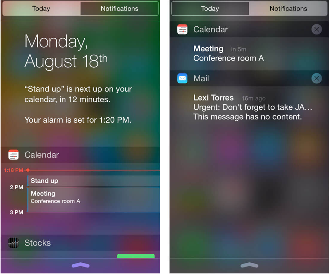
It’s likely that a good micro-moment is the thing that really makes you love – and use – an app. From notification that an item you bought online has shipped to an alarm to a sports score, these divots of information are coming at you all the time.
But what moments do you turn on? And which ones do you turn off?
The design has a lot to do with it. Google recently published a guide to “winning the shift to mobile” and included a great description of micro-moments and their importance:
“Immediate. Relevant. Frictionless. That’s the experience consumers expect when they turn to a device to find, do, or buy something.”
Google further broke this concept down into a few relevant concepts that can help guide your thinking about micro-moments and how to create them.
- It starts with strategy and you need to know what a micro-moment should do and why. Make it content based.
- Be there for users.
- Be useful.
- Be quick.
- Consider feedback and measure results.
These concepts are at the root of making micro-moments work. Think about these common interactions, how you use them and the design:
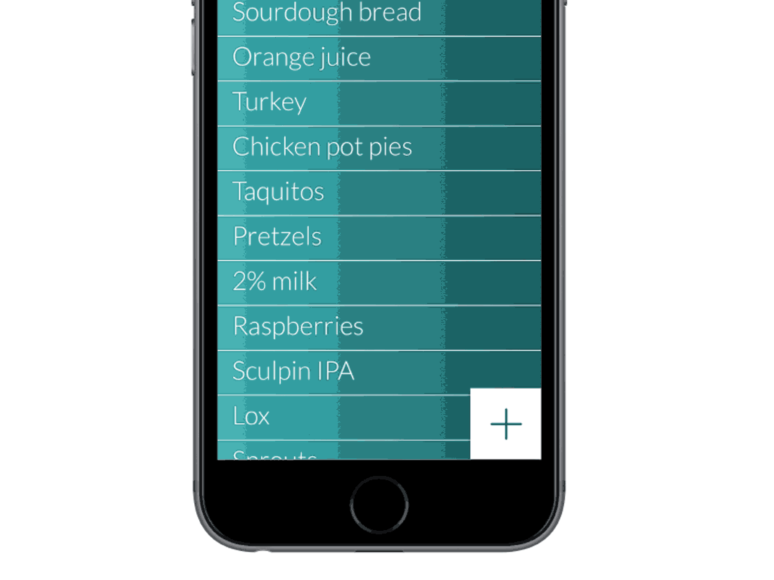
- Animation on a tap to tell you that you have added an item to a shopping cart.
- A vibration to tell you that you have put your phone in silent mode.
- A news alert that contains a few words and with a tap you go to the full article.
Each of these interactions are such a part of daily like that you don’t think about them. But chances are you love how they make things easier or more convenient for you.
Connect with Emotion or Usefulness

The convenience or connection is the core tenant behind what makes a micro-moment useful. The other related factor is emotion.
Users need to connect with every micro-moment in one of these two ways in order to be effective. Otherwise, they will probably abandon use.
The key thing to remember is that micro-moments are just that – moments. They should communicate something and connect two parties, providing an opportunity for further engagement and feedback.
In a nutshell, it comes back to human-centered design. This implies that every user feels something (even if it is not an obvious jump-out-of-your-chair emotion) and understands what happens next. Users are guided through a process with instruction and are brought into a loop for communication. Finally, a user’s needs are met and they find the experience one worth repeating.
Tiny Branding
All of the same visual tools that you use when creating any other project apply to micro-moments. The design is just minified.
These interactions need to come with a visual identity, color palette, font palette and rules for visuals, user interface elements and buttons. Micro-moments might include touch cues, vibrations or sound. It may seem like a lot to think about for something that’s about half the size of a business card.
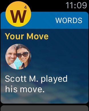
Further complicating your idea about how to design micro-moments are wearables. Not only do you need to think about how these elements look on phone screens, but you’ll likely need a second design for watches.
If your app or micro-moments work as part of a larger brand identity – say Twitter, for example – elements should follow the same brand guidelines to the degree possible. The design of these interactions can be a part of the overall branding guide. (As a bonus, guidelines for creating these tiny elements can translate to other small-scale applications for other projects.)
Readable at a Glance
Micro-moments need to be readable at a glance. Give users what they need in a way that’s easy to read without working for it.
That might make the design (and copywriting) a little tougher on your end.
- Keep the message short.
- Use active verbs.
- Stay away from spam or click-bait language, such as “you’ll never believe what happened next.”
- Use a regular weight typeface with consistent stroke widths. A sans serif is preferred.
- Increase the size and leading of text, if possible.
- Use simple animations or sounds to bring attention to your moment.
- Limit the number of micro-moments to times when the message is important so users will actually look.
Stand Out from the Crowd
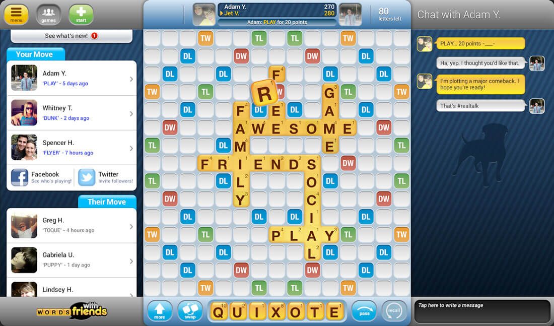
Admit it, there are some apps that you interact with every time. (I am a Words with Friends addict and impatiently wait for those micro-moments that tell me it’s my turn to play or that I scored a high point total.) Then there are others you ignore every time.
Think about the usefulness of the ones that stand out from the crowd. Is it just because you love the app? (Such as my Words With Friends addiction.) Or is it because of the design?
Study the notifications that you get and interact with the most. There’s a lot to be learned from them. Some things that often stand out to me are neat language (no bot-like phrases), oddball information, reminders and things that just look a little different (from color choices to icon shapes).
Be Authentic and Realistic
The best apps (and websites and designs in general) are authentic and realistic. They are true to what they are, what they do and how user interactions take place. Every moment spent with a user should reflect this.
Google broke this down into four types of micro-moments which capture this essence.
- I want to know
- I want to go
- I want to do
- I want to buy
What do your users want? How will you deliver it to them?
As you answer those questions, be real. Do what you do. Follow the mission of your brand or business and provide something that is truly yours. Users will thank you.
Conclusion
Are micro-moments something you regularly think about or plan for in the design process? The world of design is changing and the scope of projects continues to grow thanks to elements such as this.
Micro-moments are rapidly becoming one of the most important small elements associated with digital projects. Don’t overlook this tiny, but important user element.
Image Source: Death to the Stock Photo.