How to Design a Perfect Website Onboarding Process (With Examples)
Think about the last time you downloaded a new app or landed on a new website. Did you know exactly what to do? Did the design help you engage with the site in a meaningful way? A simple onboarding process can make all the difference.
It’s important to think about website and app design in terms of onboarding visitors to create the best experience possible. This can include anything from helping someone find an item in your online shop and understanding how to make a purchase, to playing a game, or signing up for an email.
Onboarding is the process of integrating any new user into the design flow so that they can have the best interaction possible with your website, app or digital product or service. Here’s how you design it (with examples for inspiration).
Design for Visual Flow
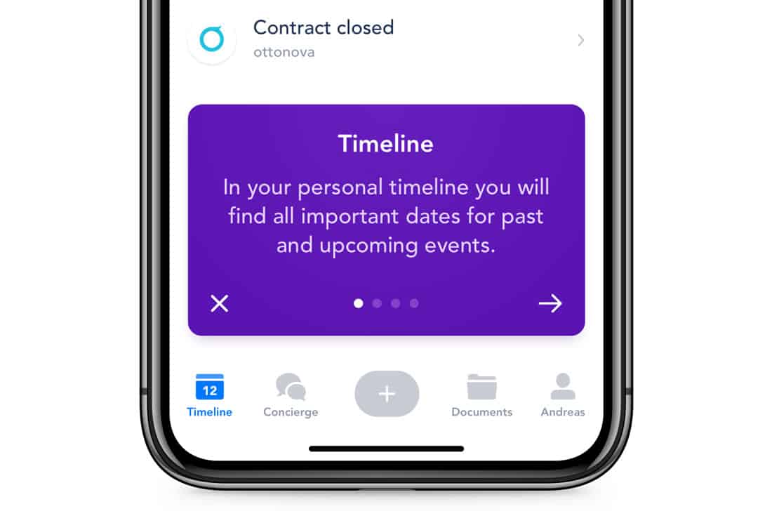
A good onboarding experience has a beginning, middle and end that’s easy to identify visually.
The user knows where to start if they need help or want to get information. This is often a large image are with an introductory line of text. (Think hero image.)
Then there’s an action to take such as filling out a form or working through a step-by-step guide or tutorial. Finish off with a notification that the action is complete and the user is on their way to success. (This sense of understanding and accomplishment can help keep users engaging online.)
The final notification should include an action that users can complete, such as “now you are ready to play the game” or “tap here to get started.”
Show Users What You Want Them To Do
The onboarding experience should be easy and clearly understandable. This is especially important if your website or app uses uncommon user patterns or unfamiliar functionality.
This is a place where you need to show the user what to do. Use tooltips or a short video that explains how engagement works. Explain the goal or expected outcome and how users can get there.
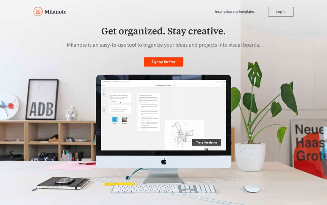
Milanote, above, does a great job with this on the website homepage. There’s a computer screen showing the app in use in the hero image area. Whether you watch it for a few seconds or the entire loop, this quick video shows every person who comes to the site how to interact with the tool and associated app.
Don’t State the Obvious

When you start thinking about instructions and onboarding experiences, it is easy to get carried away. Resist the temptation.
Only provide instructions and information for unfamiliar actions or navigation. (There’s no need to explain a hamburger icon or common button structure.)
By stating obvious interactions unnecessarily, you risk frustrating users by extending an onboarding process in a way that doesn’t need to happen. The best instructions are simple and only appear when necessary.
The website for Elizabeth Taylor, above, has a side to side slider at the top with visual instruction on how to use it, thanks to arrows. That makes it easier for users to engage with the content at their own pace.
Write Copy That Sizzles
Boring copy just won’t cut it. Every little dialog box – even those that contain a few words needs to be interesting and engaging. Use common language in the same voice as the rest of the website or app design.
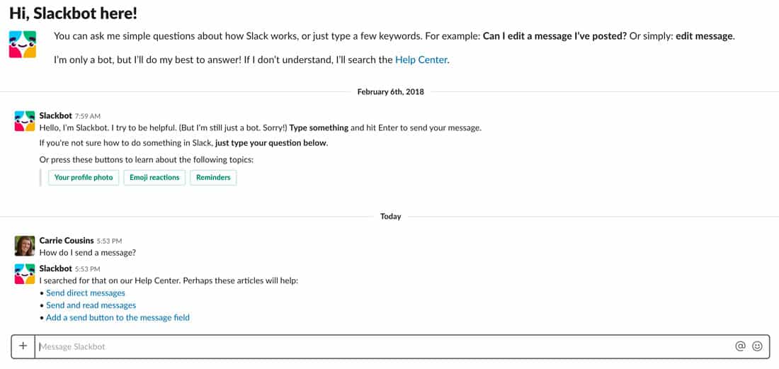
Use active verbs and direct instructions in a friendly tone. Slack, above, does a great job of this with a bot that feels like a person (even when you know it’s not).
Make It Clear If Users Must Register
Does a new user have to register for your website or app? Will features work if they do not?
First, make it abundantly clear what the expectation is and what benefits come in exchange for registering. Then, offer a “taste” for free to get people interested in the app or website.
Then, ask for registration to unlock more features or content. And keep that ask simple, using a form that only requires essential information. (You can always ask users to provide more data later.)
Provide a Tutorial
Map out the process from landing on your page or app for the first time through success. (Draw a flow chart if you must.)
This can help you figure out if your design is easy or complicated. It can also provide the roadmap for a potential tutorial that shows users exactly what to do and how to interact with the design.
Ryan Osilla has a great look at how common websites have designed perfect onboarding flows (and flowcharts). Examples walk through the steps to create accounts and get started with a popular tool such as LinkedIn, GitHub, UpWork and Twitter. (You’d be hard-pressed to find better examples of mapping onboarding flows.)
While all the examples Osilla outlines are straightforward, you can use this information to create a tutorial with more specific instructions for unfamiliar actions. Once you have built the flowchart, creating a tutorial can be easy.
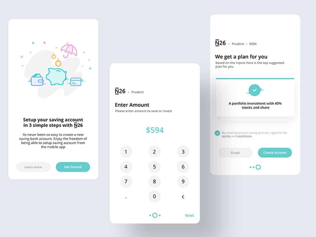
Show One Feature at a Time
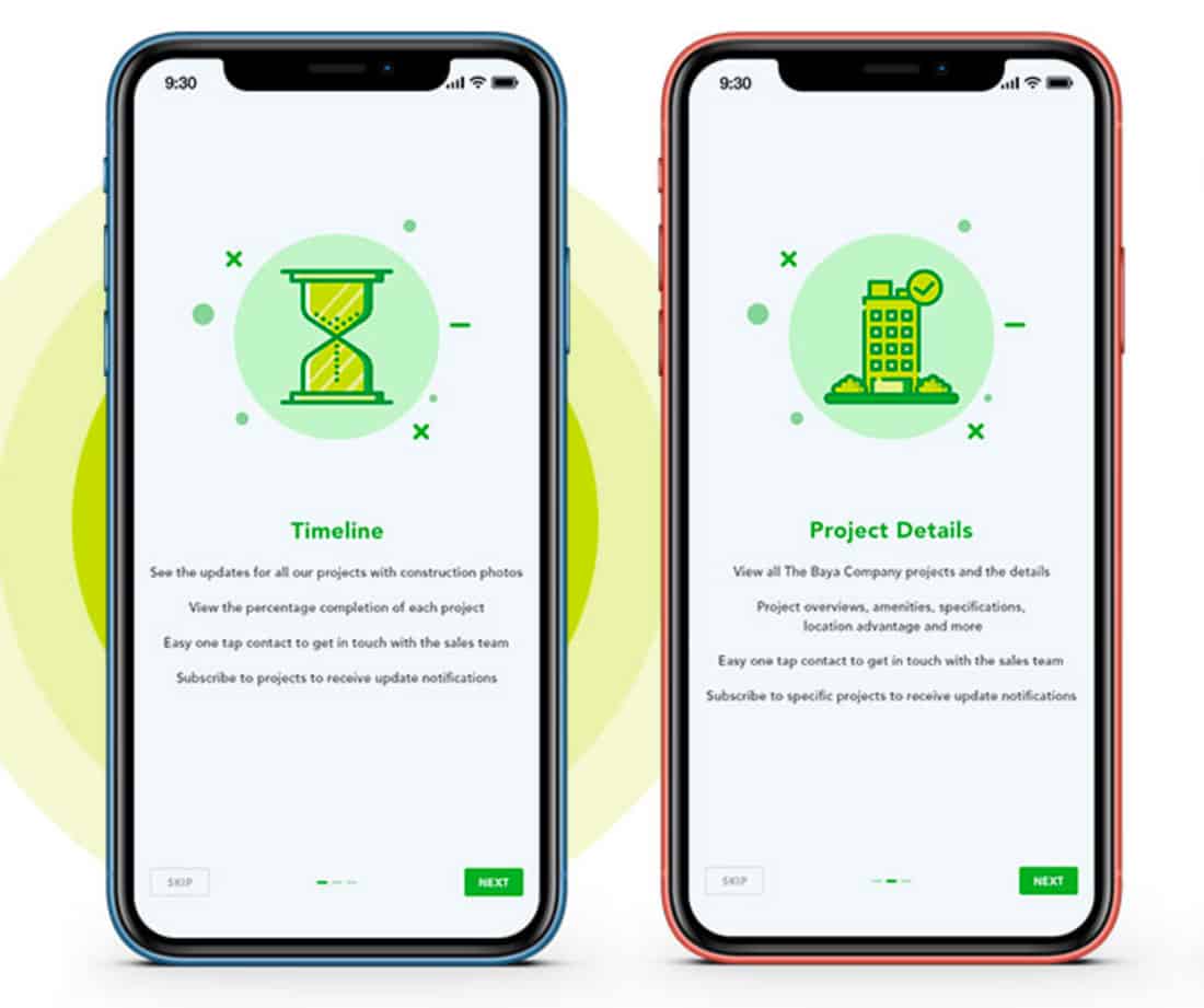
A good onboarding process works when it includes step-by-step instructions that are easy to follow (or skip). Remember, the goal is to create excitement and understanding about a digital product so you want users to get through the process efficiently.
Provide a clue as to how long an onboarding example will last. Show a progress bar for multiple-screen tutorials or information with buttons to skip ahead or go back.
Don’t forget to focus on the benefits for the user. What makes your website or app fun? Why should they want to complete the onboarding process and continue? Sell this benefit to everyone who visits your website design.
Conclusion
The goal of an onboarding experience is to give users information that can help them better understand and engage with your website or app. Remember to stick to explaining things that need it, show users what to do when possible and provide navigation.
Keep the flow simple and smooth with great images and micro-copy and reward users for completing onboarding tasks.
Onboarding is anything you do to keep users interacting with your website. It can be a game or form, but it can also be diving deeper into the content. Design something they will enjoy to make it the best experience possible.