Are You Mentally Overwhelming Users? (And How to Stop Doing It)
The internet is a tangled mess that’s visually overloaded. There’s so much to look at… and read… and comprehend, that it can be difficult to find focus and figure out what is important.
If your design is visually overloaded, chances are that you are overwhelming users and they are leaving your website or app. So how do you know if you are doing it? We’ve got a list of warning signs for you, plus a few ways to strip some of the weight out of the design and make it more manageable for users.
You Don’t Have Defined Styles
Styles and palettes are the backbone of good design. When it comes to websites, everything should be defined in the CSS so that styles are defined (and used) throughout the entire website. (Don’t rely on memory or manual changes when styling elements from page to page.)
Defined styles include everything from the font palette (with size and color usage) to a color palette to how elements, such as buttons or links, should appear and function in the design. A lack of styles can overwhelm users because there’s often inconsistency in the way things look and behave between pages, causing users to question whether things are working properly or if they got the information they requested with a previous click.
Having defined styles will also help prevent “overdoing” the design and making changes without reason. A logical, consistent pattern can help users find information with ease and stick with the design.
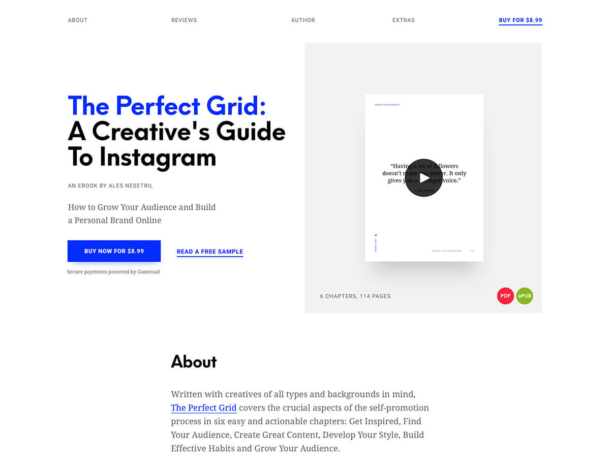
The Perfect Grid Book is a solid example of simple, consistent design.
Everything Is the Same Size
You can’t have a conversation about styles and CSS without talking hierarchy. Does your design have a clear hierarchy for text and other elements (from photos to buttons to links)?
The key part of that question is “clear hierarchy.” Styles need to be different enough that the most casual user can clearly tell the difference between a headline and body text or a button or photo. The most common problem in terms of overwhelming users is that every element feels the same size (or elements fall into groups of a couple sizes).
Size is more than just width and height or point size for typefaces. How big or different do objects appear when placed side by side? Visual weight or size is just as important and even elements of different types (text next to a photo for example) need to have varying visual weights. Color, space and image content can play a large role in determining how large something looks on the screen. Plan for variances in the visual size of elements to create a visual path for users that helps direct the eye from the most important items on the screen to the least important.
Your Bounce Rate is Really High
Do you pay attention to the bounce rate in your website analytics? If the number spikes after a design change, it could be the result of visual overload. (On the flip side, it could be that search and the design are so great that users immediately found what they were looking for.)
Compare bounce rate to time on site. Ideally, a low bounce rate and high time on site are good. If those numbers start to shift in the other direction, it could signal a problem.
If users are leaving your site too quickly, dig a little deeper into the analytics to find out how they arrived at your site in the first place and what they are looking for (using click patterns, top pages and search results). Adjust the design to make these elements high-priority items.
Users Aren’t Clicking the Right Things
While you are digging in analytics, make note of what users are clicking. Do actual clicks correspond with desired clicks? If users aren’t doing the things they are “supposed to do” with the design, it can indicate a visual problem. Buttons might not be large enough or clear enough or copy might not lead users to the appropriate calls to action.
Often the problem is that there are too many things to do. Imagine a website with a large call to action in the hero image, with an email submission form right below it and a pop-up requesting information in the form of a coupon. What would you click first? Or do you just close the website and move on with your life?
If you would do the latter, it’s from the overwhelming nature of the design and is due to cognitive overload, or the amount of brain power needed to use your website. There are too many choices coming at users too fast to process them all.
The solution is an easy on. Limit the number of actionable elements to one per “screen” outside of navigation elements or the footer. In the scenario above, the design could include a call to action in the hero image, but nothing else. The email form would live on another page or below the scroll as would the pop-up box.
The Design Is Packed With Tricks
Too many design tricks or trends or elements might feel cool when you are doing it, but can ruin the user experience. Try to keep the design to one design trick that provides a point of interest for users, but does not mentally overwhelm them.
Don’t ever let fads or things you want to try get in the way of one of KISS – keep it simple, stupid (which might be the best design philosophy of all time).
User Patterns Aren’t Actually Patterns At All
Are the functions within your website common and well-understood? Nothing can overwhelm a user like making up a new way to do something. Left to right scrolling, rather than up and down, or buttons that don’t look like buttons are just a couple of examples of user patterns that aren’t patterns. And users don’t like them.
Stick to commonly accepted user flows, tools and actions to ensure that the majority of visitors know how to interact and engage with your site. If the design requires instructions, it is probably too complicated. Use icons and elements that are also well-known. The shopping cart icon is an example of an element that every user understands and expects a certain action from.
The hidden menu, hamburger icon, is an interesting example that started as something that users didn’t understand, but has evolved into a fairly common user pattern for mobile and even desktop navigation. But it is not without controversy, with many designers still speaking out against use.
While it can be fun to create something totally different and new, think about the goals of the design project. If you need users to move through the site and perform specific actions – this is vital for e-commerce websites – common user patterns are key.
There’s No White Space
Clutter is a website killer. White space can save the design and help provide users with directional cues, help establish hierarchy and make everything feel lighter and easier to understand. Simply increasing the space between lines of text from single to 1.5 lines can increase time on site and readability.
Space can impact users in other places as well. Wider gutters and space between elements can contribute to comprehension and understanding. Exaggerated white space around an element can make it seem important and bring focus to that area on the screen.
Space also has a calming effect for many users, whereas a design crammed with elements can make a user feel frenzied and rushed.
Conclusion
It’s a phrase we’ve used at Design Shack in the past: When in doubt, leave it out. Keep this idea in mind when trying to streamline a design that might feel cluttered or overwhelming. Visual clutter is a real problem, both on individual websites and when casually browsing the internet.
A design that’s easy on the eyes will hold users longer, and hopefully, encourage more conversions. Every page, or screen, should have a single user action in mind to help encourage the right clicks at the right times.