Mobile Microcopy: Writing UI Text for Tiny Screens
In mobile UI design, every word counts.
With limited space and even less user attention, writing microcopy for mobile interfaces is more than just squeezing content into smaller screens; it’s about making every message clear, helpful, and human.
Mobile microcopy includes things like button labels, placeholder text, error messages, onboarding hints, and confirmation notes. These small pieces of text may not seem like a big deal, but they have a huge impact on the user experience.
They guide people through actions, reduce friction, and help apps feel more intuitive.
In this post, we take a look at how to write effective UI text for mobile, the challenges that come with small screens, and tips for making microcopy clear, friendly, and useful.
What Is Mobile Microcopy?
Mobile microcopy refers to the small bits of text that guide users through an app or mobile website.
These include button labels, form instructions, error messages, tooltips, notifications, and more. It’s the kind of writing that users often don’t notice when it works, but definitely notice when it doesn’t.
Unlike headlines or long-form content, microcopy is short and functional. It appears in places where space is tight and timing matters.
The goal is to help users understand what’s happening, what to do next, or what went wrong, without slowing them down.
Adding just two words of microcopy, such as “view package” instead of just “add to basket,” raised conversion rates by 17.18% by clarifying product details and reducing user confusion.
On mobile, where screen size is limited and attention spans are short, microcopy plays a key role in keeping the experience smooth.
It acts like a quiet guide in the background, offering clarity and support at just the right moment. Done well, it makes your app feel more intuitive, more human, and more usable.
Why Microcopy Matters on Mobile
On mobile, users often move fast and expect things to be intuitive.
The right microcopy helps users understand what’s happening, what to do next, and how to recover from mistakes. It also adds personality to your product without taking up space.
Good mobile microcopy:
- Reduces confusion by setting clear expectations
- Boosts confidence by guiding users through actions
- Makes apps feel more human and approachable
- Prevents user errors by offering helpful cues
- Builds trust with transparent and timely messages
Because mobile screens have limited space, poorly written microcopy can make an app feel confusing, frustrating, or even broken.
Clear UI text is what connects the interface to the human on the other side.
Common Types of Mobile Microcopy
Microcopy shows up in many places across mobile apps and websites. Some of the most common include:
- Button labels – Action text like “Send,” “Continue,” or “Try Again”
- Form fields – Placeholder or helper text like “Enter your email”
- Error messages – Simple explanations like “Password too short”
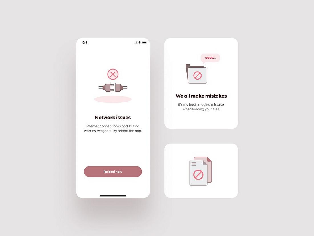
- Empty states – Friendly prompts like “No messages yet”
- Tooltips or hints – Quick guidance to help users understand features
- Confirmations – Feedback after an action, like “Saved” or “Order placed”
Each of these plays a small role in the experience, but together, they shape how users feel while interacting with your app.
Examples of Effective Mobile Microcopy
Great microcopy doesn’t just explain, it adds clarity, personality, and confidence to the user experience.
Below are some examples from different parts of the mobile interface where microcopy shines, helping users feel guided, understood, and even a little delighted.
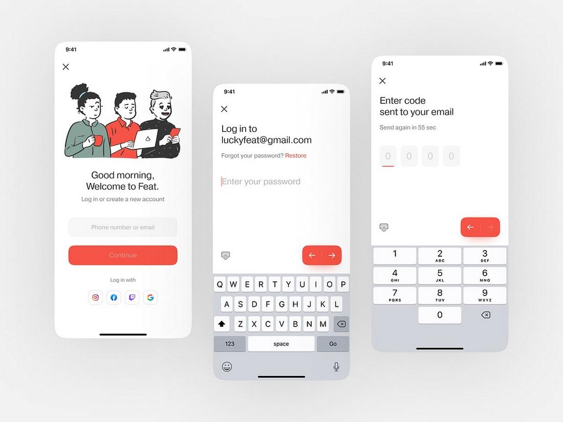
Button Labels
Clear, action-focused button text is key to moving users forward. Instead of vague words like “Submit” or “Okay,” great apps use more specific labels.
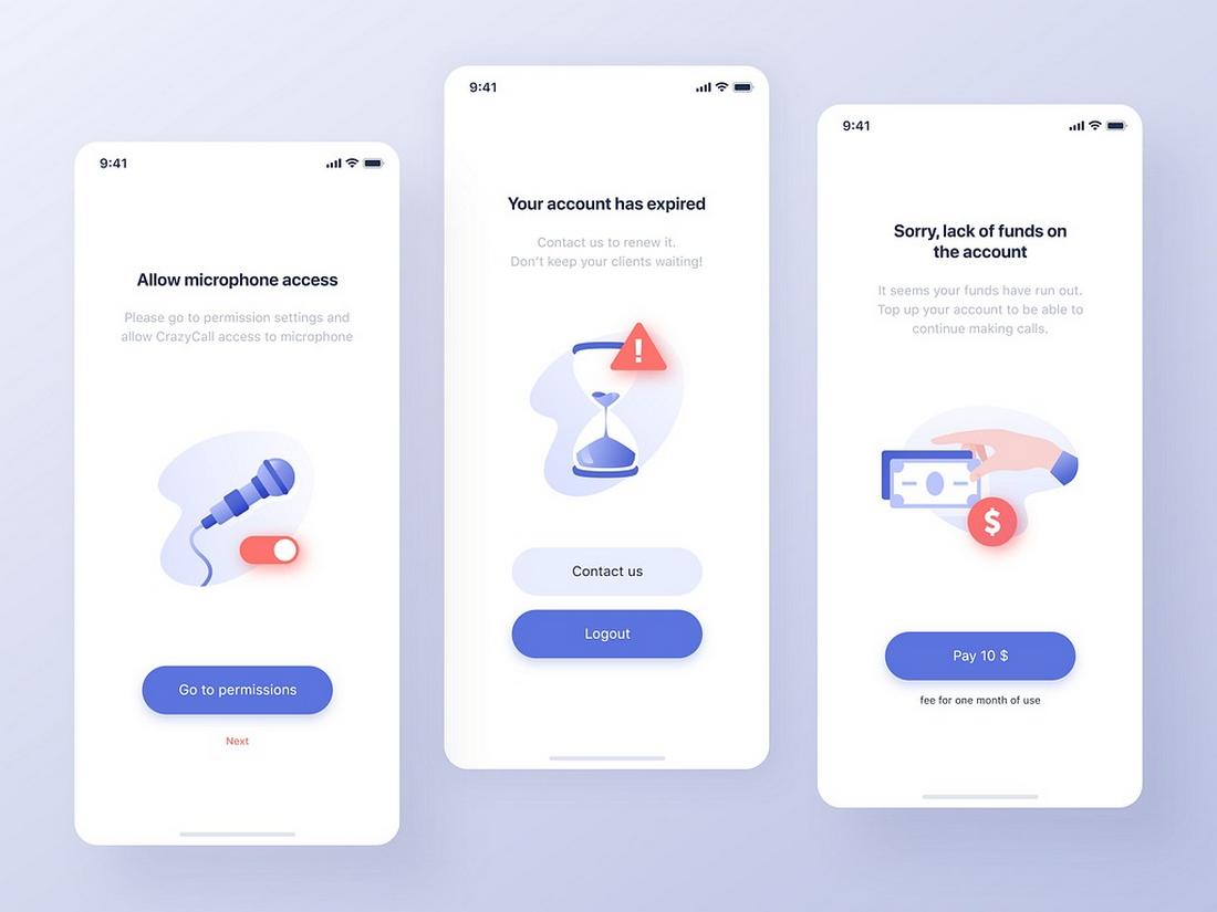
Error Messages
The best error messages do more than say something went wrong—they explain what happened and how to fix it.
Empty States
Empty screens can be confusing if they’re just blank. Well-written microcopy in these spaces offers guidance or encouragement.
Video Games
In mobile games, microcopy creates personality and builds immersion. Whether it’s part of a tutorial or a pop-up tip, good game microcopy keeps the experience smooth and fun.
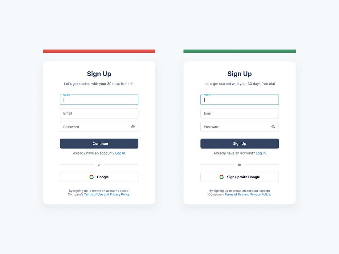
Form Fields
Forms are a common pain point on mobile, but good microcopy can make them much easier to complete.
7 Tips for Writing Better Mobile Microcopy
Writing for mobile means being clear, concise, and helpful all at once.
Here are a few tips to make your microcopy work smarter on small screens:
1. Keep It Short, But Not Cold
Space is limited, but that doesn’t mean your tone has to be robotic.
Aim for short phrases that still sound friendly and human. Instead of “Submit,” try “Send Message” or “Join Now”, phrases that are clear and inviting.
2. Use Action-Oriented Language
Buttons and calls-to-action should tell users exactly what will happen.
Start with a verb when possible: “Upload Photo,” “Add to Cart,” “Start Trial.” It sets expectations and reduces hesitation.
3. Avoid Jargon or Vague Phrases
Your users may not know your product’s internal language, so don’t assume they’ll understand vague or technical terms.
Use everyday language and keep things simple. Replace “Authentication Failed” with “Incorrect password” for better clarity.
4. Write for Errors Before They Happen
Prevent frustration by writing helpful field hints or instructions before users run into problems.
For example, “Password must include a number” is more useful upfront than just saying “Invalid password” later.
5. Be Specific with Feedback
Instead of generic messages like “Error occurred,” tell users what went wrong and what they can do about it: “Payment failed—check your card number and try again.”
Specificity builds trust and saves time.
6. Match the Tone to the Brand
Microcopy is a great place to show brand personality, but keep it consistent.
A friendly, casual brand might say “Oops! That didn’t work,” while a more formal app might choose “We couldn’t complete that request.” Either can work, just keep it on-brand.
7. Don’t Sacrifice Clarity for Cleverness
A witty phrase might feel fun, but if it confuses users, it’s not helping.
Save creativity for places where it won’t interfere with usability, like success screens or empty states, not buttons or error messages.
Conclusion
Mobile microcopy might seem like a small detail, but it plays a big role in how people experience your product. With limited screen space and even more limited attention spans, the words you choose can guide, comfort, or confuse.
By writing clear, helpful, and human UI text, you not only improve usability, you help your app feel more polished, intuitive, and trustworthy. Whether you’re refining a sign-up flow or updating a button label, remember: great design speaks, and microcopy is how it talks.