Personalized Email Design: Merging Data With Good Design
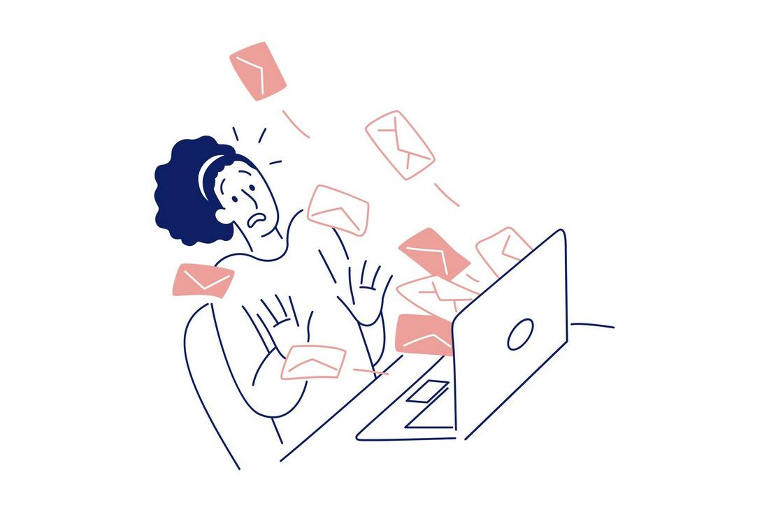
We all know the feeling of scrolling through a crowded inbox, skimming subject lines, and only clicking on the emails that actually feel relevant.
That’s where personalization comes in. But personalization isn’t just about inserting someone’s first name. It’s about using smart data and thoughtful design to create emails that feel tailored, timely, and worth opening.
When personalization meets great design, the result is more than just better click rates.
It’s a deeper connection with your audience. You’re not just sending emails, you’re starting conversations, offering value, and showing users you understand what they care about.
In this post, we’ll explore how to merge data and design effectively to create personalized emails that look great and perform even better.
Why Personalization Matters in Email Design
Personalization has gone far beyond basic name inserts. With the right tools and data, you can customize content, images, offers, and layouts based on user behavior, preferences, and purchase history. And that level of relevance pays off.
This is especially important in email marketing. Well-personalized emails have higher open rates, better engagement, and increased conversions.
“Open rates for personalized emails average 188% compared to 12.1% without personalization” – Campaign Monitor
They feel more like curated messages than bulk blasts, and that makes users more likely to take action. But personalization only works when it’s supported by good design.
You still need hierarchy, layout, and clear visuals to guide the reader’s eye and deliver your message in a way that feels easy and enjoyable to read.
Using Data to Drive Email Design
Your user data should inform both the content and the design structure of your emails.
When done well, this turns a standard email into a tailored experience that feels personal and relevant, increasing the chances of clicks, conversions, and long-term engagement.
Behavioral Data
This includes how users interact with your emails and website. What products have they browsed? Which blog posts have they read? What categories do they gravitate toward?
“60% of shoppers return to finish their purchase after getting a personalized abandoned cart reminder” – Instapage
If someone frequently clicks on sustainability-related content, you can design an email that highlights eco-friendly products or green tips, complete with matching visuals, color palettes, or icons that reinforce the theme.
Demographic Data
Knowing your users’ age, location, gender, or job role can help tailor the tone, layout, and visual style of your emails.
For instance, a city-based millennial professional might respond well to sleek, minimal email designs, while a parent in a suburban area might appreciate clear, product-forward layouts with practical details and CTAs.
Transactional Data
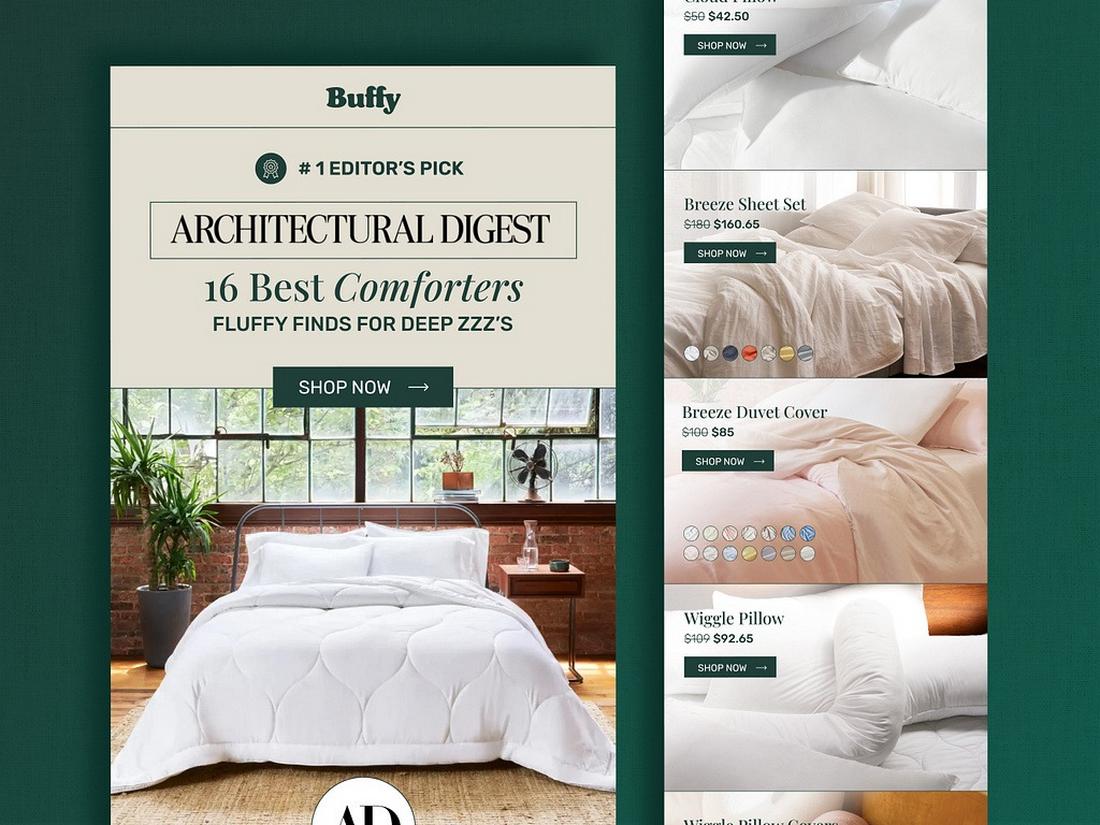
Purchase history or order frequency is especially useful for e-commerce brands. You can design reorder reminders, loyalty perks, or product recommendations based on past behavior.
If a user recently bought a camera, your email might feature a “complete your setup” layout that highlights accessories, organized with smart design grids and personalized CTAs like “Pick Your Lens.”
Engagement Data
Track which types of emails users open, what time they tend to engage, and which devices they use. If mobile open rates are high for a segment, your design should prioritize vertical scrolling, larger touch-friendly buttons, and short, digestible content blocks.
If they respond well to promotional campaigns, consider making those banners more prominent or dynamic.
Preference and Survey Data
If users have filled out profile preferences or responded to a quiz, use that data to influence layout and content types.
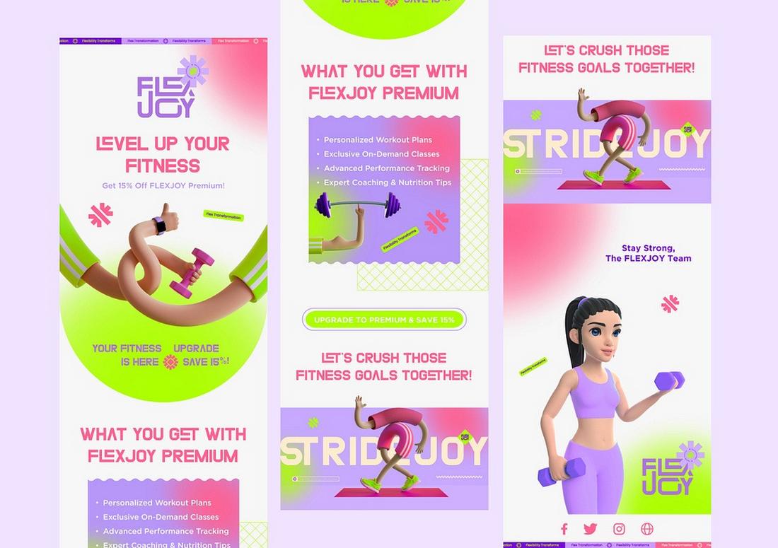
Someone who marked “Tech & Gadgets” as their top interest might receive a bold, image-driven layout that highlights new arrivals and top-rated devices, while a “Wellness” customer could receive a calmer, more editorial-style design with featured articles and product bundles.
The point isn’t to redesign each email from scratch for every user, but to build flexible, modular systems that shift depending on what you know about the person.
How to Design Personalized Emails
Once you know what kind of message you want to send, it’s time to design around it. Here are a few strategies to keep your personalized emails effective and visually appealing.
1. Segment Before You Design
Before building your layout, think about how the message might vary between audiences. Segment your list based on user traits or behavior, and build modular designs that can easily adjust to different content blocks.
“Segmented and personalized emails generate 58% of all revenue.” – Instapage
This allows you to reuse a base template while still creating a unique experience for each group.
2. Personalize More Than Just the Name
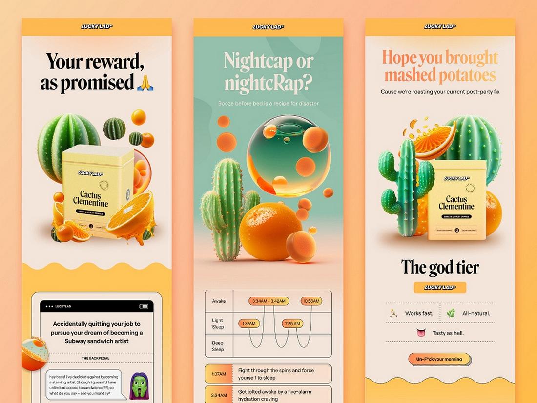
Go beyond “Hi [First Name]” by referencing recent activity, location, or preferences.
For example, “Looking for jackets in Seattle?” paired with a raincoat image, or “Still thinking about those headphones?” with a call-to-action to revisit the product page.
3. Use Dynamic Content Blocks
Design your email with sections that change based on user data. This could include product recommendations, blog articles, or event invites. Many email platforms support dynamic content that automatically swaps based on user attributes.
4. Keep the Layout Flexible and Scannable
Personalized content should still follow good design principles. Use a clear hierarchy with headers, subheadings, and visual breaks.
Make sure each section can stand on its own so readers can scan and interact quickly, even if some content isn’t relevant to them.
5. Match Visuals to the Message
If the email references a specific location or season, reflect that in the imagery. A winter sale email for users in New York might show snow and cozy clothing, while users in Florida see lighter visuals.
These small details help your emails feel more thoughtful and relevant.
6. Stay On-Brand
Personalization should enhance your brand, not confuse it. Stick to your brand fonts, colors, and tone of voice, even when swapping content based on audience data.
This consistency helps build recognition and trust, no matter how tailored the email is.
7. Test and Optimize
Even with good data and strong design, it’s smart to test. A/B test subject lines, layouts, and image variations based on audience segments. Use the results to refine future emails and improve performance over time.
Common Mistakes to Avoid in Email Personalization
Personalized emails have a lot of potential, but it’s easy to go off track if you’re not careful. When personalization is rushed or poorly implemented, it can feel awkward, irrelevant, or even intrusive.
To make sure your emails land the right way, here are some common mistakes to watch out for—and how to avoid them.
Generic Placeholders
One of the most obvious personalization fails is when variables don’t load properly. Seeing “Hi [FirstName]” or “We have an offer just for you, [CustomerName]” immediately breaks trust.
Always test your dynamic fields before sending and have a fallback in place that still reads naturally, like “Hi there” or “Thanks for being part of our community.”
Over-Segmenting Your Audience
While segmentation helps you deliver more relevant messages, going too narrow can backfire. Creating overly specific groups can lead to repetitive or shallow content, especially if you’re just changing a few words across many emails.
It also becomes hard to manage. Focus on meaningful segments that actually change how you design or write the email.
Cluttered Layouts
When trying to pack in personalized product suggestions, dynamic banners, and unique offers, it’s easy to overcrowd the design.
This overwhelms the reader and makes the content hard to scan. Stick to one main focus per email and use whitespace and visual hierarchy to keep things clean and digestible.
Too Much Personalization at Once
When every element in an email is personalized, the subject line, greeting, content blocks, and recommendations, it can start to feel mechanical or overly engineered.
Keep it human. One or two thoughtful touches are often more impactful than trying to personalize everything.
Skipping A/B Testing
Just because a personalized email looks good doesn’t mean it performs well. Not testing different layouts, images, or messages for your audience segments can lead to missed opportunities.
Run A/B tests to see which personalization strategies truly connect with your audience.
Conclusion
Merging data with design is the future of email marketing, but it’s not just about fancy tools or big data. It’s about creating thoughtful, relevant experiences that show your audience you’re paying attention.
By pairing smart personalization with clear, visually engaging design, you can build emails that feel helpful, human, and worth opening. It’s not about being flashy—it’s about being intentional. And that’s what turns a standard message into a strong connection.