15 Tips to Improve Your UX Writing
There are so many micro elements that are a big deal with it comes to user experience design. A lot of focus has been put on micro-interactions and engagements, but what about micro-copy?
UX writing is a big deal. The words, language, and composition of sentences and phrases throughout a design can make it or break it. (Think about how many times you’ve turned away from a website or app because directions were unclear, or a typo made you angry.)
Today’s the day you should vow to improve your UX writing. It’ll make your website or app better. And it’ll definitely make users happier. Here are a few ways to do it.
1. Define Your Voice

Every website, product or brand has a voice. What sometimes happens is that we forget it when it comes to the user experience and overall interface.
Even the smallest text elements – buttons, signup elements, menus and navigation, and even chatbots should use that same brand voice. These elements should have the same personality.
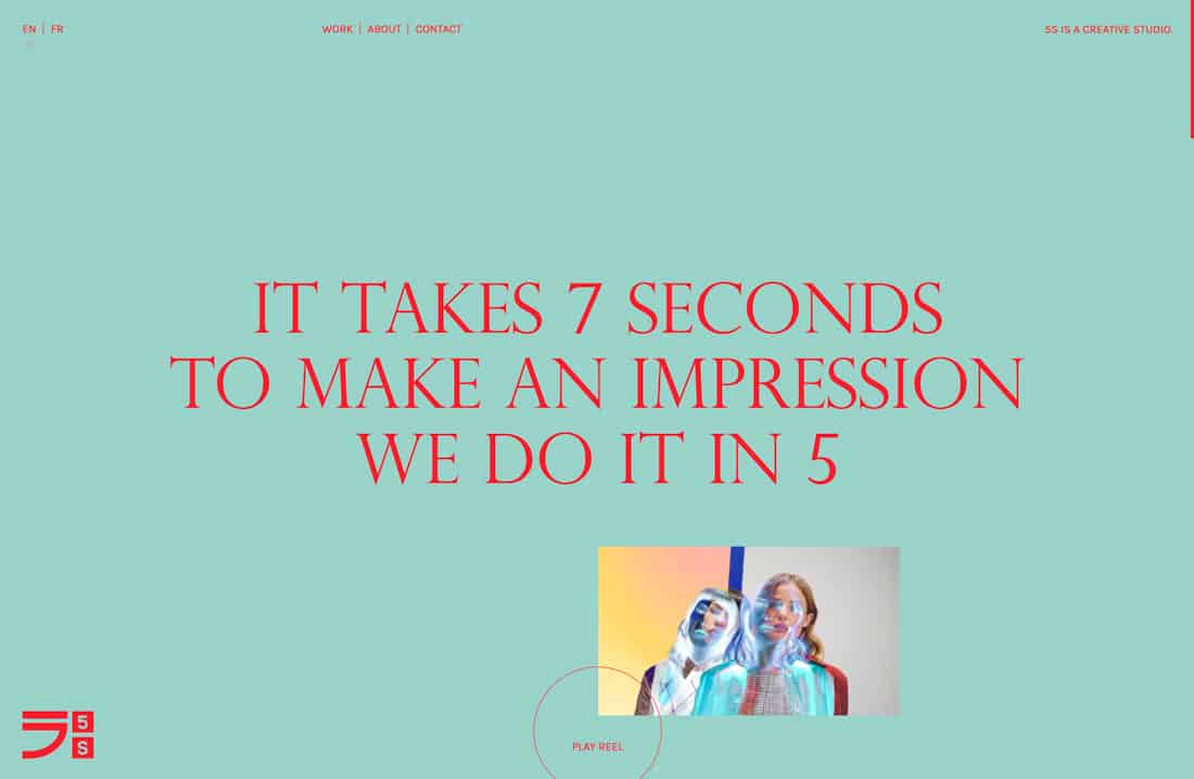
Stick to the type of language and tone that the rest of the site uses. And write microcopy that works for the target audience. Five/Four, above, uses a light tone throughout the site. That conveys through the button; rather than the traditional “contact us,” they write “hire us.” Simple and effective.
2. Create a Structure

Everything about visual design has a structure. You use a grid. You pair and parse elements so that pieces work with each other.
UX writing is the same. The words throughout the design should have a structure. Buttons should use a common set of words – if you use “learn more” to continue reading in one place, you shouldn’t use “read more” somewhere else.
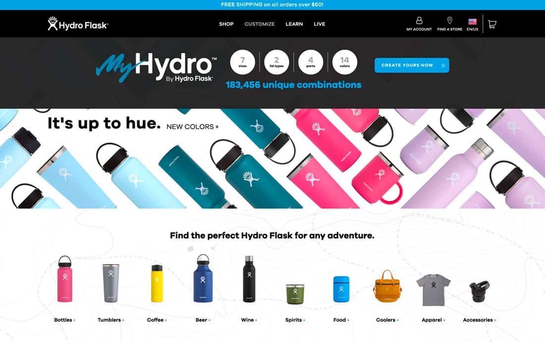
Copy should have a common style, just like picking colors for elements on the screen. Develop a set of rules for micro-copy and treat the text elements in the same way as visual ones, with a style that’s defined and must be upheld throughout the design. Midmod, above, uses “Shop” at the beginning of each call-to-action button to tell users what they will do next with a click or tap.
3. Be Simple and Concise
You’ve probably heard the adage – users have the attention spans of a goldfish.
The best UX writing is simple and concise. Users can read it at a glance and know exactly what to do next.
Don’t make them think too hard to figure things out. They might abandon your design in the process.
4. Eliminate Words You Don’t Need

Redundant words waste the user’s time. So does flowery language.
Do everyone a favor and eliminate every word that you don’t need while writing the micro-copy. (For many of us, that can be as much as one-third of the text.)
This is where having a great editor can come in handy.
5. Use Personal Pronouns
Use language that’s inclusive to create better connections. While some writing doesn’t allow for it, UX writing is the perfect place to use personal pronouns.
Personal pronouns are a good choice because they help create an association with a specific person. While I might use “the user” in this article, I’d caution you against it. (My context is a little different here.) Speak to the audience. Don’t speak about them.
What are personal pronouns? Here’s the list:
- I
- You
- He/Him
- She/Her
- It
- We/Us
- They/Them
6. Ditch the Synonyms
Unless you work for Dictionary.com or Webster’s, your website is not a thesaurus. Avoid synonyms because you think it makes website copy more interesting.
It doesn’t. This only makes it more difficult.
Every element that does the same thing, you use the same words. If buttons mix these phrases – buy, purchase, bargain, score, obtain, deal — and all do the same thing, you are doing users a huge disservice. (And they might just abandon your site.)
7. Don’t Scream at Users

All caps writing has a place, but often it can come across as overwhelming to users. The softer alternative, especially if you have more than a few characters in a small size is to use title case.
This is somewhat of a shift in thinking from not too long ago when many of us were recommending that buttons be in all caps. But as buttons have gotten larger, all caps just seems a little over the top. (Don’t you think?)
8. Take Care with Numbers
Numerical formats are easiest to read when you use actual numerals. Yes, I know that Chicago and AP styles say that you should spell out certain numbers, but when it comes to UX writing, digits are just easier.
Digits are easier to read at a glance as well.
But make sure to use accurate punctuation such as commas between long number such as 123,456, spaces between credit card entries to make it easy to keep track of digits (important for e-commerce) such as 1234 5678 9123 4567.
9. Don’t Make Up Words
This one should be obvious in a world where being able to Google something is vital to web success. But it still happens a lot.
Don’t make words up.
Don’t spell things wrong.
Don’t use odd abbreviations or things that people would never think to search or say out loud.
If you do any of these things, you are only making it harder for people to find your website. (That is unless your misspelling brand name is so wildly popular that it becomes an “actual thing.” But don’t count on it if you aren’t already there.)
10. Focus on the Positive

Try to empower users with can-do language throughout the design. By using positive associations and messages, users are more likely to feel like they can (and have been invited) to participate in the design.
This active language with a good vibe can make people more inclined to click. (It makes sense really – do you like to be told you can’t do something?)
11. Use Active Verbs

Active verbs directly reference a subject and what they are doing. (It can also be inferred.)
When it comes to UX writing, what is important is that the words create a sense of action and what is happening in the design. You want users to be a part of whatever you are selling.
Bear’s Ointment, above, does a nice job with words – Warming, Intense Warming and Cooling – that you can almost feel. That creates a connection between the design, text, and user.
12. Avoid Jargons
Be careful of using words that not every user will clearly understand. Even if your website has a very targeted audience, others might happen upon the site and you want them to get it to some degree.
Stay away from jargons that not everyone will understand. Even though we live in a world where LOL, OMG, and WTH are everywhere, there are just as many people who might take the wrong meaning away based on their own experiences.
13. Use Lists
This one is easy: A list should look like a list (not a thick paragraph). It doesn’t matter if you use bullets or numbering. It just needs to be an obvious list.
14. Sell Yourself
All copy is sales copy. It doesn’t matter what your website does or what content you create, you need to always be selling. You are selling an idea to interact with the website. You are selling a product or service. You are selling that your design is more interesting than everything else the user has happening at that moment in time.
5S Content, above, does this distinctly. It’s direct and bold and I want to know more. They sold me.
15. Make Longform Easy to Digest
Sometimes when you start talking about writing for UX, people just assume that long copy blocks are bad. We do spend a lot of time thinking about micro-copy, but long-form content is a good thing.
You just need to break it up a bit.
Use headers and a hierarchy to create visual separation as well as contextual separation. Users will scan all those headers and quote blocks to determine if they want to keep reading or not. Give them as many opportunities as possible to re-engage and stay with the content.
Conclusion
There’s almost nothing as delightful as good copy. You know you’ve found it when you read through text on a website and think “these people get me” or “this is my kind of space.”
That’s what good UX writing does. It brings the design and the user closer together. It helps establish a connection that will keep users hooked and interacting with your little piece of the internet.