11 Tips for Creating a Usable Website Contact Page
Peek at the analytics. Chances are that your contact page is among the most visited on our website.
It’s for good reason. Visitors will seek out a contact page to get additional information about your company or business, find your location, or get in touch.
Now the bad news. This is an often-neglected part of the website design. Too many websites don’t take care of the contact page, resulting in missed opportunities and conversions.
You can remedy that right now with these tips for creating a usable contact page.
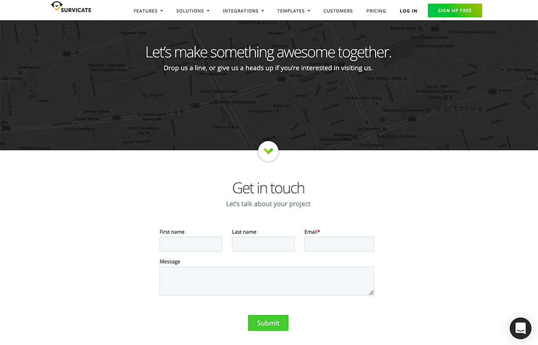
1. Make It Inviting
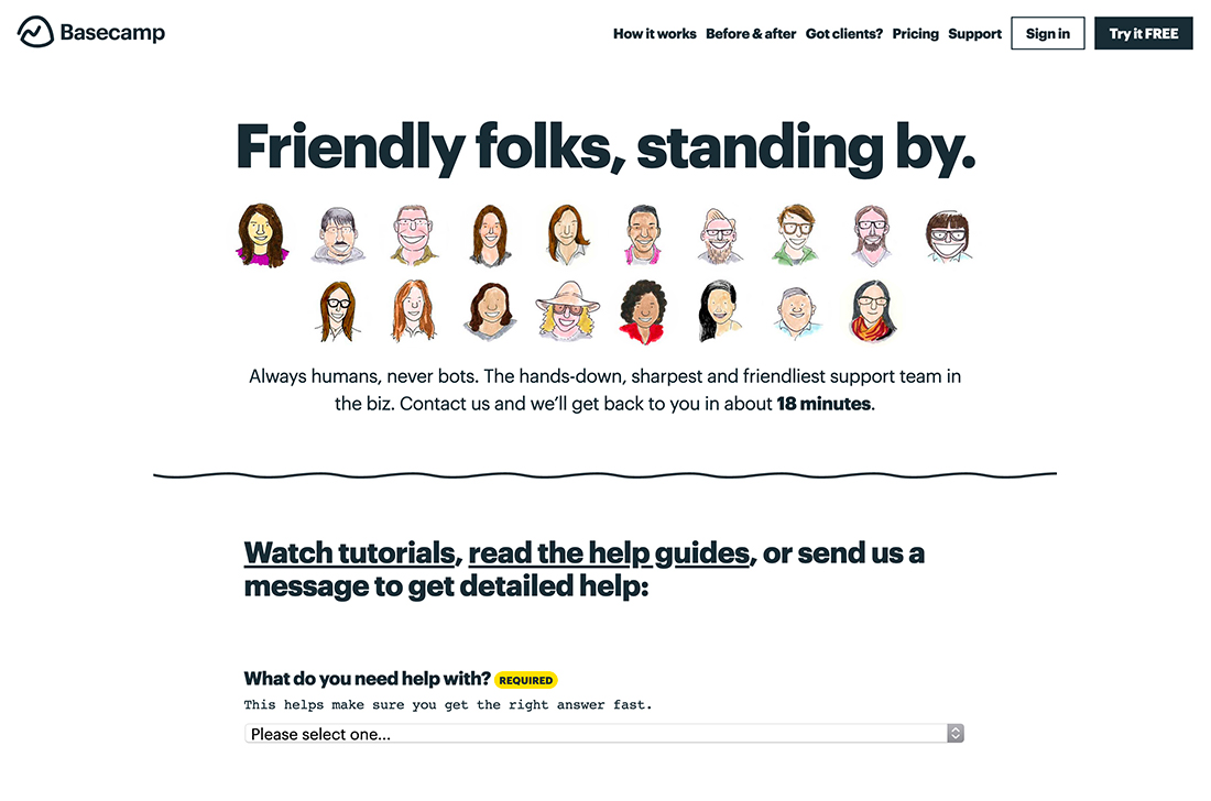
The best contact pages are warm, friendly, and inviting. You want users to engage and find just the right way to get in touch with you.
Use language that extends an invitation to reach out for questions, information, or support. Help lead users to contact the right person or department if there are multiple choices.
Design elements that invite engagement include warm language that poses a question. Light imagery and plenty of space.
Avoid trying to make or close a sale on the contact page. It should be designed in such a way that the user can find what they are looking for without feeling pressured. Remember to turn off sales-oriented pop-ups on contact pages as well.
2. Add a Personal Touch
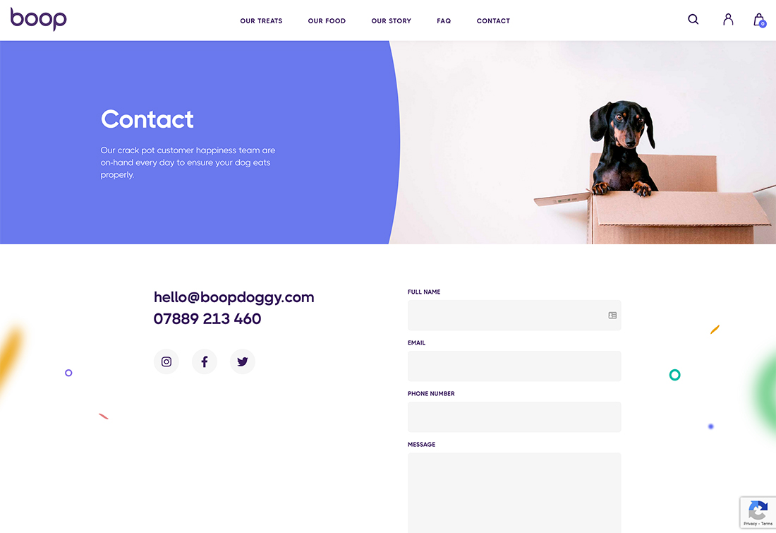
From portfolio sites that include an image of the designer to representations of a brand, the contact page is the perfect place to add a personal touch. This extra bit of warmth goes back to the previous tips as well and contributes to inviting users to actually reach out.
The example above from Boop shows a cute brand ambassador with a whimsical description above the contact information and form.
3. Include All Points of Contact
What options do people have for getting in touch with you? Include all available options on your contact page.
Don’t list options that you do not monitor or pay attention to. When a website visitor reaches out using a phone number, text line, email address, or form on your contact page, it should be the quickest, most direct, and efficient line of communication available.
If you have a certain turnaround time for feedback and can post it, do so. At the very least acknowledge messages as they are received with an idea of when to expect a response.
Points of contact options may include:
- Address, include a link to a map or visual for physical locations that people may visit
- Phone, include click or tap to dial
- Text, include click or tap to text
- Email, include a direct link
- Social media links
- Chat
- Contact form
- Hours, where appropriate
4. Maintain Design Consistency
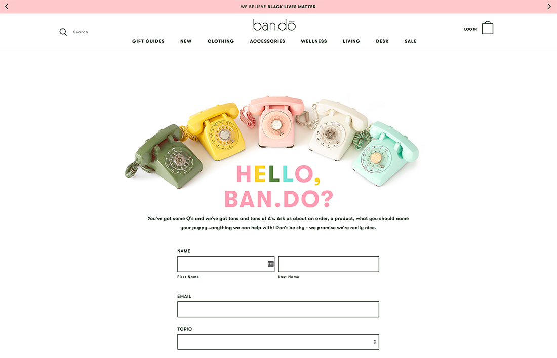
The design of a contact page should look and feel like the rest of the website.
Use the same fonts, colors, and styles as well as visual elements.
You want to ensure that visitors that find the contact page still know what website they are on and feel like they are in the right place.
The example above from Ban.do uses the same design elements and whimsy on the contact page. The header and footer are also consistent with other pages.
Consider consistency with website user patterns as well. Label the contact page as “Contact Us” or using another similar word with contact. Don’t bury contact information on the about page or using cute terms that users might not understand.
5. Avoid Cluttering the Page
There’s really only one thing visitors are looking for in a contact page – how to get in touch with you. So, don’t overcomplicate things and cutter the page with too much information.
If you can, keep everything to a page that’s on one “page” without a lot of scrolling or having to look for information. (For limited contact information and forms, a one-column layout can be ideal.)
Try to ensure that users can fill out the entire contact form with ease on desktops and mobile devices without getting lost having to enter too much information. You also don’t want them to get distracted by other elements on the screen.
Opt for the most clutter-free design possible here.
6. Include a Call to Action
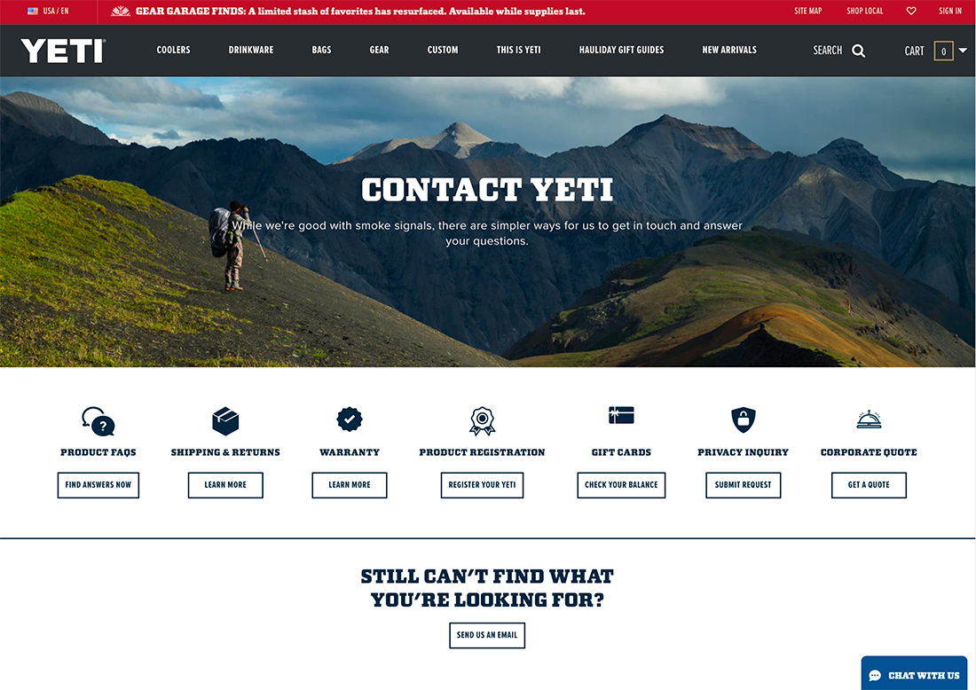
Distinct and direct buttons and calls to action on the contact page are a good thing.
How do you want people to contact you? Make it easy with a clickable option. Design the preferred option with a button that’s bigger or more colorful than others to draw users to that option.
Yeti, above, offers a smorgasbord of options on the contact page. At first glance, it seems like a lot to think about until you think about the scale of the brand. The contact page has a call to action for all of the common things people look to contact them about as a menu of options.
And if that doesn’t work the general contact option with a CTA is below with enough space framing it, that you can’t miss this option.
7. Make Complex Contact Pages as Easy as Possible
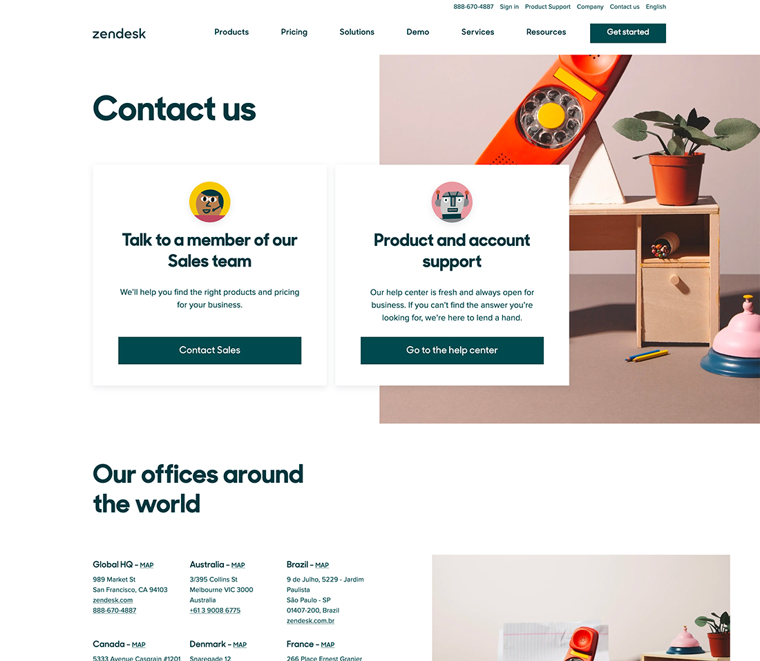
Sometimes you will have a complex contact page. This is true of larger companies, in particular, especially if they have multiple points of contact or locations.
Your goal is to make them as visually-friendly and organized as possible with options that are navigable and understandable.
Zendesk, above, does a nice job of this with two layers of contact information. First, is a pair of cards that offer choices for customers – do you need sales or support? If one of these options applies to you, then you can click through and continue with ease.
If not, each location with a map, address, phone number, and URL (if appropriate) are listed. This can help customers get to the Zendesk option closest to them, or in their language, for support or information.
With complex contact pages, don’t forget that you can link off to other parts of the website to help answer questions such as a knowledgebase, FAQ page, or support center.
8. Include a Reminder
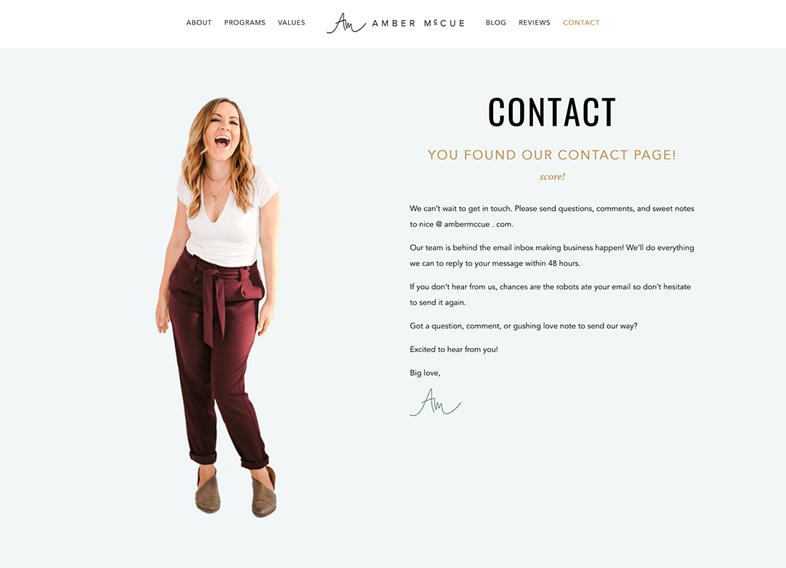
The contact page can be a good place to provide a little reminder about you, your business, or your organization. Include a mission statement or visual on the contact page to help reinforce this before people reach out to you.
If you have a portfolio or individual website, such as a blog, this can also be a good place to include a photo or headshot as a reminder that you are a real person, not just a website.
This can create a better connection between you and people before they contact and can serve as a reminder that websites are run by humans, giving someone a second chance before reeling off a not-so-pleasant communication.
9. Make the Most of White Space
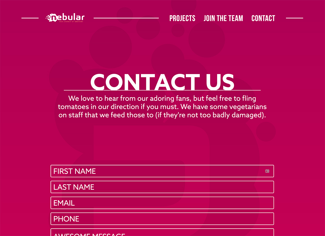
White space doesn’t have to be white to be effective.
Include plenty of white space on contact pages to put the focus on getting in touch and the methods for doing so. The approach of Nebular Agency, above, is spot on with a simple message and giant contact form.
That’s it, and really all they need.
10. Make it Easy to Find

This is the step that most people forget: Make the contact page easy to find.
It should be part of the main navigation and footer. (Those are the most common places users will look.)
Eugenia Durante takes it to the next level with a “Contact me” link that’s designed as a button in the main header navigation. You can’t miss the contact button here.
Another tip: Place contact links toward the end of navigation menus. Over time, websites have “trained” users that contact links are among the last listed and they will actually look at the end of a row or column first when the goal is seeking out contact information.
11. Don’t Limit Contact to a Single Page
Contact information can be in multiple locations and on multiple pages throughout a website design.
The easiest way to do this is by adding links to the contact page in main or secondary navigation and in the footer. That way, no matter where a user is on the website or where the journey takes them, they can find a way to get in touch if needed.
This simple step can help keep more people on your website longer, boosting engagement and conversions.
Conclusion
One of the things every good website has is a stellar contact page. As a point of engagement for users, contact pages can help people find you and better connect with your business, product, or service.
Contact pages are some of the most visited on websites across all industries. Make sure you design a great contact page to stay engaged with visitors.