7 Ways to Use Emotion in Web & Graphic Design Projects
The first impression a user has of your design can make or break their experience and determine if they continue interactions. According to WebFX data, 94% of first impressions relate to the design, making the visual and emotional connection you create of utmost importance.
Further, 75 percent of your business, brand, and website credibility comes from the design. And it all connects to the emotional response from a user. The visuals tell them what to think and feel to establish a relationship with you, making it vital to use emotion well in your website and graphic design projects.
Here’s a primer on how to do it successfully.
1. Design Pleasurable Experiences
UX Planet has maybe the best definition of emotional design: “Emotion design is about creating aesthetically pleasing and functional connections between users and the product, so that they love using the product and come back to using it again and again.”
This put emotion into a perspective that’s a little different from happy, sad, fun, or boring – elements we often connect with design and emotion. Here, the concept is that no matter how a user feels about the design, the overall user experience is pleasurable.
It’s a marriage of emotion and usability to create something functional with the right feeling.
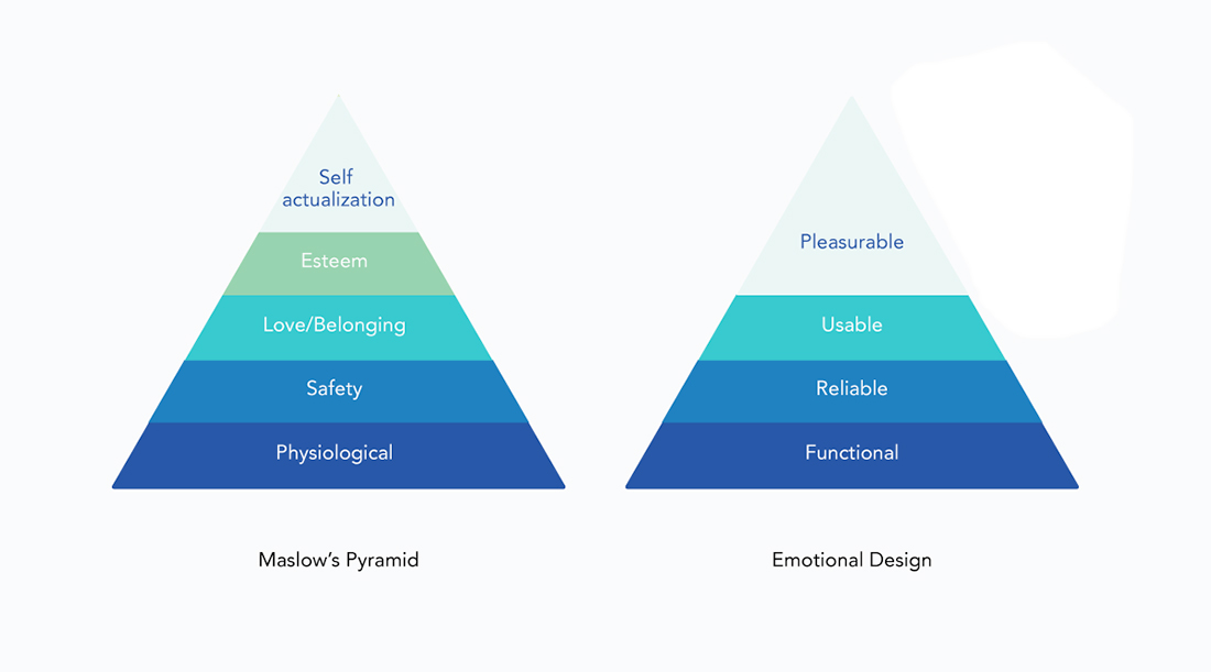
US Planet goes further to explain the connection between emotional design and Maslow’s Pyramid, a psychological concept that has been referenced to describe human emotion and motivation since the 1940s.
The pyramid stacks the things users find important in a design – digital or printed – that establishes a viable experience. Designing a pleasurable user experience prevents frustration and gives a design a better chance of success.
The foundation starts with a design that’s functional, reliable, usable, and finally pleasurable. Many designers innately include the first three, but forget the final piece.
Pleasurable experiences are ones you want to return to. They combine all of the foundation elements with visual delight and ease of use so that the design feels good, interesting, and easy.
2. Help the User “Win”
Now, everything you think about in terms of emotional design should bring you back to the first concept of creating a pleasurable experience.
Design a “win” for people who interact with the design.
Wins come in a number of ways:
- Provide valuable information that the user wants
- Help them accomplish a goal or task
- Entertain users
- Answer a question or provide a solution
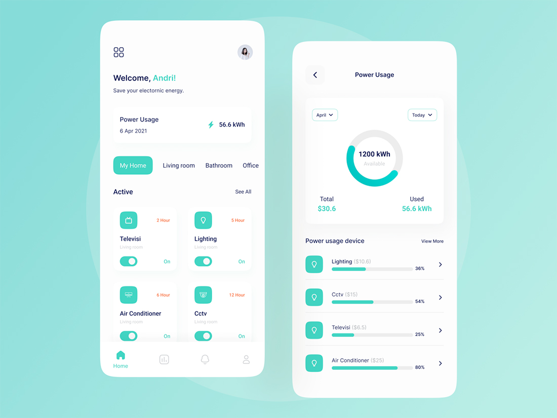
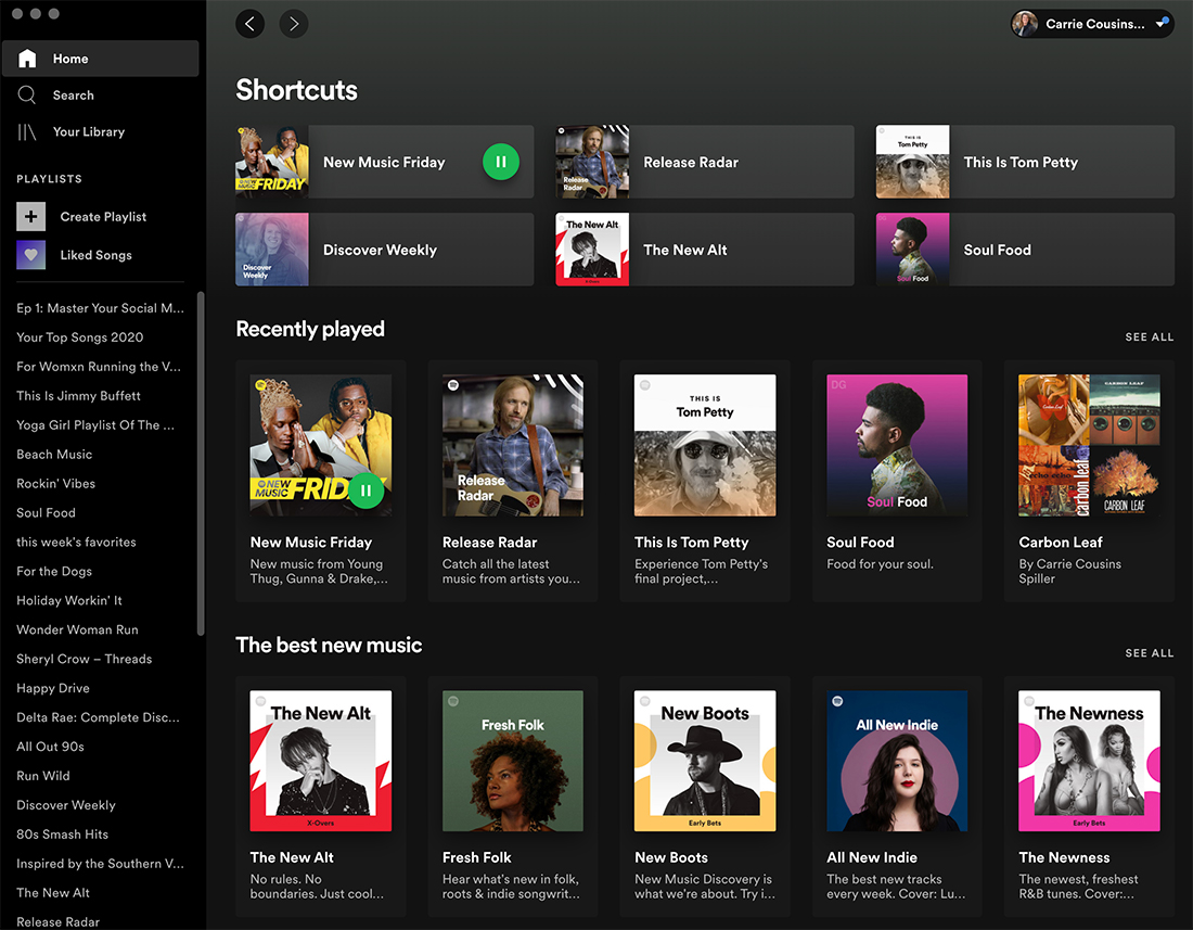
Useful designs are a surefire way to create a win. In the dashboard example above, you can see that the app design can solve a problem visually. Where is power being used in a home? It solves the problem of how to track and make better and more efficient energy choices. The design is understandable and creates a win when the user is successful and gains better understanding.
3. Create the Right Gut Reaction
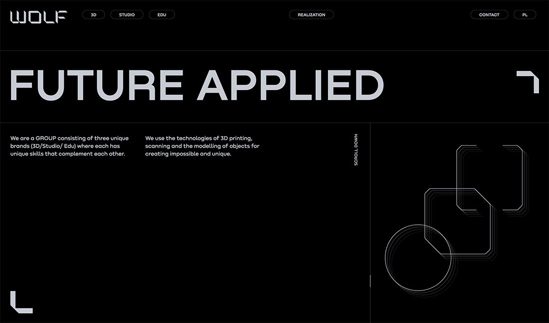
Let’s go back to first impressions of a design. What do you want people to think or feel at the instant they see the design?
That visceral impression or gut reaction often stays with users long after the first moments of interaction. This is the long-term emotional reaction that the users will connect with the project, so choose wisely.
Think about design elements such as clean space, tightness of elements, readability of text, or ease of understanding image or video elements. A clean, uncluttered, and easy-to-understand visual design establishes that same emotional connection about the content. Conversely, a dark, tight, difficult to read design will also establish a challenging emotion from users.
That’s not to say one concept or the other is right or wrong. It’s just important to understand that the layout and visual patterns can create an emotional response to the content before the user even starts to process the information at hand.
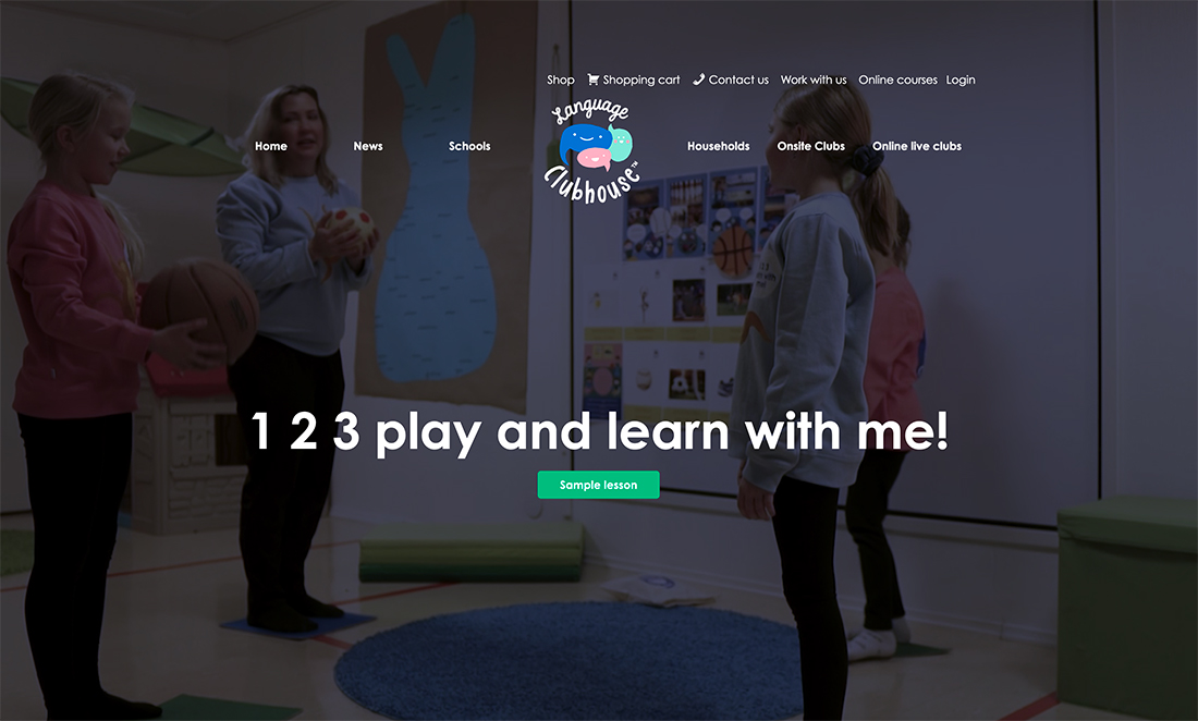
Look at the example above: What did you feel when you saw it at first? That’s the gut reaction to the design.
4. Create an Actionable Path
The right emotional connection will help someone looking at your design know what to do with it and how to act next.
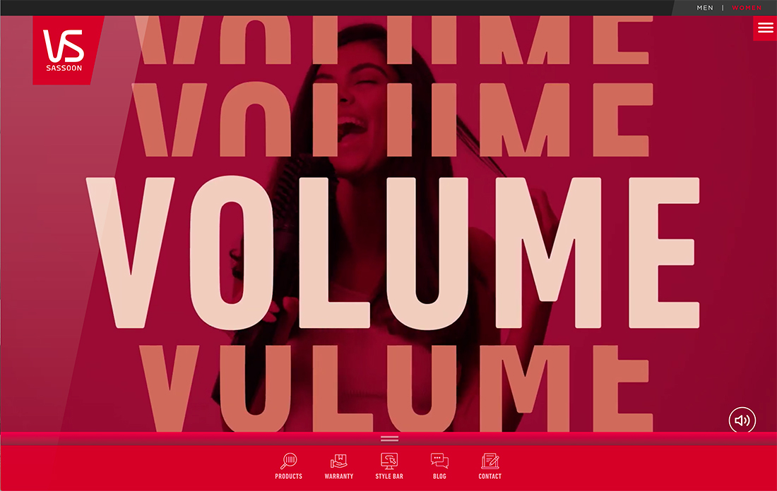
The example above from Vidal Sassoon uses fun videos with quick action and big words to make you want the hairstyles in the videos and learn how to do them. It shows a mix of finished styles and product use that’s not super common with e-commerce stores.
The visuals lead the eyes down the screen to the bottom page navigation that takes you right to products (as well as a few other options).
The emotional design here creates a desire for a product with an action to find it. There’s not clutter so that the action path is obvious and deliverable.
5. Personalize It
Think of how much more interaction you have with a design when it just seems like it was made for you. From tiny personalizations to fully custom experiences, this element establishes a positive emotional relationship between the design and the user.
Take a moment to reflect on how you feel every time you log into your favorite streaming service.
When the personalization is working you have that feeling of “Spotify gets me.” That’s exactly how you want users to feel when they view your design.
The good news is you don’t have to have AI learning and personalization to the level of Spotify to do it.
The low-tech way to create that same feeling happens with color, typography, and image choices. Take it a step further with elements that help users create additional customizations, such as the ability to create a profile, toggle between light and dark mode, or view recommended content.
6. Use Copy and Voice to Your Advantage
One of the most important elements of a design is the wording and copy context. Does the voice and tone of the text match the visual voice and tone?
If not, you risk creating an emotional disconnect that can turn off users.
If the design is light and fun, the words should be as well. Apply the concept to any emotional connection you want to create.
7. Show Your Values
Social responsibility and issues are a concern for users, companies, and designers. The choices you make with a design can show your values and what you believe in. That can connect or disconnect you from certain audiences.
It is a little deeper than thinking about who your audience is; it’s also thinking about what your audience cares about.
This is one of those places where you should “show, not tell” what you believe in. Use imagery that will resonate with your audience.
- Are you part of a diverse community? Images should reflect that with different kinds of people.
- Are you invested in the community? Images should include local landmarks or people.
- Do you serve a niche audience? Images should show them in action.
- Does your company stand behind an issue or cause? Images should create that connection.
Conclusion
Emotional design can do a lot of different things and there are a magnitude of tactics to help you establish just the right emotion.
If you want to dive in even further, the Interaction Design Foundation has a solid deep dive.