10 Things Every Email Newsletter Design Needs: Best Practices
There’s an art to crafting the perfect email newsletter design.
It’s a combination of visual presentation and just the right words. It’s delivering quality content in a way that resonates with subscribers and generates opens so that your messages avoid the spam box.
A few email design best practices can help you find inbox success and generate greater conversions for this type of targeted messaging.
And if you need some help, each of the email design examples here is available as a downloadable template.
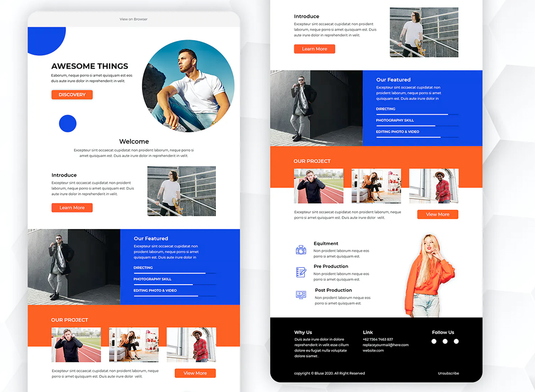
1. Identifiable Email Newsletter Design Brand
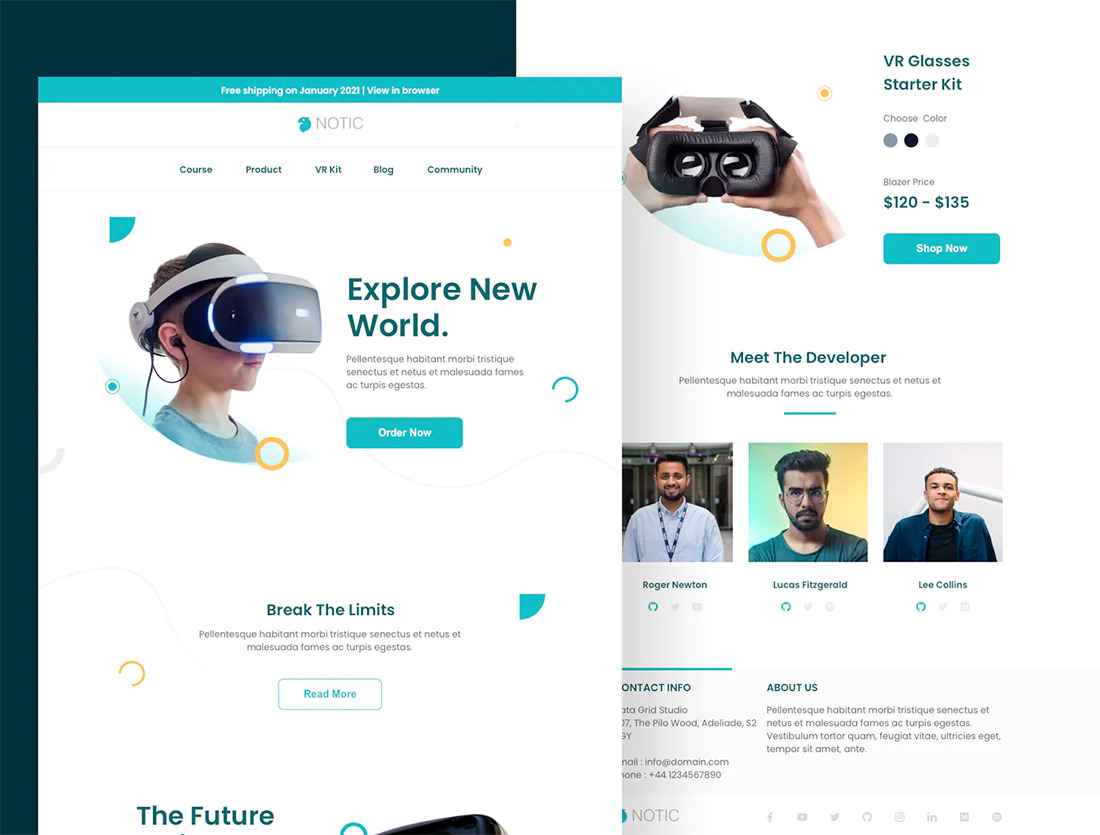
For most brands you don’t need an email design, you need a series of email designs that all feature similar branding and visual style.
Most email senders distribute different types of email campaigns for different users. A brand set of emails helps differentiate different types of communication while maintaining visual identification so that subscribers know who the email is from at a glance.
Newsletter branding is rooted in the same elements you use for any other design: Common color and typography palette, logo and placement, overall aesthetic.
Then you can add a few specialty elements for different campaign types. This can help you – and users – get a better idea of what each different type of email newsletter is about.
2. Mobile Friendliness
Email opens on mobile devices swelled to 81% of all emails in 2020, according to SuperOffice. https://www.superoffice.com/blog/email-open-rates/
What that means for you is that if the email newsletter design is not mobile-friendly and responsive, chances are that it won’t render properly and will end up deleted within an instant.
Every element of the email design, from images to typography need to scale properly for mobile viewing. That might also mean using larger typefaces and ensuring that buttons are easy to tap with a thumb. Those simple email design best practices can make a huge difference for mobile users.
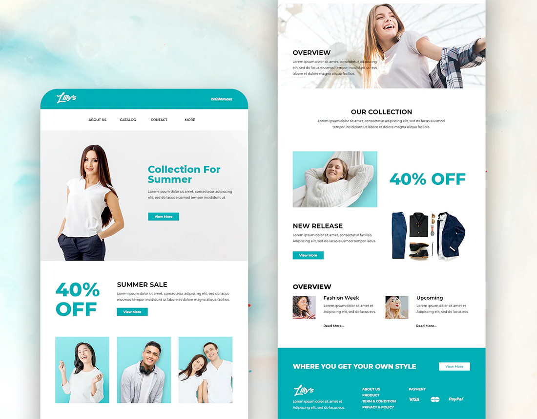
3. Easy to Understand Buttons
Speaking of buttons, this is one of the most important elements in your email design. Use a common look and style for buttons so that users know exactly what to do when they see them.
The microcopy on each button should be direct and concise while creating an expectation as to what will happen when it is clicked or tapped.
Use a color for buttons that contrasts with the rest of the design so that they draw the eye and try to limit each email to one action.
You can repeat the same button and call to action multiple times in the email. Consider repeating the CTA so that a button always appears no matter where the user is in the scroll of the design, keeping that action top of mind.
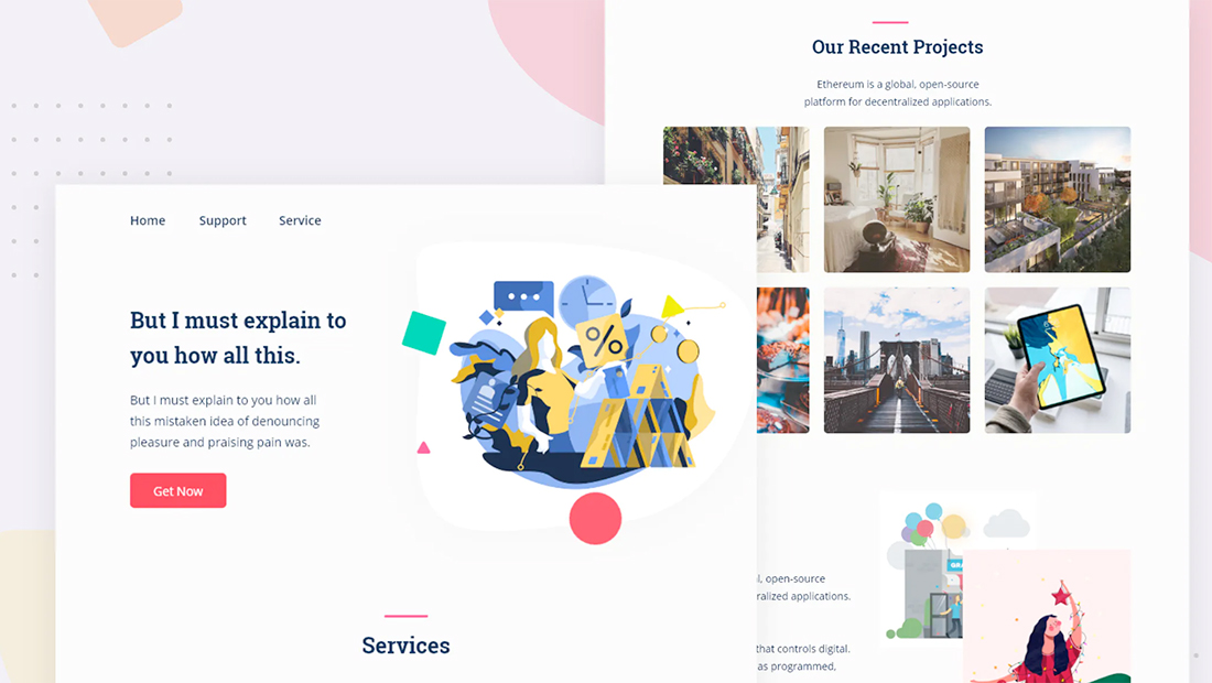
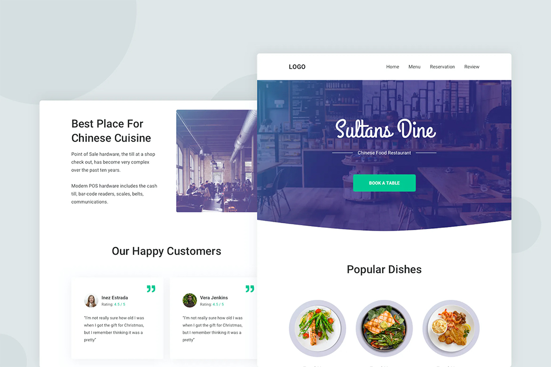
4. Amazing, and Compressed, Imagery
You probably know you need a great image for your email newsletter, but did you remember to size it properly and compress it?
A strong, highly deliverable email is lightweight. This can help it push through other email clutter and away from spam filters while ensuring that every person who opens it sees your content right away.
And while we are thinking about best practices with email images, don’t forget to add alt information for images. This can help in the instance that images don’t load, and assists with users who rely on screen readers or other accessible technology.
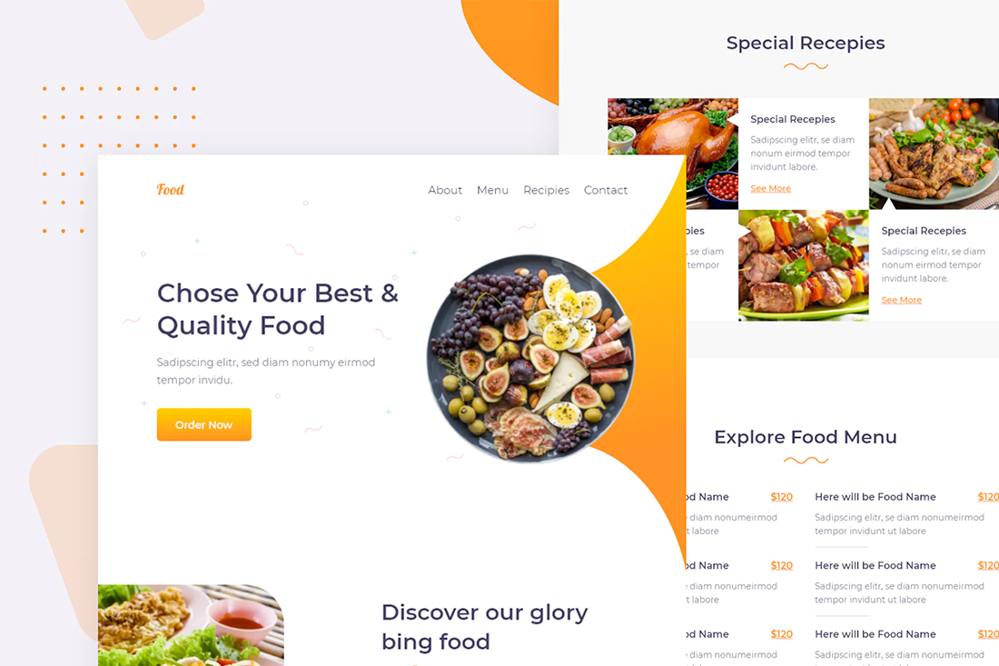
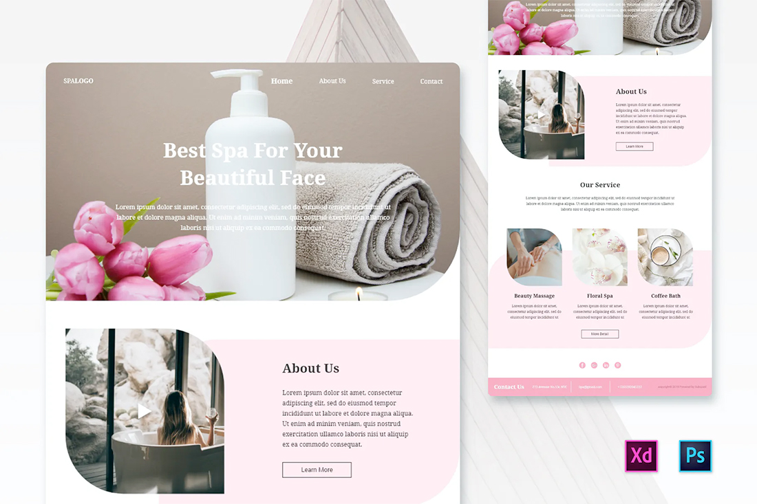
5. A White Background
It’s disappointing, but you still need to create email designs on white backgrounds. While some email clients can read background images, many popular tools – including Microsoft Outlook – still don’t render backgrounds properly.
Stick to a white background. Set colored elements and images within a frame to ensure that everything renders exactly as you expect it to. (And don’t forget to test each campaign with a preview tool such as MailNinja.)
6. Email Design Best Practice: Minimal Style
This email newsletter design best practice goes back to the idea that most users are likely opening on a mobile device: Minimal design schemes are easier to read, skim, and understand at smaller sizes. There’s a lot less clutter to navigate with simple, streamlined, minimal styles.
The good news is that minimal designs have a modern feel and are trendy as a design option.
When you think minimally, consider plenty of white space, simple images or illustrations, and highly readable typography. This combination of elements never gets old.
7. Accessibly Design Email
As with any other type of digital design, accessibility matters. Keep basic accessibility rules in mind when designing email campaigns to ensure as many people as possible can read the content and maintain your email “good citizen” status.
Remember to think about:
- Color contrast
- Appropriate use of alt text and avoid text in images
- Include a plain-text email option
- Use direct microcopy for click elements
8. Design for Sharing
Don’t forget the share!
Include social media and email sharing buttons in every campaign so that your best subscribers can pass emails (and any included offers) along to friends. These ambassadors can help you grow your email list naturally and with higher-quality leads.
Some of the biggest email senders have used this technique – with incentives for sharing – to grow their lists and engagement. It is ok to ask subscribers to share the email or include icons that facilitate easy sharing.
9. Engaging Subject Line
Message design is just as important as visual design when it comes to email. The subject line is the first impression your newsletter makes and will determine if the visuals are even seen.
Use strong, actionable language in subject lines. Keep them short and consider including an emoji to disrupt the visual flow of the inbox.
All of these messaging design elements can help more people see your email, improving conversion rates.
10. Logo, Contact Information, and Opt Out
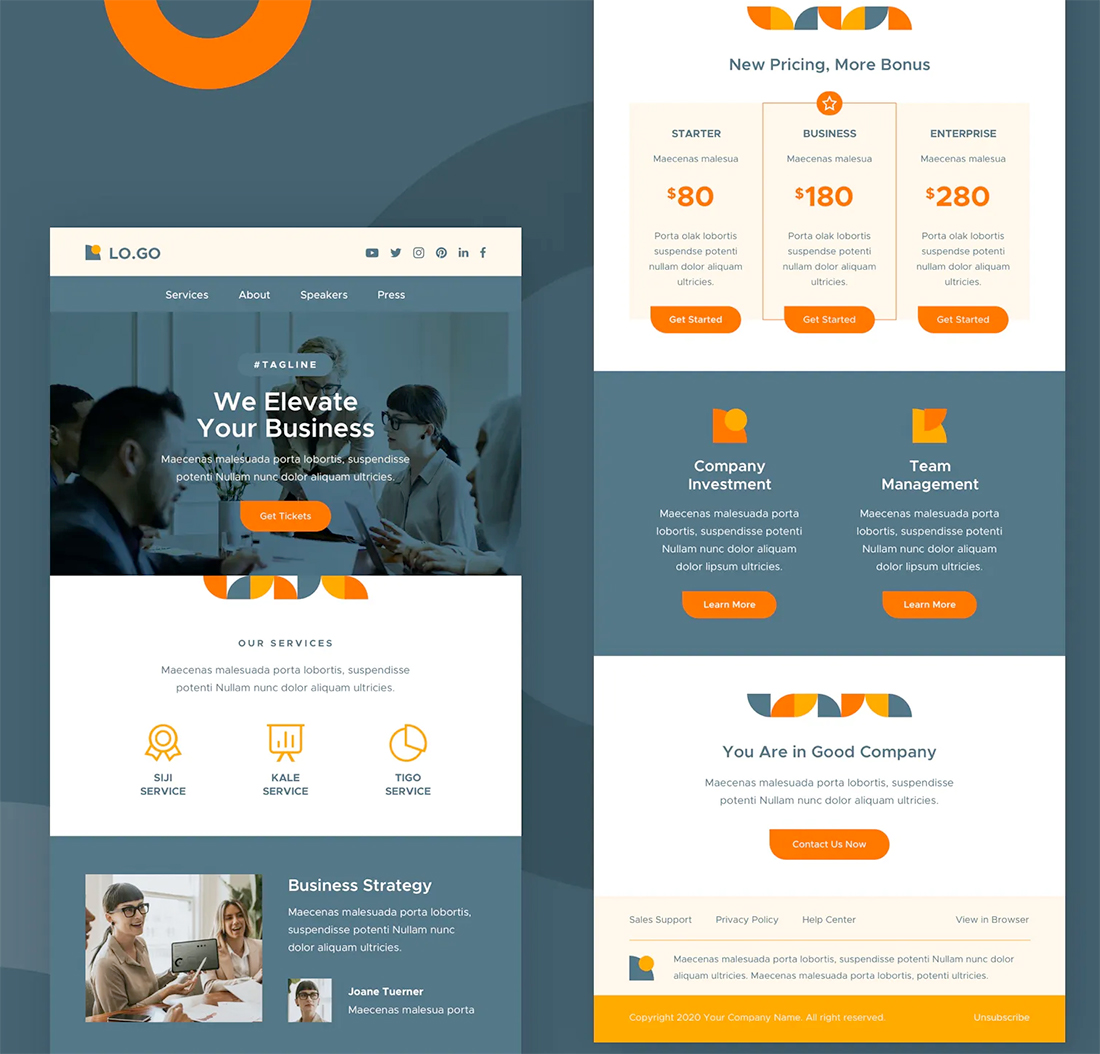
A logo, contact information, and unsubscribe button are more than functional and credibility tools, they are required by law in some places. (Check your region’s laws for specific guidance.)
As a general rule, following the email design best practices aligned with the CAN-SPAM Act can keep your sends in check. In terms of design, all most all of these elements can be created as part of a standard email footer.
- Use a straightforward subject line that’s not misleading.
- Honor unsubscribe requests and include a button in every email.
- Track unsubscribes to ensure that they never expire.
- Include a physical address in email campaigns.
- Recognizable from name and address so that users know who is sending the email.
- No forwarding incentives of emails to circumvent opt-out rules.