How to Design Content for User Experiences
Content is a major part of the user experience. Content is more than search engine optimization; it’s more than blogging. It is part of your site, brand identity and why users interact with your design.
Every day it becomes even more important to design for content as part of the overall function and user experience in website and app design. But how can you do it? (We can help you with some case studies and examples, such as The Hen House, which uses a variety of design and user engagement techniques to keep you scrolling.)
What is Website Content?
Website content is more than a stream of blog posts. It includes every piece of text or image on a website. This includes everything from the main copy to footer information to alt tags. Every bit of it counts as content.
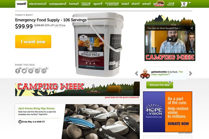
There’s a lot of this information that designers sometimes forget about when we think of content. Take an e-commerce site, for example: Product descriptions and even shipping policies are content. Retailer Woot does a great job of creating content for every element on its website. As you would expect, each item for sale includes images, descriptions and a way to buy. What’s more is that each item also includes an element of fun. Look at the description for the secondary item, a set of knives: “April Knives Bring May Knives. Note how well this title works for a sale that straddles two months? Yeahhhhh.”
The goal of every piece of website content is to optimize and enhance the user experience. (That’s why the cute Woot descriptions work.) Content should contribute to the overall voice of your brand and showcase why users should visit and engage with your site. (Engagement is anything from reading to playing a game to signing up for a newsletter to making a purchase.)
“Designing” Content
Content design is much more than aesthetics. Think of designing content as a link between your message and the user. What tools or types of information will make that connection?
The Moz blog recently compiled a great list of tips for designing content as part of the overall user experience:
- Link to a blog or relevant blog posts
- Embed related social media content
- Optimize content you already have; use it in different ways
- Write great descriptions for sections, photos and other bits of “hidden” content
- Be proud of you content and show it off by making it large enough to see
- Guide users through content in logical (and methodical) ways
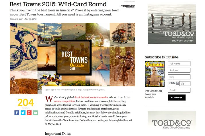
Oustide magazine does a great job with this on its website. Content is a mash-up from various sources – the magazine, online specific content, social media and user interaction. In “Best Towns 2015: Wild-Card Round” this mixed-bag of content is on display. The magazine is hosting a user-submitted photo content on Instagram. The “content” is designed as a rules guide to participate in the contest. The cool add-on content is the feed of photos from the Outside Instagram feed with the contest hashtag. The beauty of the design is that the main content message does not change, but the pieces of content on the page are ever changing and updating, demanding that users come back and interact.
Content and Function
How does the design and content come together? It should be in sync.
User experience and function are a vital part of the design. And there are techniques and things you can do visually to entice users even more. Key factors are thinking about how users read and engage with a website, how interactions work and use of design theory and principles to create something people want to look at, including trendy design outlines.
Users read and engage with most designs in a basic pattern, scanning blocks of content until they find the parts they want to engage with or find interesting. The Next Web recently examined this user eye-tacking pattern that takes on a “F-shape” in great detail. The basic premise is that F-shaped content from left to right and top to bottom is the most dominant user behavior and that can provide cues for designers. “The F refers to the reader first scanning a horizontal line across the top of the screen, as is understandable for cultures that read left-to-right. Next, the user scans a vertical line down the left side of the screen, looking for keywords or points of interest in the paragraph’s initial sentences or subsection titles. When the reader finds something they like, they begin reading normally, forming horizontal lines.”
Then the interactions that happen between the user and the design need to be sensible and relevant. Users need to understand when and where to click and what will happen. This is a vital step in the development of content and design in the form of user cues. What are the colors and labels that you will use on these tools to direct user traffic?
Finally, designers can use basic design tools and techniques to create an aesthetic that is just appealing. One trick? Create a design or interaction that is based on current trends or offers a surprise for the user. The look of a site can contribute to its function; create something fun that users want to touch.
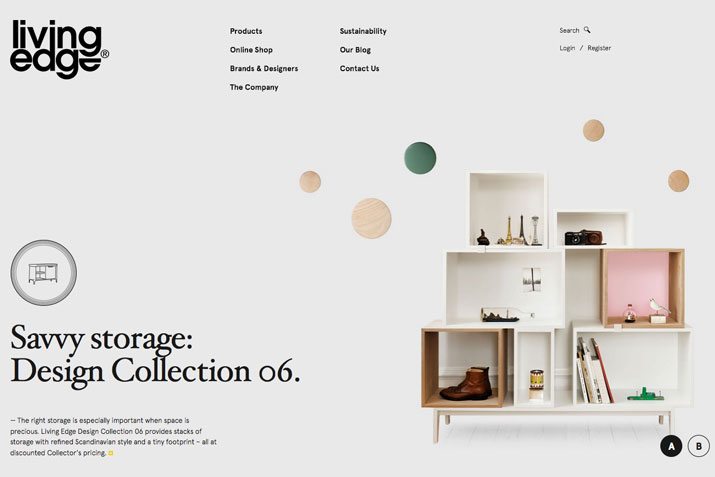
Living Edge merges function and design in a way that is almost seamless. The simple design uses page-based scrolling to introduce users to the brand and products. Nifty color hover actions encourage clicks on important information such as financing and email signup. The site uses design trends such as minimalism and parallax scrolling to create an immersive experience with simple typography and color that encourage action.
Content Dilemmas
When it comes to thinking about content, designers tend to have one of two dilemmas: An overwhelming amount of content or not enough content at all. The middle, which would be a steady stream of varying content types that is constantly updated, is rarely the norm.
The first step in combating this dilemma is to develop a complete content strategy. This plan is not the easiest thing to do, but will make design and content come together more seamlessly and be easier to execute as a team. Smashing Magazine’s “Content Strategy Within the Design Process” is an almost timeless guide to beginning conversations about content strategy. From the guide: “When content strategy is in place and in its proper place, we’re on our way to producing beautiful and effective results.”
Then comes time to deal with your content dilemma:
- If you have an overwhelming amount of content simplify. Consider a modular, card-style design that breaks content into smaller, more digestible pieces.
- If you don’t have enough content, repurpose what you have. Consider a game or gimmick in the design that emphasizes key points. Encourage user or social interaction and then republish that interaction in your site outline.
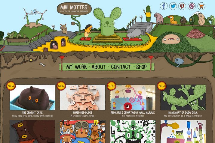
The portfolio of Miki Mottes showcases how to design a lot of content while managing to keep it organized and unique. Using a modular and block design, portfolio items are easy to see and provide clickable links. The site uses a whimsical style that makes you look at each of the animations, which is content that contributes to the designer portfolio (and potential employment) as well. Scroll down to find even more content – learn about the designer, buy from the shop or send a message.
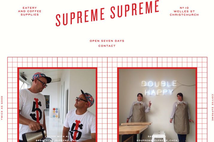
Supreme Supreme has a fun website design with minimal content. But the included content is engaging and offers distinct actions for users. A great gallery of photos makes users want to share for potential inclusion and with a contest to win free coffee, users will likely click or perform other actions such as downloading the app.
Conclusion
Designing content for user experiences is first about understanding users and then about design. Good design will encourage users to interact with your website or brand.
Create a design that uses the basic theories of good design, establishes a strong message with content and then offers users a surprise in the form of aesthetics or function to reel them in.