Website Design for Kids: Tips and Advice
Designing a project for children is a rather common assignment. From websites to packaging to other images, creating something that is kid-friendly will likely be asked of most designers at some point. But how can you make something kids and adults will appreciate?
That’s the real trick. Kids and adults have to feel engaged by what they are seeing. There are some things that you can do in the design process. Consider elements such as color, typography, gamification, language, animation, storyline and age group for the best success. Today we’re offering some advice and insight into this very topic!
Age Groups
When designing for children, age is one of the most important factors to consider. The age of the child audience can greatly impact the choices a designer makes because the cognitive levels of children can vary so much.
There are four age groups to think about:
- Very young, ages 3 to 5
- Young, ages 6 to 8
- Older kids, ages 9 to 12
- Teens, ages 13 and up
Knowing which audience you are working with is the starting point for all of the other tips that follow. Understanding what works and is appealing to those age groups is especially important.
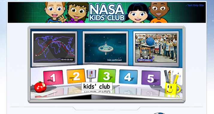
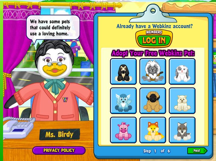
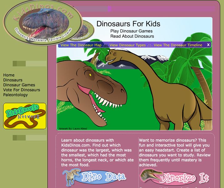
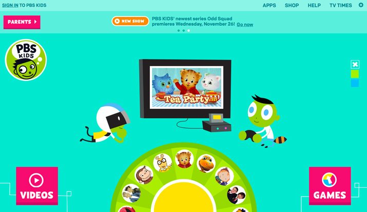
Very young kids best react to bright color, cute characters and nature themes. Keep color and type palettes to a minimum. Use very limited text, and when working digitally, incorporate elements such as graphics and sound.
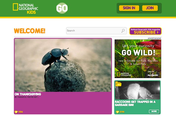
Young kids like to be challenged with more words to showcase reading skills, but keep words simple. Graphics and images should have a more human and less cartoon-like look and deeper color schemes are usable. Typography should be very simple.
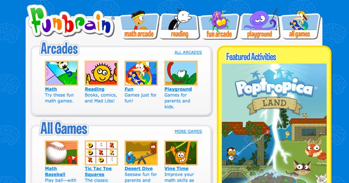
Older kids want to be engaged so create something they will want to interact with. The concept should have a more grown-up feel with the mix of words and images. Interactive games are a good option for this age group in digital and printed projects. Simple type and color are a good idea but palettes can be expanded beyond the minimal style.
Teens want an experience that mirrors adult-targeted design. Keep in mind their shorter attention spans but be mindful of their ages when it comes to imagery and content. Darker, deeper colors and more elaborate typography is more acceptable at this age range.
Parents want to feel like their children are learning, are interacting in a secure environment and that all images and text are age-appropriate. They, too, like to be engaged with child-friendly designs. If you are creating something that you would not have any interest in, parents will likely avoid it as well. And if the parent does not engage with your design, they will not pass it on to a child. Parents might also appreciate a section just for them in the design (just be sure to label it well).
Color
Color can be one of the most impactful design choices when working with a child audience. Create a palette that is bright, cheerful and fun.
Primary colors are a great option when thinking about child-friendly designs. Select hues without dark tints or toning. Yellow, red, green, blue and purple are popular options.
When creating a color palette for children, consider breaking the rules. More color can actually be a good thing here. Instead of a color palette with only two or three colors, consider using five, six or seven hues. More color and less shading and tinting will appeal to the young audience more than simple color palettes. Avoid pastels and jewel tones.
Think about the mood color creates as well. Bold, bright colors are happier and more engaging. Yellow is a very common color in design projects for very young children for that specific reason.
Typography
With an audience that has low-level (or no) reading skills, typography choices can make or break the design. Basic sans serif lettering is the only option for children, while more options are available for teens.
The typography palette should be limited as well. Stick to a single typeface for younger audiences. Limit to two typefaces for older groups.
Be cautious of type effects and usage as well. In most design outlines, it is recommended to use multiple weights and options from a type family. Not here. Stick to a single typeface and style throughout. Stay away from elaborate effects. Letters should not be obstructed in any way and should stand in stark contrast to the background.
Think about size as well. Type should always be at least 14 points for children. Consider larger sizes for younger children. Designs for older children and teens can be somewhat smaller.
Language
Just as important as the design of text are the actual words. Age-appropriate language is key for understanding and interaction. Images and pictures should outweigh text. The younger the child, the less text you will use. Reading level is equally important.
Here are some things to consider by age group:
- Very young kids likely won’t recognize many words, but will want to see some text for an “older” feel. They will react strongest to the use of single words in a fun environment. Avoid sentences or paragraph-type structures.
- Young kids are starting to read and can comprehend simple sentences of only a few words. Design with simple sentences or single words.
- Older kids can appreciate a more traditional text structure to a degree. Use of headlines and body text is acceptable, but keep all blocks short and simple.
- Teens have short attention spans but can handle a language and text structure that resembles most other websites.
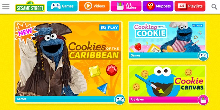
Gamification
Gamification is not just for websites. Printed designs should also include this engaging technique. From a simple coloring exercise or matching to a video or clickable route, children like to play. Use this concept in design projects.
Be aware of ease of play when planning games. Actions should be large and easy to find. In digital projects, this includes super-simple navigation with oversized buttons.
Consider a reward for games, especially for older children. Will they earn a badge on websites or apps? Is there a “prize” or ribbon at the end of a map? (Remember cereal box games you completed as a child?) Remember to include that prize or reward in the design.
Animation and Cartoon-Style Design
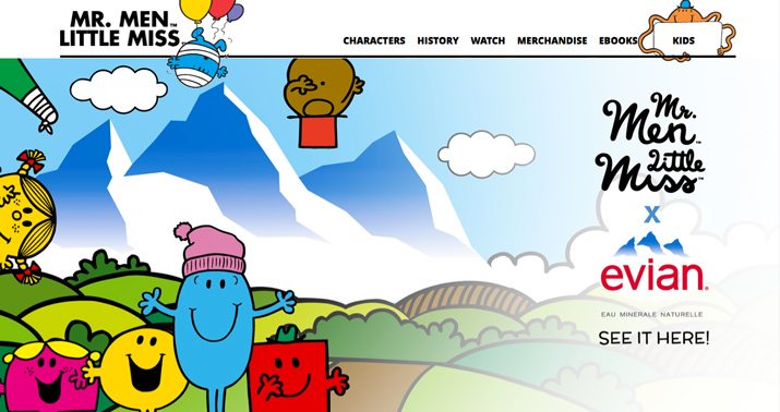
While you can probably guess what captures a child’s attention (especially younger children) – animation and cartoons – it is sometimes forgotten in the design process. Some of the things adults find most annoying can be a child’s best friend. Incorporate things like music, animation, videos and lots of fun characters to engage children.
Include a storyline and developed characters in the design. Create that connection between child and design. Make that story and those characters the focus of the design.
Create further engagement with characters that children can help design. Make personalization elements easy to find and use. Consider this when thinking about digital design as well. Children won’t play games or follow storylines with a lot of typing or searching, so everything needs to be positioned on the screen in an easy to tap or click location.
Conclusion
Designing for children can be fun and a little difficult as well. It requires designers to think about the audience in a new way and even break out of their comfort zones.
Color, typography, language and interaction are the factors that can lead to success or failure when designing for younger age groups. Try to think about things that lead to interaction and fun; those are they keys to designing something children will enjoy.