10 Great Google Font Combinations You Can Copy
The average man considers which flavor of Doritos will taste good with his Heineken. The sophisticated man considers which cheese will pair well with his choice of wine. The designer of course considers which two fonts will look great on the same page.
Today we’re going to use the Google Font API as a playground for mixing fonts and finding ideal pairings. You’ll be able to skim through and instantly grab out selections that you think are appropriate for your projects.
The best part? You need only to copy and paste our code to implement these fonts on your site. It’s completely free and there are no downloads required.
Why Google Fonts?
The web font game was up in the air a few years ago. Everyone had an idea and a solution but no one really knew which would be left standing when the dust settled. In my mind, this debate is over: @font-face won.
Here’s why @font-face wins. First, a pure CSS solution is one that developers can get on board with. Next, the fact that @font-face fully supports text selection and actions such as copy and paste means that usability experts love it. Finally, the fact that you can easily cook up an @font-face recipe for just about any font means that designers love it because they have a wide range of properly licensed fonts to choose from. If you get developers, designers and the usability guys on board, it’s game over for Flash, JavaScript and image-based solution.
Now, within the @font-face world there are many competitors. My personal favorite solution is just to use FontSquirrel’s @font-face kits, whether I’m downloading one of their pre-built options or uploading a font file so the site can churn out the rest for me.
However, I’ve used this solution several times on Design Shack before so I wanted to switch things up today and use something else. Since the Google Font Directory is free and has plenty of options, it seemed like a natural fit!
Quick Tips for Combining Fonts
Before we get started, there are a few basic rules that you can keep in mind when combining fonts. These aren’t absolutes that you must follow in every occasion but merely some guidelines to stick to when in doubt.
Use Font Families
First of all, when possible, check out the various fonts within a single family. These fonts have meticulously been designed to work together and are therefore the safest method of varying your font without creating visual discord.
Contrast is King
Next, when you’re combining two fonts, go for contrast. Try pairing a bold slab with a light sans-serif. If you mix two fonts that are fairly similar, the lack of contrast makes it look more like something is slightly off with the typography rather than the intended impression of two different typefaces. Make it clear to designers and non-designers alike that two distinct styles are present.
Go Easy
Also, limit yourself to only a few typefaces. If you can get by with two, do it, if not, stop at three. In all but the most experienced hands, lots of different fonts wreak havoc on the cohesiveness of a design. It’s easy to end up looking like a kid who just discovered the font menu in Photoshop for the first time.
Think About Which Fonts Are Appropriate
Finally, let the content play a big role in your font choice. If your content is modern and professional, stick to fonts that suggest these qualities. If it’s supposed to look like something from the 1700s, Helvetica Neue Ultra Light might not be the best way to go.
The Fonts!
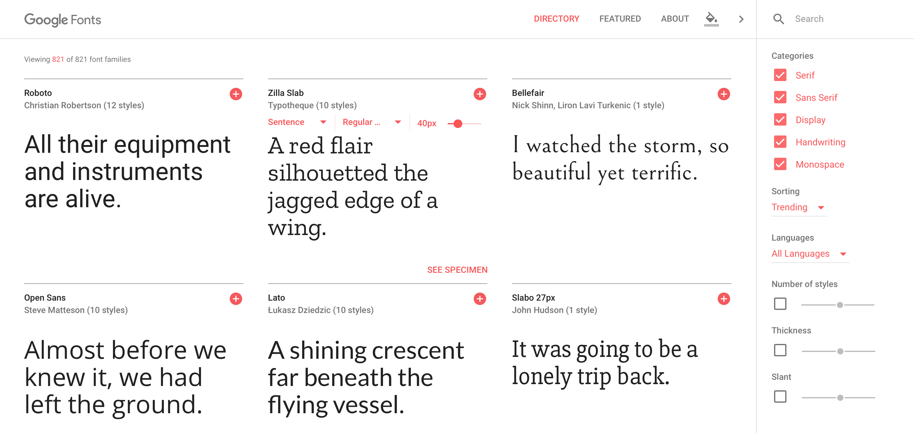
Enough discussion already, let’s get down to business. Cruise over to the Google Font Directory and look for the following options.
If you’ve never worked with the Google Font Directory before, don’t worry, it’s the easiest custom font solution out there. All you have to do is drop a link into your page header and then reference the font in your CSS font-family just like you would anything else. For each font pairing below I’ll provide you with all the necessary snippets of code so that all you have to do is copy and paste!
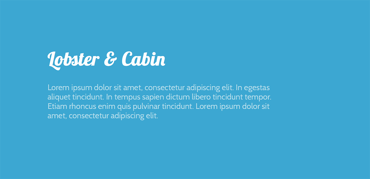
Lobster & Cabin
Lobster is one of my favorite scripts of all time. It’s bold and beautiful while remaining quite readable, attributes not easily found in other scripts.
To complement this strong statement, you don’t want anything that competes for attention. Instead pick something plain and simple like Cabin.
The HTML
<link href="https://fonts.googleapis.com/css?family=Lobster" rel="stylesheet">
<link href="https://fonts.googleapis.com/css?family=Cabin" rel="stylesheet">
The CSS
h1 {
	font-family: 'Lobster', Georgia, Times, serif;
	font-size: 70px;
	line-height: 100px;
}

p {
	font-family: 'Cabin', Helvetica, Arial, sans-serif;
	font-size: 15px;
	line-height: 25px;
}
Raleway & Goudy Bookletter 1911
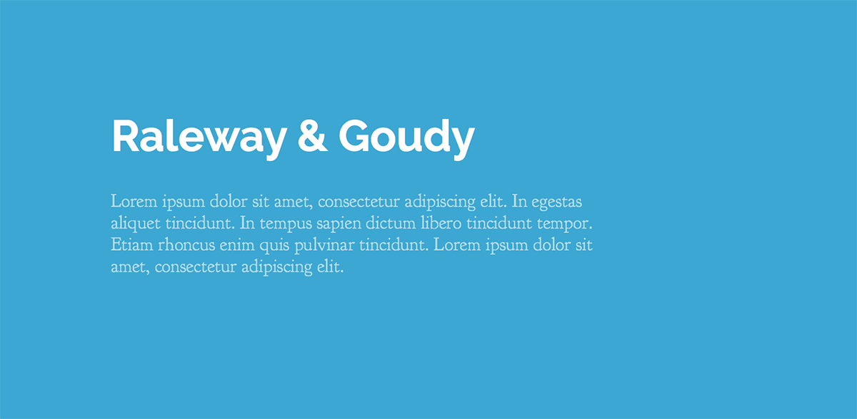
Raleway is a super attractive font, but it’s so thin that it doesn’t always work the best on body copy. For this reason, it’s best to keep it as large as possible whenever you can, which makes it a perfect font for your headers.
I think the combination of Raleway and the fairly ornate old stye Goudy Bookletter 1911 make for a super classy pair. Be careful though, this particular Goudy is a little too complex for tons of body copy and I definitely wouldn’t want to read a big page full of copy written in it. This combination is probably best for scenarios with minimal copy.
The HTML
<link href="https://fonts.googleapis.com/css?family=Raleway" rel="stylesheet">
<link href="https://fonts.googleapis.com/css?family=Goudy+Bookletter+1911" rel="stylesheet">
The CSS
h1 {
	font-family: 'Raleway', Helvetica, Arial, sans-serif;
	font-size: 50px;
	line-height: 70px;
}

p {
	font-family: 'Goudy Bookletter 1911', Georgia, Times, serif;
	font-size: 15px;
	line-height: 25px;
}
Allerta & Crimson Text
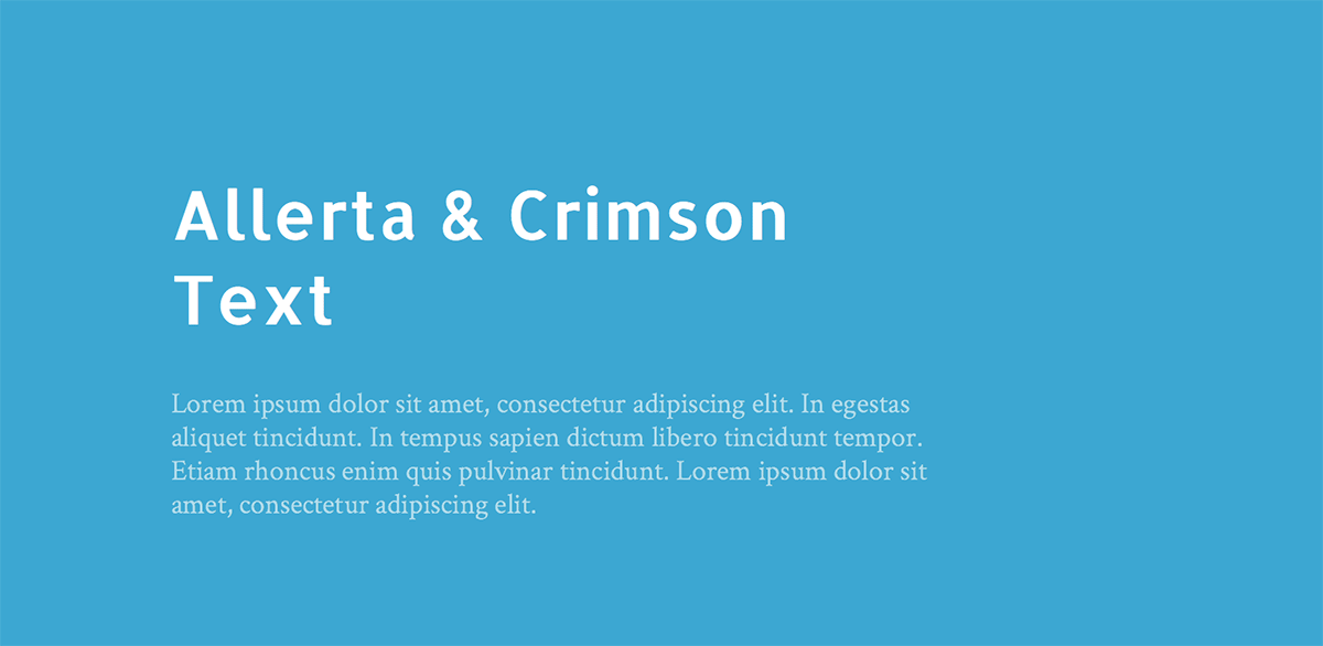
Allerta is a moderately bold sans-serif with a personality. If you don’t want something boring or something crazy, it’s a good middle ground that looks great in both a headline and body copy.
Crimson Text is a straightforward font with strong serifs but little to no differentiation between the thicks and thins. This makes is retain a good amount of readability even when its small.
The HTML
<link href="https://fonts.googleapis.com/css?family=Allerta" rel="stylesheet">
<link href="https://fonts.googleapis.com/css?family=Crimson+Text" rel="stylesheet">
The CSS
h1 {
	font-family: 'Allerta', Helvetica, Arial, sans-serif;
	font-size: 50px;
	line-height: 55px;
}

p {
	font-family: 'Crimson Text', Georgia, Times, serif;
	font-size: 16px;
	line-height: 25px;
}
Arvo & PT Sans
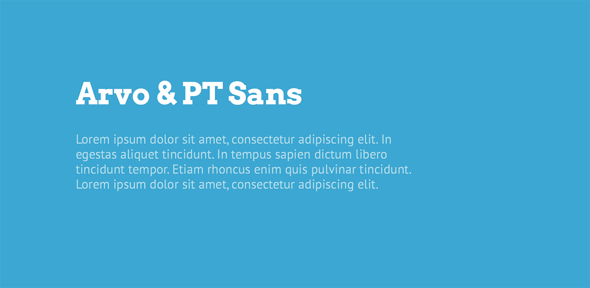
No font selection would be complete without a good slab serif. The Google Font Directory only has a couple of these and Arvo is currently one of the boldest options. I really like most of the characters but admit that the “S” feels a little awkward.
I paired this with yet another great sans-serif: PT Sans. There are several variants of this available but the plain version is the best for body copy. I really like how round the characters are, it makes for a very friendly feel.
The HTML
<link href="https://fonts.googleapis.com/css?family=Arvo" rel="stylesheet">
<link href="https://fonts.googleapis.com/css?family=PT+Sans" rel="stylesheet">
The CSS
h1 {
	font-family: 'Arvo', Georgia, Times, serif;
	font-size: 59px;
	line-height: 70px;
}

p {
	font-family: 'PT Sans', Helvetica, Arial, sans-serif;
	font-size: 16px;
	line-height: 25px;
}
Dancing Script & Josefin Sans
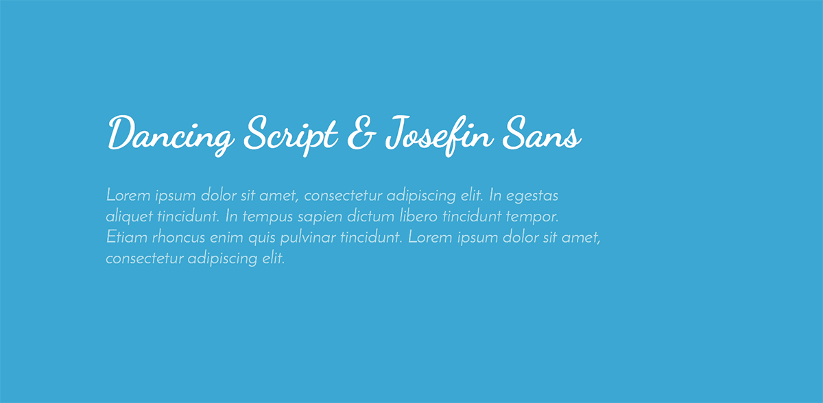
Scripts are hard to implement properly, especially when they’re not as widely applicable as Lobster. Dancing Script, shown in the example above, definitely isn’t my favorite script but it’s one of the better ones available in the Google Font Directory.
Since Dancing Script is a lot more feminine than Lobster, I paired it with Joesfin, a really thin sans-serif to further this style. This combination is definitely appropriate for any products or websites with a female skew.
The HTML
<link href="https://fonts.googleapis.com/css?family=Dancing+Script" rel="stylesheet">
<link href="https://fonts.googleapis.com/css?family=Josefin+Sans" rel="stylesheet">
The CSS
h1 {
	font-family: 'Dancing Script', Georgia, Times, serif;
	font-size: 59px;
	line-height: 60px;
}

p {
	font-family: 'Josefin Sans', Helvetica, Arial, sans-serif;
	font-size: 18px;
	line-height: 25px;
	margin-top: 15px;
}
Allan & Cardo
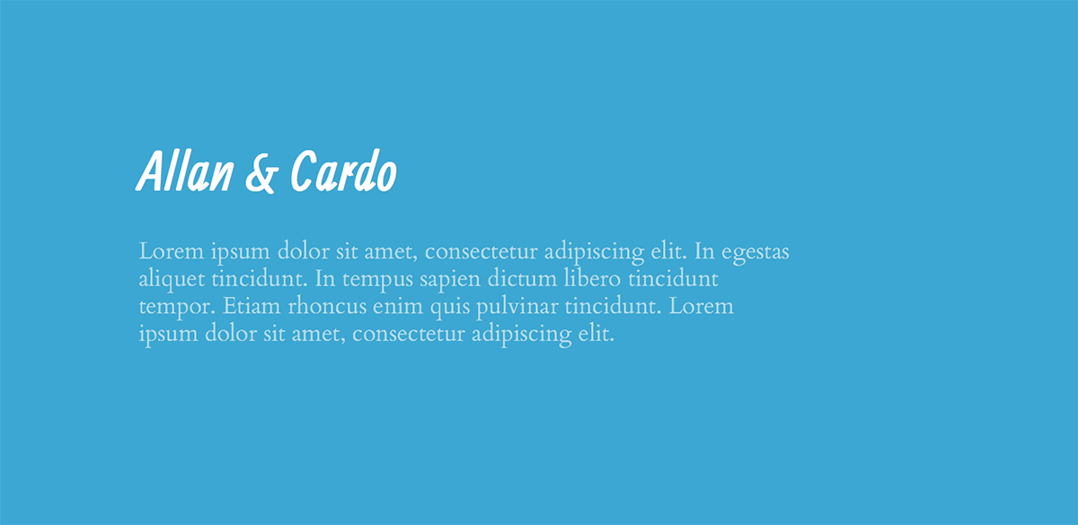
I typically hate comic-type fonts, but Allan is really eye-catching and attractive. I love the boldness of the font and the italicized feel.
My pairing with an old style font (Cardo) seems almost a conflict of time periods but I really liked the way they looked together. Feel free to opt instead for a light sans-serif.
The HTML
<link href="https://fonts.googleapis.com/css?family=Allan" rel="stylesheet">
<link href="https://fonts.googleapis.com/css?family=Cardo" rel="stylesheet">
The CSS
h1 {
	font-family: 'Allan', Helvetica, Arial, sans-serif;
	font-size: 70px;
	line-height: 75px;
}

p {
	font-family: 'Cardo', Georgia, Times, serif;
	font-size: 18px;
	line-height: 25px;
}
Molengo & Lekton
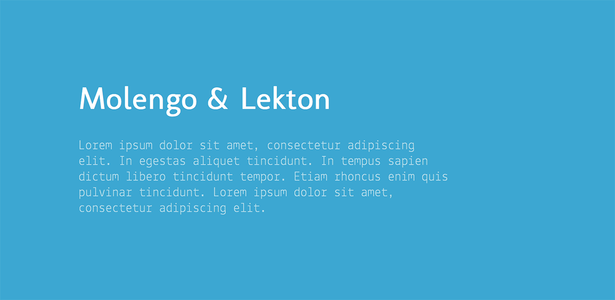
Molengo and Lekton together feel like an old school attempt at a technical feel. Largely due to the typewriter feel of the latter of these.
This combination is something I would expect to see on a website with a parchment texture background along with photos with a polaroid effect and maybe even some coffee stains.
The HTML
<link href="https://fonts.googleapis.com/css?family=Molengo" rel="stylesheet">
<link href="https://fonts.googleapis.com/css?family=Lekton" rel="stylesheet">
The CSS
h1 {
	font-family: 'Molengo', Georgia, Times, serif;
	font-size: 56px;
	line-height: 80px;
}

p {
	font-family: 'Lekton', Helvetica, Arial, sans-serif;
	font-size: 16px;
	line-height: 25px;
}
Droid Serif & Droid Sans
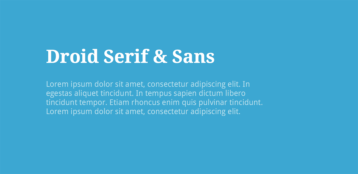
One of our tips above suggested staying within a single family. I put this into practice here with the natural combination of Droid Serif and Droid Sans.
As you can see, both are beautiful typefaces that perfectly complement each other. These could easily be switched so that Droid Serif was the body font and Droid Sans the header font. You can spot Droid in the wild on a certain wildly popular design blog.
The HTML
<link href="https://fonts.googleapis.com/css?family=Droid+Serif" rel="stylesheet">
<link href="https://fonts.googleapis.com/css?family=Droid+Sans" rel="stylesheet">
The CSS
h1 {
	font-family: 'Droid Serif', Georgia, Times, serif;
	font-size: 49px;
	line-height: 65px;
}

p {
	font-family: 'Droid Sans', Helvetica, Arial, sans-serif;
	font-size: 14px;
	line-height: 25px;
}
Corbin & Nobile
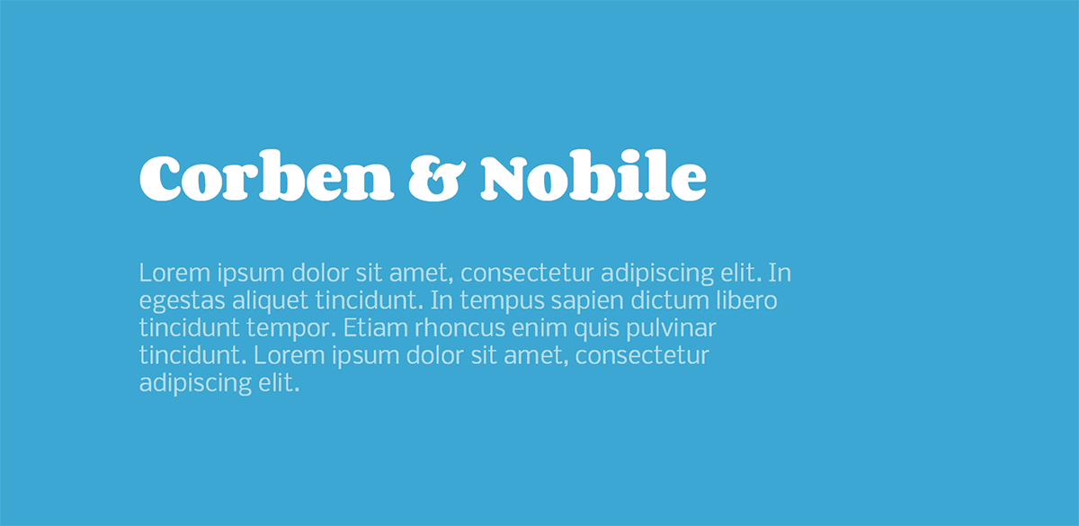
If you’re a fan of Cooper Black, Corben is an excellent free alternative. This fat and toony serif is perfect for anything that should have a 1920s feel to it.
Nobile is a more modern font with letter forms that appear vertically stretched. The minimal styling here keeps your focus on the bold headlines.
The HTML
<link href="https://fonts.googleapis.com/css?family=Corben" rel="stylesheet">
<link href="https://fonts.googleapis.com/css?family=Nobile" rel="stylesheet">
The CSS
h1 {
	font-family: 'Corben', Georgia, Times, serif;
	font-size: 40px;
	line-height: 55px;
}

p {
	font-family: 'Nobile', Helvetica, Arial, sans-serif;
	font-size: 13px;
	line-height: 25px;
}
Ubuntu & Vollkorn
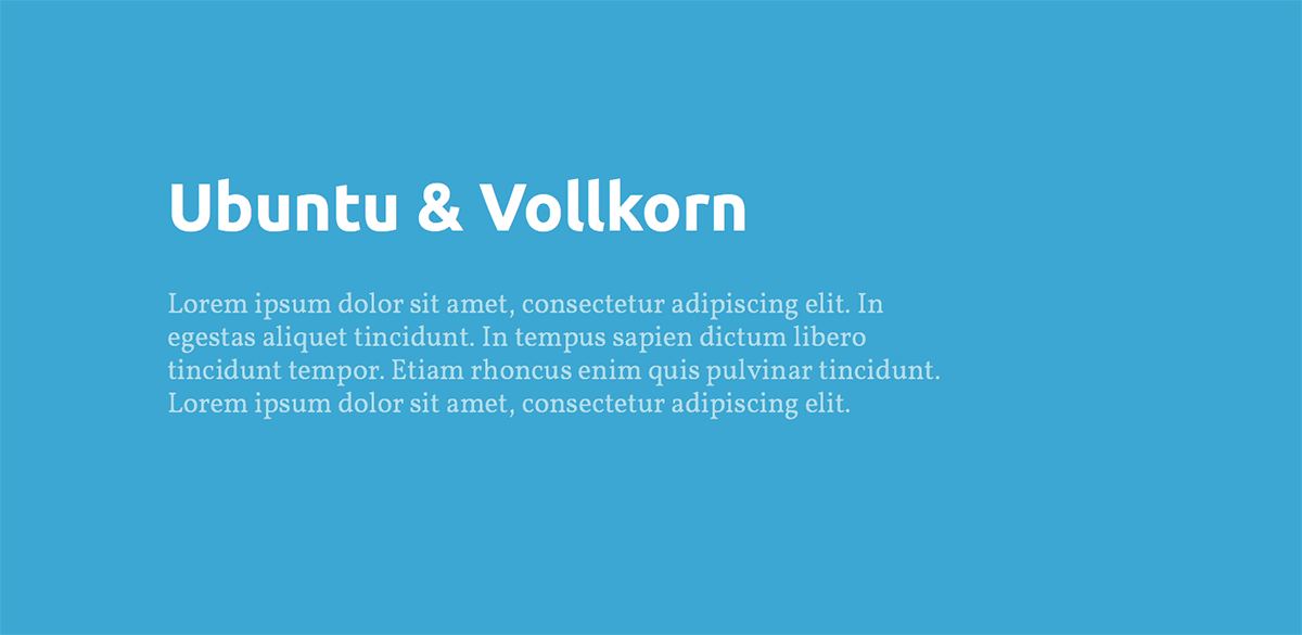
Ubuntu is a notably rounded sans that has a modern feel to it. I used the bold variant here to give extra contrast from the body text.
Vollkorn is definitely a very different typeface, mirroring a long past era. Again, always be careful about mixing fonts from different time periods. Make sure it’s intentional and with purpose!
The HTML
<link href='http://fonts.googleapis.com/css?family=Ubuntu:bold' rel='stylesheet' type='text/css'>
<link href='http://fonts.googleapis.com/css?family=Vollkorn' rel='stylesheet' type='text/css'>
The CSS
h1 {
	font-family: 'Ubuntu', Helvetica, Arial, sans-serif;
	font-size: 50px;
	line-height: 65px;
}

p {
	font-family: 'Vollkorn', Georgia, Times, serif;
	font-size: 16px;
	line-height: 25px;
}
Tell Us Your Favorites!
This article is meant to be a tool that you can bookmark and refer back to every time you’re stuck and in need of a good font combination for the website you’re working on. Both web fonts and browsers have come a long way and these solutions should work really well across the board, but each include appropriate backup fonts in the case that the Google font doesn’t load.
Leave a comment below and tell us your favorite free font combinations. Google’s directory has no shortage of hideous offerings as well so feel free to also share your least favorites!