Focal Point: Intelligent Cropping of Responsive Images
The practice of implementing responsive images is still in its infancy. We’ve seen a lot of ideas and suggestions for how it should be done and we’re bound to see a lot more.
Today we’re going to look at a fascinating little framework that allows you to not only automatically resize your images when the viewport changes, but also crop the images with a specific important focal point in mind. Amazingly enough, it does all this with pure CSS. Read on to see how it works.
Meet Focal Point
Focal Point is a GitHub project and CSS framework created by Adam Bradley. As you know, the concept of responsive images requires that any images on your page resize and reflow to achieve optimal layout for the current viewport size. Focal Point takes this idea a step further though and not only resizes your images, but crops them as well.
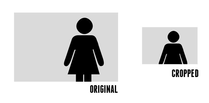
The problem with this idea of course is that if you arbitrarily crop an image, you could be cutting out the most important part of the image! For instance, in the image above, the subject is on the right side of the image. How do we prevent her from being cropped?
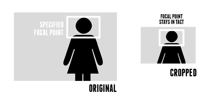
Fortunately, Focal Point allows you to specify a targeted area of the image to retain (the focal point). This way, when the framework crops your image, it will do so in a way that ensures that your picture still looks great.
How Does It Work?
Implementing Focal Point is a pretty unique process, but it’s quite easy. First, we’ll talk about the general process that’s used to choose a focal point, then we’ll dive into the code.
When you insert an image into your web page using Focal Point, that image will automatically be split up into an invisible 12×12 grid. It doesn’t matter what the dimensions of the images are, the grid will adapt to whatever you need.
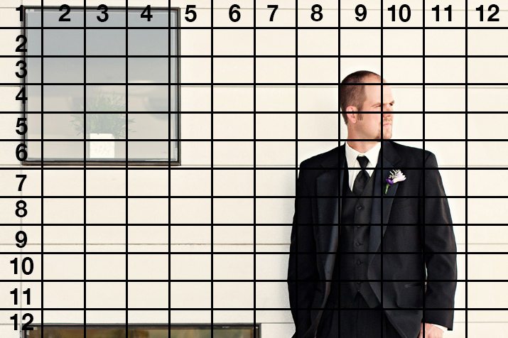
Now that we know how the image is split up, we must decide on a specific place in that grid that will serve as our focal point. What this means is that, as the image is cropped, the point that we choose will serve as a central area around which the crop will happen. So if we choose the man’s face, we can ensure that the important aspects of this photo are maintained.
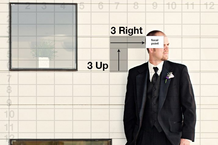
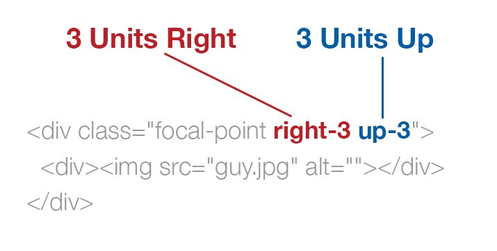
The process here is to find the face, then count grid units from center. In this case, his face is three units right and three units up from the center of the grid.
The Code
Now that we have our focal point in mind, it’s time to plan out our code. To begin, make sure you download the project from GitHub and link the included CSS file to your HTML document.
Once you’re all set up, it’s time to set up two divs and an image tag. Yep, I know, that’s a heck of a lot of markup for a single image and definitely a huge downside to using this framework. Here’s the basic markup:
<div class="focal-point">
  <div><img src="guy.jpg" alt="guy"></div>
</div>
As you can see, the outer div contains the “focal-point” class and the inner div contains our image with no classes applied.
Translate Grid Units to Classes
Now it’s time to tell Focal Point where we want to focus in the image. Remember that our focal point is three grid units to the right and three grid units up. This translates to the class names “right-3” and “up-3”, which are applied to the outer div.
<div class="focal-point right-3 up-3">
  <div><img src="guy.jpg" alt=""></div>
</div>
With this code applied, our image will start out like normal on large screens, then as the viewport is reduced, the width will gradually decrease as the crop tightens around our focal point.
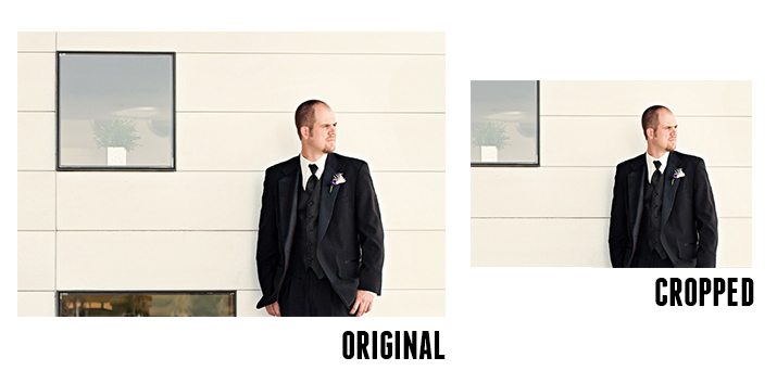
Notice how the image on the right isn’t just smaller, unimportant parts of the photo have actually been cut out. This magic happened live, with CSS! To get a better idea of how this works in a project, let’s build a basic page.
Build It
The first thing that we’re going to do is set up a div with a class of “column”:
<div class="column">
</div>
Simple enough right? Now let’s add in a heading and a paragraph just for some generic page content.
<div class="column">
  <h1>Focal Point</h1>
  <p>Lorem ipsum.... </p>
</div>
Next, toss in the image just like we did above using the “right-3” and “up-3” classes and two divs.
<div class="column">
  <h1>Focal Point</h1>
  <p>Lorem ipsum.... </p>

  <div class="focal-point right-3 up-3">
    <div><img src="guy.jpg" alt="guy"></div>
  </div>
</div>
Now, to finish off the page, copy and paste that entire chunk of code. This time around though, we’ll use another image and a different focal point.
<div class="column">
  <h1>Focal Point</h1>
  <p>Lorem ipsum...</p>

  <div class="focal-point right-3 up-3">
    <div><img src="guy.jpg" alt="guy"></div>
  </div>
</div>

<div class="column">
  <h1>Focal Point</h1>
  <p>Lorem ipsum...</p>

  <div class="focal-point right-2 up-2">
    <div><img src="couple.jpg" alt="couple"></div>
  </div>
</div>
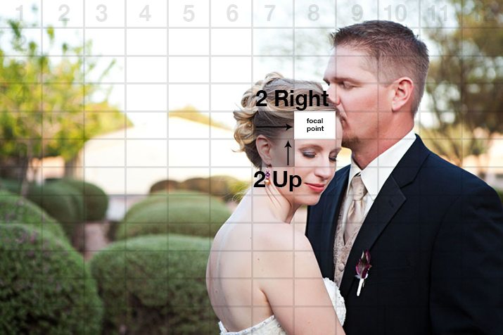
For the second image, the focal point will be right two units and up two units. Here’s what that looks like on our grid:
CSS
Now it’s time to style up this page. The awesome part is that the responsiveness of the images as well as the focal point voodoo is all taken care of for us. All we have to do is make everything look pretty. The process that I go through here basically splits the page into two columns and styles the text.
* {
  margin: 0;
  padding: 0;
  -webkit-box-sizing: border-box;
  -moz-box-sizing: border-box;
  -ms-box-sizing: border-box;
  box-sizing: border-box;
}

.column {
  float: left;
  overflow: auto;
  padding: 20px;
  width: 50%;
}

h1  {
  text-transform: uppercase;
  font: bold 45px/1.5 Helvetica, Verdana, sans-serif;
}

p {
  margin-bottom: 20px;
  color: #888;
  font: 14px/1.5 Helvetica, Verdana, sans-serif;
}

@media all and (max-width: 767px) {
  p {
    font-size: 12px;
  }

  h1 {
    font-size: 35px;
  }
}

@media all and (max-width: 550px) {
  h1 {
    font-size: 23px;
  }
}
See It in Action
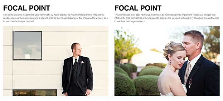
Now that our demo is built, let’s take a look. If we take a look at the page on a desktop or laptop computer, we see that the images have automatically conformed to our column size and are displaying the full image area.
Demo: Click here to launch.
Now if we either narrow our window size or switch to a mobile device, we can see the images adapt perfectly. As we get smaller and smaller, a media query kicks in and suddenly the images are not only smaller, but cropped.
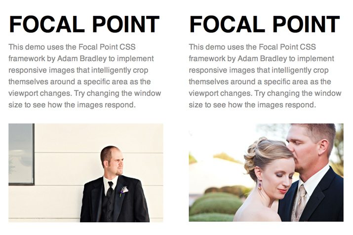
From a design perspective, how cool is that!? The smaller an image becomes, the easier it is for what was once a large, prominent focal point to become a tiny speck. With this framework, you can make sure that viewers on small devices still receive high impact images.
Browser Compatibility
This should work fine in all major, modern browsers. For IE8, the images will resize correctly, they simply won’t crop themselves. This really isn’t the end of the world as 99.99% of sites on the web don’t have this auto-cropping functionality anyway!
Cool, But How Does it Work?
Now we know that Focal Point works, but it’s important to know how it works. This way if you want to tweak what’s happening or do something similar without the framework, you’ll be able to with no problem.
The first portion of the code is a basic CSS-only responsive image solution. It would be good to back this up with some JavaScript, but it’s a solid start. As you can see, it takes advantage of 100% width, 100% max-width and auto height to work its magic.
.focal-point {
    width: 100%;
    height: auto;
    overflow: hidden;
}

.focal-point img {
    width: 100%;
    max-width: 100%;
    height: auto;
    -ms-interpolation-mode: bicubic;
}

.focal-point div {
    position: relative;
    max-width: none;
    height: auto;
}
What happens next is a little more complicated. First, a basic media query is implemented at 767px. Then, to make the crop happen, some negative margins are used for each of the possible classes. I’ve cleaned up this code to only include the “up-3” and “right-3” classes that we used above.
@media all and (max-width: 767px) {

    /* 4x3 Landscape Shape (Default) */
    .focal-point div {
        margin: -3em -4em;
    }

    /* Landscape up (Total 6em) */
    .up-3 div {
        margin-top:    -1.5em;
        margin-bottom: -4.5em;
    }

    .right-3 div {
        margin-left:  -6em;
        margin-right: -2em;
    }
}
As you can see, there’s really not much code at work here, but it’s a pretty tricky chunk of CSS. Negative margins are being used with em units to crop the image relative to a specific point. Serious kudos to Adam Bradley for thinking up this clever technique!
What Do You Think?
Now that you’ve seen what Focal Point does and how it works, it’s time for you time chime in and let me know what you think. Would you use this in a project? Why or why not? How would you make it even better?
Also, if you’ve seen any other great responsive image tools, techniques or frameworks, leave a link and I’ll check them out.