Three Super Easy Ways to Pull Off a Masonry Layout
Masonry style layouts push the boundaries of creative layout techniques. I personally love how capable they prove to be at maximizing the efficiency of galleries containing items with varying heights. Every bit of screen space is used and the result can be downright mesmerizing.
Today we’re going to dive into the concept, ideas and popular techniques that are currently prevalent in masonry style layouts. We’ll learn three different methods for pulling off a masonry layout, discuss the ins and outs of each and make sure that the result is beautifully responsive and reflows based on browser width.
What Is a Masonry Layout?
When you float objects in CSS, the browser arranges elements first horizontally then vertically. When we fill a container with a bunch of equally sized objects and float them left, we get a nice grid of images.

However, if the objects have variable heights, the results are much more difficult to predict. Instead of a nice tight grid, we get something that tends to be fairly scattered.

The obvious quandary here is how to pull off a nice tight grid that with items that have variable heights. It’s a pretty interesting topic and various developers have come up with several ways to go about it. Let’s take a look at three of the current best solutions.
To go one step further, we’re going to make sure that all three solutions are responsive, meaning the grid will reflow as the window size changes.
jQuery Masonry
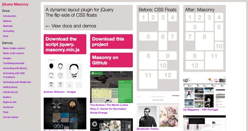
jQuery Masonry is the most popular solution to pull off this type of layout. It utilizes some pretty fancy JavaScript to reflow a series of divs.
Putting Masonry into practice is pretty easy, all you need is a container that holds a series of divs that you want to arrange masonry style. You can place anything you want inside the divs, in this case I threw in some placeholder images.
Once you have that in order, toss in jQuery and jQuery Masonry. Then you need to create a simple function that identifies your container and targets the class that we used for our Masonry images divs. Here’s a basic example:
<div id="container">
	<div class="masonryImage">
		<img src="https://designshack.net/wp-content/uploads/http://lorempixum.com/200/200/food/1" alt="" />
	</div>

	<div class="masonryImage">
		<img src="https://designshack.net/wp-content/uploads/http://lorempixum.com/200/150/food/10" alt="" />
	</div>

	<div class="masonryImage">
		<img src="https://designshack.net/wp-content/uploads/http://lorempixum.com/200/250/food/3" alt="" />
	</div>

	. . .

</div>

<script src="jquery-1.7.1.min.js"></script>
<script src="jquery.masonry.min.js"></script>
<script>
  $(function(){

    var $container = $('#container');

    $container.imagesLoaded( function(){
      $container.masonry({
        itemSelector : '.masonryImage'
      });
    });

  });
</script>
CSS
As long as we have a width set on our container div, the code above performs the magic we need it to and reflows the elements. If you set the div width to a percent, jQuery Masonry even automatically reflows the items as the page resizes.
Even though this is the case, things can get messy if you want to keep your container centered. I found it easier to apply a static width to my container, then use media queries to reflow the columns as the page size decreases past the container size.
#container {
	width: 1200px;
	margin: 0 auto;
}

/*Media Queries*/
@media only screen and (max-width : 1199px),
only screen and (max-device-width : 1199px){
	#container {
		width: 1000px;
	}
}


@media only screen and (max-width : 999px),
only screen and (max-device-width : 999px){
	#container {
		width: 800px;
	}
}

@media only screen and (max-width : 799px),
only screen and (max-device-width : 799px){
	#container {
		width: 600px;
	}
}

@media only screen and (max-width : 599px),
only screen and (max-device-width : 599px){
	#container {
		width: 400px;
	}
}

@media only screen and (max-width : 399px),
only screen and (max-device-width : 399px){
	#container {
		width: 200px;
	}
}
See It In Action
This gives us a nice tight image gallery that perfectly responds to various browser window sizes. I’ve taken all the spacing out to illustrate just how tight you can get your images, but feel free to build in some margins so your images are spaced out a bit more.
Demo: Click here to launch demo

Wookmark
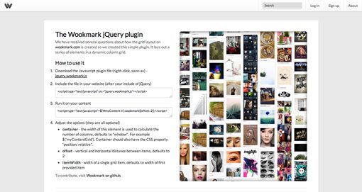
Another popular JavaScript solution for achieving the same type of layout is Wookmark.js, which is the driving plugin behind the Pinterest-like Wookmark.com.
Wookmark.js is in my opinion a little trickier to implement than jQuery Masonry because of the lack of documentation, but it’s still pretty basic stuff. All we need to do to start is toss a bunch of images into an unordered list. The catch with this plugin is that we have to declare inline height values for each of the images.
<ul id="myContent">
	<li style="height: 206px;"><img src="https://designshack.net/wp-content/uploads/http://lorempixum.com/200/206/animals/1" alt="" /></li>
	<li style="height: 256px;"><img src="https://designshack.net/wp-content/uploads/http://lorempixum.com/200/256/animals/2" alt="" /></li>
	<li style="height: 216px;"><img src="https://designshack.net/wp-content/uploads/http://lorempixum.com/200/216/animals/3" alt="" /></li>
	<li style="height: 276px;"><img src="https://designshack.net/wp-content/uploads/http://lorempixum.com/200/276/animals/4" alt="" /></li>
	. . .
</ul>
Once you’ve got that set up, then you insert the JavaScript at the bottom of the body just like last time. Insert both jQuery and Wookmark.js, then set up the simple function below, which targets the list items in our #myContent unordered list.
I tossed in another simple function here which essentially reloads the script as the window changes size. This will ensure that the columns automatically reflow and provide that responsive functionality. This time around we’ll ditch the media queries and let the JavaScript handle all of the layout.
<script src="jquery-1.7.1.min.js"></script>
<script src="jquery.wookmark.js"></script>

   <script>
		$('#myContent li').wookmark({offset: 2});

		window.onresize = function(event) {
		    $('#myContent li').wookmark({offset: 2});
		}
   </script>
CSS
The CSS for this version is super minimal. All we need to do is set our ul width with a percentage and use position:relative. Then we set a specific width for each list item. That’s it!
#myContent {
	width: 80%;
	position: relative;
}

#myContent li {
	width: 200px;
}
See It In Action
Just like last time, the result is a tight grid of images. However, even though spacing options are adjustable with Wookmark.js, I couldn’t get it to work at zero so we have a little bit of spacing in between the images.
Demo: Click here to launch demo

Pure CSS
The JavaScript solutions are probably the safest and most widely compatible ways to go about a masonry layout, but the CSS nerd in me knew there had to be a way to pull it off without JavaScript.
It turns out, it’s actually pretty easy using some fancy CSS3. This technique was pioneered by Radu Chelariu at SickDesigner and though it’s definitely not as powerful, flexible, or cross-browser-compatible as the previous options, it’s still extremely impressive given that it’s all CSS.
To start off, let’s use the same unordered list that we did last time (no inline styles necessary), thrown into a container div.
<div id="container">
	<ul id="myContent">
		<li><img src="https://designshack.net/wp-content/uploads/http://lorempixum.com/200/206/nature/1" alt="" /></li>
		<li><img src="https://designshack.net/wp-content/uploads/http://lorempixum.com/200/256/nature/2" alt="" /></li>
		<li><img src="https://designshack.net/wp-content/uploads/http://lorempixum.com/200/216/nature/3" alt="" /></li>
		<li><img src="https://designshack.net/wp-content/uploads/http://lorempixum.com/200/276/nature/4" alt="" /></li>
		. . .
	</ul>
</div>
CSS
Here’s where the voodoo happens. To start, apply a width to the container and center it. Then use the new CSS columns functionality to lay out the content into six columns with zero gap. Finally, target the images directly and set the display to inline-block with a width of 100%. Inline-block allows us to flow elements inline without floats while maintaining block level functionality.
#container {
	width: 1200px;
	margin: 0 auto;
}

#myContent {
	-moz-column-count: 6;
	-moz-column-gap: 0px;
	-webkit-column-count: 6;
	-webkit-column-gap: 0px;
	column-count: 6;
	column-gap: 0px;
	width: 1200px;
}

#myContent img{
	display: inline-block;
	margin-bottom: 0px;
	width: 100%;
}
That’s all we need for the masonry layout, but we still have the responsive bit to go. We’ll basically use the same trick that we used for the first layout, only this time we’ll change the column count and container width when the window size gets too narrow.
@media only screen and (max-width : 1199px),
only screen and (max-device-width : 1199px){
	#myContent {
		-moz-column-count: 5;
		-moz-column-gap: 0px;
		-webkit-column-count: 5;
		-webkit-column-gap: 0px;
		column-count: 5;
		column-gap: 0px;
		width: 1000px;
	}

	#container {
		width: 1000px;
	}
}


@media only screen and (max-width : 999px),
only screen and (max-device-width : 999px){
	#myContent {
		-moz-column-count: 4;
		-moz-column-gap: 0px;
		-webkit-column-count: 4;
		-webkit-column-gap: 0px;
		column-count: 4;
		column-gap: 0px;
		width: 800px;
	}

	#container {
		width: 800px;
	}
}

@media only screen and (max-width : 799px),
only screen and (max-device-width : 799px){
	#myContent {
		-moz-column-count: 3;
		-moz-column-gap: 0px;
		-webkit-column-count: 3;
		-webkit-column-gap: 0px;
		column-count: 34;
		column-gap: 0px;
		width: 600px;
	}

	#container {
		width: 600px;
	}
}

@media only screen and (max-width : 599px),
only screen and (max-device-width : 599px){
	#myContent {
		-moz-column-count: 2;
		-moz-column-gap: 0px;
		-webkit-column-count: 2;
		-webkit-column-gap: 0px;
		column-count: 2;
		column-gap: 0px;
		width: 400px;
	}

	#container {
		width: 400px;
	}
}
Compatibility
The big problem here is that IE doesn’t have support for CSS columns until IE10. This means that you’ll have to use jQuery Masonry as a backup for IE users if you want to implement this technique in a real world scenario.
See It In Action
Here’s our third and final masonry layout demo. At a glance, the effect is exactly like we saw with jQuery Masonry. Not bad for plain old CSS!
Demo: Click here to launch demo

Conclusion
In a recent article on Pinterest, I discussed just how powerful masonry layouts can be from a UX perspective, especially when combined with infinite scrolling.
You can definitely expect this budding trend to increase in popularity and before you know it you’ll have clients asking for a layout like the one they see on Pinterest. When this happens, you’ll now be prepared with not one but three possible solutions!