What’s the Deal With Display: Inline-Block?
We’ve been using floats for layout pretty much since we left tables behind. It’s a quirky solution that can often cause troubles, but if you know what you’re doing, it works.
One interesting alternative to floats that people are turning to more and more lately is to set the display value of an element to inline-block. What does this do exactly? How is it like a float? How is it different? Let’s dive in and see what we can discover.
The Display Property
Web browsers render different elements in different ways. Some elements are block-level, meaning that their default display value is set to block. Block-level elements have a definable width and height and automatically create a new row in the layout as they’re created.
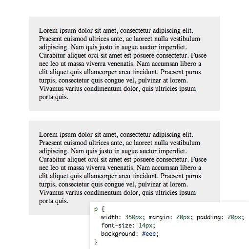
One example of a block-level element is a paragraph. If I toss two paragraphs into a HTML document, they stack on top of each other rather than appearing side by side. I have a lot of freedom over their dimensions and can really treat them as individual building blocks to shape as I please.
Other elements have their display value set to inline by default. This means they don’t have a definable height and width and will not create new rows in a layout (thus they appear “inline”). Inline elements are generally the type of thing that you institute within a paragraph or other block-level element: strong, em, anchor, etc.
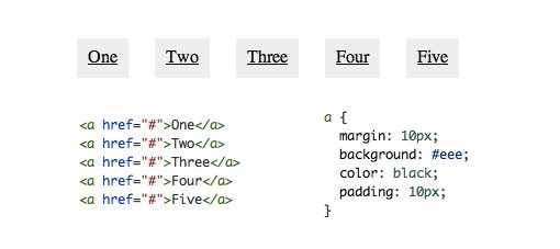
Here’s what happens if I toss a bunch of anchor tags into an HTML document. Unlike the the paragraphs above, which automatically stack, these elements are created side by side. Their width and height are determined by the content they contain and can’t be manually overridden as with the block-level elements.
There are a few other basic display default values that you’re probably familiar with as well. For instance, items in the head portion have a display property of none.
Setting Your Own Display Value
One really interesting feature of CSS is the ability to change the default display behavior of elements. Though a standard behavior is already set for a given element, we can override that for our own purposes.
For instance, we can easily take those inline anchor tags from the second example above and make them act more like the block-level paragraphs from the first example. We do this be setting the display property to block in our CSS.
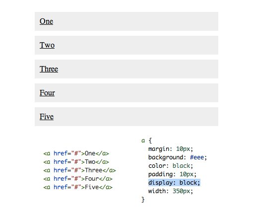
Now our anchor tags behave like block-level items, so each one creates a new line and can have a custom height/width value applied.
As you can imagine, it’s more difficult to work with the reverse of this example by taking a block-level element and setting the display value to inline. Instinctively, you might use display: inline to try to make the two paragraphs above appear side by side, but when you do this, the result is instead that the two flow together into a single paragraph.
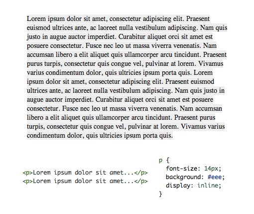
We’ve now lost all ability to set our width and height so the two paragraphs are inexorably integrated, which isn’t at all what we were going for.
Floating Elements
So what if we want the two paragraphs above to remain distinct but appear side by side as individual columns instead of stacked into rows? The typical answer that many of us have turned to for years is floats. By applying “float: left” to the paragraphs, we can maintain block-level functionality while creating multiple columns of content.
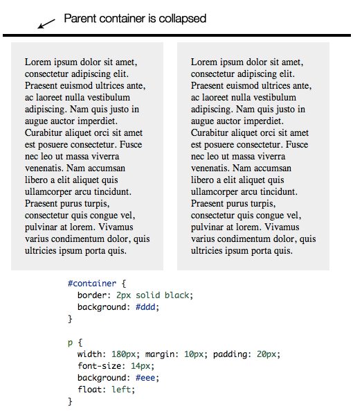
Floats come with some interesting behavior. For instance, floated items tend to collapse their parent container, leading to all kinds of messy issues if you’re applying background colors or borders. To get around this, we have a few tricks. We can either clear the floats on a new element (these days it’s often a pseudo-element) at the end of the container or use overflow:auto on the parent. Both fixes have their caveats, but if you know how to leverage each properly you can typically pull off any layout feat without too much trouble.
display: inline-block
There are tons of values for the display property beyond what we’ve mentioned already, some of which are helpful, others that I doubt you’ll ever use. The topic of today’s discussion is by far one of the most interesting and useful of the bunch: inline-block.
Watch what happens when we take our two paragraphs from the original example above and apply a display value of inline-block.
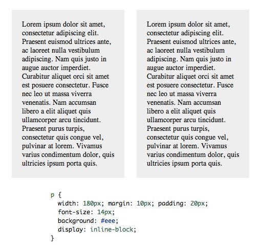
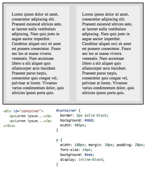
Looks a lot like a float right? So what happens if we add in a parent container? Does it have the collapsing problem that we saw with floats? Nope! Everything works just how we expect it to.
What’s happening here is that we’re telling the browser to display the paragraphs inline, but allow them to retain their block-level characteristics. This means we can set a width and height manually and have the two elements remain distinct, but also have them appear next to each other in the document flow. Pretty slick!
The Alignment Issue
On the surface, inline-block may seem like the layout savior you’ve been waiting for. Who wants to mess with messy clearfix hacks when you can skip it altogether with this method? It turns out though that floats aren’t the only layout method with quirks, inline-block also has some strange functionality that you have to wrap your head around.
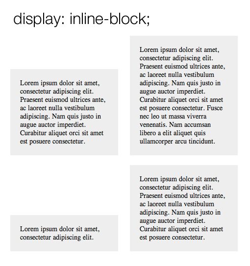
One of the first things that you’ll floats and inline-block look quite different when you have several elements with varying heights. For instance, here’s what happens when you float a bunch of paragraphs to the left:
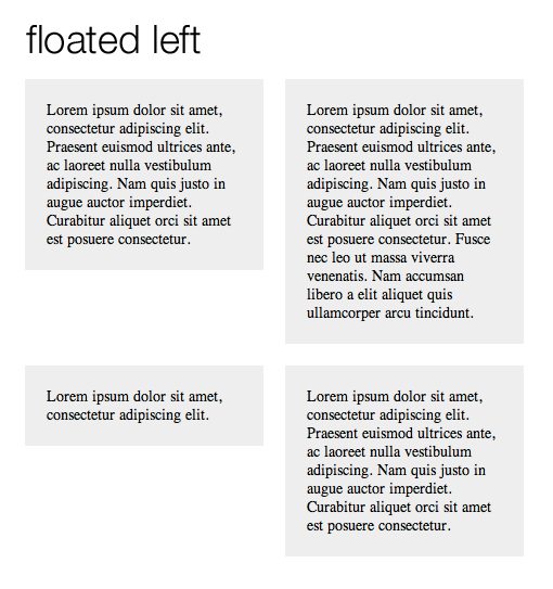
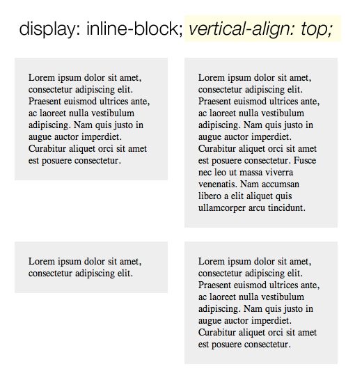
Now here’s what happens when you use inline-block to pull off the same thing. Notice that the bottom edges of the paragraphs are aligned instead of the top as in the previous image.
Fortunately, this isn’t a huge problem. To address the issue, make sure you set the vertical-align property to top.
The Whitespace Issue
There’s another important place that the behavior of inline-block differs from floats. I find it bizarre that anything in HTML and CSS could be whitespace aware when it comes to layout, but that’s exactly what we find here. Consider the following examples.
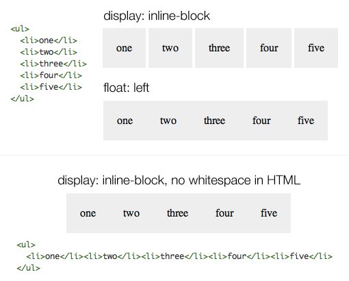
Here we can see that when a group of list-items is floated, they smash right up against each other like we would expect, allowing us to manually set the gap without any unexpected extra space. However, when we do the same with inline-block, there’s a little bit of default space that won’t even go away if we set our margins to 0.
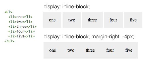
As you can see, one solution is to take out the whitespace in our HTML and push the elements right up against each other. Once again, I find this pretty confusing but it does work. An alternative solution that produces the same result without screwing with the visual hierarchy in your HTML is to apply a margin of -4px on the list items.
Browser Support
Now that we know what inline-block is and how it functions differently than floats, it’s time to discuss everyone’s favorite topic: browser support. What atrocities will we have to embark upon to make sure this technique actually works across the board?
When we stop by CanIUse.com to see the answer, the results are probably a lot better than you would’ve expected.
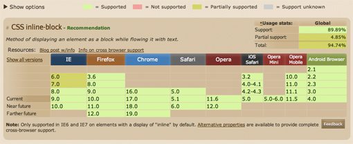
Here we can see that we have at least partial support across the board and full support for everything but IE7 and older (feigned shock and awe). The note at the bottom informs us that inline-block is “only supported in IE6 and IE7 on elements with a display of ‘inline’ by default.” This means that the paragraph examples that we’ve used all throughout this article are out.
Fortunately, the Mozilla blog posted some fixes for this way back in 2009. To get IE to play along nicely, we just need to trigger hasLayout with the zoom property and then use the star hack to target IE6/7 and set the display to inline. This allows you to functionally treat the inline elements as if they were inline-block elements. It’s certainly not pretty, but it gets the job done.
li {
  display: inline-block;
  width: 100px;
  vertical-align: top;

  /*Dirty IE Hack*/
  zoom: 1;
  *display: inline;
}
Further Reading
If you’d like to learn more about inline-block, here are some articles that I found to be particularly helpful in my research.
- Float vs. Inline-Block
- What Is Inline-Block?
- inline-block: Lots of Examples
- Cross-Browser Inline-Block
A Better Solution?
To be honest, I’ve never really played around with inline-block too much before today, but I’ve been seeing more and more suggestions in the comments that I explore this method as an alternative to floats so I thought I’d take the advice. I was hopeful going into it that it was indeed some magic, no-hassle way around floats, but in truth it really isn’t. There are still several unexpected behaviors that you have to know about and respond to, resulting in some hacky code much like we often see with float clearing fixes.
To be fair though, it is in fact a pretty simple way to accomplish float-like layouts. More importantly, the CSS that you have to implement to make sure it’s cross-browser compatible is briefer than even the popular micro clearfix hack from Nicolas Gallagher. This may make it a better way to go for many projects.
Ultimately, I think I will in fact begin adding this method to my bag of tricks. I suspect that certain times will arise when floats aren’t ideal (example: right floats render everything in reverse) and this will be a great alternative to have in those situations.
What do you think? Is inline-block a good alternative to floats? What situations can you think of where one clearly has an advantage over the other?