Which Is Right for Me? 22 Responsive CSS Frameworks and Boilerplates Explained
CSS frameworks have been around for years now, but the arrival of responsive design practices has rendered many of our old favorites useless. Fortunately, lots of really talented developers have jumped in to fill the gap with the next generation of CSS frameworks and boilerplates.
There’s already a ton of these things floating around. Everyone has a list, but no one really walks you through how each framework and boilerplate differs from the next so that you can make an informed decision. That’s our goal today. Follow along as we take a look at what makes each of these 22 responsive CSS frameworks and boilerplates unique.
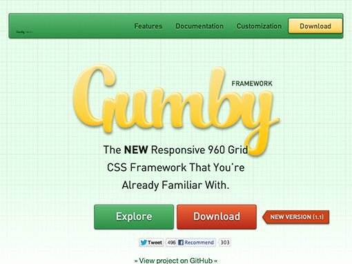
Gumby
The Gumby framework takes the 960 grid that we all cut our teeth on years ago and brings it into the modern age of web design with a responsive touch. It also has prebuilt styles for things like forms, buttons, toggles, dropdowns, tabs, and more.
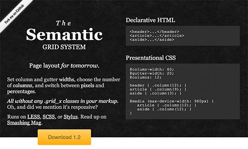
The Semantic Grid System
If you hate grid systems and their bloated, non-semantic markup, this one is for you. The Semantic Grid System leverages the power of CSS preprocessors (LESS, Sass and Stylus) to create customizable variables for things like gutter and column width. All you have to do is use a few prebuilt mixins in your CSS, no extra markup required!
Gridless
Gridless is a powerful boilerplate that uses mobile first responsive web design to adapt itself to the device’s width. It’s also packed with great features like CSS normalization, IE bug fixes and typography styles.
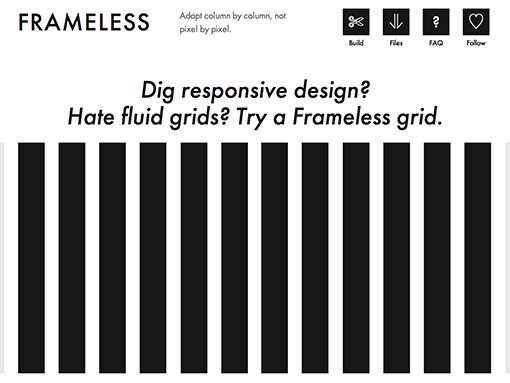
Frameless
Frameless is difficult to classify because it’s technically more of a recommended way of approaching responsive design than an actual set of files that you can download. There are three steps: First, make a regular fixed-width grid, then make it repeat infinitely, and finish off by centering it in the viewport.
The site specifically states that Frameless isn’t a framework and that there are no files do download, but despite this claim there are in fact some basic templates to help get you started.
Proportional Grids
Proportional grids tackles some big problems that arise when attempting responsive CSS layout, namely nesting grids and wrestling with percentage-based based values across vastly different viewports.
Proportional Grids uses CSS box-sizing to create a solution that allows for fixed gutters (ems/rems) mixed with fluid columns. The distance between columns will remain equal at every break point, in relation to the base font-size. Columns are defined by proportion e.g. one half, one third, two thirds and can be easily re-used as many times as you like, even when nested.
The Goldilocks Approach
The Goldilocks Approach is aimed at reducing the tendency of responsive designs to lean towards support of specific devices. Instead, it shoots for a universal design that isn’t dependent on any device.
The Goldilocks Approach uses a combination of ems, max-width, media queries and pattern translations to consider three states that allow your designs to be resolution independent.
Twitter Bootstrap
Twitter Bootstrap needs no introduction. It’s one of the biggest, baddest CSS boilerplates on the web and is the starting point for countless professional and personal sites from developers all over the world.
Twitter Bootstrap includes a responsive grid system in addition to tons of stellar pre-styled elements like forms, buttons, navigation menus and more. Check out our full introduction here.
Foundation from ZURB
Foundation is the most significant competitor to Twitter Bootstrap as the two projects are very similar. Like Bootstrap, Foundation gives you a responsive grid as well as various styled UI elements.
Foundation 3 just launched recently so if you haven’t taken a look at the project in a while, it’s time to stop by and check it out. It’s hands down one of the most helpful and thorough frameworks that you’ll find anywhere.
Skeleton
Skeleton was one of the earliest responsive boilerplates to make an appearance and it’s still one of the best. In concept, it’s a little like Foundation only it feels more lightweight (type, buttons and forms are the only UI elements included).
Check out our Skeleton tutorial to see how incredibly easy this tool makes it to get a responsive design up and running in minutes flat.
Amazium
Amazium is a lot like Gumby above in that it’s a responsive grid built on top of the 960 grid techniques of old. Recently though the framework has been updated to stretch all the way out to 1,200px so you can take advantage of large displays. It even includes support for retina displays!
Golden Grid System
The Golden Grid System calls itself a “folding grid,” which is really just a fancy way to say that media queries are used to collapse the original sixteen column layout into eight and then four columns as the viewport narrows.
Like some of the other grids that we’ve seen thus far, Golden Grid System uses gutters based on ems so that the gutters always stay in proportion to the content.
The 1140px CSS Grid System
This one is a pretty standard grid system without anything fancy. It starts with a 12 column fluid grid that uses percentage-based gutters and works great on 1,280 and 1,140px monitors. As the viewport gets smaller, a couple of simple media queries are used to reflow the content.
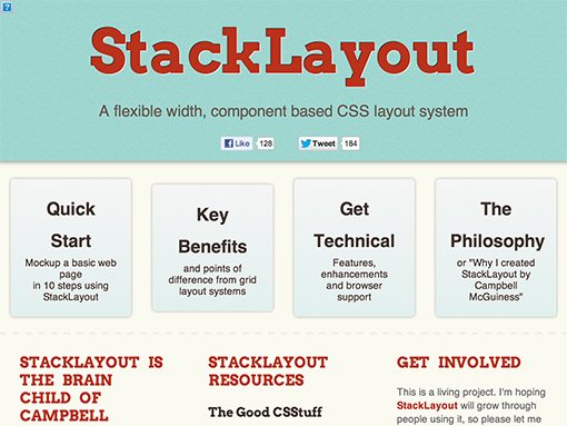
StackLayout
StackLayout is for the rebels, it’s going to be very different from other frameworks that you’ve tried. In fact, it arose out of a dislike of typical CSS layout frameworks.
The basic principle at work here is that StackLayout uses inline-block as the cornerstone of a unique layout system. The system is a little quirky but it’s pretty impressive nonetheless. Check out a walkthrough here.
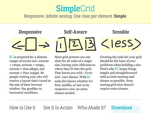
SimpleGrid
SimpleGrid is another unique layout system that you’ll enjoy if you love playing around with these things as much as I do. The grid here is based on four different screen ranges: screens less than 720px wide, screens greater than 720px wide, screens greater than 985px wide, and screens greater than 1235px wide.
To implement the system, you utilize “slot” classes from both a four and six column layout. It sounds complicated but it’s actually true to its name and quite simple to implement.
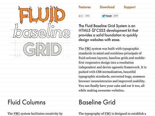
Fluid Baseline Grid
Fluid Baseline Grid is built with a heavy emphasis on strong typography that adheres to a baseline grid. It also contains a three column folding grid that is intended to be a helpful starting point, not a standard to be followed.
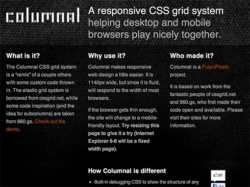
Columnal
Columnal is sort of a hybrid grid system that borrows the best elements from various other frameworks. It has the elastic DNA of the 1140px CSS Grid System with some 960.gs thrown in as well. It’s pretty standard stuff but if the others don’t seem like a good fit, you might try it out.
Inuit.css
Inuit.css is a great framework that is actually built with extensibility in mind. Use the custom grid builder to create your own responsive grid, then download some igloos (plugins) to extend the framework in useful ways.
320 and Up
320 and Up is like a collection of web design buzz words (in a good way). It contains a responsive layout system that uses the “mobile first” mentality, along with Bootstrap visual styles, Font Awesome icons, Modernizr, Selectivizr, LESS and Sass. It’s an impressive little toolbox of goodies that I think you’ll enjoy.
Susy: Responsive grids for Compass
This one is for the super nerds like myself that love layout systems as well as Sass and Compass. Build your layouts in minutes with the magic of mixins and variables.
Given that Compass has recently dropped native support for grids altogether, Susy should come in handy for those who miss them.
Initializr – Responsive HTML5 Template
Initializr is a tool that helps you launch your HTML5 projects quickly and easily using HTML5 Boilerplate, Bootstrap or a new responsive boilerplate.
Selecting the responsive template is only the beginning, from there you custom build your download by choosing from all of the resources you might typically want such as Modernizr and LESS.
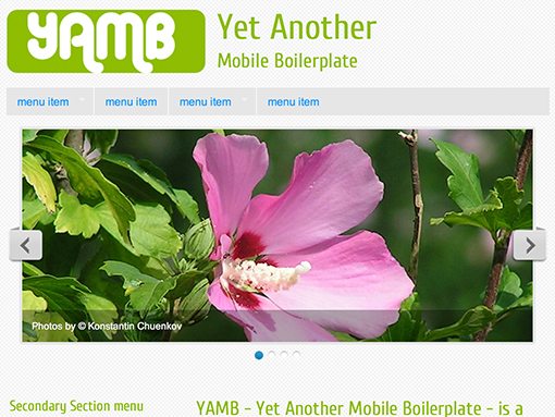
Yet Another Mobile Boilerplate
YAMB is a great starting point for your responsive web projects, built on a few key features: a responsive fluid grid, dropdown navigation menus that automatically turn into select boxes on small screens, and responsive images/slideshows.
I think the website is pretty ugly but the toolset itself is quite handy!
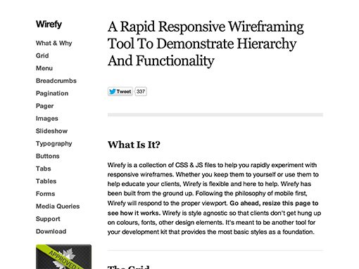
Wirefy
Wirefy is built specifically with rapid responsive wireframing experimentation in mind. It uses a modified version of the sixteen column 960 grid along with some Bootstrap-like UI elements (menus, forms, slideshows, buttons, images, etc.).
Which is Your Favorite?
Inevitably, these types of posts will attract commenters who feel the need to attempt to discredit the entire notion of using any sort of template or grid system for web design. They’re simply not for everyone and I respect your opinion if you can’t stand them.
If you are into grid systems though, I’d love to hear your feedback about the options above. Which ones have you tried and what did you think of them? Which is your favorite?