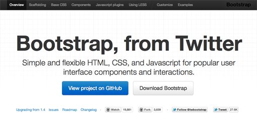
Twitter Bootstrap 2: Bootstrap Goes Responsive
Recently, we published a piece titled 5 Incredibly Useful Tools Built Into Twitter Bootstrap, which took a look at the basic structure of Twitter’s Bootstrap framework and walked you through implementing some of the major components.
Twitter just released Bootstrap 2.0, an update so large it equates to a near full rewrite. There are quite a few new features and toys to play with, but the real headliner is that the framework is now fully responsive. Join us as we dig in to see how the new grid works and what other cool new features have been added. You’ll learn how to implement Bootstrap in your projects and will also pick up some extremely handy CSS techniques that you can use anywhere.
Demo
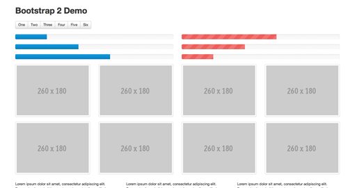
We’ll be talking about several new Bootstrap features today. If you want to see them in action, stop by the live demo below.
Demo: Click here to launch.
Implementing the Responsive Grid
The most major aspect of Twitter Bootstrap is of course that it is now fully responsive. If you’re still labeling the whole responsive movement as a silly fad in hopes that you can ultimately skip learning the requisite techniques, you’re out of luck. Responsive design is well on its way to being a standard practice instead of a “nice to have” add on. It’s really not as complicated as you might think and tools like Bootstrap make it even easier.
The new responsive grid is twelve columns wide and works much like the sixteen column grid from Bootstrap 1. If you’ve ever used any grid system before, then you’ll feel right at home as there’s nothing too Earth shattering here.
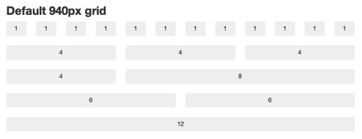
To implement the grid, you pretty much follow the same steps as you always did. Start with a container div, then create a row and fill that row with span(x) divs. Given that it’s a twelve column grid, just make sure the numbers in a row add up to twelve. Try four “span3” divs, a “span9” with a “span3” or even just a straight up “span12” to go all the way across. Here’s a quick example:
<div class="container">
  <div class="row">
    <div class="span4"><p>Lorem ipsum dolor sit amet</p></div>
    <div class="span4"><p>Lorem ipsum dolor sit amet</p></div>
    <div class="span4"><p>Lorem ipsum dolor sit amet</p></div>
  </div>
</div>
The above represents a static grid. It will still be responsive, it just won’t respond to every minute browser window size change, only those set by media queries. If you want a fluid grid, use the fluid classes:
<div class="container-fluid">
  <div class="row-fluid">
    <div class="span4"><p>Lorem ipsum dolor sit amet</p></div>
    <div class="span4"><p>Lorem ipsum dolor sit amet</p></div>
    <div class="span4"><p>Lorem ipsum dolor sit amet</p></div>
  </div>
</div>
The Media Queries
The included media queries are listed below, starting at mobile and working their way up. Basically, each one goes in and changes the size of the columns to reflow the layout to something more appropriate for the viewport.
- @media (max-width: 480px)
- @media (max-width: 768px)
- @media (min-width: 768px) and (max-width: 980px)
- @media (max-width: 980px)
- @media (min-width: 980px)
- @media (min-width: 1200px)
The first media query (480px and below) targets smartphones and pretty much breaks everything down to a single, 100% width column. This may be a bit oversimplified for your tastes, but the beauty of frameworks like this is that they’re only suggestions, you’re encouraged to customize to your heart’s content.
The next media query targets portrait tablets with a range of 480px to 768px, then up to 980px for landscape tablets and on up to standard desktops and large displays.
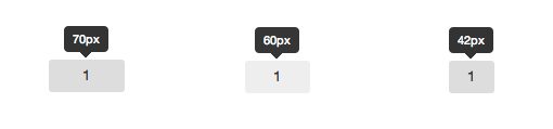
For the static grid, individual columns start at 70px wide, then jump down to 60px and finally down to 42px before going 100% width for mobile.
Tip: Grab the Right Download
Interestingly enough, the media queries aren’t included in the default download from the Bootstrap homepage. If you want them, you’ll have to grab the GitHub Download.
Nice Attribute Value Selector Usage
If you check out the code for the media queries, you might learn a neat trick or two.
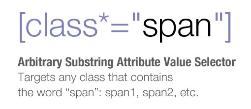
Bootstrap has many classes that use the word “span” (span1, span2, etc.), and rather than typing out each individually, the ASAVS grabs them all in one go with this fancy bit of code: [class*=”span”]. This selector actually digs through the HTML and finds anything with “span” in the class name, regardless of what follows it. Even a class of “spansomethingtotallycrazy” would be targeted.
Content Transformation
Though the heart of the media queries is to reflow the columns, there’s a lot more going on here as well. The developers have actually taken the time to restructure many of the elements so that they transform as the viewport size changes.
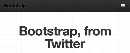
For instance, the navigation menus change pretty drastically when you’re viewing on a tablet or smartphone. To see an example, test out the Bootstrap Homepage. At full size, the navigation menu is a simple horizontal list of text links.
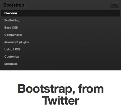
On a tablet or smartphone though, the text is cleared out and replaced with a button up in the top right of the screen.
Tapping on the button will expand the new menu area. Here we have a vertical list of links, which allows for larger tappable areas.
Responsive Images
The navigation menu isn’t the only thing that changes size with the viewports, lots of other objects do as well, from simple buttons up to more complicated objects like image carousels. To pull off the automatically resizing images, Twitter has taken the “max-width: 100%;” route. Here’s the full snippet:
img {
  max-width: 100%;
  height: auto;
  border: 0;
  -ms-interpolation-mode: bicubic;
}
This makes it so that, as those columns and rows resize themselves, the image width will max out at the width of the parent column. Also notice the “-ms-interpolation-mode: bicubic;” line. This is a fairly obscure property that essentially makes image re-sizing smoother in IE.
More New Stuff
The responsive functionality is definitely the coolest new feature of Bootstrap, but there’s a lot more here to get excited about. Here are three of my favorite items:
Progress Bars
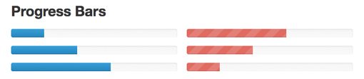
Bootstrap now has cross-browser-compatible progress bars that are super easy to implement. Just insert a snippet like the one below:
<div class="progress">
  <div class="bar" style="width: 30%;"></div>
</div>
The “width: 30%” here resembles how far along the progress bar will be. If you want to change that to half full, just type in 50%.
Button Groups
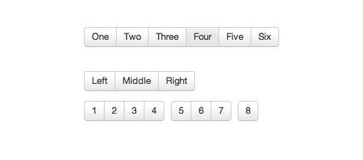
Button groups are a bit like breadcrumb navigation in that they’re individual buttons that are all smushed together. Normally, this takes a good chunk of code to pull off. Not only do you have to style the general button theme, you also have to make the first and last button different.
With Bootstrap, all you need are some links with the “btn” class inside of a “btn-group” div.
<div class="btn-group">
  <a class="btn" href="#">One</a>
  <a class="btn" href="#">Two</a>
  <a class="btn" href="#">Three</a>
</div>
Carousels
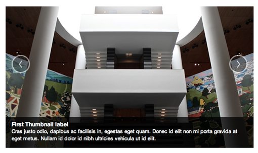
The old Bootstrap JavaScript plugins have been revamped and some completely new ones have been added. My favorite here is the new jQuery carousel. The example code below may seem hefty, but if you break it down it’s pretty simple. The slide contents gets thrown in the “.item” div and an optional caption can be added. Navigation is tossed in at the end.
<div id="myCarousel" class="carousel slide">
    <div class="carousel-inner">

        <div class="item active">
            <img src="assets/img/bootstrap-mdo-sfmoma-01.jpg" alt="">
            <div class="carousel-caption">
                <h4>Third Thumbnail label</h4>
                <p>Lorem ipsum...</p>
            </div><!--end caption-->
        </div><!--end item-->

         <div class="item">
            <img src="assets/img/bootstrap-mdo-sfmoma-02.jpg" alt="">
            <div class="carousel-caption">
                <h4>Third Thumbnail label</h4>
                <p>Lorem ipsum...</p>
            </div><!--end caption-->
        </div><!--end item-->

    </div><!--end inner-->

    <!--nav-->
    <a class="left carousel-control" href="#myCarousel" data-slide="prev">‹</a>
    <a class="right carousel-control" href="#myCarousel" data-slide="next">›</a>
</div>
Conclusion
When a large company like Twitter puts out a free resource, it’s a gamble to actually build your workflow around it. One major issue is that you can’t know for sure how well it will be kept up in the long run. Fortunately, it seems like Bootstrap is, for now at least, a fairly high priority at Twitter. The new version represents a massive amount of time and effort and it really shows. This is turning into one extremely extensive boilerplate.
I’m personally stoked that Twitter deemed it necessary to take Bootstrap responsive. This will definitely help further the cause of responsive design that works well across not only all major browsers, but all major devices as well.
Leave a comment below and let us know what you think of Bootstrap 2.0. Did you try the first version? What are your favorite improvements?