Designing With Constraints: Thinking Inside the Box
It’s one of those fundamental parts of design we don’t talk about much: Designing within the rules. We talk a lot about creativity and innovation, but sometimes leave out one of the ideas that pushes most projects along, and that’s actually creating something with a lot of rules attached. It’s thinking “inside the box.”
Design constraints are those little keys to consistency that help brands establish visual identity and guide voice. These restrictions can come in a number of forms, and like them or not, it’s something you are going to have to deal with.
And here’s the good news: Constraints can actually help you become a better designer.
The Ultimate Designer Toolkit: 2 Million+ Assets
Envato Elements gives you unlimited access to 2 million+ pro design resources, themes, templates, photos, graphics and more. Everything you'll ever need in your design resource toolkit.


Canvas and Aspect Ratio
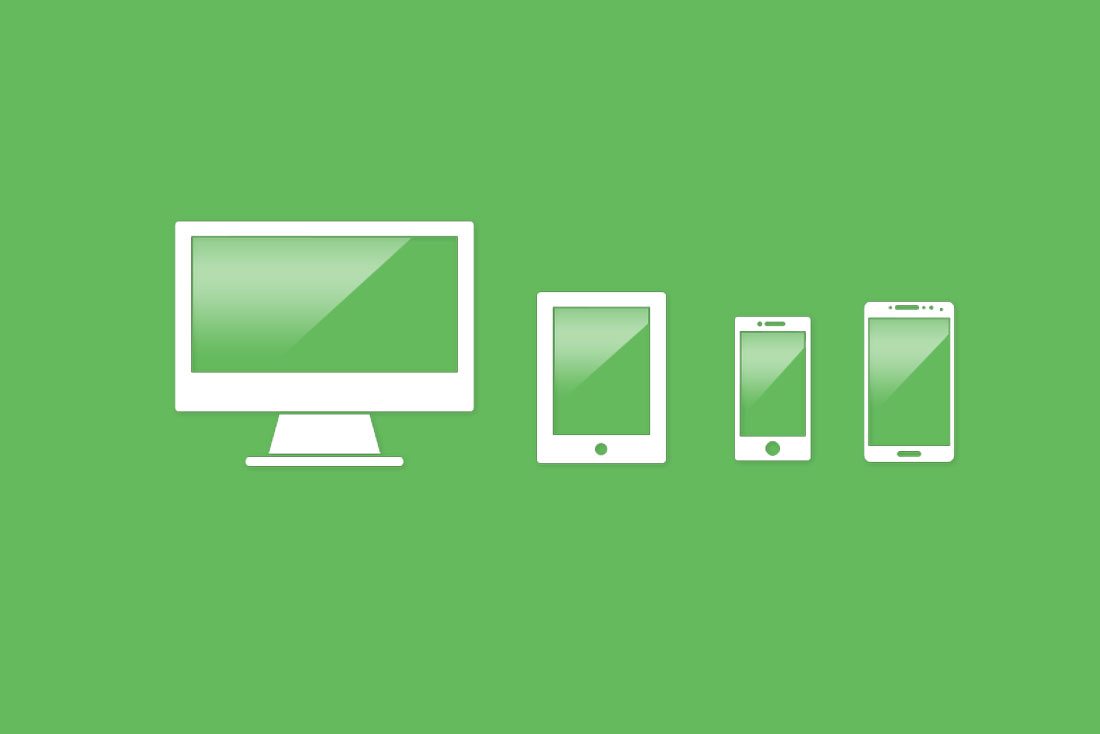
This is a pretty obvious design restriction. You are limited to a certain canvas size or shape. With print, this can extend to the number of pages you have to work with as well.
When working with a size constraint, it is important to think about scale so that elements work together well and the end result fit the space. Text should be readable and other elements should be easy to see and understand.
While this seems pretty easy with larger canvases, they can be just as trick to work with as smaller ones. Remember to think about how the design will be received and look at it from that perspective when you are planning placements, contrast and the overall visual outline.
Typography Palette
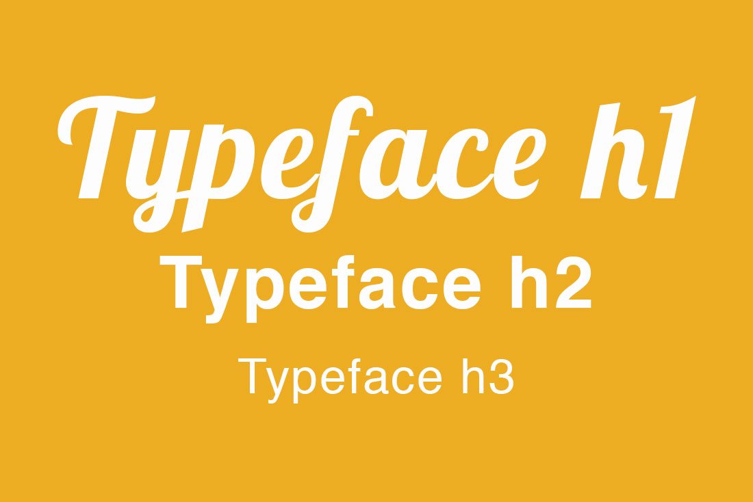
We often talk about the importance of selecting a typography palette that includes a couple of great type families. Often times this may already be done for you (especially with branded projects).
While working with a set of typefaces can feel somewhat limiting at first, sticking with a predefined palette can be a good way to test your design chops. What can you do with the type options you have available?
This present a great opportunity to stack layers of type in interesting ways, play with color or how text works with images. You can use an established typography palette to keep a brand looking like the brand, but with a little bit of a twist with a new technique.
Color Palette
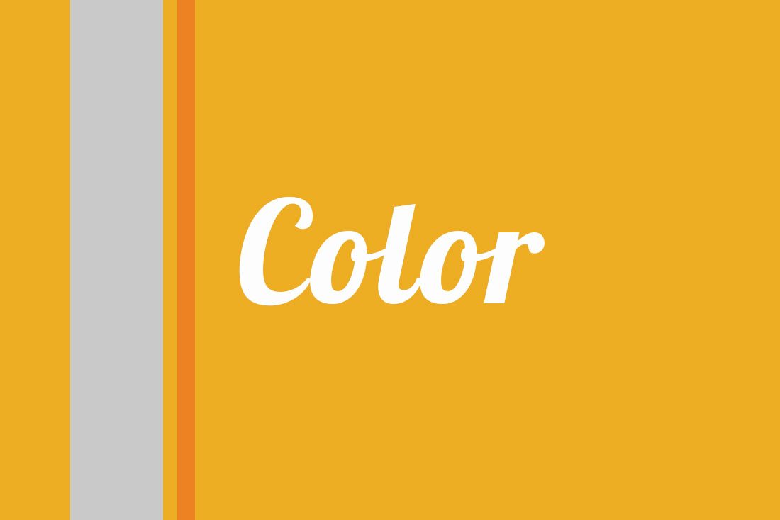
At some point you’ve probably gotten stuck with a project that came with a pretty awful color palette. (Hopefully, you’ve had more that came with an inspiring set of hues.)
The best way to work within a palette is to pair those colors with neutrals, black or white. If the color options are hard to manage, consider a more minimalist style design where the color can really just serve as an accent and is not the main visual element.
Tints are another viable option when it comes to color. You might also consider changing saturation levels too add a little extra pop to color choices. It can also be fun to use color with a trendy style such as a color overlay on an image. This is a fun trick that can add visual interest and help with color-based branding.
Words and Content
Content is king. We’ve all heard this before and are likely subscribers to the concept.
Content can also be a little overwhelming at times. Projects that require certain language present their own challenges. (Have you ever come across the 25 word headline that you must use?)
While you can try to work with the rest of the team to refine the language and all of the words that have to be a part of the design, you will have to work with this kind of stuff at some point. And you can make it work. A solution to wordiness is often a great type treatment.
The same is true with projects that have a lot of parts. This can include everything from 10 navigation elements to multiple calls to action to text boxes to photos to video. And it all has to be part of the design. I like to dump the bucket and drop all the parts on the screen to get started. Just so I can take a good look at them before the actual design comes together. (It sounds a little silly, but it can really help!)
Logos and Imagery
Don’t fight it. Use the logo. Even if it is bad. Even it is an odd shape and leaves trapped spaces.
Working with logos or specific imagery can be a challenge, because we know these elements set the tone of a project. What you want to do is use this to work with the rest of the project. Don’t get stuck in the trap of hiding a logo or picture because you don’t like it; figure out a way to make it work.
Technology or Software

Don’t try to design outside of the laws of technology or software. A cool video is no good if the file is too large to render properly on the screen. Neat loading animations are great as long as something loads quickly. The coolest app icon ever won’t see the light of the App Store if it isn’t to spec.
There are limits to what you can do based on where the project will live. Honor those rules and don’t try to get around them. It’s ok to think about what’s new and next, but it has to be done in a way that works with the access available to your audience.
Conclusion
Design rules and constrains can help us focus on what’s visually important in a project or for a brand and think even more creatively about a solution. Be thankful for these rules as well. You can jumpstart a project if you have a set of guidelines in place from the start.
Restrictions can help you make other decisions a little faster (so you won’t obsess over a typeface all day) and spend more time on parts of the design that need the most work. I’ve done projects that were completely open-ended and others that came with a set of rules and my best work has always come in those rule-based projects.