Five Fascinating Things You Didn’t Know About Famous Car Logos
Automobile logos represent some of my favorite emblems. I recently became curious as to the origins of several of these popular icons and came across some incredibly interesting facts!
Join us as we look back at some of the most well known logos around and uncover some of their unbelievable secrets!
The Chevy Bowtie May Have Stolen
This story centers around a man named William Durant, who has a long and crazy history with Chevrolet. In the early 1900s, this guy was all over the automobile industry, buying and selling companies like Buick, major shares of GM and even putting in a failed bid for purchasing Ford.
In 1911, Durant started Chevrolet through a partnership with Louis Chevrolet. Given the name of his partner, it’s quite obvious where the title of the company came from. However, the origins of the company’s longstanding logo, the Chevy Bowtie, are greatly debated.
By 1913, the logo was being stamped on Chevrolet products and Durant, who apparently enjoyed logo creation quite a bit, was credited as its creator. But where did he get the idea for the distinct shape? The answer it turns out, depends on who you ask (interestingly enough, no one thinks it came from an actual bowtie).
One simple solution is that the cross-like shape is meant to mirror the Swiss flag as an homage to the birth place of Louis Chevrolet. However, there are at least three other accounts worth noting that might ring closer to the truth.
The Chevrolet Story: Wallpaper
According to the 50 year anniversary issue of a publication titled “The Chevrolet Story,” (1961) Durant spotted the interesting shape in 1908 in a repeated pattern on his Paris hotel wallpaper of all places!
Supposedly Durant liked the shape, sketched it down and showed it to several people as a potential car logo.
Durant’s Daughter: Dinner Time Sketch
Margery Durant, William’s daughter, wrote a book about her father that was published in 1929. These pages contained an entirely different account of the logo’s origins.
According to Margery, she saw her father sketch the logo at the dinner table after eating a bowl of soup! There’s obviously no way to know if he was once again thinking about his wallpaper revelation or if this was indeed the genesis of the idea.
Durant’s Wife: A Newspaper Ad
Even Durant’s own family seems to be divided on the origin of the Chevy Bowtie. In seeming contradiction to his daughter’s dinner table story, William’s wife Catherine claimed that “Billy” had spotted the logo in a newspaper ad while vacationing in Virginia and instantly thought it would be good for the Chevrolet logo.
So what did Bill spot in the paper on that fateful day? Historian Ken Kaufmann found a major clue in the form of a “Coalettes” ad that ran within days of incorporation of Chevrolet. Check out the Coalettes logo compared to that of Chevrolet.
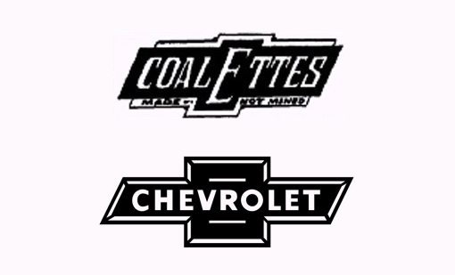
We can’t be completely certain if Durant ever saw this particular logo, but the similarities are plentiful. The heightened center suddenly makes sense given the enlarged “E” and the italic lettering seems a much better fit with the slanted sides than the Chevrolet text, which is rarely, if ever, shown italicized inside the bowtie.
Sources: Chevrolet.com, Jalopnik and The New York Times
The BMW Logo is an Airplane Propeller… Maybe
Bayerische Motoren Werke, also known as Bavarian Motor Works or simply BMW, began life in 1917. Today, we know this company for their legendary luxurious and sporty automobiles and perhaps even their motorcycles, but the company originally had a different focus: aircraft engines.
In 1918, BMW was actually forced to cease production of aircraft engines and subsequently switched to motorcycle and eventually automobile production.
However, the company’s heritage is still reflected in its logo. Like me, you’ve probably seen this icon a thousand times without a second thought as to what it means. It turns out that the four quadrants are meant to represent a white airplane propeller against a blue sky.
This idea can clearly be seen represented in this illustration:
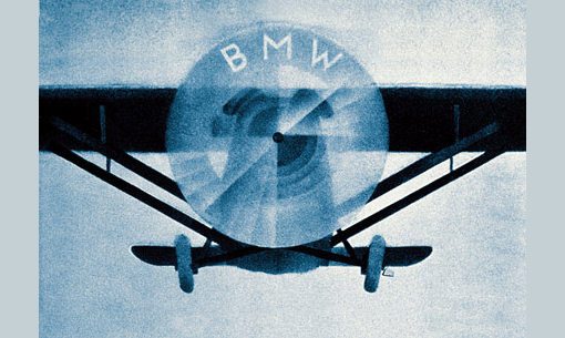
This is how the story traditionally goes, and it’s a great story! However, in 2010, an official spokesperson from BMW told the New York Times that a 1929 BMW ad like the one above might have been the inspiration for this tale, while the original logo is really just meant to mirror the blue and white that represents the Bavarian Free State. The logo is undeniably similar to a cropped section of the Bavarian Flag.
The Pontiac “Dart” is a Native American Arrowhead

Chief Pontiac is a Native American Chief of the Ottowa who became famous for his involvement in “Pontiac’s Rebellion” agains the British in the early 1760s.
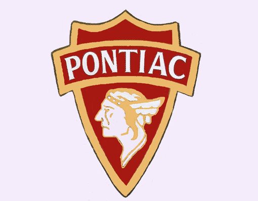
In 1926, the chief served as the inspiration for the name of General Motors’ Pontiac Brand. The original Pontiac logo, shown below, was a much more direct representation of the chief:
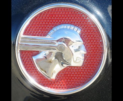
By the 1930s, the logo had evolved a bit and was popularly shown with a sort of shield or arrowhead behind Pontiac’s profile:
Eventually, the head was removed altogether and the arrowhead went through several iterations until reaching “The Pontiac Dart” that we’re familiar with today, which undoubtedly resembles a downward facing arrowhead.
The Mustang Horse Runs the Wrong Way
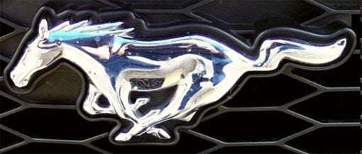
This is another tale that might be a tall one but makes for some fun conversation. In 1964, Ford introduced the Mustang, thereby giving us one of the most popular line of automobiles in history.
Nearly every source available tells the story of the logo going through several iterations before a final was chosen, but they differ when it comes to why the finished horse is depicted running from right to left.
Some claim that Phil Clark, a major player on the design team, was left handed and therefore drew the logo in a way that seemed natural to him. Others claim that the galloping horse “is shown running the opposite way that trained racehorses run around a track” to represent the free spirit of the car and its customers.
Most interesting perhaps is the story that the logo was originally drawn running from left to right, but was accidentally reversed when converted to a die that would be used to mold the actual physical emblem (sources: Mustang Pedal Cars and Ford Mustang History).
No matter what the reason, the Mustang’s logo will always challenge our instincts and run freely to the left.
The Toyota Logo’s Many Hidden Meanings
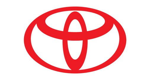
The Toyota Motor Corporation (originally Toyoda) began life in 1937, but the Toyota logo we know today didn’t come around until 1989, when it debuted alongside the Lexus brand logo. The interesting shape is very intentional and clearly forms the letter “T”.
There’s more to it than that though. According to Toyota, the “T” is formed from three distinct ovals, each with its own meaning. The two overlapping ovals in the center represent the relationship and trust between the company and its customers and the encircling oval represents the global expansion of Toyota and endless opportunities ahead. The logo also forms a steering wheel, representing the car itself. Even the negative space in the logo is meant to represent the “infinite values” of the company.
This is where fact ends and lore begins. Some say that the logo pays homage to the fact that the Toyota Motor Corporation was a spinoff of a company that produced looms and sewing machines. It’s said that the logo resembles the eye of a needle.
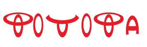
Finally, in addition to the obvious “T”, many claim that indeed every single letter of the word “Toyota” has been intentionally hidden inside of the logo. Here’s my rough interpretation of this idea:
Conclusion
From the borrowed Chevy Bowtie to the wayward running Mustang, automobile logos are simply packed with interesting history. These days we see far too many logos simply typed out in Helvetica so it’s always a pleasure to have a look back at some emblems so rich in meaning.
Leave a comment below and let us know about the history of your favorite logo. Is there a hidden message or a refuted past? We want to hear it!