Why Almost Is a Dirty Word in Design
Almost. It seems innocent enough right? Surely there’s no evil lurking in those six letters. You might even see this as a positive word. However, as a designer, you should always be on guard when this word can describe certain aspects of your work.
Read on to see why “almost” can be a dirty word and how it just might be bringing down the quality of your work. We’ll also take a look at two underlying foundations of good design that provide ready solutions to solve your “almost” design woes.
2 Million+ Digital Assets, With Unlimited Downloads
Get unlimited downloads of 2 million+ design resources, themes, templates, photos, graphics and more. Envato Elements starts at $16 per month, and is the best creative subscription we've ever seen.
Secrets Hidden in Plain Sight
Design is an interesting topic. It’s something that, by definition, has to be innate and intuitive to a certain degree. Effective design is pleasing and logical to the beholder, so in theory, designing for mass appeal should be something that almost anyone can do because it leverages our common ideas towards aesthetics and information organization.
The fascinating thing is, finding and identifying those commonalities is a lot more difficult than you’d think. Lots of people know good design when they see it, but they lack the fundamental design education to point out exactly what separates the good from the bad, or even more to replicate the good design practices in their own work.
This type of information, the simple bits of knowledge that are hidden in plain sight, is my absolute favorite topic to explore. This discussion will cover just such a concept. One so simple that absolutely anyone can understand it, yet so secret that I see countless people, from laymen to professional designers, completely miss the mark with this principle on a daily basis.
Almost The Same Is Awkwardly Different
Enough suspense, why in the world, you ask, is “almost” a dirty word in design? It seems harmless enough right? Instead of telling you why it’s dangerous, let me show you.
Alignment & Size
The inspiration for this piece was a website that I was recently asked to critique. The design featured an image with a button below it that looked something like the one shown below:

When I look at this example, I immediately see a case where “almost” is wreaking havoc on the quality of a design. This is more clearly illustrated if we add in some guides:

As you can now clearly see, the button is “almost” the same size as the image, but not quite. This causes some conceptual dissonance and can even be a distraction:
“Did the designer intentionally make the two objects different sizes? It’s difficult to tell. Maybe this is a mistake! Surely the two are meant be the same size.”
Your user has now been thrown off course and instead of focusing on your content is now wondering whether or not you screwed up. Now, some might disagree and say that the above example is an alignment issue and not a size issue, the button should simply be aligned to the center:

Admittedly, this helps. When size discrepancies are present between two simple objects, a center alignment can prove useful. However, I still see the same problem. The two objects are too close in size.
The key to solving this problem is to ask yourself why you made the two objects a different size to begin with. If it’s an accident, then you’re simply being sloppy with your dimensions. However, if it’s an intentional decision meant to add differentiation, then attack this goal with new fervor and actually make the two objects look different:

There’s no doubt when I see this example that the button is actually supposed to be smaller than the image. Similarly, if you don’t really have a need for the difference, then just make the two objects the same width:

My point is, it’s up to you to decide whether or not the objects merit differentiation. Just make sure that if they do, you don’t wuss out and make them slightly different. Go big!
Typography
There are several places where this principle proves true in typography. The first that comes to mind is once again a size issue. The most common place that I see this arise is when a headline and paragraph look something like this:
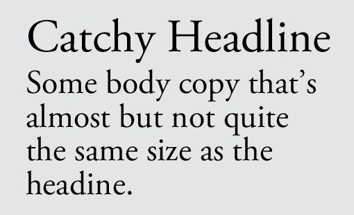
Here again we run into the trouble that “almost” brings us. The body copy is “almost” the same size as the headline. Sure, you can tell that they’re different but it’s not something strong enough to really help present a clear informational hierarchy. When we drop “almost” and go big, the result is much better:
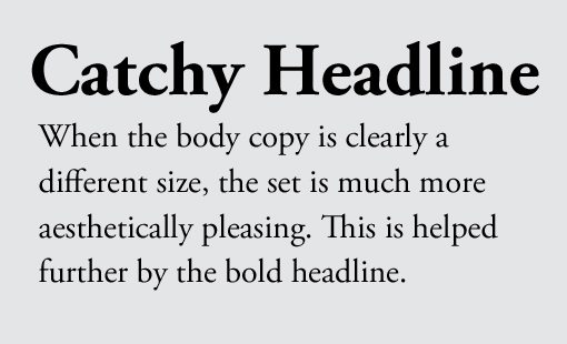
This image illustrates that there are other factors to consider as well, such as boldness. Consider the following example, which compares a minor difference with a major one:
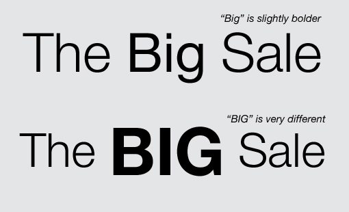
Notice how the word “Big” is bolded in the first example, but the result is still so subtle that it’s ineffective. “Big” is almost the same as the rest of the sentence. By now we know that if this statement can be said, we need to be a little more extreme. In the second example, I made the typeface even bolder, then use all caps on the word and enlarged the font.
The same goes for the style of typefaces that you select. In this next example, I’ve implemented two different typefaces in an attempt to add some variation to my headline: Garamond and Trajan.
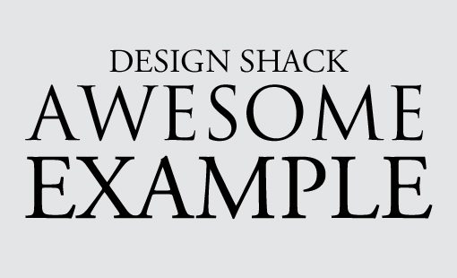
As you can see, these typefaces are so similar that they’re difficult to differentiate between. Do you think a non-designer will spot the difference between the two? I made the example and I can barely spot it!
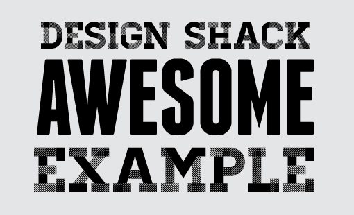
This example is probably a little extreme, I’m sure you wouldn’t choose two fonts this similar. However, it drives home a point that is constantly missed by real world designers. Make sure your typefaces are never “almost” the same. Try varying the serif choice, boldness, etc. Take something simple and mix it with something more complex. The result is much more aesthetically pleasing:
The Underlying Principles
I could go on and on, but I’m sure you get the point. You can apply this idea to any area of design you choose. The basic idea is that “almost” is dangerous. Any time you find yourself approaching “almost,” just remember that it typically leads to average results. No designer should want to produce average work!
By now, faithful Design Shack readers have realized that I’ve tricked you into reading yet another post on contrast. Yep, this whole concept can be boiled down to that one magical word. Contrast is one of the main pillars of good design and learning to wield it properly will make you an infinitely better Designer.
The information here simply frames the idea of contrast in a different way that might or might not make the topic clearer for you: Different is good, almost different is bad.
This goes even deeper than that as well. Notice that the first example with the button presented an alternative that suggested making the two objects exactly the same width. This is of course the principal of repetition. When contrast doesn’t seem appropriate, repetition is your best bet.
Conclusion: Be Careful with Almost
Keep in mind that there are in fact plenty of legitimate uses for close similarities in design. For instance, subtle variations of a color can provide a nice and simple color scheme. However, even in this scenario you don’t want the two to be so close that no one can tell them apart.
The message here is not to completely avoid the “almost syndrome” all the time but merely to take caution when designing anything that approaches it and to ask yourself whether the result you’re going for can be better achieved with contrast or repetition.
