Effortless Full Screen Background Images With jQuery
Today we’re going to build a simple and fun webpage for the sole purpose of showing off Fullscreenr, a great little jQuery plugin that makes it easy to add a background image to your site that automatically adjusts to the window size.
We’ll also throw in some @font-face and rgba action to keep things modern and educational on the rest of the build. Let’s get started!
Demo
Just so you can get a feel for what we’re building, check out the demo below. To see the jQuery in action, resize the browser window and watch how the image adapts dynamically.
Now that you’ve seen how it works, let’s build it!
Step 1: Grab Fullscreenr
The first thing you’re going to want to do is go to the Fullsreenr website and download a copy. Grab the JS files and throw them into a folder with a basic website framework: html, css and images folder.
Step 2: Start the HTML
To begin the HTML, thrown in the code for an empty page and add the references for the stylesheet and the two JavaScript files.
<!DOCTYPE html PUBLIC "-//W3C//DTD XHTML 1.0 Strict//EN"
	"http://www.w3.org/TR/xhtml1/DTD/xhtml1-strict.dtd">
<html xmlns="http://www.w3.org/1999/xhtml" xml:lang="en">
<head>
	<title>Design Shack + Fullscreenr</title>
	<!-- Stylesheet -->
	<link rel="stylesheet" type="text/css" href="css/style.css" />
	<!-- JavaScript codes -->
	<script src="js/jquery-1.3.2.min.js" type="text/javascript"></script>
	<script src="js/jquery.fullscreenr.js" type="text/javascript"></script>
</head>
<body>
</body>
</html>
Step 2: Select a Background Image
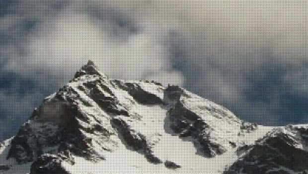
Before we insert the code for placing our background image, we’ll need to know the size. Which of course means we need to find an image.
I grabbed the image below by Faisal.Saeed on Flickr Creative Commons. It’s an awesome snowy mountain scene that should make the perfect setting for our site.
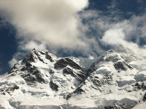
Next, I sized the image so that it would be 907px by 680px. These are the dimensions that we’ll use in our next step.
Step 3: Insert the Fullscreenr Snippet
In the demo files of the Fullscreenr download, you should find the following JavaScript snippet to enable the plugin. I’ve customized it a bit with the image dimensions specified above.
<script type="text/javascript">
	var FullscreenrOptions = {  width: 907, height: 680, bgID: '#bgimg' };
	jQuery.fn.fullscreenr(FullscreenrOptions);
</script>
All you have to do for your own version is change the hight and width to match that of your own image.
Step 4: Body HTML
Next up, there is a chunk of HTML in the demo page that you’ll need to grab. The structure may seem a little funky but really all the developer has done is applied the background image to the body and created a basic container (realBody) for you to then add all the rest of your content to. If you don’t like the div ID names used by the developer, feel free to change them to something more conventional.
<body>
	<!-- This is the background image -->
	<img id="bgimg" src="img/mountains-907x680.jpg" />

	<!-- Here the "real" body starts, where you can put your website -->
	<div id="realBody">

	<!-- Here the "real" body ends, do not place content outside this div unless you know what you are doing -->
	</div>
</body>
As you can see, all we’ve done here is throw in the background image.
Step 5: Add the CSS
Finally, throw in the CSS below to make everything work properly. This is necessary to make sure your content will scroll correctly and stay positioned properly in the stack.
body {
	overflow:hidden;
	padding:0;margin:0;
	height:100%;width:100%;
}

#bgimg {
	position:absolute;
	z-index: -1;
}

#realBody{
	position:absolute;
	z-index: 5;
	overflow:auto;
	height:100%;width:100%;
	background: url('../img/raster.png');
}
And with that, you’re done! You should now have a background image that dynamically scales with the browser window. The transition is super smooth and works brilliantly.
The plugin comes with an dotted pattern image overlay, shown below in a zoomed-in view. If you don’t like this effect, simply leave it out!
If you’d like, you can stop here and proceed with your own design. If you’re interested on where to go from here, I’ll finish up with some fun design.
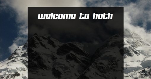
Step 6: Add a Background Div and Header
Now that we’ve got our background image, we want to center a div over the top of it and give it a background fill. We’ll also give it a basic header that I thought seemed appropriate given the snowy background image.
<body>
	<img id="bgimg" src="img/mountains-907x680.jpg" />

	<div id="realBody">
		<div id="container">
			<h1>Welcome to Hoth</h1>
		</div>
	</div>
</body>
Next we’ll style these two elements with CSS (insert this in addition to the CSS above).
#container {
	width: 800px;
	height: 1000px;
	margin: auto;
	margin-top: 60px;
	padding-top: 10px;
	background:rgba(0,0,0,.8);

}

#container h1 {
	color:#fff;
	font-family: 'KitchenpoliceRegular', sans-serif;
	font-size:60px;
	font-weight: normal;
	text-decoration:none;
	text-align:center;
}

@font-face {
	font-family: 'KitchenpoliceRegular';
	src: url('KITCHENPOLICE-webfont.eot');
	src: local('‚ò∫'), url('KITCHENPOLICE-webfont.woff') format('woff'), url('KITCHENPOLICE-webfont.ttf') format('truetype'), url('KITCHENPOLICE-webfont.svg#webfontCRDciSXC') format('svg');
	font-weight: normal;
	font-style: normal;
}
This is a big chunk of code but it’s all super basic. First, we gave the container a height and width, then set the margins to auto. This gives us a vertical strip that automatically stays centered on the page. The background color for the container has been applied using rgba. This will give us a nice transparent container that lets some of that nice background image show through.
Next, we used applied some basic styles to the header and customized the font using @font-face. I used a font called Kitchen Police and an @font-face kit from FontSquirrel.
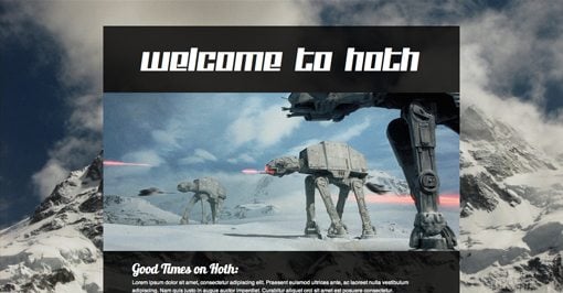
At this point, your page should look like the image below.
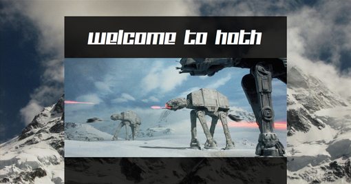
Step 7: Add a Header Image
The next step is extremely easy. All you have to do is toss in an image that’s the same width as the container (800px).
<body>
	<img id="bgimg" src="img/mountains-907x680.jpg" />

	<div id="realBody">
		<div id="container">
			<h1>Welcome to Hoth</h1>
			<img src="img/walkers.jpg" />
		</div>
	</div>
</body>
And with that your image should fall right into place without any extra styling.
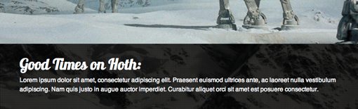
Step 8: Add Some Text
In this step we’re going to add some basic filler text to the page and in the next we’ll add a grid of images. Since the text will hypothetically tie into the images, we’ll throw it all into a “grid” div.
<body>
	<img id="bgimg" src="img/mountains-907x680.jpg" />

	<div id="realBody">
		<div id="exampleDiv">
			<h1>Welcome to Hoth</h1>
			<img src="img/walkers.jpg" />

			<div id="grid">
				<h2>Good Times on Hoth:</h2>
				<p>Lorem ipsum dolor sit amet...</p>
			</div>

		</div>
	</div>
</body>
To style the text, we’ll first add a little margin to the top of the div. Then we apply basic color, size, and positioning to both the h2 tag and the paragraph tag. Notice I used some more @font-face goodness, this time with Lobster.
#grid {
	margin-top: 20px;
}

#grid h2{
	color: #fff;
	text-align: left;
	margin-left: 65px;
	font-size: 30px;
	font-family: 'Lobster', sans-serif;
	margin-bottom: 3px;
	font-weight: normal;
}


#grid p{
	color: #fff;
	text-align: left;
	margin-left: 65px;
	margin-bottom: 3px;
	font-size: 12px;
	font-family: helvetica, sans-serif;
	margin-top: 0px;
	width: 650px;
	line-height: 18px;
}

@font-face {
	font-family: 'Lobster';
	src: url('Lobster_1.3-webfont.eot');
	src: local('‚ò∫'), url('Lobster_1.3-webfont.woff') format('woff'), url('Lobster_1.3-webfont.ttf') format('truetype'), url('Lobster_1.3-webfont.svg#webfontcOtP3oQb') format('svg');
	font-weight: normal;
	font-style: normal;
}
This should give you a nicely style block of text similar to that in the image below. Now we can move onto the final step!
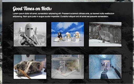
Step 9: Add the Gallery
To finish the page up, we’ll toss in a simple image gallery that is basically just a grid of nine JPGs. To give the photographers credit, I’ve linked each to the original source images on Flickr.
<body>
	<img id="bgimg" src="img/mountains-907x680.jpg" />

	<div id="realBody">
		<div id="container">
			<h1>Welcome to Hoth</h1>
			<img src="img/walkers.jpg" />

			<div id="grid">
				<h2>Good Times on Hoth:</h2>
				<p>Lorem ipsum dolor sit...</p>
				<a href="http://ow.ly/35afM"><img src="img/hoth1.jpg" /></a>
				<a href="http://ow.ly/35ah9"><img src="img/hoth2.jpg" /></a>
				<a href="http://ow.ly/35aim"><img src="img/hoth3.jpg" /></a>
				<a href="http://ow.ly/35ajg"><img src="img/hoth4.jpg" /></a>
				<a href="http://ow.ly/35ajY"><img src="img/hoth5.jpg" /></a>
				<a href="http://ow.ly/35alw"><img src="img/hoth6.jpg" /></a>
			</div>

		</div>
	</div>
</body>
As the final piece of the puzzle, we’ll toss in some margins and borders to make the image grid look nice and styled.
#grid img {
	margin: 20px 10px 20px 10px;
	border: 3px solid #000;
}

#grid a:hover img{
	border: 3px solid #fff;
}
That should space everything and and finish up your page! Feel free to keep going and add in a navigation section, footer, sidebar and whatever else you can think of!
Conclusion
jQuery and the Fullscreenr plugin present the easiest and best-looking solution I’ve found for scaleable background images. If you’d rather try the same effect with CSS, check out Chris Coyier’s methods on CSS-Tricks. Chris presents three possible alternatives, the last of which uses pure CSS and works much better than other CSS attempts I’ve seen.
As always, thanks for reading. If you liked the article give us a tweet, digg or any other social shout out you can come up with!