Designing Engaging Header Images: Think Outside the Box
One of the first things you do in designing a site is to decide what that first chunk of pixels that users will see looks like. You’ve got to grab their attention and communicate your message above the fold or risk that person moving on to their next open tab.
Unfortunately, many of us fall into predictable patterns for this piece of the site. We use the same old tricks, shapes and plugins and come up with a result that might look great, but isn’t really that exciting. Today we’ll take a brief look at how you can make your header images more interesting. Along the way we’ll see some live examples from sites that have implemented these techniques successfully.
The Ultimate Designer Toolkit: 2 Million+ Assets
Envato Elements gives you unlimited access to 2 million+ pro design resources, themes, templates, photos, graphics and more. Everything you'll ever need in your design resource toolkit.


The Standard, Boring Header Image
Far too often, when I start wireframing a project, I begin with something like this:
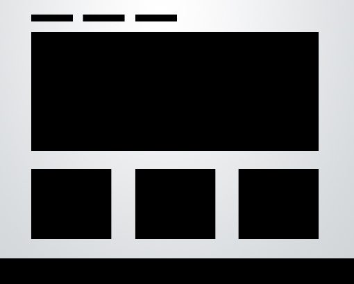
Don’t get me wrong, this is a rock solid layout, and the reason that it’s so popular is that it works extremely well. However, there’s a time for going the safe route and a time for creatively branching out and exploring new ideas.
Particularly, the part that I get bored with is the header image (I’m using the term “header” loosely to mean the top portion of the page). It’s just a big static rectangle. If it is dynamic, it’s usually something as simple as a jQuery image slider. Once again, one of my favorite design tricks, however, not exactly a good representation of “out of the box” thinking at this point in time.
So how can we get out of the rut of running to the tired rectangle every time we need a big, bold image in our header? If we really give the problem any thought at all, some solutions readily present themselves.
Changing it Up
Here are a few quick thoughts for how to add some variety to your header images. Can you think of any other ideas?
Change the Shape
The first thing that comes to mind is to ditch the rectangle. Try using a square, circle, triangle, or even a series of images. You can even ditch the container all together and try placing an icon or graphic right onto your website background.
Also, don’t just get caught up on standard shapes. Try creating an image that uses a more abstract, fluid shape. Bend it around your content for some real creativity.
Make It More Dynamic
Go beyond the jQuery image slider. Try to think of a new way that you can get a user to interact with the image. Use clicking, scrolling, mouse movements and more to transform the image in some interesting way.
Break Out
Another really simple way to make the header image more interesting is to allow the content that’s inside of it to break out or the content that’s outside to break in.
I used this technique with an app screenshot in a recent Design Tricks article.
Something Different Every Time
One popular trick that you see Apple frequently using on their homepage is to have a series of header images on rotation. When you refresh the page, it grabs from a set of three to four different options at random.
This not only makes your site more engaging for users, it helps you track what works best and what users seem to be interested in the most. Looking at your stats, you can track which image is getting the most clicks and then create a new a strategy based on that knowledge.
Examples in the Wild
Now that we’ve got some ideas on the table for approaching header images in a more interesting way, let’s see if we can find any examples of designers following these techniques.
Co-Work
One of my favorite examples that I’ve seen recently is on the site Co-Work. The image slider at the top of this page is, at heart, the same old standard technique. However, the designer added a few notches that give it an irregular shape.
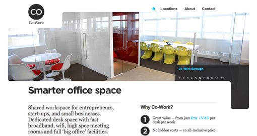
Notice how much more integrated this image feels with the rest of the content than your typical rectangle. It curves around the logo, navigation and body copy in a way that gives the site an almost abstract modern art sort of feel that’s perfect for the clean, nicely designed working spaces the site is advertising.
This doesn’t require an overactive imagination or even much work to implement, it’s just the result of a little bit of extra effort that gives the site a look that’s all its own.
Adrian Baxter
Web developer Adrian Baxter has another great example of a unique header image on his site.
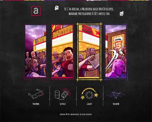
Apart from the awesome idea of fighting off a zombie horde with only a Mac Bluetooth keyboard, this image is different because it’s been split up into four separate panels. Functionally, there’s really no reason for this, but from a design perspective, it’s a nice touch. Notice how it mirrors the arrangement of the links below, a classic example of repetition in design.
The fun doesn’t stop there though, Adrian took it one step further by adding a parallax effect that shifts the scene as you move your mouse around the site. As the scene shifts, images bleed out of one frame and into another. It’s a really nice effect!
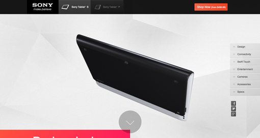
Sony Tablet S
The most impressively innovative example I was able to find was the site for the Sony Tablet. Starting off, the site looks simple enough, the header image shows a sort of folded stream that ends in the tablet. At this point I wasn’t really impressed and even thought the site looked a little too cluttered.
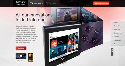
As you scroll down (or hit the down button), the site gets really fancy really quickly. The tablet stays in the middle of your screen as the rest of the content moves. It disconnects from the folded stream and begins to spin and flip in 3D space.
As you come to a new content section, the tablet flips into a pose that integrates with the design of that area.
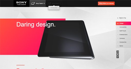
It goes under some content, over other parts, overlays pop up and point to features, hands come out and use the touchscreen; the result is super impressive and makes for an awesome, dynamic and interactive browsing experience that requires only scrolling.
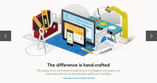
Kyan
This site is very similar in concept to the Sony Tablet page, only in a horizontal fashion. The initial position of the image slider shows an iPhone, tablet and computer screen sitting around various design tools. I love the flat paper-like illustration style.
When you hit the arrow button on the right, each of the objects surrounding the devices in the center flies up and off the screen one by one, then the screen shifts and brings the devices into a new scene:
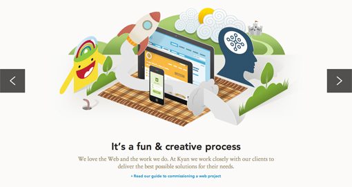
This is much more impressive, unique and engaging than your typical slider. When you first see the effect, you can’t help but hit the button a few more times to see it again.
Conclusion
The purpose here is to help get your brain out of the rut of inserting the same old big rectangle image at the top of your designs. With a little thought and effort you can easily accomplish something more unique and engaging.
This barely scratches the surface of what’s being done currently with header images. Have you seen any other interesting examples? Also, have you come up with any great ideas yourself? Leave a comment and let us know.