Kinetic Typography: An Introductory Guide
Kinetic typography seems to be everywhere these days. From television commercials to website landing pages, movable type is a popular visual tool. This popularity could come from a number of reasons but one obvious factor is that it catches your attention. People tend to be drawn to words and want to read them.
Kinetic typography puts this together with some simple animations to create words that move on the screen, grabbing your attention and engaging the senses. So let’s take a look at kinetic typography and how you can integrate it into some of your design projects. (Note: The examples in this article include animation; click the images for links to the original sources to see them in action.)
The Ultimate Designer Toolkit: 2 Million+ Assets
Envato Elements gives you unlimited access to 2 million+ pro design resources, themes, templates, photos, graphics and more. Everything you'll ever need in your design resource toolkit.


What is Kinetic Typography?


Kinetic typography refers to the creation of moving type. It is an animation technique that is used to make lettering expand, shrink, fly, move in slow motion, grow and change in numerous ways for the user. The effect can be simple and short with only small changes or quite elaborate and lengthy.
Kinetic typography use has almost exploded recently because of more use of the technique in web design. Once something that was only used in video and television, kinetic typography is gaining popularity as a background effect on websites and in web-based videos. (All of this is possible thanks to higher and more common broadband and increased internet and web surfing speeds.)
The technique used for a number of reasons but can add emphasis to certain content. It can help convey tone and emotion. It can help create a unique visual where none exists. It can be an affordable option for those with limited budgets. It can add interest when your design is in need of a boost.
Origins of Kinetic Typography


While kinetic typography can be labeled as an emerging trend for web design today, it has been around for quite some time. It was first used on the big screen.
Researchers at the Human Computer Interaction Institute and School of Design at Carnegie Mellon University have traced the first use of kinetic typography to the 1959 Alfred Hitchcock’s 1959 film “North by Northwest.” In the opening credits, type is used in a movable format. A year later, the effect was used again in “Psycho.” “This work stemmed in part from a desire to have the opening credits set the stage for the film by establishing a mood, rather than simply conveying the information of the credits,” researchers wrote.
From this point, kinetic typography became more commonplace in film and later in television. It’s been used in credits, during shows and for advertisements. A notable use of kinetic typography in advertising came in 2009 when Pepsi launched a “Refresh Everything” campaign (now called “Pepsi Pulse”) with a new logo. The new design – featuring a logo in place of the letter ‘o’ – appeared everywhere from television to online using movable type.
More recently, it has become a widely-used technique in website design (and for some mobile apps as well) and is quite common in online videos. It is used for everything from advertising and promotion to art to music videos to a storytelling tool for journalists.
When Should You Use Kinetic Typography?

Kinetic typography is a fun tool for your kit, but it is not an easy solution to the I-don’t-have-any-art-so-now-what problem. It should be used – like any other tool – for a specific purpose and with a certain goal in mind.
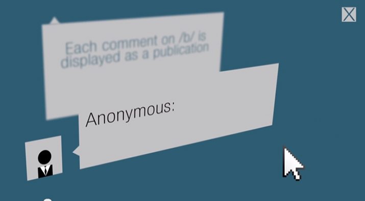
There are uses in which kinetic typography has proven to be particularly effective. These uses most relate to tone. Adding movable type to something that would otherwise be static in nature can add help achieve this. Best uses for kinetic typography include:
- Creating emotional content
- Creating characters
- Capturing attention
The way type moves contributes to these uses as well, according to research. For example: “Loudness can be mimicked by changing the size of text, as well as its weight, and occasionally contrast or color. For high volumes, motions mimicking vibration can be used.” In the creation of characters, type can be set to move in a way that mimics human motion and can further be animated to “attach” to objects or shapes in ways that create spatial relationships or create associations to specific direction.
Kinetic Typography Applications

Now that you are starting to get excited about the idea of kinetic typography, how can you use it in practical applications? What mediums work best?
First, movable type is a video and online format. Unless you are creating a flipbook, there are few uses for this concept in printed projects. It is important to think about your audience and the amount of time they might spend with an animation. Keeping it short is recommended for web and mobile applications, while in film or advertising you may have slightly more time with each user.
Either way, it is important to create something that is interesting, easy to read and understand and that creates an emotional connection. Common practical uses for kinetic typography include educational uses, such as the popular “Schoolhouse Rock” videos and programming that were on-air from 1973-2009; promotional or advertising; and music videos.
When planning for kinetic typography, there are some common patterns of movement and behavior.
- Slow motion or fast motion
- Stretching or shrinking
- Movement in arcs or waves as text moves along curved paths
- Anticipated action, such a subtle movement before a sharp one
- Follow through actions that happen after something else has happened
- Secondary action when text moves because of something that happens to another element in the frame
Resources and Tutorials
Putting together animated type can be as simple as creating a gif or as complicated as producing a music video. But there are plenty of good – and super easy to follow – tutorials available if you really want to learn kinetic typography techniques.
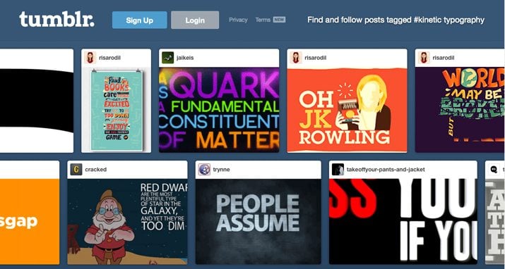
First, a recommend looking at what’s out there and the limitless number of options available for creating moveable type. (Check out kinetic typography on Tumblr for some fun examples.) And then start playing with gifs. If you are comfortable with Adobe Photoshop’s animation tools, you can create something simple in minutes. After that, you might want to move on to bigger projects.
In addition, there are some tools to help you create simple text animations in a hurry.
- Kinetic Typography Engine
- Kinetic Typography tutorial by Jesse Rosten
- Kinetic Typography Tutorial by Crooked Gremlins
- Kinetic Typography Techniques with After Effects
- Udemy Kinetic Typography course
- Adobe TV: Learn Edge Animate video tutorials
- MotionWorks Type Animation Tips
Conclusion
Using kinetic typography can be a fun tool. Moveable type can add impact, emotional connection and visual interest to digital and video projects. While the techniques can take some time to master, it is something that is likely around to stay. (Just think, designers have been using the technique in some form for more than 50 years.)
Are you currently working on projects using kinetic typography? How are they shaping up? Share your thoughts (and project links) with us in the comments. We’d love to see what you are working on.