10 Rules for Perfect Type Design, Every Time
Do you ever notice that some projects just seem to glow with great type? Some designers have a certain knack for designing perfect typography for every project.
You can do it too. With a handful of simple rules, you can improve the look and design of typography in all your projects, digitally and in print. If you struggle with picking typefaces and pairing fonts, these rules will help you design perfect type, every time. (Just make sure to follow them.)
1. Set Goals for the Project
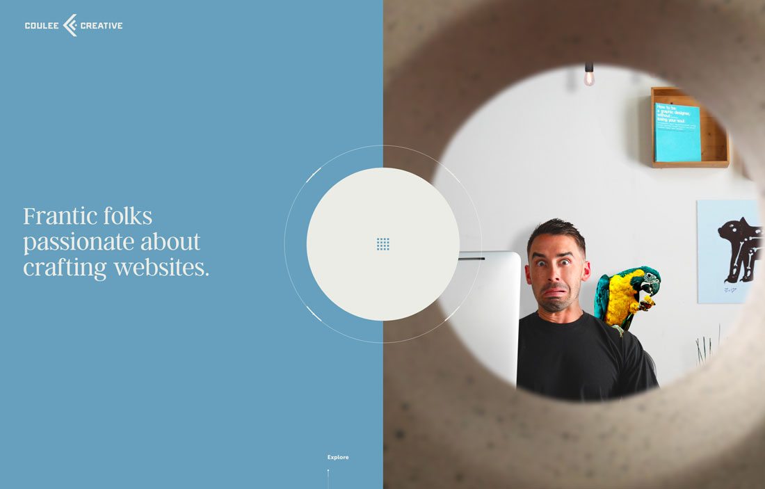
Good typography starts with a solid understanding of what your project is supposed to do. Before you even start to browse Google Fonts or Typekit, jot down the answers to a few questions.
- Who are you trying to reach with this project?
- What are users supposed to do with the design?
- What are the conversion points?
- What’s the mood of the project?
- Do you need to match or coordinate with other designs or branding?
The answers will help you start to frame an idea of what kind of typography you are looking for. (Here’s a guide to meaning and mood of typefaces in design projects.)
2. Look for Similar Shapes
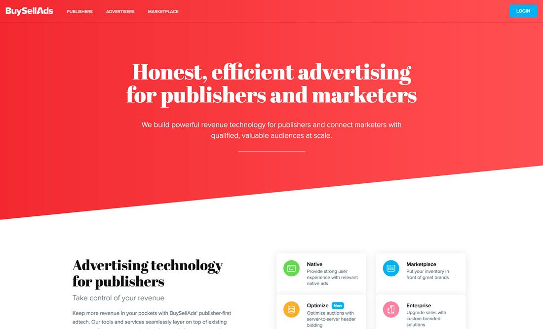
When it comes to matching multiple typefaces in a design, something as simple as the shape of lettering can make or break the font combination.
So how to you ensure that you make it?
Look for typefaces with similar shapes. Think about whether each typeface is more round or oval, thick or thin, has a short or tall x-height or includes a slant or tilt.
Pick a primary, or body, typeface that you like and then match complementary typefaces with similar shapes.
- Look at the lowercase “o” in each type family. Is the inside “bowl” round or oval? Match typefaces where the inside of the “o” is the same.
- It’s OK to pair thick and thin typefaces. It’s better to pair a thick or thin and regular typeface.
- Look for typefaces with similar x-heights (the vertical size of an “x”).
- Don’t be afraid to mix and match different type styles. Try a serif and sans serif combination. Just make sure that if one typeface is complex, the other is simple. And use the simple typeface for the widest application, such as body text.
- Pay attention to slant and italics. (You can look at the center of the “o” again as a guideline.) Don’t use more than one slanted typeface and avoid typeface pairs that slant in opposite directions. They can be jarring for users.
Still unsure? Here’s a guide to mixing typefaces.
3. Set a Type Scale for Sizing
The size of lettering can make or break a project. If text is too big, it results in an unnatural reading patterns with too many pauses and stops. If text is too small, it can strain the eyes and cause users to leave the design.
When text is just right, users move through the words freely.
Text that’s sized just right also comes with a scale for different sizes in the project. Body text is one size, headlines are another size, and subheaders are yet another size. And all of the sizes and use should be consistent throughout the design.
What this does for users is make everything easier to read.
- Text size prioritizes information by importance. Bigger type is more important and is more likely to be skimmed by most users.
- A scale increases the scannability of text so that users can look at it quickly.
- Related items have the same appearance.
- Bigger text elements, such as subheaders, help break up long blocks of text, making it easier to read.
4. Pay Attention to Spacing
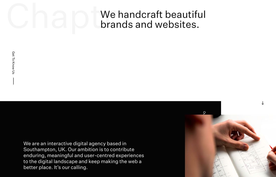
It’s isn’t the type per se, but type spacing matters.
Kerning, leading, tracking and padding can render your type beautifully or turn it into a hot mess.
There’s a fine art to getting spacing just right. And a lot of it depends on the actual letter combinations used, size and typeface. There’s no kerning rule – other than to do it when necessary – and there’s not a perfect amount of padding for text and other elements.
You’re going to have to eyeball it.
The test is feel. If the design feels “off” in a way you can’t pinpoint, problematic spacing could be to blame. It just takes practice – and a good eye – to get it right.
5. Align Left for Reading
In English, as well as other languages, users read from left to right. That’s also the ideal alignment for optimizing readability within blocks of copy.
Small bits of text – menu elements or hero headlines – don’t have to align to the left because they are quick to read. Large amounts of copy – anything more than a sentence – should probably be left aligned. (Justification is arguable, although it can cause some off spacing concerns if you aren’t very careful.)
6. Pick Two Type Families

This rule has probably been pounded into your head already: Use just two typefaces for a project.
It’s being said here again because so few designers actually pay attention to this rule. Scan the web or a portfolio website and you’ll see plenty of projects with “fonts gone wild!”
If you are planning to break this rule, think again. What are you gaining by adding another typeface to the mix? Instead, look at the typeface you have selected and see if another style – bold or thin or italic – might be a better solution.
7. Don’t Alter Fonts
Never ever stretch or twist or slant a typeface. If you need something different from what you have, pick a different option.
Type designers spend a lot of time creating lettering that works as presented. Altering the form of letters hurts readability and can cause fonts to “break apart” in the way a photo gets pixelated when you use larger than original size.
8. Use Plenty of Contrast

One of the things that gets designers into trouble is putting type on an image or background element. It only works when you have plenty of contrast between elements to create separation and ensure readability.
If you have to add a drop shadow to lettering, there’s not enough contrast.
Light on dark or dark on light can ensure readability. It also helps to use a typeface with a regular or wider stroke.
But that’s not always the case. A photo might include light and dark spaces or letting might include thick and thin strokes.
Options include boxing text, picking a heavier typeface or adding a color overlay to the image. All of these techniques can help create more contrast and make text more readable. (Plus, they tend to hold up when used in multiple responsive breakpoints where text and images move around.)
9. Remember Mobile Typography
When it comes to typography for the web, mobile readability should be a top concern. Fun techniques like adding a pattern or texture to letters can work in print and some desktop screens but will fall short on smaller devices.
You need to think about how typefaces will render in all uses. (Go back to your typography scale and remember to include specifications for type on large and small screens.)
Mobile typography is often a little large and includes a little more spacing than typography on desktops. It also helps if the paragraphs are shorter so that you don’t end up with blocks of text that take multiple scrolls to read, which can intimidate users.
10. Stick to a Style Guide
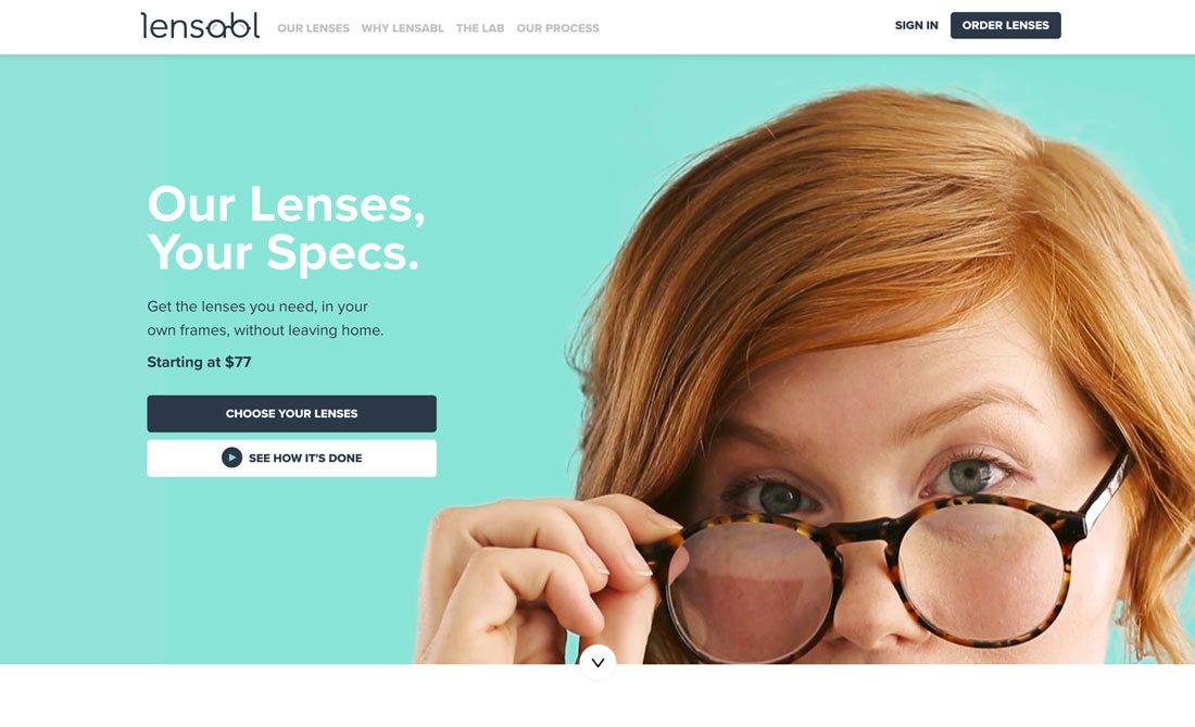
Once you have a solid idea of how type should look in a project, create a style guide with all of your exact rules for usage.
Make copies. Put it online in an accessible location. And use it whenever you make changes to the design.
Consistency is a key component of perfect typography design.
Conclusion
The thing about good versus bad typography is that most users can identify one or the other. They only know when the design just isn’t quite right.
The key concern when it comes to creating perfect typography is readability. Type must be easy to read and understand. It should match the mood of the copy. And it should feel almost invisible to users; it works when they don’t have to think about it and can read with ease.