Tips for Designing Better Mobile Typography
Mobile is big right now. But often the typography is small. When it comes to creating great type on small screens, there are plenty of challenges.
So how can you make the most of responsiveness, mobile design and typography? The first step is really understanding type and the second is by thinking about how people read. Put the two together and you will get a handle on creating great mobile type in no time. It’s a skill that every designer needs to master in the digital age.
Mobile and Responsive Typography Basics

Unlike type designed for print and even many desktop web design projects, mobile and responsive typography is often not measured using the traditional point system. Rather than selecting a typeface and using it at “14 points with 15 points of leading,” mobile and responsive type is designed using pixels, ems or rems. These flexible units are percentage based and can help designers more easily create type for multiple devices.
Two of the most important considerations when designing type for mobile devices are size and space. Type must be large enough to read easily and there should be enough space between lines so that text does not feel cramped in the small space.
There is no magic formula for what size or spacing to use. But typically mobile type should be a bit larger proportionately than that on desktops and include more line spacing. While many argue that the optimum number of characters per line for print and desktop design is 60 to 75 characters, for mobile this number should be cut in half.
How People Read

The key to any style of typography, on any device, is readability. If the user can’t read it, the design does not work.
This is especially important on mobile devices. And there are so many mobile options, it is practically impossible to know how your lettering will render on every device. So really work to refine your type for the most popular device screen widths.
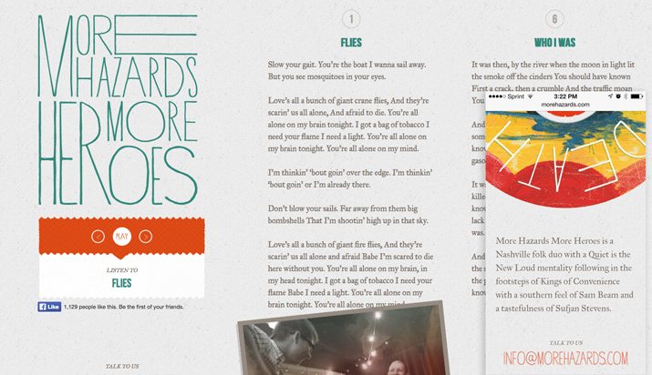
Think about how people read when planning your mobile design. You may have to adjust the relationships between different type elements, such as the header and the main text. (The Chattanooga Renaissance Fund site, above, does a great job of this.) Any type that is too big can eat away at the screen quickly, distracting readers. Type that is too small can be missed or seen an unimportant.
Consider alignment as well. Generally, people read from left to right. Especially on a small device, keep alignment styles simple for maximum readability.
It’s All About Width
The key factor when designing type for mobile devices, apps or tablets is the width of the screen. And remember, there are two widths to consider – vertical (how most people hold their phones) and horizontal.
Text that is too large will create lots of breaks in the type and if you use hyphenation, lots of hyphens. (It should be noted that few web designers use hyphens; they are a character seldom found in body text for the web.) Frequent breaks in the flow of text can cause the reader to stop too often and make the message choppy and more difficult to comprehend.
Text that is too small can cause the reader to strain and make it hard to focus on the text. It can also be hard to find the beginning and end of lines of text when there are too many letters to digest at one time.
Design in Space
When it comes to small screens, space is a key consideration. Think about the elements your users may encounter – low contrast on the screen because of lighting, padding so that text does not bump the edge of the screen (or a loose-fitting phone case) or somewhere users can scroll the screen without inadvertently clicking a link.
By adding a little space to text – both between lines and in the margins – you are helping users better interact with the words. Good spacing also aids readability, especially in subpar conditions. As with other techniques, the right amount of spacing is critical and an overabundance of white space can take away from the content area on the screen or even hinder readability.
A good place to start is in the 10 to 20 percent range. Play with the numbers as a guideline as to how much extra space to add between lines of type. You may also consider using paragraph spacing as well since graphs may look longer on smaller screens. This additional space gives readers the perception that text is not too dense and will feel easier to read.
Keep Typefaces Simple

There is a reason you see so many sans serif typefaces on mobile websites and in apps. They are generally easy to read.
When selecting typefaces for blocks of text in mobile design – think anything other than a logo or typographic art element – go with something simple, of a standard weight and that has a fairly uniform stroke width. Avoid novelty typefaces, condensed styles and letterforms with thin strokes.
More designers are opting to use a second set of typefaces for mobile sites versus the desktop version, which may include a more elaborate type palette. While there are pros and cons to this concept, it can be a solution if you have your heart set on a certain specialty typeface for the desktop design.
Also be wary of type tricks. Effects such as shadows or bevels can look great at larger sizes but might fall short or hinder readability on a screen that’s only a few inches wide. Forget the tricks when working on type plan for your mobile site.
Mobile Proportions and Scale
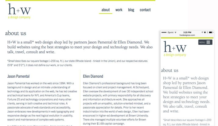
While there is no perfect solution, Jason Pamental of H+W Design has one of the best out there. He detailed his modern measured scale for the Typecast blog with CSS and a full scale of numbers.
The idea is that every different piece of type in a web design should be thought about and scaled separately for an optimized web design experience. Often, we (collectively as designers) scale everything all at once. Pamental shows why this is not the best idea through a simple example, where the header takes up almost the entirety of the screen.
No conversation about mobile web typography would be complete without thinking about Pamental’s piece. Make sure to read it for yourself and see how his ideas might translate into your work.
Consider Functionality

One last thing to think about when designing mobile typography is how it actually works. While some type on desktop websites is designed to click and link, mobile typography often does even more. Some text may allow users to make a call, other type contains a link, other text may allow users to buy a product, or text in an app may be part of a game.
Design this type so that users know exactly what it will do. And make it large enough for users to complete this action with ease. Active text boxes need to be big enough to tap and separated from other text actions so that only one thing happens at a time. Any other configuration will likely confuse and frustrate users.
Conclusion
As with any design project, guidelines and tips are just a place to get started. Mobile typography is one of those areas that designers are really starting to dive into and trends will evolve.
Make sure to mix and match the ideas above with your own for the best results. (And if you have additional tips, we’d love to hear them.) The No. 1 piece of advice is to test, test, test. The more devices you try text styles on, the better idea you will get of how it looks and works for users.
Image Source: Phil Roeder. Note about images: The images in this post are shown in desktop view and also on an iPhone 5S.