Note that I’ve used ‘Josefin Sans’ for the font. This is from the Google Font Library so to make it work make sure you have this snippet in the head section of your HTML.
Now we need to apply a background to the slideshow div. In the next step we’ll do a lot more with this but for now you basically just want to choose a placeholder image and apply a width and height to the div.
Our page is looking great at this point. Now that we’ve got it how we want, we can proceed with bringing it to life!
Setting Up the Slideshow Image
The way that we’ll be setting up this slideshow is basically through the use of a modified version of CSS sprites. The idea is to create one big image containing all of our slides then to use keyframe animations to reveal specific portions of the image at certain points in the animation.
If that doesn’t quite make sense yet, don’t worry, it’s a lot easier than you think! To start off, we’ll need to go into Photoshop and build our image. Now, given that the size we set up above for the slideshow is 465px wide by 300px tall, we’ll need to make our Photoshop document 930px by 600px (double both the width and the height). This will give us enough area for four images, if you want more, simply make it bigger!
From here, you want to drop in four images, each of which is 465px by 300px. Set them up in a grid with no gaps and save out a JPG at full size. Your result should look something like the image below.
Slideshow CSS
Webkit Keyframe Animations are really simple to work with. All you have to so is choose something to animate and then set the state of that item at various points in the animation, defined by percentages. So if you set the width of a div to 100px at 0%, 50px at 50% and 10px at 100%, the div will shrink over the course of the animation.
Today, we’re going to animate the background-position property. Our slideshow is set up to show only the top left quadrant of our image by default and we can use background-position to move that around to show the others.
To visualize this, picture our webpage as a dark background with a rectangle hole cut in it. The image we just created is then set under that hole and we’re going to move it around.
First, we want to go from the top left picture to the top right picture, so we’re going to set the “right” value (the first number) to the negative width of one image (465px). Next, we set the “up” value (the second value) to the negative height of one image (300px). Finally, we stay at -300 on the height but bring the right value back to zero. The effect of this will be to show the top left image, the top right image, the bottom right image and then the bottom left image.
Notice that I threw a bit of a curve ball in here and set everything to 0 at 10%. This is because I didn’t like the slideshow starting right away without giving you a chance to look at the first image. This simply builds in a brief pause.
Also, one of the most important elements here is the syntax at the beginning: “@-webkit-keyframes slider”. The “@-webkit-keyframes” part tells the browser what you’re defining with the code below but the “slider” part is a customizable title that you give the animation. It can be anything you want, just remember to use it again in the next step when we activate this animation.
Activating the Slideshow
Throwing in the CSS above defines the behavior of the slideshow, but it doesn’t activate it. To do that, you need to add a new line into your slideshow div.
Here I called the “slider” animation that we just defined, then set the length to 20 seconds, the iterations to infinite and the direction to alternate (once the animation is finished, it will go backwards to the beginning).
Demo
With that, we’re all finished! Check out the live demo to see it in action. Again, make sure you’re using Safari or Chrome.
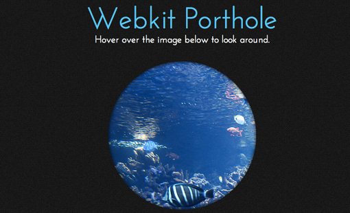
Alternative Execution: Porthole Effect
Notice that this technique isn’t really using multiple images but is instead just panning around a single image. Because of this, you can achieve a really cool effect by simply utilizing one large photo.
To see how this works, I grabbed an underwater image and modified the page above to have a sort of ocean porthole feel. The code is shown below. Notice that this time, instead of making the animation start automatically, it only takes place when the user hovers over the image.
For the styling, I simply rounded the corners of the div so that it’s a circle and applied a box shadow set to inset to give it that cut out look.
Webkit Porthole
Hover over the image below to look around.
[/code]
Demo
To see the Porthole Demo, click on the image below.
Conclusion
In summary, Webkit Keyframe Animations hold tons of potential for making web pages impressively dynamic without a shred of JavaScript. Typically this kind of effect would take a pretty decent chunk of code but with CSS it’s incredibly easy.
Leave a comment below and let us know what you think of the effect. Are you excited that CSS is expanding to include these types of behaviors or do you think that this should always be the job of JavaScript? Let us know!