Designing for Print in Canva: Mistakes to Avoid
Canva is perfect for designing everything from business cards to posters. But when it comes to taking those designs from screen to paper, things can get tricky.
Designing for print has different rules from designing for digital. File resolution, bleed settings, color modes, and even licensing can impact how your final product looks and how legally safe it is to use.
If you skip over these details, you could end up with blurry prints, misaligned layouts, or worse, content you can’t legally distribute.
In this guide, we’ll walk through the most common mistakes people make when designing for print in Canva and how to avoid them, so your print materials come out clean, professional, and ready to share with confidence.
Let’s dive in.
1. Using Unlicensed or Non-Commercial Elements
Canva offers a huge library of photos, graphics, and fonts, but not all of them are free for commercial use.
Some elements, especially those labeled as “Pro” or from third-party creators, may have restrictions on how you can use them, particularly in printed products meant for resale or advertising.
Before printing or distributing your design, double-check the license on any Canva elements you’ve used.
When in doubt, stick to assets clearly marked for commercial use or consider upgrading to Canva Pro, which offers a broader license and more clarity on usage rights.
2. Relying on On-Screen Colors Only
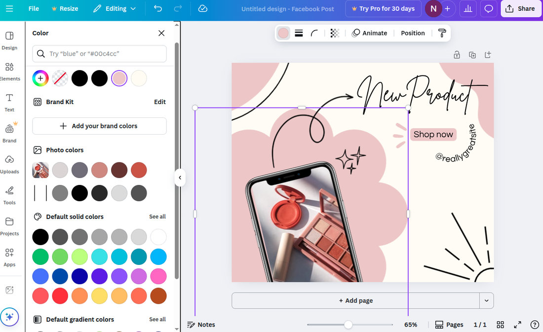
What looks good on your screen doesn’t always look the same on paper. Canva designs use RGB color mode, which is optimized for screens.
But printers typically use CMYK, and some vibrant colors, especially neons and deep blues, can shift or dull when printed.
To avoid surprises, stick with colors that print well (like rich blacks, softer tones, or tested brand colors), and if possible, order a print proof before committing to a large batch.
3. Ignoring Bleed and Safe Zones
One of the most common print issues in Canva is not accounting for bleed and safe zones. Bleed is the area that extends beyond your design’s edge, which gets trimmed off after printing.
Safe zones are the inner margins where important text or logos should be kept to avoid being cut off.
Canva does allow you to set bleed lines (found under “File > Show print bleed”), but many users forget to activate them.
Make sure to extend background colors or images to the bleed edge, and keep all essential content within the safe zone to ensure clean, professional results.
4. Using Low-Resolution Images
A photo that looks crisp on your screen may look blurry or pixelated in print. Canva supports high-resolution uploads, but it’s still easy to accidentally drag in a low-res image from the internet or an old project.
For print, make sure all images are at least 300 DPI (dots per inch) and check the quality before exporting or printing.
Canva doesn’t automatically warn you about image resolution, so it’s up to you to verify.
5. Overusing Popular Templates Without Customization
Canva templates are convenient, but they’re also widely used by thousands of other creators. I
f you use a trending template without adjusting colors, fonts, or layouts, your final print may look generic or very similar to someone else’s materials.
To stand out, treat templates as a starting point, not the finished product. Customize elements, use your brand kit, and bring in original photos or icons when possible.
This helps you avoid brand confusion and gives your printed piece a more polished, unique look.
6. Overlooking Trim Marks and File Types
When sending your Canva file to an external printer, you’ll need to export it correctly.
Many designers forget to include crop marks and bleed, or they export in the wrong file format, leading to extra steps or costly delays at the print shop.
Always download your file as a “PDF Print” with “Crop marks and bleed” checked. This gives the printer everything they need to trim the design accurately and maintain quality.
Avoid using PNGs or JPEGs unless the printer specifically requests them, as these are more suited for digital use.
7. Not Proofreading Before Printing
Typos and grammatical errors are easy to miss, especially when you’re focused on design. But once a print job is done, there’s no easy fix.
Always double-check your spelling, dates, names, and contact details before exporting. Better yet, ask someone else to review your file with a fresh set of eyes.
Proofing your copy thoroughly ensures that you don’t waste money on reprints or distribute material that looks unprofessional.
8. Using Too Many Fonts
Canva makes it tempting to explore creative typography with hundreds of font choices at your fingertips.
But in print, too many fonts can create visual clutter and confuse your message. Stick to two or three complementary fonts per design: a heading font, a body font, and maybe an accent if needed.
Too many type styles can break the visual flow, making your printed piece feel chaotic rather than cohesive.
9. Forgetting About Readability
Some colors and font combinations look great digitally but become difficult to read when printed. Using light text on a white or pastel background may look subtle on screen, but it can disappear in print.
The same goes for small or thin fonts that lose detail when scaled down.
Always test your contrast and legibility before sending your file to print. Zoom in, print a sample on your home printer if you can, and make sure your audience can read it at a glance.
10. Ignoring Paper Type and Finish
What your design looks like on-screen can change drastically depending on the type of paper it’s printed on. Glossy paper enhances colors and images, while matte paper gives a softer, more elegant feel.
Some finishes absorb ink differently, affecting saturation and texture.
Think about the purpose of your print, event flyers, menus, business cards, and choose your paper type accordingly. If you’re unsure, ask your printer for samples or recommendations.
11. Using Transparent Elements Incorrectly
Canva supports transparency in backgrounds and elements, but printers don’t always handle these effects well, especially if the final output is meant to be CMYK.
Transparent overlays, gradients, or drop shadows may print differently than expected, sometimes appearing muddy or distorted.
If you’re using effects like transparency, try flattening the layers by exporting the file as a PDF, or test a sample print to ensure it renders correctly.
12. Not Creating Multiple Versions for Print Sizes
Designs in Canva often start with digital formats like social posts or A4 layouts, but print materials come in many sizes, such as flyers, posters, postcards, and more.
Simply resizing a digital design without adjusting proportions can lead to stretched images, misaligned text, or awkward spacing.
Instead of stretching or cropping, duplicate your original design and adjust the layout for each intended print size.
Canva’s “Resize” tool (available with Pro) can help with this, but be sure to manually review and tweak each version afterward.
In Conclusion
Designing for print in Canva can be smooth and effective if you know what to watch out for.
Paying attention to licensing, resolution, print formatting, and customization ensures that your design looks just as good on paper as it does on screen.
Whether you’re creating a stack of business cards or a batch of event posters, take a few extra minutes to prep your files correctly and avoid common missteps.
A little care on the front end can save you from wasted prints, blurry results, or legal headaches down the line.