How to Design a Modern Business Card
Everyone wants a business card that stands out. As more people begin to return to work and physical meetings and spaces, now is the time to revamp your card to make a solid first impression.
There are a few different things that help create distinction among business cards and a modern design is at the top of the list. Let’s dive into some modern and trending design concepts.
Plus, every example is something you can actually download, customize and use.
Mono Color
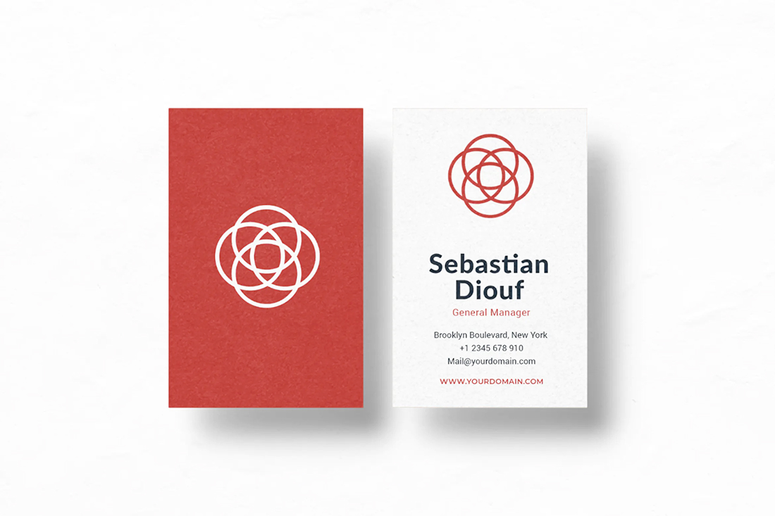
Monotone color palettes are modern and striking at the same time. Pick a color from your brand palette and go for it.
Make the most of a mono style with a card back that uses the color for the full canvas with a light or dark logo in one color to add even more emphasis to the splash of color.
Carry that same color choice to the front of the card as an accent for text elements or other design divots.
This style works best when you use a pretty bold color choice. It can work for subtle color choices such as pastels or beiges, but you probably won’t end up with quite the same overall impact as a bright or more saturated hue.
Use Both Sides
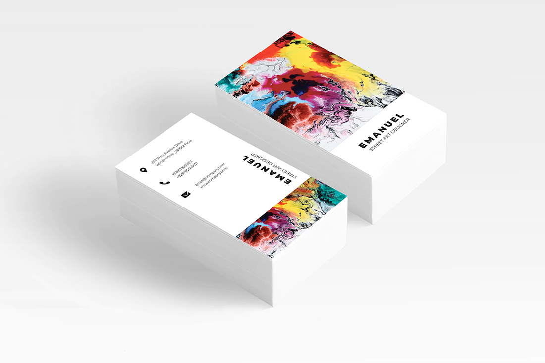
Gone are the days where business cards only use one side. Two-sided business cards are much more of the norm, with a full image on the back and contact info on the front.
Opt for a matte finish or printing if you think people will still want to write on your card, but that’s not super common anymore if you include all relevant contact info on the cards. (It was more standard practice before people started including cell phone numbers.)
When you are planning the design, keep both sides of the card top of mind so that they match and seem to go together well.
Print on Great Paper
When you hand someone your business card, it should feel nice.
A quality print job on premium paper is key. (Don’t even consider printing cards on your home printer.)
Papers that make an impact are those with an interesting finish, such as a velvet touch, interesting cutouts or edges (something as simple as a round edge is just a little different), and paper stock. Thicker cardstock will make a strong impression than a flimsy card.
Some printers even offer added bonuses with thicker cards such as colored edges or textured finishes. And the good news is that many of these premium papers and finishes don’t add that much to the overall cost of business cards.
Use White Space Well
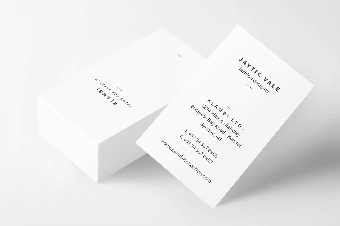
A business card is a tiny method of information delivery. Nice use of white space will help direct the eyes and help people focus on the information that matters most with a business card – your name and contact information.
Use space to help create just the right focal point for your name and key point of contact or what you do.
Consider exaggerated space between elements on the card and around your name.
There’s no need to cram it full of information. Just a few key points of contact, such as phone number, email address, and website are generally enough.
Add a Photo
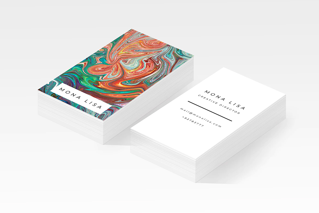
Full-color printing with great images is an ideal way to show off your brand, business, or portfolio on a business card.
Use the back of your cards to show people exactly what you do. Some printers will allow you to add different images to the back for a “variety pack” of business cards that can help you show work even more broadly.
Every time you hand out a business card, you are establishing a relationship with that leave behind. Ensure that it speaks to who you are and what you do so that it is easier for the person with the card to find your information and recall why they wanted to work with you again at a later time.
Consider an image that is part of your elevator speech about yourself or your business. Then the card image resonates with the holder because of the conversation you had.
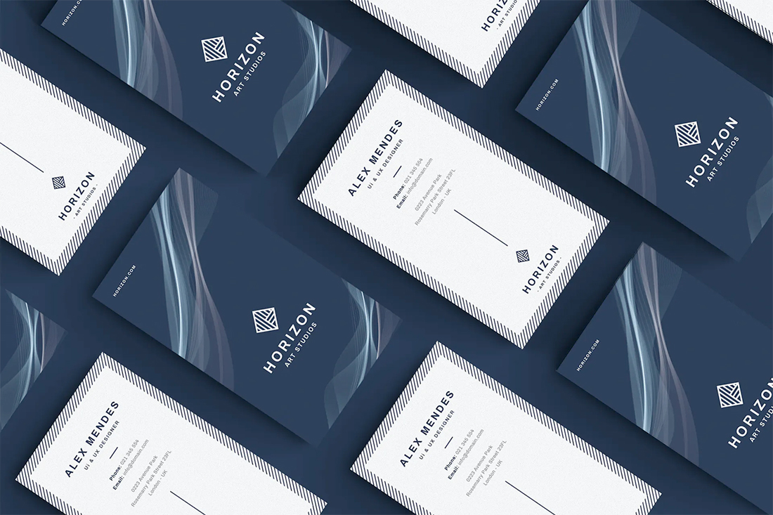
Details from the Back on the Front
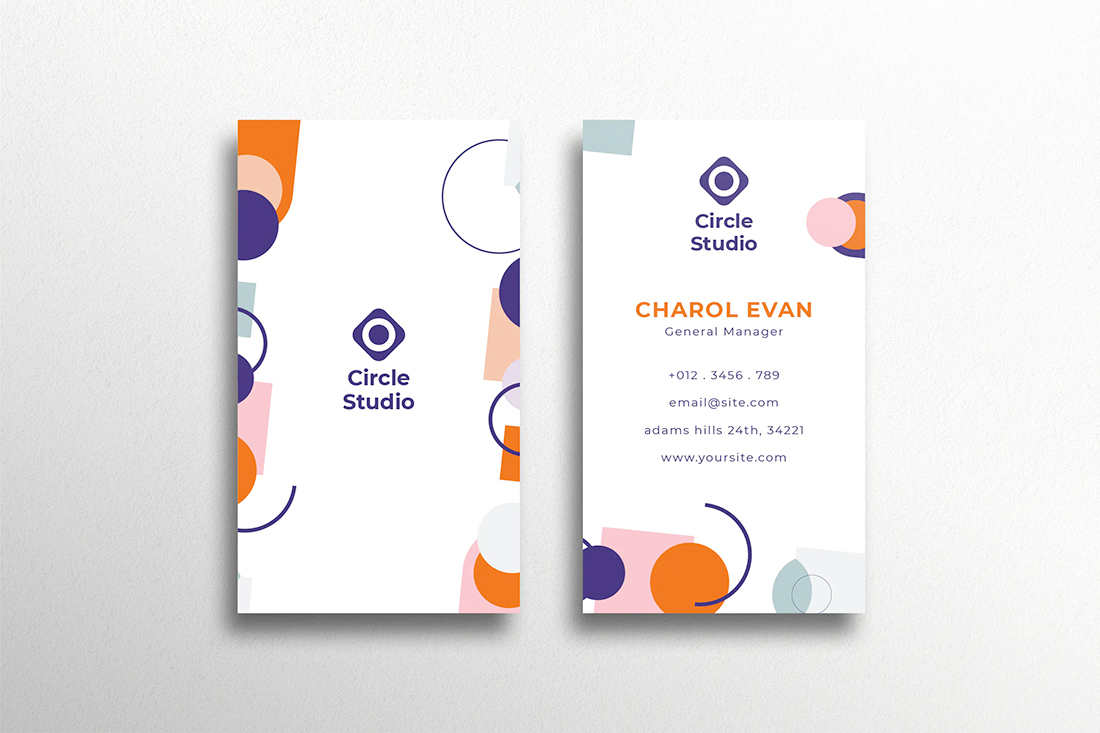
Carry over little design details from the back of the card to the front to keep the visuals interesting.
You probably won’t have a lot of design room after adding contact information, but you can carry over small elements to make the connection on the card.
Here’s why it can help: Imagine flipping through a stack of cards after a conference or event. You have an idea of what the card looked like, but can’t remember the name on it. If some of the design elements are on both sides of the card, it is easier to find that one in the stack quickly.
Bold, Readable Typography
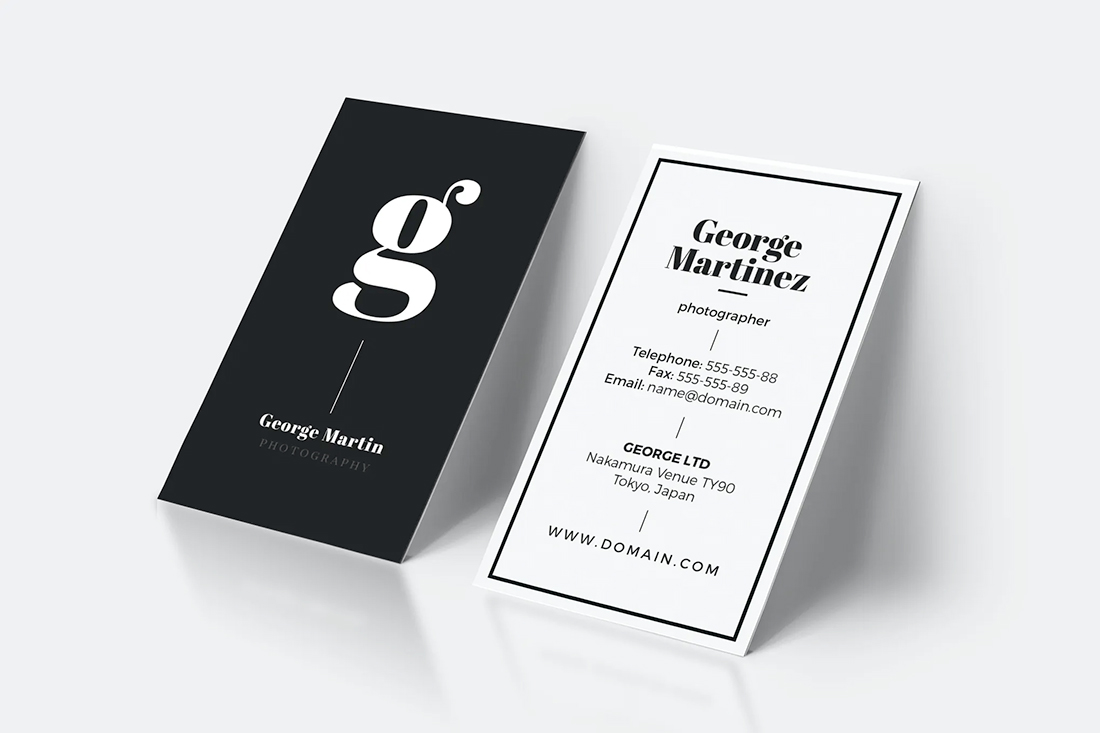
Business cards are a pretty small format design item. Bold, readable text is the perfect combination when it comes to impact and usability.
The largest type element on a business card is likely your name. Use a typeface that is highly readable and works well with the actual letters of your name. A thicker serif or sans serif option is often ideal.
You will most likely want to avoid scripts or novelty typefaces that present readability challenges for business card design. If someone can’t clearly identify the name and information on the card, the chances that they contact you from it later are slim.
Make it easy to read at a glance. In this instance, simple is definitely better.
Conclusion
A modern business card design has a rather simple aesthetic, plenty of color, great use of white space, amazing typography, and leaves a great impression.
While odd-sized business cards were a trend for a while, it is advisable to stick to standard sizes. Otherwise, they can get lost easily or won’t fit into pockets or locations where people put their cards. Give your card every chance it needs to be seen and convert a quick hello or introduction into a solid lead later.