Choosing the Best Font for Business Cards: 10 Tips & Examples
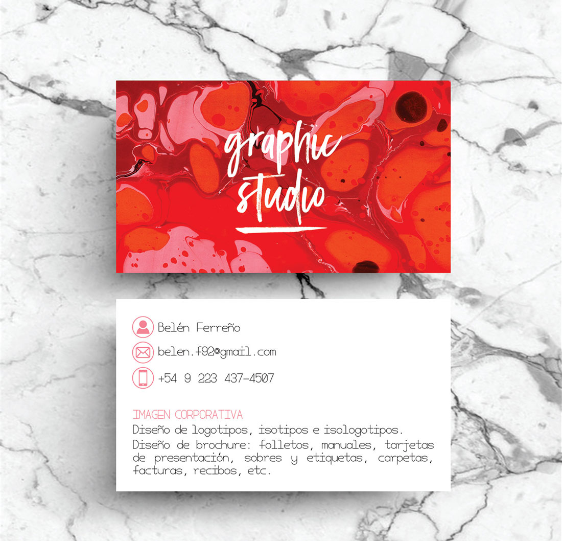
One of the smallest things that can be the most difficult to design is a business card. Due to its small size and a need to include a lot of information, choosing the best font for your business cards is important. It has to set the right tone for you (and your business) and maintain a high level of readability.
While there are a lot of amazing fonts out there, not all of them are super easy to read and understand at small sizes. Most printers recommend that the font on a business card not drop below 8 points (that’s pretty small), so a highly readable option for anything this size is vital.
Here, we’ll look at 10 of the best fonts for business cards and ways you can make the most of these typefaces. Plus, we have a few examples of business card designs that are sure to inspire you.
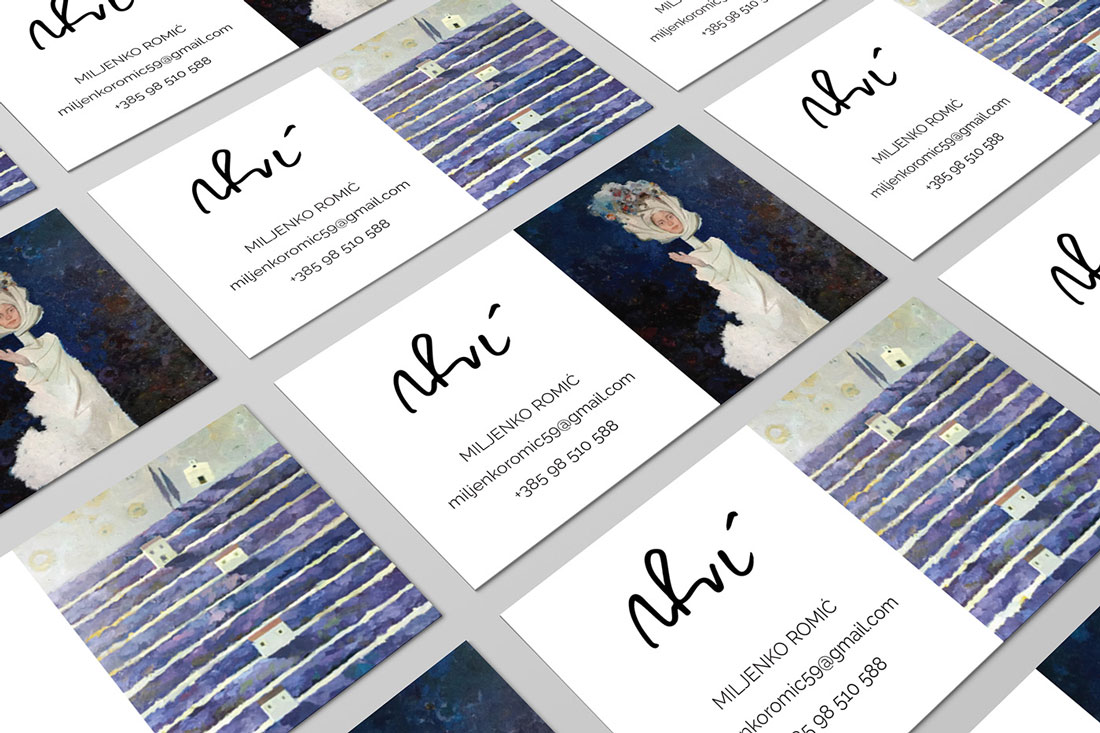
1. Showcase Your Personality
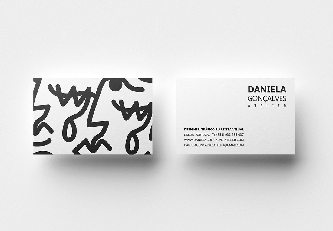
The font you choose for your business cards should reflect your personality and that of your company or brand.
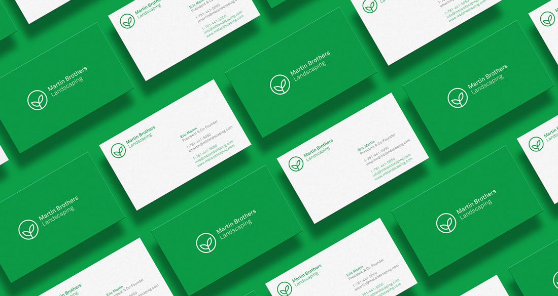
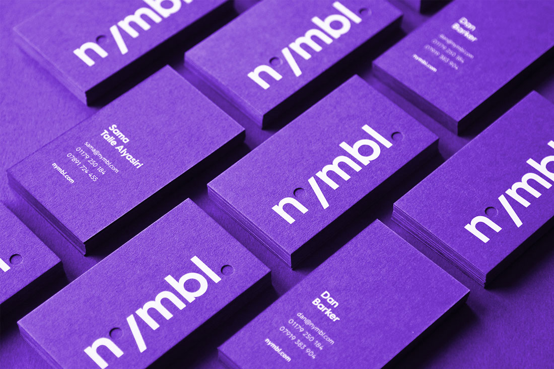
With so many people using personal branding for cards – those that don’t include a traditional logo placement – a font that feels like you can speak volumes. Look for something with details that match your personality, not every business card needs to use traditional fonts such as Arial or Times New Roman.
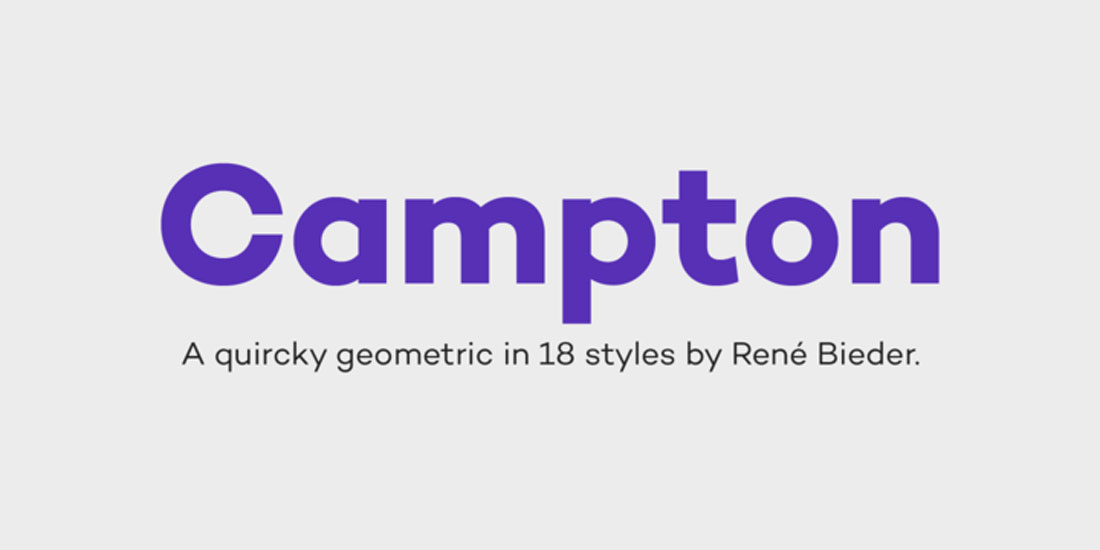
Try this: Campton
2. Go Traditional
On the other hand, there’s something to using traditional, tried and tested fonts for a business card design.
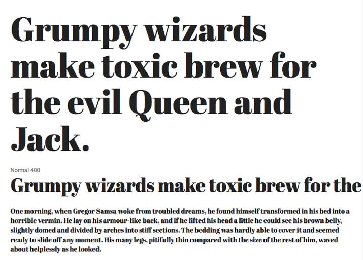
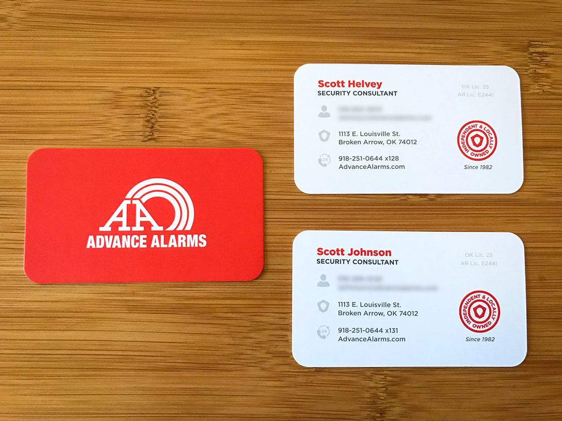
The major benefit is knowing how they will print and read at small sizes. These typefaces are often featured at 12, 10 and 8 points and ease of reading will be a concern on the standard 3.5 inches by 2-inch canvas. A traditional typeface – or one that your printer recommends – is often something they know will work well.
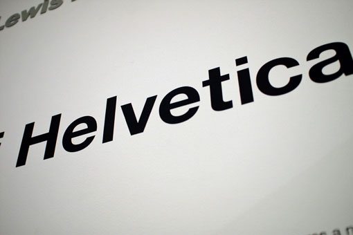
Try this: Helvetica
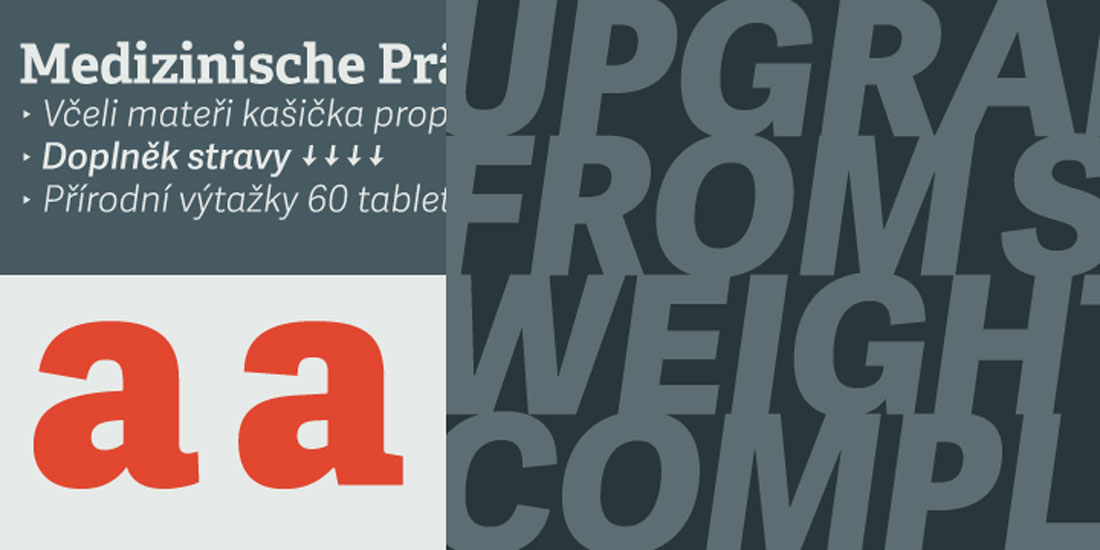
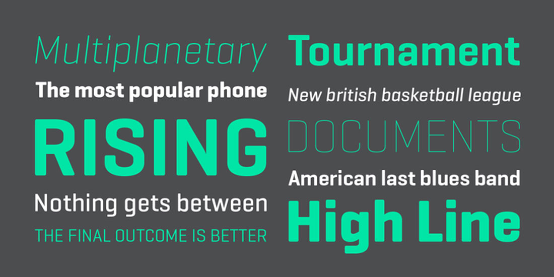
3. Look for Different Weights
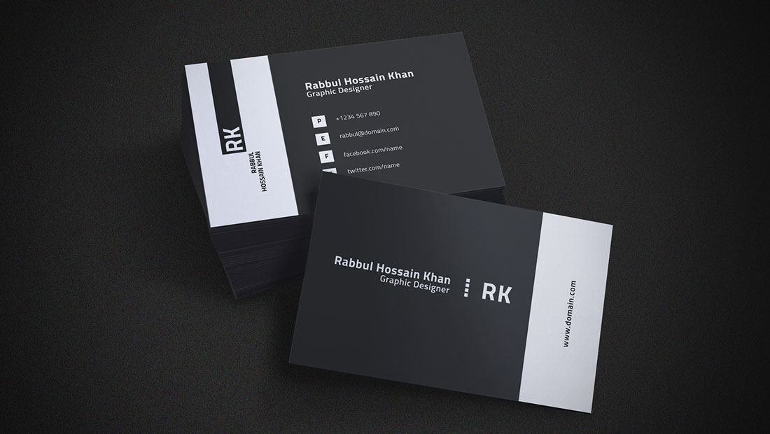
If you are buying a font for a business card design, chances are you want to be as economical as possible. Look for a single font in different weights to give you plenty of flexibility in the design.
A single font with multiple weights will give you flexibility in creating hierarchy and variance in the design without having to work with multiple typefaces.
Try this: Abril
4. Find a (Premium) Freebie
While many designers think about premium, paid fonts first for print projects – there can be quality and character set issues here – you can find nice “freemium” options as well.
If you pick a free font for your business card design, examine the character set carefully first. Does it have a character for all the letters you plan to include? Does it contain the necessary numerals, punctuation or glyphs?
If not, you’ll need a second similar font to fill the gaps or need to make a new selection altogether. (It’s a lot easier to figure all this out before you get into the actual design.)
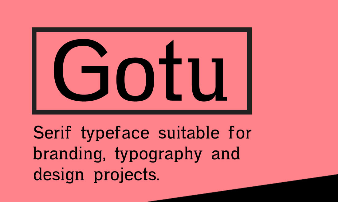
Try this: Gotu
5. Readability is Key
Nothing matters more than readability when it comes to choosing a font for your business card.
Look for a typeface that isn’t too thin or condensed and has more even stroke widths and nice bowls (that’s the round shape of a lowercase o). Pay special attention to kerning and leading.
The business card should be easy to read when you hold it at an arm’s length.
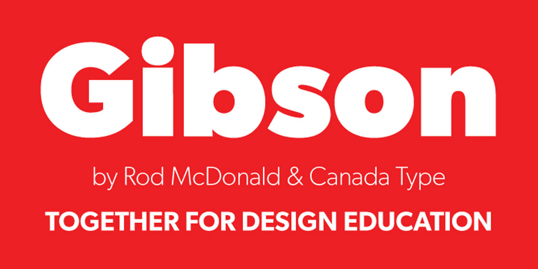
Try this: Gibson
6. Look for Interesting Details
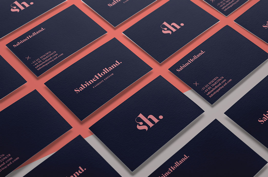
A strong character set with interesting details – a nifty ligature, a long tail or elaborate drop cap – can make a great statement font for a business card.
Pick a single letter to focus on – maybe in your name – to use a special character. This is great for a fun tail on a descender or filled bowl or counter.
Look for a typeface that includes interesting details in the character set as a whole or a set that expands with glyphs or ligature options.
Try this: Rooney
7. Match It To Your Website
Particularly if most of your work is in the digital space, you might want to match the fonts on your business card to that of your website. This can help establish brand and consistency in both the physical and digital space.
Even if you don’t pick the same typeface, something with a similar shape and weight can create the same vibe.

Try this: Roboto
8. Consider a Font Pair
The same rules apply to business cards as other design projects – instead of picking just one font, select a font pair.
Mix and match fonts with different styles, such as a serif and sans serif or sans serif and novelty typeface. The goal is to have two fonts that are different enough to create distinct contrast and visual interest.
Font similarities should include shape and height. Most designers have a strong enough eye to look at a font pair and know if it works or not. Trust your judgment here as well.
Not sure where to start? We have a guide that includes 10 great Google Font combinations that also work for business card design.
Try this: Adelle Sans
9. Serifs Are OK
There’s this nasty little rumor that sans-serifs are the most readable fonts. Baloney!
A nice serif font can be just as easy to read and might even set a more appropriate tone for your business card design. A big part of choosing the best font for business cards is picking an option that communicates your information appropriately.

Try this: Libre Baskerville
10. Match it to Your Printing
When it comes to business card fonts, printing makes a huge difference. From paper type to finishes, you need to match styles appropriately.
Will the paper soak up ink or high color options? Will lettering show with a glossy finish? Are you adding a texture such as foil or embossing?
All of these print considerations can impact how type actually looks on the card when printed. Make sure you have a good idea of how the digital representation will reproduce physically. And when in doubt, talk to your printer about it; they probably have a good idea of what does and doesn’t work when it comes to specific paper and print options.
Try this: Geogrotesque
Conclusion
When planning a typography palette for your business cards, remember to keep readability top of mind. Even if you pick a fun novelty typeface for bigger lettering, such as your name, the main text on the card needs to be easy to read at a glance.
Always print a proof of your business card design on your office printer at actual size to test font size and readability, and if there’s any concern at all, consider a change to the typeface.