What Makes a Stock Graphic Truly ‘Premium’? a Designer’s Checklist
We’ve all been there. You find a stock graphic labeled “premium,” pay the extra fee, and then realize it still looks cheap in your design.
The price tag doesn’t always match the design quality, and that’s a hard lesson many designers learn the expensive way.
The truth is, truly premium stock graphics have specific qualities that go way beyond resolution and price.
When you know what to look for, you can spot the difference between genuinely professional assets and overpriced mediocrity.
Let’s break down exactly what separates the “premium” from the generic in the stock graphics world.
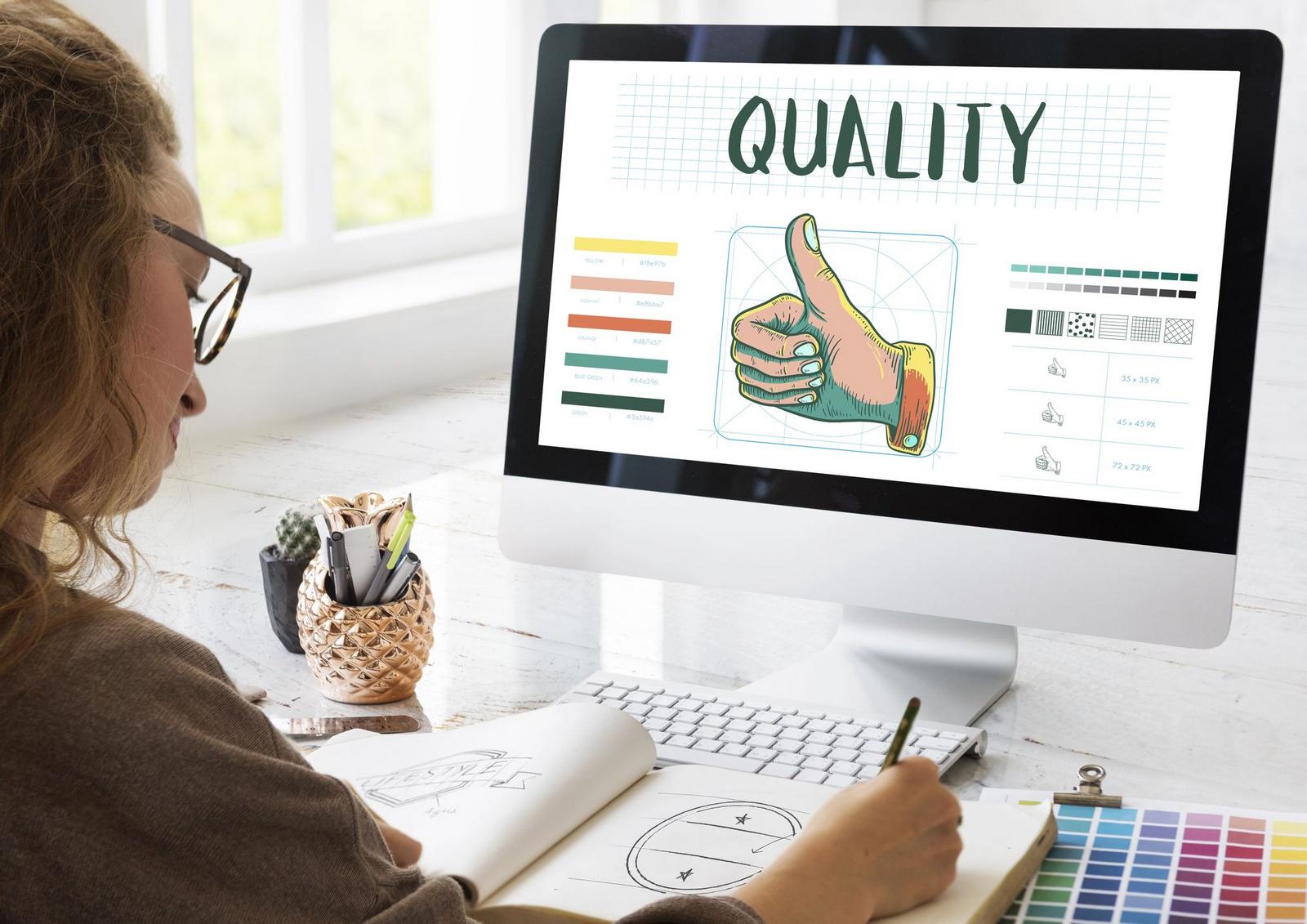
1. The Technical Foundation Most Designers Miss

(Image Credit: DepositPhotos)
The real quality of a stock graphic lives in its technical construction, not just its visual appeal. Unfortunately, most designers overlook this important fact.
Resolution Reality Check
Everyone talks about 300 DPI like it’s the holy grail of image design quality. But context matters more than raw numbers.
A 300 DPI image that’s poorly constructed will still look amateur next to a well-designed 150 DPI graphic.
Premium graphics are built with their end use in mind. If it’s meant for web use, it should look crisp at screen resolution. If it’s for print, the resolution should match without unnecessary file bloat.
Test this by scaling the graphic up and down. Premium assets maintain their visual integrity across different sizes, while cheap ones fall apart quickly.
“Everything is designed. Few things are designed well.” -Brian Reed
File Format Flexibility
A truly premium stock graphic comes with a range of options. You shouldn’t have to settle for just a JPEG when you need flexibility.
The best assets include multiple formats, often PSD files with organized layers, vector formats when appropriate, and optimized web versions.
Pay attention to how PSD files are organized. Premium graphics have logically named layers and groups that make sense.
If you open a file and see “Layer 1,” “Layer 2,” and “Shape 47,” you’re dealing with amateur work.
SVG files deserve special attention too. Well-made vector graphics have clean, optimized code. Poorly made ones are bloated with unnecessary anchor points and messy paths.
2. Visual Sophistication: Reading Between the Lines

(Image Credit: DepositPhotos)
Premium graphics show restraint and intentionality in every visual choice, from color to typography.
Color Depth and Nuance
Amateur stock graphics often suffer from flat, oversaturated colors that scream “template work.”
Premium graphics show restraint and sophistication in their color choices. They use subtle gradients, thoughtful color relationships, and understand when to hold back.
Look for graphics that use color strategically rather than just making everything bright and bold. The best premium assets often have more muted palettes that feel timeless rather than trendy.
Color transitions should feel smooth and intentional. If gradients look banded or harsh, that’s usually a sign of rushed work or poor technical execution.
“Simplicity is the ultimate sophistication.” -Leonardo da Vinci
Typography Integration
When stock graphics include text elements, the typography choices reveal everything about the designer’s skill level.
Premium graphics use fonts that feel intentional and appropriate, not just whatever was trending that month.
Spacing and hierarchy in text-based graphics should guide your eye naturally. If you have to work to figure out what’s important, the designer failed at their job.
Custom lettering often signals premium work, but even when using standard fonts, the spacing and arrangement should feel effortless and professional.
3. The Importance of Composition Quality
(Image Credit: DepositPhotos)
How elements are arranged and spaced reveals the designer’s skill level more than any other factor.
Intentional White Space
One of the biggest tells of amateur design work is the fear of empty space.
Cheap stock graphics often cram every inch with visual elements, creating cluttered, hard-to-read designs.
Premium graphics understand that white space (or negative space) is a design element in itself. They use breathing room strategically to create focus and hierarchy.
When you look at a premium graphic, your eye should move through it smoothly. There should be clear entry and exit points, with important elements getting the attention they deserve.
“Whitespace is like air: it is necessary for design to breathe.” -Wojciech Zielińsk.
Visual Hierarchy That Actually Works
Making something bigger doesn’t automatically make it more important. Premium graphics create hierarchy through contrast, positioning, color, and spacing – not just size differences.
The best premium assets guide your eye through the design in a logical order.
You should be able to understand the main message within seconds, then discover supporting details as you look longer.
If a graphic feels chaotic or you can’t figure out where to look first, it’s not truly premium no matter what the price tag says.
4. The Versatility Test

(Image Credit: DepositPhotos)
The best premium graphics adapt to different contexts while maintaining their visual impact and clarity.
Adaptability
Premium stock graphics work across different situations without losing their impact. They’re not so specific that they only work for one industry or use case.
Color schemes in premium graphics are usually flexible enough to adapt to different brand requirements.
The design should hold up even when you need to adjust colors to match your project.
Size adaptation is crucial too. A premium graphic should work as a small social media icon and as a large banner without losing clarity or impact.
“Design can be art. Design can be aesthetics. Design is so simple, that’s why it is so complicated.” -Paul Rand
Customization Potential
Well-organized files make customization smooth and intuitive.
Premium graphics are built with modification in mind. The layers are properly named, effects are editable, and smart objects are used appropriately.
Try editing the graphic before you commit to using it. If simple changes require major reconstruction, you’re dealing with poorly built assets.
The best premium graphics feel like they were designed to be customized, not just used as-is.
5. Red Flags That Expose Cheap Work

(Image Credit: DepositPhotos)
Most of the time, all cheap stock graphics show the same telltale signs.
Overused Visual Clichés
Some stock graphics get used so often that they become visual clichés.
Handshake photos, light bulb ideas, and generic business team shots are everywhere for a reason: they’re cheap and overused.
Trendy effects date graphics quickly. If a design relies heavily on the visual trend of the moment, it’s probably not built to last.
Generic metaphors that don’t add real meaning to your message are another red flag. Premium graphics enhance your content rather than just filling space.
“Some people think design means how it looks. But of course, if you dig deeper, it’s really how it works.” -Steve Jobs
Technical Shortcuts
Copying and pasting elements across a design shows laziness. Premium graphics have original elements created specifically for that composition.
Inconsistent line weights and styling throughout a graphic suggest rushed work or poor attention to detail.
Poor edge quality is often visible when you zoom in. Jagged lines, poorly cleaned up selections, and sloppy masking all point to amateur execution.
6. The Professional Standards Checklist

(Image Credit: DepositPhotos)
Before you purchase any stock graphic, run through this quick evaluation:
- Technical Check: Does it include the file formats you need? Are layers organized logically? Does it scale well at different sizes?
- Visual Assessment: Do the colors feel sophisticated? Is the composition balanced? Does it avoid overused clichés?
- Versatility Test: Can you adapt it to different contexts? Is it flexible enough for your brand requirements?
- Customization Review: How easy would it be to modify? Are the files well-organized for editing?
After downloading, test the graphic in a real project context. Sometimes issues only become apparent when you’re actually using the asset in your work.
How To Build A Premium Stock Asset Library
Think of your stock graphics as building blocks for your design toolkit. Premium assets work better together because they share similar quality standards and design sophistication.
Follow these simple rules when building your own premium stock asset library to maintain that level of quality across all your designs.
- Choose quality over quantity. It’s better to have 20 exceptional graphics than 100 mixed-quality assets. Premium graphics work better together because they share similar design standards and attention to detail.
- Stick to consistent creators. Find stock graphic designers whose style matches your aesthetic and build a collection from their work. This creates natural cohesion across your asset library without looking like a random grab bag.
- Avoid mixing cheap and premium assets. Clients notice when your designs have inconsistent quality levels, even if they can’t pinpoint why. Keep your standards high across your entire toolkit.
- Organize by project type and style. Group your premium assets by use case (social media, presentations, web headers) and visual branding style (minimalist, bold, corporate). This makes selection faster and ensures better design consistency.
- Invest in complementary color palettes. Look for graphics that share similar color approaches or can be easily adapted to work together. This makes it easier to create cohesive brand experiences across different projects.
Keep Developing Your Premium Eye
Learning to spot truly premium stock graphics becomes instinctive with practice. Start by comparing obviously cheap graphics with expensive ones – the differences become clear quickly.
The business case for premium assets is simple: they make your work look more professional, save time on revisions, and give you more flexibility in how you use them.
Your clients may not consciously notice the difference between premium and cheap stock graphics, but they definitely feel it. Professional-quality assets elevate everything they touch.