5 Design Lessons That I Learned From Writing 85 Web Design Critiques
Here at Design Shack we offer a simple but useful service called a web design critique. It’s basically a consulting service that you can take advantage of for a mad cheap price in exchange for letting us post it on the site as an educational tool.
I’ve personally written up a whopping eighty five of these things thus far (#85 will be posted later this week). That’s a whole lot of design advice! Read on to see what I’ve learned about web design in the process, both from the good examples and the bad.
Web Design Critiques
When someone submits a page for a critique, I pour over it, make notes about what works well, what could be better and what needs to be fixed immediately. I then write it all up as a web design critique post.
It’s obvious that I’m using these critiques as a teaching tool, but what you may have missed is that I’m not strictly teaching, I’m actually learning from you guys as much as you are from me! It’s often that we get a website to critique that is truly fantastic, as I analyze and explain why it’s so great, I’m absorbing techniques, ideas, UI patterns and more.
After about twenty of these things I noticed that some patterns and trends emerged, advice that I was giving over and over, places where designers tended to be strong and weak, mistakes that are often made. Sixty critiques later and I have lots to say about the areas where most designers need to focus on improving.
1. The Three Second Rule
If you’ve read a few of the critiques that I’ve written, you’ve probably noticed that I always start with what my first impression tells me about the site. When I load that page into the browser, what I can I tell about the page in the first three seconds?
Three seconds you say? What good is that? The answer is that, as a web browser, it only takes me a few seconds to decide of your site is what I’m looking for, after that I’ve made my decision about whether I’ll move on or explore further.
For some designers, this brings up a challenge to catch the user’s attention with something flashy to pull them in. This is a good technique, but it may not be appropriate for all design situations. The universal truth here is that I should always, at a bare minimum, know who you are and why your site exists in these first few seconds.
We saw this done well in the site header for IdentyMe.

Both the graphics and the messaging here come together to create a crystal clear message that’s readable in an instant: this site allows you to create virtual business cards.
When we see this done well, it’s hard to imagine how anyone could screw it up, but it’s actually far more often the case that the sites I critique miss the mark in this area with vague messaging. We forget that when we’re close to a project, we can often lose sight of the fact that not everyone knows what it’s all about like we do.
After a few meetings, you know all about your client’s business and it slips your mind that you have to still explain to everyone else just what the heck “Smith’s Logistics” does and what their website is seeking to accomplish.
2. Goal-Oriented Design
The second important thing that I learned about web design is that projects are much more successful when they’re approached with a very specific set of goals in mind. The previous lesson was really just an extension of this: one of the major goals of any site is to communicate its own purpose.
Far too often, designers just open up Photoshop and start sketching ideas out at random. This is a great creative exercise, but as the primary method of building client sites, it sucks. It’s a lot like being a taxi driver who skips asking the guy in the backseat where he’s going and instead just drives to some random place, hoping he gets it right.
Instead, what needs to happen is that a very intentional set of goals should be worked out by you and your client regarding what you hope to accomplish with the design. This should happen before you write a single line of code or create a single PSD.
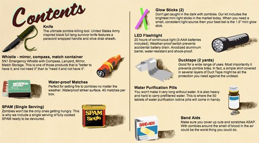
We saw this idea put into practice very effectively in Web Design Critique #61: Undead Kit. Given that the site was selling a kit meant to help you survive an oncoming zombie apocalypse, there were two obvious subgoals that the site needed to achieve.
The first was to showcase what exactly was in the case so potential buyers knew what they were getting into:
The second subgoal was to explain how buyers would use their kit to survive. Listing the items isn’t enough, people need to see the benefit of these items in practice.
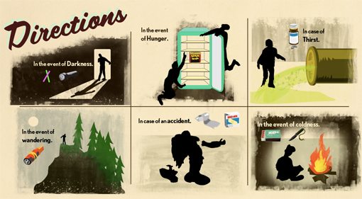
As you can see, both of these goals were accomplished through awesome illustrations and simple text descriptions. The designer was still able to goof off and flex his creative muscles, but he did so in a way that led the site in a successful direction.
3. Design Trends are Like Wallpaper
Picture your grandma’s house. Imagine all of the things in there that indicate that the house is owned by someone who grew up in a different era from your own: the porcelain knick knacks adorning every shelf, the eye-gouging color schemes and of course, the wallpaper. Layer upon layer of wallpaper, a primary (though now fairly antiquated) design element in the room that changed every few years to match the latest trends.
The homes owned by various members of my family have surely sacrificed 5% of their square footage to layers of wallpaper madness. If you were to peel away these layers one at a time, you would travel through time and witness various patterns and colors that were once seen as fit to cover a room but were years later scorned as a hideous mistake and replaced with something that would only serve to continue this ceaseless cycle.
Compared to wallpaper, web design is still in its infancy, but we’ve already come far enough to see that the design trends here operate on the same principles. Grab any design trend that seemed so awesome five years ago and it likely now serves as something that dates a site.
We saw this in practice with the patterns, textures and bevel effects used on the site from Web Design Critique #74:

Here we see what once may have been cutting edge design, but now simply feels like something well past its time. Web designers are fickle beasts and when the mob moves on, you either move with it or get left behind.
Even if you account for the fact that the site above has an intentionally retro feel, the design still doesn’t work because the way that we pull off retro actually evolves over the years as well!
You may think that staying up with modern design trends (or setting new ones) is silly, but that’s absolutely not the case. Web design trends evolve as a part of your culture as a whole. Fashion, television, Hollywood, food, nothing escapes the reach of the trendy. Just as workers in all of those industries have to keep up or risk becoming irrelevant, so too do you as a web designer.
Don’t believe me? Find someone who hasn’t built a website since 1999 and let them design your new portfolio. Odds are, you shutter at the thought.
4. Many Web Designers Still Struggle with Typography
In the past two or three years, web designers have fully embraced typography. This particular area of design has gone far beyond a trend for many designers and has grown into an obsession. Run a search for “typography” on Pinterest or Dribbble and you’ll see countless examples of amazing typographic art.
Combine this with services like Typekit and Google Web Fonts, which bring beautiful custom fonts to the web, and you see an industry that has grown by leaps and bounds in this area in a very brief amount of time.
That being said, one of the issues that I come across most often in web design is poor typography. This takes many forms: little knowledge of how to effectively combine typefaces, poor choice of fonts, ugly Photoshop kerning, odd sizing, squished line-height, etc. Here’s an example:

We may focus our attention on a piece of typographic art for hours on end, but when we’re working on a live project, type is rushed and pushed live without proper preparation or examination. Good print designers cringe at kerning examples like the one above because they know in their industry, there’s no going back. Once it’s printed, you’re done.
With web designers, the knowledge that everything can easily be updated at any time can make for sloppy, rushed work. Take the time to get your type right the first time.
5. Less is More
As I’ve looked through these 85 websites and suggested changes that need to be made, it’s honestly a very rare case where my impression is that the page is too sparse.
Instead, I’m always struggling to get designers to understand that they’re actually trying too hard to fill up the page. This results in cluttered, text-heavy designs that no one really takes the time to sift through.
The web is a fast-paced place. There’s a reason the term is worded “browsing the web” rather than “reading the web.” We jump around quickly from place to place looking for anything that jumps out and holds our attention.
The things that do so are typically simple and attractive with a few bold statements and/or images that stand out from their surroundings. Pages full of clutter present a case of information overload and we quickly move on.
Consider the example below from Critique #68:

This box isn’t ugly by any means, but it can be made more effective by stripping out most of the text and making adding in a little typographical contrast:
Type isn’t the only area where things need to be simplified though. Consider this example:
This is a classic example of simply trying to squeeze too much stuff into a small space. We don’t think critically about content organization but instead hit a point where we still have a lot of stuff that needs to be included and no place to put it, so we just cram and the result is ugly, ineffective clutter.
What Have You Learned?
So there you have it, five lessons that I’ve learned about web design from writing eighty five critiques. Now it’s your turn.
Do you read our web design critiques? What have you learned from them? How can we make them even better? Leave a comment and let us know.