5 Incredibly Useful Tools Built Into Twitter Bootstrap
Bootstrap is an interesting framework or “toolkit” offered up to developers completely free of charge by none other than Twitter.com. According to Twitter, Bootstrap is “designed to kickstart development of webapps and sites.”
Today we’re going to jump into Bootstrap and take a quick look at some of the things that it has to offer. This should help you decide whether this is just another bloated framework or an incredibly useful tool that you should use to kickstart your next project.
What Can You Do With Bootstrap?
Bootstrap is sort of a Swiss Army Knife for developers. It’s simply loaded with tools and utilities, some of which you’ll find extremely useful, others you’ll never touch.
The real goal behind Bootstrap is to save you time. Twitter has done the heavy lifting for you by researching and implementing some of the best ways to perform various tasks. They’ve also taken several steps towards applying solid basic styles to various commonly used elements.
Should you take this as it is and turn your critical brain off during development? Absolutely not! You should dig in, find what you like and ditch or change what you don’t. Bootstrap is specifically built to handle customization in many cases so feel free to go nuts and make it your own.
Getting Started
If you want to implement some of the styles we’ll be working with on the fly, you can simply hotlink to the Bootstrap CSS file like so:
<link rel="stylesheet" href="http://twitter.github.com/bootstrap/1.4.0/bootstrap.min.css">
We’ll be going a step further and digging into some of the optional LESS files so it might also be helpful to just stop by GitHub and download the entire project.
Once you have all of that ready to go, it’s time to move on and see what this thing has to offer. I won’t be going through a step by step tutorial of every single feature in Bootstrap, it’s pretty huge and the documentation should have you covered. This will merely serve as a quick overview for some of the things that I find useful about Bootstrap and how you can quickly and easily take advantage of them in your own code.
Demo
Click the link below to see Twitter Bootstrap in action. I built this sample page in only a few minutes utilizing the techniques that we’ll go over below.
Demo: Click here to launch the demo.
#1: A Prebuilt Grid
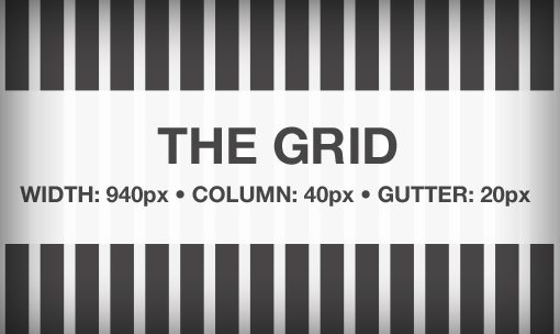
The first thing that we should discuss is the grid. Every good framework has one and Bootstrap is no exception. You don’t have to use the grid to benefit from the wealth of styles offered up by Bootstrap but it is the key element to using this toolkit to perform rapid page layout with almost no effort.
By default, the grid is 940px wide with 16 columns. Each column is 40px with a gutter of 20px. Like 960.gs, Blueprint and others, this grid is a little div heavy and requires some markup that you may not love, but in the end it’s actually really easy to use and makes using Bootstrap a snap.
The grid works primarily on row and span classes. Rows are self-explanatory, when you want to start a new row, create a div and apply the “row” class. Everything for that row goes in that div, when it’s time for another row, close the old one and start a new one.
For each div within a row, you apply the “span#” class with “#” being the number of columns you want the div to span.
Grid Example
Let’s say we were mocking up a layout that used a large header image that covered the full width of the site above four columns of text. The markup for this is simple:
<div class="row">
	<div class="span16"></div>
</div>

<div class="row">
	<div class="span4"></div>
	<div class="span4"></div>
	<div class="span4"></div>
	<div class="span4"></div>
</div>
The styling for this will be completely automated. All you have to do is drop some content into the HTML above and you’ve got yourself a layout.
Just like 960.gs, the Bootstrap grid also supports nesting and columns. You can even make the page fluid by throwing everything into a div with a “container-fluid” class, or simply use “container” for fixed width.
#2: LESS
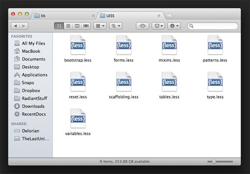
LESS, the increasingly famous CSS preprocessor, gets a big endorsement here from Twitter with a ton of built in support. They’ve really gone all out and created a lot of LESS mixins and variables for you to work with right out of the box.
Let’s take a quick look at just a few of the things that you can do with Bootstrap and LESS.
Customize the Grid
The Bootstrap grid is built using LESS mixins and CSS math so it’s easy to customize. Just change a couple of variables and everything is automatically updated. For instance, let’s say you wanted a twelve column grid instead of a sixteen column one, simply go into “variables.less”, find the grid variables and change the number of columns to twelve. It’s that easy.
// Modify the grid variables
@gridColumns:       12;
@gridColumnWidth:   40px;
@gridGutterWidth:   20px;
CSS3 Without the Hassle
Bootstrap makes it easy to use a few of your favorite CSS3 tricks without the pain of manually repeating yourself for every browser. You’ll find helpful mixins for implementing rounded corners, shadows and transitions.
// Border Radius
.border-radius(@radius: 5px) {
  -webkit-border-radius: @radius;
     -moz-border-radius: @radius;
          border-radius: @radius;
}

// Drop shadows
.box-shadow(@shadow: 0 1px 3px rgba(0,0,0,.25)) {
  -webkit-box-shadow: @shadow;
     -moz-box-shadow: @shadow;
          box-shadow: @shadow;
}

// Transitions
.transition(@transition) {
     -webkit-transition: @transition;
        -moz-transition: @transition;
         -ms-transition: @transition;
          -o-transition: @transition;
             transition: @transition;
}
There are also resources for creating gradients and color schemes using the magic of LESS.
Clearfix
If you stick to the prebuilt grid, you shouldn’t have to manually set up and clear floats, but if you go your own way with layout the built-in clearfix mixin can save you a lot of hassle.
// Clearfix for clearing floats like a boss h5bp.com/q
.clearfix() {
  zoom: 1;
  &:before,
  &:after {
    display: table;
    content: "";
    zoom: 1;
  }
  &:after {
    clear: both;
  }
}
To implement this, all you have to do is type “.clearfix()” in your .less file. The structure here mirrors the method used by Nicolas Gallagher.
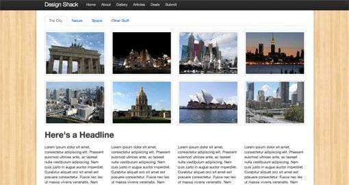
#3: Navigation
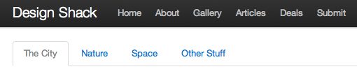
One of Bootstrap’s most convenient pieces is the awesome navigation toolkit provided, which you can use to implement several different types of complex navigation elements in seconds.
Main Navigation
For instance, there’s an awesome main navigation bar that looks sharp, allows for easy custom branding and even stays with you as your scroll (shown above on top). The markup seems unnecessarily heavy but it sure does make it easy to create a really slick menu (support for dropdowns included as well).
<div class="topbar">
	<div class="topbar-inner">
		<div class="container">
			<a href="#" class="brand">Design Shack</a>
		 	<ul class="nav">
			 	<li><a href="#">Home</a></li>
			 	<li><a href="#">About</a></li>
			 	<li><a href="#">Gallery</a></li>
			 	<li><a href="#">Articles</a></li>
			 	<li><a href="#">Deals</a></li>
			 	<li><a href="#">Submit</a></li>
		 	</ul>
 		</div>
	</div>
</div>
Tabs
You can also easily implement a tabbed navigation scheme. This markup looks much nicer and really couldn’t be any easier. Simply add the “tabs” class to an unordered list and you’re done!
<ul class="tabs">
	<li class="active"><a href="#">The City</a></li>
	<li><a href="#">Nature</a></li>
	<li><a href="#">Space</a></li>
	<li><a href="#">Other Stuff</a></li>
</ul>
Even More
Bootstrap doesn’t stop there. In it you’ll find similar constructs for creating breadcrumb navigation, pagination and more. Most of these are implemented just like tabs, with a simple class.
Remember that all of the default styling can be changed so even if you don’t necessarily like the style used, these tools are extremely helpful for getting the basic structure of your navigations up and running in no time.
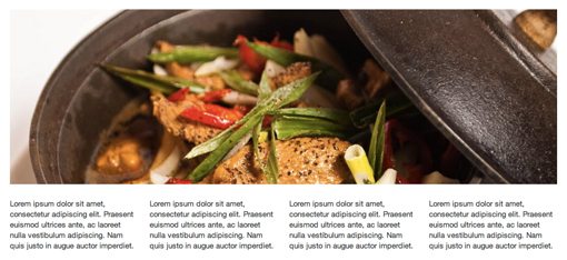
#4: Galleries
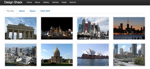
With Bootstrap, image galleries are fairly automated. As with tabs, they simply require an unordered list with a special class, in this case “media-grid”. With this applied, the gallery automatically performs the layout work taking into account the size of your images. That being said, Twitter recommends using sizes such as 90, 210, and 330, which work well with the layout.
<div class="row">
	<div class="span16">
		<ul class="media-grid">
	    		<li><a href="#"><img src="img.jpg" alt="" /></a></li>
	    		<li><a href="#"><img src="img.jpg" alt="" /></a></li>
	    		<li><a href="#"><img src="img.jpg" alt="" /></a></li>
	    		<li><a href="#"><img src="img.jpg" alt="" /></a></li>
	    	</ul>
	</div>
</div>
Gallery images come pre-styled with borders, rounded corners, padding, hover styles; everything you need to get a grid of images in place and functioning. You can even mix image sizes and the grid will automatically handle the differences without breaking your page layout.
#5: JavaScript Goodness
Thus far we’ve primarily discussed the HTML and CSS goodies packed into Bootstrap, but this toolkit goes well beyond style and structure and adds plenty of functionality benefits as well. You’ll find JavaScript libraries for implementing tooltips, modal windows alerts and more.
You’ll also need some JavaScript to bring some of the elements we’ve already seen to life. For instance, there are built in functions for making each tab load separate content and for handling the dropdown menu items.
By utilizing data attributes, you can even skip writing the JavaScript. Here’s a sample snippet that lets you implement a tool-tip right from your HTML:
<a href="#" data-placement="below" rel='twipsy' title='Some title text'>text</a>
Conclusion
This article is meant to give you a very brief peek into some of the great tools that are available to you in Twitter Bootstrap. Whether you’re looking for a quick way to perform a complex layout or simply want some nice UI elements like tabs and buttons, Bootstrap has you covered.
There are things here and there that I might not agree with, but on the whole I think Twitter has succeeded in creating a genuinely useful set of tools. I’m always thrilled to see corporations offering up valuable resources to the web design community free of charge. Do you know of any similar tools from other companies? Let us know in the comments below.