How to Implement Some Slick Icons Using a Font and CSS
Using an image-based font can be a fun and quick way to implement icons across your site. It’s a super easy process that gives you complete freedom to go back and re-size your icons at any time.
Today we’ll use the excellent Pictos font to build a simple web page so you can get a feel for the process.
Using a Font for Icons
This week’s design deal features the awesome Pictos font, which contains 96 minimal icons that are just perfect for web design. The great thing about this font is that you not only get a print version, but a folder full of various formats to use on the web as well.
What this means is that we can easily use @font-face to embed the Pictos font into a site and then utilize the icons in place of images. Just in case you’re a little hazy on how this is done, I wanted to cook up a quick tutorial that walks your though a basic implementation of the font.
Even if you’re pretty new to CSS, this should be a breeze. In some ways, it’s actually easier than working with images! Let’s get started.
Basic HTML and CSS
The first thing you want to do is start up a basic starter kit with one HTML file and one CSS file. The code below is what I usually start with.
<!DOCTYPE html>
<html>
<head>
<meta charset=utf-8 />
<meta name="description" content="description">
<title>Design Shack Pictos Example</title>
<link rel="stylesheet" type="text/css" media="screen" href="style.css"/>
</head>

<body>
</body>
</html>
CSS
For little projects like this I don’t like to mess with huge resets, if you prefer something more extensive, feel free to include it.
* {
	margin: 0; padding: 0;
}
Body CSS
For the body, all we need to do is set the base font size and apply a background image. I wanted something subtle but attractive so I naturally stopped by Subtle Patterns and downloaded the “Subtle freckles” texture. This site is amazing and is quickly becoming one of my go-to stops for quick design resources.
All you have to do is apply the downloaded file to the background and set it to repeat.
body {
	background: #fff url('subtle_freckles.png') repeat; /*source: subtlepatterns.com*/
	font-size: 62.5%;
}

Intro Paragraph
The first thing we’re going to add to the page is an intro paragraph. We’re going to imagine that we’re building a page for a web app called “Anchorrr”. With that in mind, insert the following HTML.
<div class="container">
    <div id="intro">
    	<h2>Anchorrr</h2>
    	<p>Lorem ipsum...</p>
    </div>
</div>
As you can see, there’s not much here, just just a container with one div that holds a header and a paragraph. Let’s style this to look nice.
Intro Paragraph CSS
To style this section, we start by applying a width and some margin to the container. We use auto margins to center the container in the body and overflow: hidden to help clear the floats we’ll be using.
Next, we apply a width to the intro div and float it to the left. I used a bit of shorthand for the font property to keep things nice and concise. Notice that the line-height doesn’t have an associated unit.
.container {
	width: 900px;
	margin: 50px auto;
	overflow: hidden;
}

#intro {
	width: 400px;
	float: left;
	overflow: hidden;
	font: 1.7em/1.6 "Helvetica Neue", Arial, Helvetica, Geneva, sans-serif;
	margin-top: 60px;
	color: #2a2626;
}

#intro h2 {
	font-size: 3.5em;
}
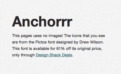
As you can see in the preview above, I actually had a link in my version, which required a little bit of extra styling:
#intro p a { color: #04626a;}
#intro p a:hover { color: #08b1c0;}
The Big Anchor
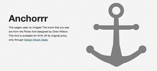
Next, we want to add in a big image of an anchor, which just happens to reside in our Pictos font. The first thing we need to do is embed the font into our CSS, then insert the anchor into our HTML and finally, style it back in CSS.
Embed the Pictos Font
Fortunately, the font actually comes with a snippet specifically for this task so our work here is incredibly minimal. All you have to do is move the font files into your project folder and paste the following into your CSS file.
/*fonts*/
@font-face {
	font-family: 'Pictos';
	src: url('pictos-web.eot');
	src: local('☺'), url('pictos-web.woff') format('woff'), url('pictos-web.ttf') format('truetype'), url('pictos-web.svg#webfontIyfZbseF') format('svg');
	font-weight: normal;
	font-style: normal;
}
Insert the Anchor into Your HTML
Like embedding the font, inserting the character couldn’t be any easier. All we have to do is look through the character map below to find the image we want and then type that letter in a paragraph in our CSS.
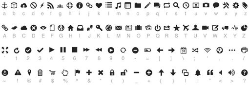
As you can see, the anchor can be implemented via the lowercase “a” in the font. Here’s how we implement this in our HTML.
<div class="container">

    <div id="intro">
    	<h2>Anchorrr</h2>
    	<p>Lorem ipsum…</p>
    </div>

    <div id="anchor">
    	<p>a</p>
    </div>
</div>
Easy right? Initially it’ll just show up as a lowercase “a”, so let’s jump over to our CSS to style it.
Style the Anchor
To turn our simple letter into an icon, we need to make sure the font is set to the Pictos font we embedded earlier. Note that, since this is in fact type we’re working with, we can position the anchor vertically via the line-height property. I played around with some different values until I found something that looked right.
I’ve also applied some CSS3 magic to make the anchor look nice. A little RGBa allowed me to make the anchor slightly transparent and a white text-shadow gives it a hint of a letterpress effect.
/*anchor icon*/
	#anchor p {
		font: 50em/.94em Pictos, "Helvetica Neue", Arial, Helvetica, Geneva, sans-serif;
		color: rgba(0, 0, 0, 0.5);
		-moz-text-shadow: 3px 5px 3px rgba(255,255,255,0.9);
		-webkit-text-shadow: 5px 3px 3px rgba(255,255,255,0.9);
		text-shadow: 3px 5px 3px rgba(255,255,255,0.9);
		text-align: right;
	}
With that, our top section is looking pretty good! Our anchor is in place and working perfectly.
Dividing Line
Before we start the next section, I want to create a clear visual division with a solid line. Since the content we just laid out is all wrapped up in a nice container, this is pretty easy to do with a simple border.
As with the anchor icon, I’ve combined the bottom-border with a shadow to give it a little more dimension.
.container {
		width: 900px;
		margin: 50px auto;
		overflow: hidden;
		border-bottom: 2px solid rgba(0, 0, 0, 0.3);
		-moz-box-shadow: 0px 3px 3px rgba(255,255,255,0.8);
		-webkit-box-shadow: 0px 3px 3px rgba(255,255,255,0.8);
		box-shadow: 0px 3px 3px rgba(255,255,255,0.8);
	}
The result is a simple and effective divider between our two sections.

Adding the Three Columns
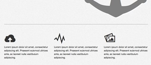
The next section will hold three columns of text and will simulate your typical “features” section on a web app site. Naturally, we’ll want to include some visual cues as well and our Pictos font serves as the perfect tool for doing just that.
Features HTML
The first step here is to implement the basic markup for our three columns. We’ll use three paragraphs and top each with an h3 that will hold the icons. I’ve gone in and picked some good letters to use, feel free to choose your own for a different effect.
Each column gets the same class so we can style them all together and the last one adds an additional class so we can knock the margins off easily.
<div id="features">
	<div class="featurecolumn">
		<h3>c</h3>
		<p>Lorem ipsum dolor sit amet, consectetur adipiscing elit. Praesent euismod ultrices ante, ac laoreet nulla vestibulum adipiscing.</p>
	</div>

	<div class="featurecolumn">
		<h3>Y</h3>
		<p>Lorem ipsum dolor sit amet, consectetur adipiscing elit. Praesent euismod ultrices ante, ac laoreet nulla vestibulum adipiscing.</p>
	</div>

	<div class="featurecolumn last">
		<h3>P</h3>
		<p>Lorem ipsum dolor sit amet, consectetur adipiscing elit. Praesent euismod ultrices ante, ac laoreet nulla vestibulum adipiscing.</p>
	</div>
</div>
Features: Basic CSS
To start off with the feature section CSS, we just need some super basic CSS like we used before. At this point, this should all make perfect sense.
Notice that, once again, I implemented the Pictos font, but only on the h3 tags.
#features {
		width: 900px;
		margin: 50px auto;
		overflow: hidden;
		font: 1.5em/1.5 "Helvetica Neue", Arial, Helvetica, Geneva, sans-serif;
		color: #2a2626;
	}

.featurecolumn h3 {
		font: 5.4em/1 Pictos, "Helvetica Neue", Arial, Helvetica, Geneva, sans-serif;
		color: rgba(0, 0, 0, 0.8);
		-moz-text-shadow: 3px 3px 1px rgba(255,255,255,0.8);
		-webkit-text-shadow: 3px 3px 1px rgba(255,255,255,0.8);
		text-shadow: 3px 3px 3px rgba(255,255,255,0.8);
	}
Features: Column CSS
I set the width of this page quite arbitrarily, which can make implementing columns a little tricky. Grid systems use values like 960px because they’re easy to divide up into several column variations.
However, creating your own column system on the fly is pretty easy. In fact, I covered this very topic in a recent article. We’ll use this same technique below.
Basically, we start out with 100% width. If we want a 4% right margin applied to two of the columns that brings us down to 92%. We divide that by three columns to get roughly 30.66667%, which is our column width. This will automatically distribute three columns over the width of the container.
.featurecolumn {
		float: left;
		width: 30.66667%;
		margin-right: 4%;
	}

.last {margin-right: 0;}
As you can see in the preview below, our columns came out pretty awesome. Each is topped with a nice little icon, which adds some considerable visual interest to the page.
The Demo
With that, our web page is all finished. Using only CSS, we were able to implement beautiful icons with ease, no images required! As you can imagine, using this technique across a really large site could be a huge time-saver. The best part is, once you load in the font a single time, you’re ready to go and can easily access any of the icons within.
Live Demo: Click Here
Conclusion
To sum up, using an image-based font like Pictos can be a great trick for placing icons into your site with very little effort. Just use @font-face to embed the font and insert/style the icons just like you would any other text.
If you’re interested in getting your hands on the Pictos font, head over to our deals page. Be quick though, our offer ends on Monday, July 25th!
